

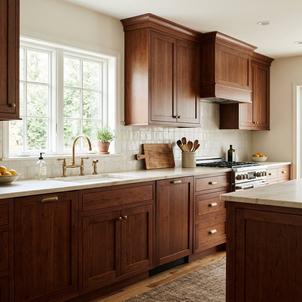
Cherry cabinets have a warmth and richness that can make a kitchen feel inviting, but they can also be tricky when you’re choosing a wall color.
The challenge is usually the wood’s undertone.
Cherry cabinetry often has noticeable red, orange, or reddish-brown warmth. Depending on the finish, age, lighting, and specific wood, those tones can range from subtle to quite strong.
Choose a wall color that’s too yellow, and the entire kitchen may become overly warm. Choose a cool blue-gray without considering the rest of the room, and the cabinets can suddenly look even redder. Choose a stark white, and the contrast may be harsher than you expected.
The best paint colors for cherry cabinets generally do one of two things: quietly complement the warmth of the wood or provide enough contrast to balance it.
Soft warm whites, muted greiges, gentle greens, earthy neutrals, and carefully selected blue-grays can all work.
Below are 15 paint colors and color directions worth sampling, plus tips for coordinating cherry cabinets with countertops, backsplashes, flooring, hardware, and lighting.
Understanding Cherry Cabinet Undertones
Before looking at paint samples, study the cabinets themselves.
Cherry wood is known for its warm coloring, but not every cherry kitchen looks the same.
Your cabinets may lean:
- Red
- Reddish brown
- Orange-red
- Deep brown
- Burgundy
- Golden red
The finish matters too.
Older cherry cabinets may have a glossy reddish finish, while other cabinetry may appear darker and browner.
Natural wood can also change in appearance over time and under different lighting conditions.
That’s why choosing a wall color based solely on another person’s cherry kitchen isn’t reliable.
Should You Complement or Tone Down Cherry Cabinets?
This is the first decision to make.
If you love the warmth of your cabinets, choose a wall color that creates a harmonious palette.
Think:
- Cream
- Warm white
- Beige
- Warm greige
If you want to visually balance some of the redness, consider muted colors with green or blue-green influence.
Think:
- Sage
- Muted olive
- Soft green-gray
Because green sits opposite red on the color wheel, it can create a natural balancing relationship with reddish wood.
But don’t choose an obviously mint-green wall simply because color theory says green works with red.
Muted colors are generally much easier to live with.
1. Sherwin-Williams Alabaster SW 7008
Alabaster is a warm white worth sampling with cherry cabinetry.
Instead of creating the strong contrast of a very crisp white, a softer warm white can relate more naturally to the warmth of the wood.
This combination works particularly well if you have:
- Warm stone
- Cream backsplash
- Beige flooring
- Warm metal finishes
Keep an eye on the other whites in the kitchen.
If your countertop or backsplash is a very cool white, a warm wall color may make the difference between the two more obvious.
2. Benjamin Moore White Dove OC-17
White Dove is another warm white to consider.
A soft white can brighten a kitchen filled with dark cherry cabinets without making the cabinetry look quite as heavy.
This is particularly useful in kitchens with limited natural light.
Pair the combination with lighter surfaces and simple accessories to keep the overall room from feeling too dark.
3. Sherwin-Williams Shoji White SW 7042
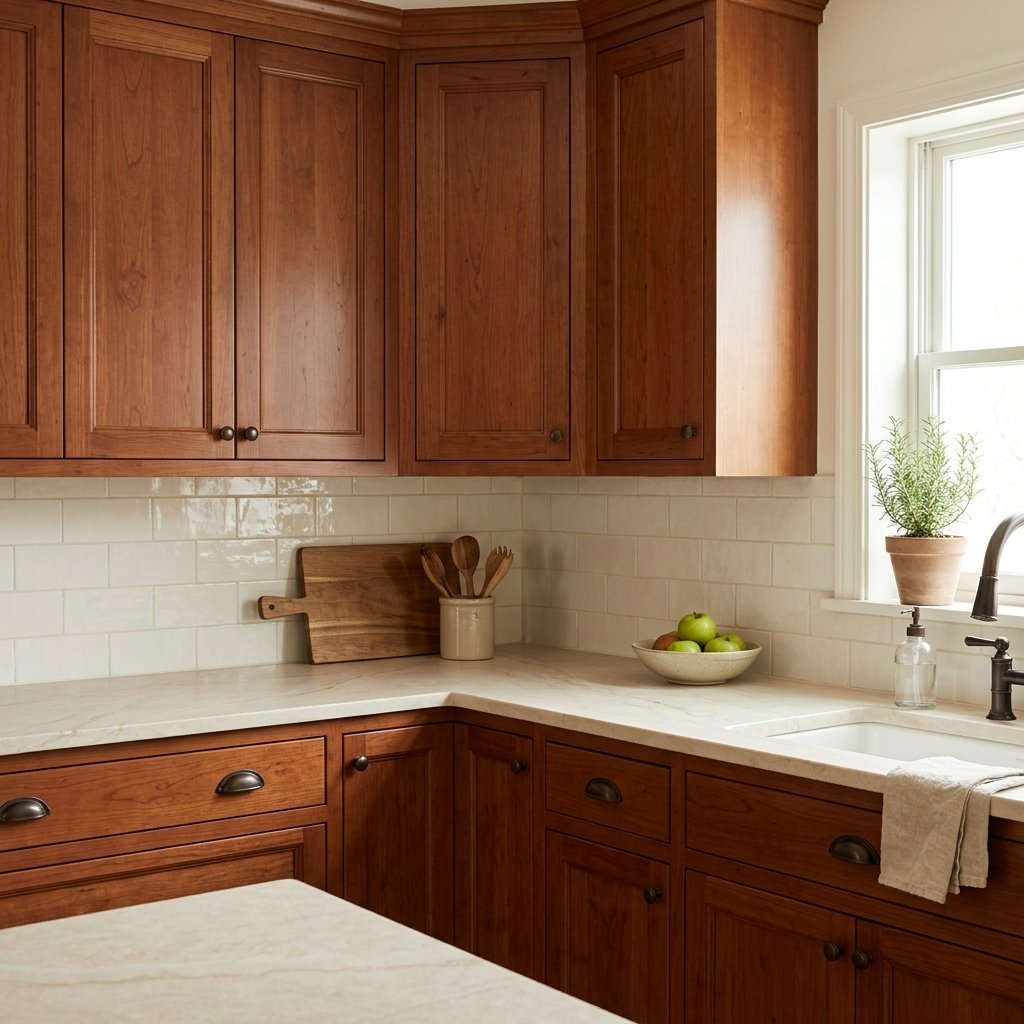
If bright white feels too stark, consider moving toward a deeper off-white.
Shoji White can be worth sampling when you want more softness and depth on the walls.
This direction can work well with traditional cherry cabinetry because it doesn’t force a sharp light-versus-dark contrast.
It can also help connect cherry cabinets with beige, tan, or warm stone finishes elsewhere in the kitchen.
4. Benjamin Moore Pale Oak OC-20
Pale Oak is a light neutral worth testing if you want something between off-white and greige.
A soft neutral can allow cherry cabinets to remain the strongest color in the room without adding another obvious hue.
This approach is particularly useful when the kitchen already has multiple fixed finishes.
For example, if you have:
- Cherry cabinets
- Granite countertops
- Tile backsplash
- Wood flooring
…adding a strong wall color may simply create one more element competing for attention.
A quiet neutral can help calm the palette.
5. Sherwin-Williams Accessible Beige SW 7036
Accessible Beige can be a useful direction for a warm, earthy kitchen.
It provides more color than an off-white while still functioning as a neutral.
Try it when the cherry cabinetry is paired with:
- Warm granite
- Beige tile
- Cream backsplash
- Medium wood flooring
Be careful if everything in the room is already warm brown or beige.
You may need lighter countertops, backsplash, textiles, or accessories to keep the kitchen from feeling too heavy.
6. Benjamin Moore Edgecomb Gray HC-173
Edgecomb Gray is another neutral worth sampling with warm wood.
It can provide a softer transition between dark cherry cabinets and light walls than a stark white.
This type of light greige can be especially useful in open floor plans where the kitchen wall color needs to flow into adjacent living or dining spaces.

7. Sherwin-Williams Agreeable Gray SW 7029
Agreeable Gray is a popular warm greige that may work with some cherry kitchens.
The key word is some.
Greige isn’t automatically compatible with cherry wood.
Compare your sample with both the cabinets and countertop.
If the countertop contains warm gray, taupe, cream, or beige, a greige wall can help connect those finishes.
If your countertop has strong cool blue-gray undertones, the relationship may be less successful.
8. Sherwin-Williams Repose Gray SW 7015
If you want something grayer, Repose Gray may be worth testing.
Compared with warmer beige-based neutrals, a soft gray can give cherry cabinets a more updated appearance.
But this is where large samples matter.
A gray that looks perfectly neutral on a paint chip can reveal cooler or warmer undertones beside reddish cabinetry.
Test it directly against the cabinet doors.
9. Benjamin Moore Revere Pewter HC-172
Revere Pewter is another well-known neutral that can be worth comparing in a cherry cabinet kitchen.
A medium-light greige can provide more depth than white without introducing a strong competing color.
This can work particularly well if you want a traditional or transitional look.
Use lighter elements elsewhere to balance dark cabinetry.

10. Sherwin-Williams Sea Salt SW 6204
If you want to move beyond neutrals, muted green-blue colors can be interesting with cherry cabinetry.
Sea Salt is worth sampling because it introduces a soft contrasting color rather than another warm neutral.
A muted green direction can visually balance some of the red in cherry wood.
This can make the overall palette feel fresher.
It works particularly well when the rest of the room includes:
- Cream
- Soft white
- Natural stone
- Brushed or aged metals
11. Sherwin-Williams Rainwashed SW 6211
Rainwashed provides another blue-green direction.
It generally has more noticeable color than a quiet neutral, so it creates a stronger design statement.
Consider it when you want the kitchen to feel lighter, fresher, and less brown.
However, don’t select it solely because blue-green theoretically complements reddish wood.
Compare it with your backsplash and countertops.
A colorful wall still needs to coordinate with every major fixed finish.
12. Benjamin Moore Saybrook Sage HC-114
Muted sage is one of the most natural color families to consider with cherry cabinets.
Sage introduces green without creating a bright complementary-color contrast.
It can work beautifully in kitchens with:
- Warm stone
- Cream
- Natural textures
- Traditional details
The combination feels earthy rather than trendy.
If you have a lot of cherry cabinetry, keep the green relatively muted so the room doesn’t become visually busy.

13. Benjamin Moore October Mist 1495
October Mist offers another soft green direction worth sampling.
A gentle green can make cherry cabinets feel more intentional because it contrasts with the reddish wood rather than trying to match it.
This can be particularly effective if your kitchen opens to a living or dining area with natural, earthy colors.
Repeat the green subtly through nearby textiles or artwork to connect the spaces.
14. Sherwin-Williams Evergreen Fog SW 9130
For a moodier kitchen, consider a deeper muted green.
Evergreen Fog can create more contrast and drama than light sage.
This direction works best when the room has enough light or enough lighter surfaces to prevent the kitchen from becoming overly dark.
Try balancing it with:
- Light countertop
- Light backsplash
- Warm metal hardware
- Natural wood details
Deep green walls with cherry cabinets can feel sophisticated when the undertones work together.
15. Benjamin Moore Boothbay Gray HC-165
Blue-gray can work with cherry cabinetry, but it needs careful testing.
A muted blue-gray creates a cooler contrast against warm reddish wood.
That contrast can make the room feel more balanced and updated.
However, cool colors can sometimes make red undertones in wood appear stronger.
If you like that contrast, great.
If your goal is to make the cabinets look less red, a muted green may be more successful.

Best White Paint Colors for Cherry Cabinets
If your main goal is brightening the kitchen, start by sampling soft whites rather than automatically reaching for the brightest white available.
Good directions to compare include:
- Sherwin-Williams Alabaster
- Benjamin Moore White Dove
- Sherwin-Williams Shoji White
A softer white can create contrast while still relating to the warmth of the cabinets.
But your countertop and backsplash should influence the final choice.
If those surfaces are crisp white, you may need a cleaner white.
If they’re cream, warm stone, or beige, a softer white may coordinate better.
Best Neutral Paint Colors for Cherry Cabinets
If you want the cabinets to remain the focus, try a quiet neutral.
Consider:
- Pale Oak
- Accessible Beige
- Edgecomb Gray
- Agreeable Gray
- Repose Gray
- Revere Pewter
These colors cover a range from warmer beige-based neutrals to grayer options.
Don’t assume the most popular greige is automatically the right one.
Place several large samples beside the cabinetry and countertop.
The winner is the color that connects the existing materials.
Best Green Paint Colors for Cherry Cabinets
Green can be one of the most interesting choices for cherry wood.
Try sampling:
- Saybrook Sage
- October Mist
- Evergreen Fog
- Other muted sage or olive greens
Why does green work?
Cherry often contains red undertones, while green provides a complementary relationship.
But the goal isn’t to create a Christmas red-and-green palette.
That’s why muted, grayed, earthy greens generally work better than clear bright greens.
Best Blue Paint Colors for Cherry Cabinets
Blue can also provide contrast.
Consider muted:
- Blue-gray
- Slate blue
- Blue-green
Very icy blue can make warm cherry wood feel even redder.
A grayed or muted blue usually provides a more sophisticated transition.
If you’re nervous about blue, start with a blue-green rather than a clear blue.
Paint Colors to Be Careful With Around Cherry Cabinets
There aren’t many colors that are universally “wrong,” but some require extra care.
Strong Yellow
Yellow can intensify the overall warmth of cherry cabinetry.
Orange-Based Beige
If the cabinets already have orange-red tones, orange-heavy walls can make the entire room feel overly warm.
Bright Red
Red walls plus red-toned cabinetry can overwhelm the room.
Very Cool Blue-Gray
Cool contrast can be beautiful, but it can also emphasize the cabinets’ redness.
Stark Blue-White
A very cool white may make warm cherry cabinetry appear heavier or more orange-red by comparison.
That doesn’t mean you can’t use these colors.
It simply means sampling becomes especially important.
How to Make Cherry Cabinets Look More Modern
You don’t necessarily have to paint or replace the cabinets.
Start with the surrounding finishes.
Lighten the Walls
A lighter wall color can reduce visual heaviness.
Simplify the Backsplash
If you’re renovating, a quieter backsplash can reduce competing colors and patterns.
Update Hardware
Simple hardware can change the overall character of cabinetry.
Check existing hole spacing before ordering replacements.
Simplify Countertop Styling
Clear unnecessary items from the counters.
Update Lighting
A more current light fixture can change how the entire kitchen feels.
Any hardwired electrical work should be completed safely and according to applicable requirements.
Introduce Contrast
Light stone, soft white, muted green, or black details can make cherry cabinetry feel intentional rather than dated.
What Countertops Look Good With Cherry Cabinets?
If you’re choosing new countertops, the right option depends on the exact cabinet color and overall style.
Many cherry kitchens benefit from lighter counters because they create contrast.
Possible directions include:
- Warm white
- Cream
- Light beige
- Soft warm gray
- Subtle stone patterns
Bring cabinet samples or an actual drawer front when shopping if possible.
Countertops are a major permanent finish, so don’t select them independently from the cabinetry.
What Backsplash Goes With Cherry Cabinets?
A simple backsplash can help calm a visually heavy kitchen.
Consider:
- Warm white tile
- Cream tile
- Subtle stone
- Quiet neutral tile
If your countertop already has strong movement, keep the backsplash relatively simple.
If the countertop is quiet, you have more flexibility.
Pay close attention to white undertones.
A cool white backsplash beside warm cream countertops can create an unintended mismatch.
What Flooring Goes With Cherry Cabinets?
Cherry cabinetry already contributes a strong wood tone.
If you also have wood floors, the two woods don’t have to match.
In fact, an exact almost-match can sometimes look more awkward than intentional contrast.
Consider:
- Lighter oak
- Medium neutral wood
- Stone
- Warm neutral tile
If you’re keeping existing floors, include them when evaluating every wall color sample.

What Hardware Looks Good With Cherry Cabinets?
Several metal finishes can work.
Aged Brass
Reinforces the warmth and can create a rich traditional or updated-classic look.
Bronze
Creates a subtle, low-contrast appearance against dark wood.
Black
Adds definition and can make traditional cabinetry feel more current.
Polished Nickel
Provides cooler contrast and can brighten the overall look.
Hardware doesn’t have to match every other metal in the kitchen exactly.
A coordinated mix can look more natural than forcing every finish to be identical.
Should You Paint Cherry Cabinets?
Not necessarily.
If the cabinets are well constructed and you still like natural wood, changing the surrounding colors may be enough.
Try updating:
- Wall color
- Hardware
- Lighting
- Backsplash
- Countertop styling
Then reevaluate.
Natural wood cabinetry can look beautiful when it’s surrounded by finishes that complement it.
If you do decide to paint existing cabinets, careful surface preparation is essential. Follow the coating manufacturer’s instructions for cleaning, sanding or deglossing where required, priming, ventilation, application, drying, and curing.
How to Choose the Right Paint Color for Your Cherry Cabinets
Don’t start with a list of 30 paint colors.
Start with your fixed finishes.
Step 1: Identify the Cabinet Undertone
Does the wood lean red, orange, or brown?
Step 2: Look at the Countertop
Identify the dominant background color and undertones.
Step 3: Look at the Backsplash
Is it warm white, cool white, beige, gray, or multicolored?
Step 4: Consider the Floor
The floor is another large color surface.
Step 5: Choose a Direction
Decide whether you want:
- Warm white
- Greige
- Sage
- Blue-green
- Blue-gray
Step 6: Sample Several Colors
Large samples are much more useful than tiny chips.
Step 7: Check Them Throughout the Day
Evaluate morning, afternoon, evening, and artificial light.
Common Mistakes When Choosing Paint for Cherry Cabinets
Choosing a Color Without Looking at the Countertop
The wall color needs to work with more than the cabinets.
Trying to Match the Cherry Wood
You usually don’t need another reddish-brown surface.
Automatically Choosing Gray
Not every gray works with warm wood.
Using Stark White Without Sampling
The contrast can emphasize the warmth of the cabinets.
Ignoring the Floor
Wood flooring can significantly influence the palette.
Looking Only at Online Photos
Screens, photography, and lighting alter paint colors.
Testing Tiny Paint Chips
Large samples make undertones much easier to see.
A Simple Color Formula for Cherry Cabinet Kitchens
If you’re overwhelmed, start with one of these combinations.
Warm and Light
Cherry cabinets + warm white walls + cream stone + aged brass
Soft and Neutral
Cherry cabinets + light greige walls + warm white backsplash + black accents
Earthy
Cherry cabinets + muted sage walls + cream countertops + brass
Fresh
Cherry cabinets + soft blue-green walls + light stone + polished nickel
Moody
Cherry cabinets + deep muted green + light countertops + warm metal
The best formula is the one that works with the permanent materials already in your kitchen.

FAQ About the Best Paint Colors for Cherry Cabinets
What color walls look best with cherry cabinets?
Warm whites, light greiges, muted greens, soft blue-greens, and carefully chosen blue-grays can all work with cherry cabinets. The best choice depends on the cabinet undertones, countertop, backsplash, flooring, and lighting.
What color tones down red cherry cabinets?
Muted green and green-gray colors can help visually balance reddish cabinetry because green provides a complementary relationship to red. Choose muted rather than bright greens.
Does gray paint go with cherry cabinets?
Yes, but not every gray works. Warm or softened grays and greiges are often easier to coordinate than very cool blue-grays. Always sample directly beside the cabinetry.
Does white paint go with cherry cabinets?
Yes. Soft warm whites can brighten a cherry cabinet kitchen and create contrast without necessarily looking stark.
What Sherwin-Williams colors go with cherry cabinets?
Colors worth sampling include Alabaster, Shoji White, Accessible Beige, Agreeable Gray, Repose Gray, Sea Salt, Rainwashed, and Evergreen Fog. The right choice depends on your other finishes.
What Benjamin Moore colors go with cherry cabinets?
White Dove, Pale Oak, Edgecomb Gray, Revere Pewter, Saybrook Sage, October Mist, and Boothbay Gray are among the colors worth sampling with cherry cabinetry.
What color makes cherry cabinets look less red?
Muted green or green-gray can help balance red undertones. However, lighting and surrounding finishes also affect how red the cabinets appear.
What colors should I avoid with cherry cabinets?
Be cautious with strong yellow, orange-heavy beige, bright red, icy blue-gray, and stark cool white. They aren’t automatically wrong, but they can emphasize the warmth or redness of cherry wood.
How can I update cherry cabinets without painting them?
Try a new wall color, updated hardware, simpler backsplash, lighter countertops, updated lighting, and less clutter on the counters before deciding to paint the cabinetry.
Final Thoughts
The best paint colors for cherry cabinets don’t try to disguise the wood.
They help it make sense within the rest of the room.
If you love the warmth of cherry, try soft whites and warm neutrals such as Alabaster, White Dove, Pale Oak, or Edgecomb Gray.
If you want to balance some of the redness, move toward muted greens such as Saybrook Sage or October Mist.
If you want more contrast, explore blue-green and carefully selected blue-gray colors.
Most importantly, don’t choose the wall color by looking at the cabinets alone.
Your countertop, backsplash, flooring, lighting, and adjoining rooms all contribute to the palette.
Bring several large paint samples into the kitchen and place them directly beside those permanent finishes. Look at them throughout the day and under your normal artificial lighting.
You may discover that the cherry cabinets weren’t really the problem.
Sometimes the right wall color is all it takes to make warm wood cabinetry feel rich, intentional, and beautifully connected to the rest of your home.