

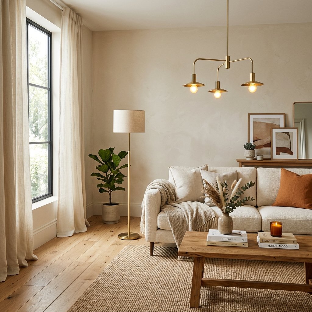
Choosing paint for a north-facing room can be frustrating because the light often feels cooler, softer, and more muted than it does in rooms facing other directions.
Sherwin-Williams notes that north-facing rooms typically receive the least amount of natural light and tend to have cooler light throughout the day. Their current guidance recommends looking toward warmer undertones to help balance that cooler exposure.
That does not mean every north-facing room has to be beige.
Warm whites, soft greiges, creamy neutrals, muted taupes, and even warmer greens or yellows can all work beautifully.
The key is choosing a color that does not become excessively gray, blue, or flat under cool northern light.
Below are 15 of the best Sherwin-Williams colors for north-facing rooms, including several shades Sherwin-Williams specifically recommends for northern exposure and additional warm neutrals worth sampling.
1. Sherwin-Williams Greek Villa SW 7551
Greek Villa is one of the strongest places to start if you want a soft warm white.
Sherwin-Williams specifically features Greek Villa SW 7551 as one of its recommended colors for north-facing rooms.
It can work well when you want:
- A warm white rather than stark white
- A soft backdrop for natural wood
- Something lighter than beige or greige
- A relaxed, bright feeling
Greek Villa can be especially useful in living rooms, bedrooms, kitchens, and hallways where cooler whites may feel too sterile.
Pair it with warm wood, cream fabrics, muted greens, and black accents for contrast.
2. Sherwin-Williams Worldly Gray SW 7043
Worldly Gray is another color Sherwin-Williams specifically highlights for north-facing rooms.
Despite the name, it is not simply a cold gray.
It has enough warmth to work well in rooms where a cooler gray might turn dull or bluish.
Try it with:
- Cream upholstery
- Warm oak
- Brass
- Beige rugs
- Muted blue or green accents
This is a good choice if you want a neutral that feels more grounded than white but still light enough for everyday spaces.
3. Sherwin-Williams Antique White SW 6119
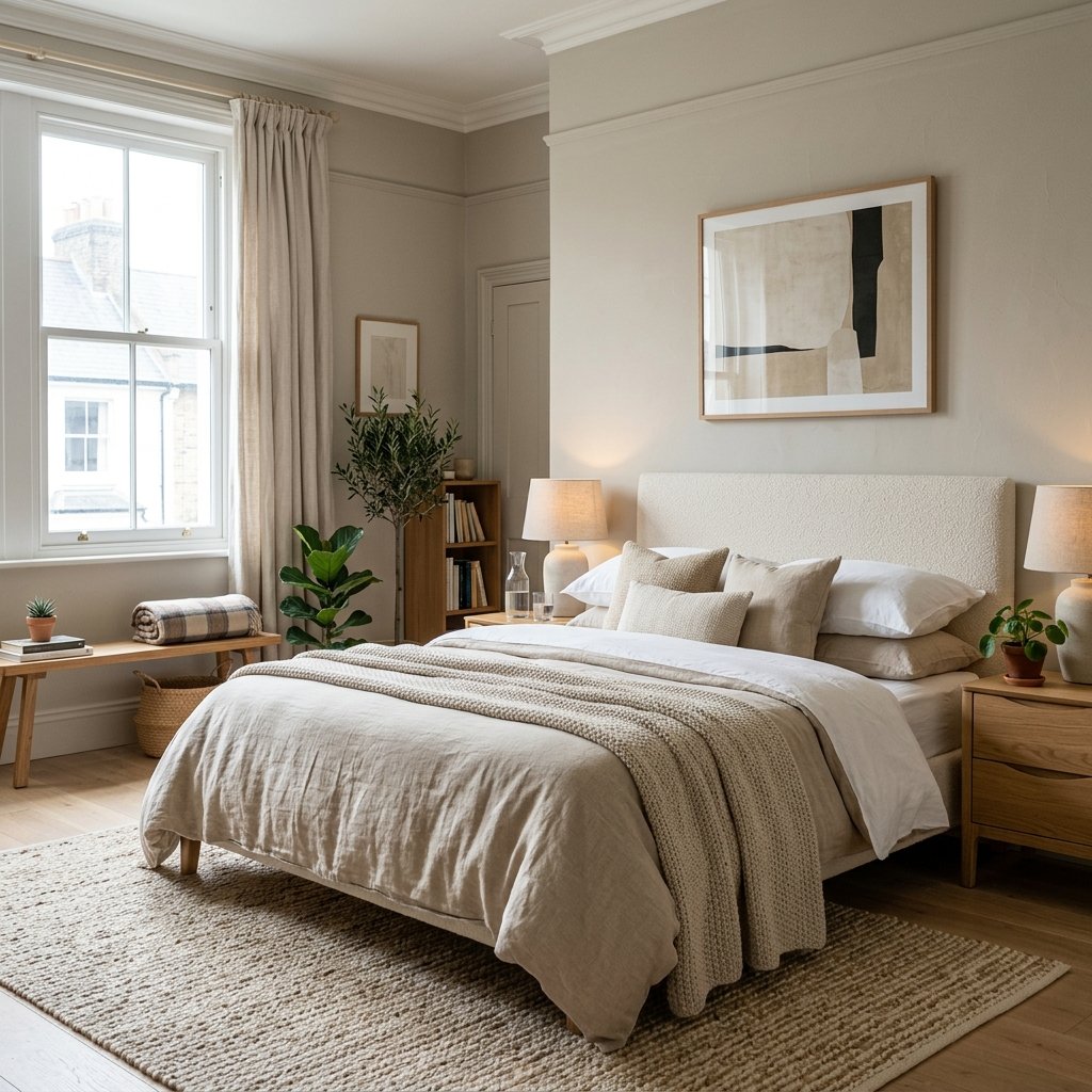
Sherwin-Williams also lists Antique White SW 6119 among its north-facing room recommendations.
This is a noticeably warmer option.
It works particularly well in rooms with:
- Warm wood floors
- Traditional furniture
- Beige stone
- Cream textiles
- Bronze or brass accents
Antique White can help offset cool northern light, but because it has more warmth, it should be tested carefully near bright-white trim or countertops.
If the surrounding finishes are very crisp and cool, the contrast may become more noticeable than you expect.
4. Sherwin-Williams Drift of Mist SW 9166
Sherwin-Williams currently identifies Drift of Mist SW 9166 as a useful warm neutral for north-facing rooms.
It is a soft, light neutral that can work well when you want the room to feel:
- Airy
- Calm
- Light
- Understated
This shade can be especially useful in open-concept areas where you do not want a strong beige or gray.
Pair it with natural wood, creamy whites, woven textures, and warmer metals.
5. Sherwin-Williams Rivers Edge SW 7517
Rivers Edge SW 7517 is another shade Sherwin-Williams specifically recommends in its current north-facing neutral guidance.
It is worth considering if you want a neutral with more warmth and presence.
Use it with:
- Wood furniture
- Cream upholstery
- Brown leather
- Warm white trim
- Natural stone
It can create a comfortable, slightly richer look without making the room overly dark.
6. Sherwin-Williams Olympus White SW 6253
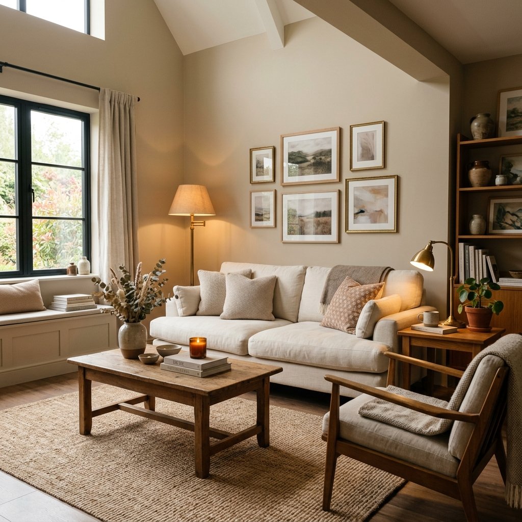
Sherwin-Williams also includes Olympus White SW 6253 in its warm-neutral guidance for north-facing rooms and notes that higher light reflectance can help these spaces feel brighter.
This is an interesting option if you want a very light, subtle neutral.
Because every north-facing room behaves differently, sample it carefully.
Surrounding flooring, windows, furnishings, and artificial light can shift whether a pale color looks crisp, muted, or slightly cool.
7. Sherwin-Williams Accessible Beige SW 7036
Accessible Beige is one of Sherwin-Williams’ most versatile warm neutrals.
Sherwin-Williams describes it as having gray undertones while still creating a warm, snug feeling and recommends pairing it with earthy tones.
That balance makes it useful in north-facing rooms where you want something warmer than gray but less yellow than traditional beige.
It pairs beautifully with:
- Natural oak
- Olive green
- Cream
- Black
- Warm stone
Accessible Beige is especially useful in living rooms, bedrooms, and open-plan spaces where you want a neutral that feels soft rather than stark.
8. Sherwin-Williams Alabaster SW 7008
Alabaster is a warm white worth testing if a north-facing room feels too cold with brighter whites.
It can work well with:
- Wood floors
- Cream textiles
- Black hardware
- Brass
- Warm greige
Alabaster is especially useful when you want the room to stay light but do not want a blue-white effect.
In very dim rooms, however, any white can look different than it does on a sample card, so test it near the largest windows and in darker corners.
9. Sherwin-Williams Creamy SW 7012
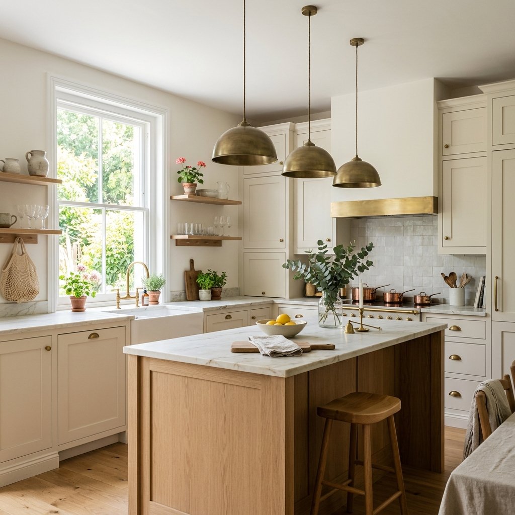
Creamy is a stronger choice when your home already contains distinctly warm finishes.
It can work beautifully with:
- Honey-toned wood
- Beige flooring
- Warm countertops
- Cream trim
- Traditional furniture
In a north-facing room, its warmth may help soften cool light.
However, if your home contains a lot of crisp white or icy gray, Creamy may look more yellow by comparison.
This is a shade to sample beside the fixed finishes rather than viewing alone.
10. Sherwin-Williams Shoji White SW 7042
Shoji White sits deeper than a traditional bright white.
It is a muted off-white that works well in rooms where stark white looks too sharp.
Try it with:
- Oak
- Walnut
- Beige stone
- Greige
- Soft black
Shoji White can be a good compromise between warm white and light greige.
It also works nicely in organic-modern and transitional interiors.
11. Sherwin-Williams Aesthetic White SW 7035
Aesthetic White is another warm off-white worth considering.
It can look beautiful when the room needs softness but you still want the walls to stay relatively light.
Pair it with:
- Warm wood
- Cream
- Taupe
- Black
- Muted blue
It is especially useful when brighter whites look too stark but deeper beige feels too heavy.
12. Sherwin-Williams Natural Choice SW 7011
Natural Choice is a warm, relaxed off-white that can work well in a north-facing room with traditional or organic finishes.
It works especially well with:
- Natural wood
- Woven textures
- Warm stone
- Linen
- Olive green
This type of color can create a soft background without making the space feel overly yellow.
13. Sherwin-Williams Neutral Ground SW 7568
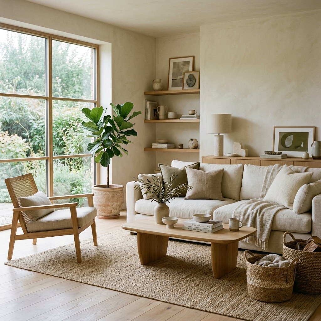
Neutral Ground is a soft neutral worth sampling if you want something between creamy white and beige.
It can help warm up a north-facing room while keeping the palette calm.
Try it with:
- Warm oak
- Stone
- Tan
- Soft green
- Brass
It works particularly well in homes where the overall palette is natural and understated.
14. Sherwin-Williams Malted Milk SW 6057
If you want to move beyond neutrals, Sherwin-Williams specifically suggests warm peachy neutrals such as Malted Milk for north-facing rooms because the warm undertone can counteract cool northern light.
This is a more colorful choice than beige or greige.
It can work beautifully in:
- Bedrooms
- Powder rooms
- Cozy sitting rooms
- Nurseries
Pair it with cream, warm wood, aged brass, or muted brown.
15. Sherwin-Williams Lemon Chiffon SW 6686
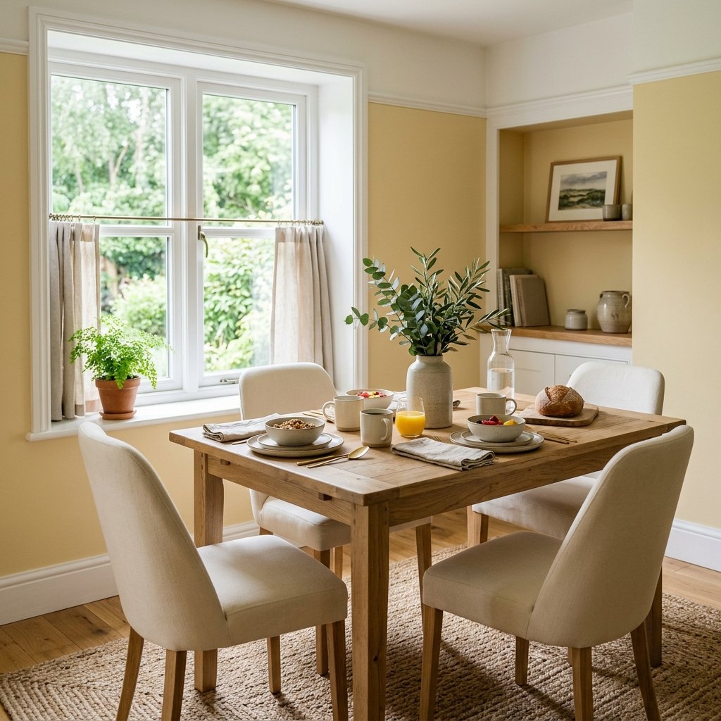
Sherwin-Williams also points to Lemon Chiffon as an example of a warm, sunny color that can add coziness to a north-facing room.
This does not mean every north-facing room needs yellow.
But if your room feels persistently cool and gray, a softened yellow can bring warmth in a way beige cannot.
Use it with:
- White or cream
- Natural wood
- Warm brown
- Soft green
It can be particularly charming in kitchens, breakfast rooms, or smaller rooms where you want a cheerful feeling.
Why North-Facing Rooms Are Tricky
North-facing light is generally cooler and more diffused.
Sherwin-Williams describes these rooms as receiving minimal direct sunlight, with naturally cool and soft light.
That can make some colors appear:
- Grayer
- Cooler
- Flatter
- More muted
This is why a paint color that looks warm in the store can feel surprisingly cool once it is on the wall.
Should You Avoid Cool Colors in a North-Facing Room?
Not necessarily.
Sherwin-Williams’ general direction-based guidance recommends warm undertones when you want to counteract cool north light.
However, the company also notes elsewhere that some cool neutrals can look crisp and serene in northern light.
So the real question is:
What mood do you want?
If you want the room to feel warmer and cozier, warm neutrals are usually the safer starting point.
If you intentionally want a cool, calm, atmospheric room, a cool neutral may work beautifully.
Best Warm Whites for North-Facing Rooms
If you want the room to stay bright, sample:
- Greek Villa
- Alabaster
- Shoji White
- Natural Choice
- Aesthetic White
These can create warmth while keeping the overall look light.
Compare them directly against your existing trim.
Two whites with different undertones can make one another look much warmer or cooler.
Best Greiges for North-Facing Rooms
Try:
- Worldly Gray
- Accessible Beige
- Drift of Mist
These work well if pure white feels too stark but beige feels too traditional.
Warm greiges can help bridge:
- Gray flooring
- Warm wood
- Cream upholstery
- Black accents
Best Beige Paint Colors for North-Facing Rooms
Beige is returning because warm neutrals work naturally with the cooler light of northern exposure.
Good options to sample include:
- Rivers Edge
- Accessible Beige
- Antique White
- Neutral Ground
Choose the depth based on how much natural light the room receives.
Best Sherwin-Williams Colors for a North-Facing Living Room
Living rooms often contain many materials, so choose a flexible color.
Consider:
- Greek Villa
- Accessible Beige
- Worldly Gray
- Drift of Mist
- Alabaster
If the room contains warm wood and beige upholstery, Accessible Beige or Worldly Gray may provide more visual connection than a bright white.
If the room already has lots of color, Greek Villa or Alabaster may create a quieter backdrop.
Best Sherwin-Williams Colors for a North-Facing Bedroom
Bedrooms can handle slightly softer, warmer colors.
Try:
- Shoji White
- Accessible Beige
- Worldly Gray
- Natural Choice
- Malted Milk
The goal is not necessarily to make the room look as bright as possible.
A north-facing bedroom can feel beautifully calm when its softer light is embraced.
Best Sherwin-Williams Colors for a North-Facing Kitchen
Kitchens require extra care because paint interacts with fixed finishes.
Look at:
- Cabinets
- Countertops
- Backsplash
- Flooring
- Appliances
Warm whites such as Greek Villa or Alabaster can work well when the cabinetry and stone are warm.
Accessible Beige or Drift of Mist may be useful if you want more contrast.
Always test directly beside the cabinets.
Best Sherwin-Williams Colors for a Dark North-Facing Room
If the room gets very little natural light, do not assume the brightest possible white will automatically fix it.
In some rooms, a pale white can simply look shadowy.
Instead, consider:
- Warm off-white
- Light beige
- Soft greige
- Intentional deeper color
Sherwin-Williams recommends looking at light reflectance value when choosing color for north-facing rooms and generally suggests higher-LRV colors when you want to maximize reflected light.
But LRV is only one factor.
A color still needs to work with the room’s undertones.
What Is LRV and Why Does It Matter?
LRV stands for Light Reflectance Value.
Sherwin-Williams explains that it refers to how much light a color reflects on a scale from 0 to 100. Higher values reflect more light.
In a north-facing room, a lighter color with a higher LRV may help the space feel more open.
But a very high LRV does not guarantee the color will feel warm.
A bright cool white can still look cold in northern light.
Use LRV together with undertone, not instead of it.
How to Test Paint in a North-Facing Room
Test More Than One Color
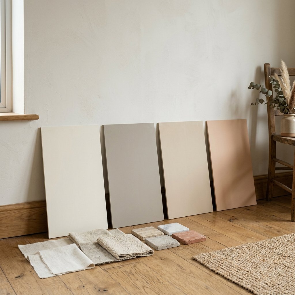
Compare several similar shades.
Warmth is easier to see side by side.
Use Large Samples
A small chip does not show how the color will behave across an entire wall.
Check Several Walls
The wall opposite the windows may look different from the wall beside them.
Look Throughout the Day
Check:
- Morning
- Midday
- Late afternoon
- Evening
Turn On Your Lamps
Artificial lighting can shift the color significantly.
Compare With Fixed Finishes
Place samples beside:
- Flooring
- Cabinetry
- Stone
- Upholstery
- Trim
Sherwin-Williams offers physical samples and recommends testing colors in the actual room before committing.
Warm vs. Cool Artificial Lighting
Artificial lighting can either reinforce or offset your room’s natural exposure.
Sherwin-Williams notes that warmer artificial lighting can influence a room in a way similar to warmer natural exposure, while cooler artificial lighting can reinforce the cooler quality of north-facing light.
This is why you should test paint with the actual bulbs you plan to use.
How to Make a North-Facing Room Feel Warmer
Paint is only part of the solution.
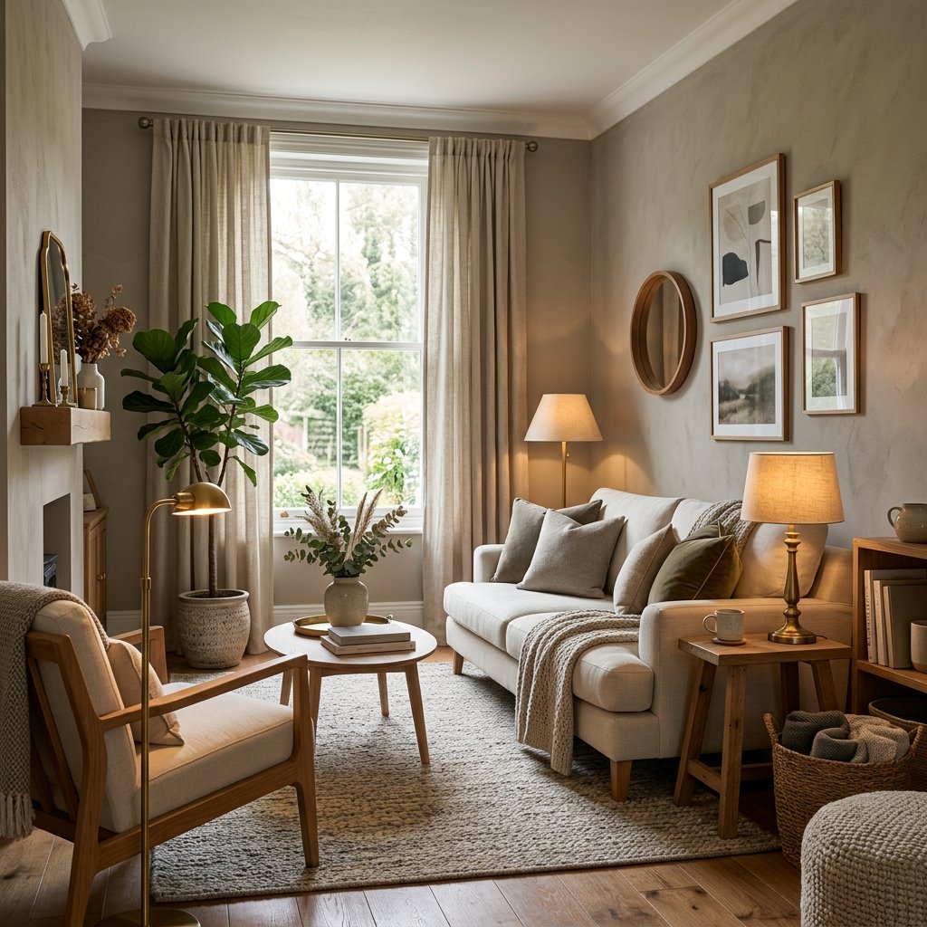
Add warmth through:
- Natural wood
- Cream fabrics
- Brass
- Warm lighting
- Woven textures
- Beige rugs
- Brown leather
- Warm artwork
If you intentionally choose a cooler wall color, these materials can keep the room from feeling sterile.
Common Paint Mistakes in North-Facing Rooms
Choosing Color in the Store
Store lighting is completely different from your room.
Using Only a Tiny Paint Chip
Undertones become much clearer on a large sample.
Assuming White Will Brighten Everything
Some whites look dull or blue under north light.
Choosing Gray Without Checking Undertones
Cool gray can become significantly cooler.
Ignoring the Floor
Warm or cool flooring can completely change how the wall color appears.
Forgetting Artificial Light
The room may spend much of the day under lamps.
Copying Another Home Exactly
The same color can look very different depending on exposure, windows, flooring, and surrounding finishes.
FAQ About the Best Sherwin-Williams Colors for North-Facing Rooms
What Sherwin-Williams colors are specifically recommended for north-facing rooms?
Sherwin-Williams currently highlights Antique White SW 6119, Worldly Gray SW 7043, and Greek Villa SW 7551 in its room-orientation guide. Its neutral guidance also recommends colors including Rivers Edge SW 7517, Drift of Mist SW 9166, and Olympus White SW 6253 for northern exposure.
What color undertones are best for north-facing rooms?
Warm undertones are a good starting point when you want to counterbalance the naturally cool light.
Is gray good for a north-facing room?
It can be, but warmer grays and greiges are generally easier to use if you want the room to avoid feeling cold.
Is white good for a north-facing room?
Yes, particularly warmer whites. Test them carefully because northern light can emphasize cool undertones.
Is Accessible Beige good for a north-facing room?
It is worth testing because Sherwin-Williams describes Accessible Beige as a warm neutral with gray undertones and a warm, snug feel.
Should I use a high-LRV paint in a north-facing room?
A higher LRV can help reflect more available light, particularly if brightness is your goal. Sherwin-Williams recommends considering higher-LRV shades for northern exposure.
Can I use dark paint in a north-facing room?
Yes. Sherwin-Williams notes that if you want a bold dark color in a north-facing room, choosing one with warm undertones can help balance the cool light.
Final Thoughts
The best Sherwin-Williams colors for north-facing rooms tend to either warm up the naturally cool light or intentionally work with it.
For a lighter room, start by sampling Greek Villa, Alabaster, Drift of Mist, or Shoji White.
For more depth, consider Worldly Gray, Accessible Beige, Rivers Edge, or Antique White.
And if you want something beyond neutrals, warmer shades such as Malted Milk or Lemon Chiffon can bring a softer, sunnier feeling to cool northern exposure. Sherwin-Williams specifically points to warm neutrals, peachy tones, and sunny yellows as useful options when you want to add warmth.
Most importantly, do not choose based on the paint chip alone.
Test several colors directly in the room, look at them throughout the day, and compare them with your flooring, trim, furniture, and artificial lighting.
North-facing rooms can be beautiful.
Once you understand how the cooler light changes paint, it becomes much easier to choose a color that makes the space feel warm, balanced, and intentional.