

Choosing the right exterior paint colors can completely change the look of a home.
A dated exterior can feel fresher with a better body color, a front door can become a focal point with one contrasting shade, and the right trim color can make architectural details stand out without making the house feel too busy.
But exterior paint is not something to choose from a tiny swatch alone.
Colors look different outdoors than they do inside. Bright sunlight can make paint appear lighter, while shade can make the same color look cooler and deeper. Roof color, stone, brick, landscaping, windows, and neighboring homes also affect the final result.
The best exterior color scheme usually includes three parts:
- Main body color
- Trim color
- Accent color
The goal is to make those colors work together and with the permanent features already on the house.
Here are 17 exterior paint color ideas to help you create a home that feels updated, balanced, and welcoming.
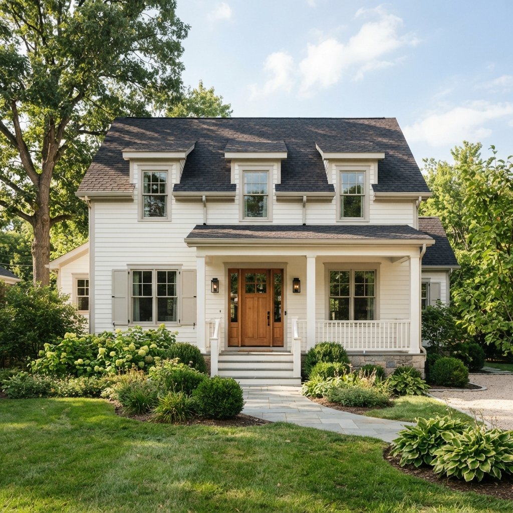
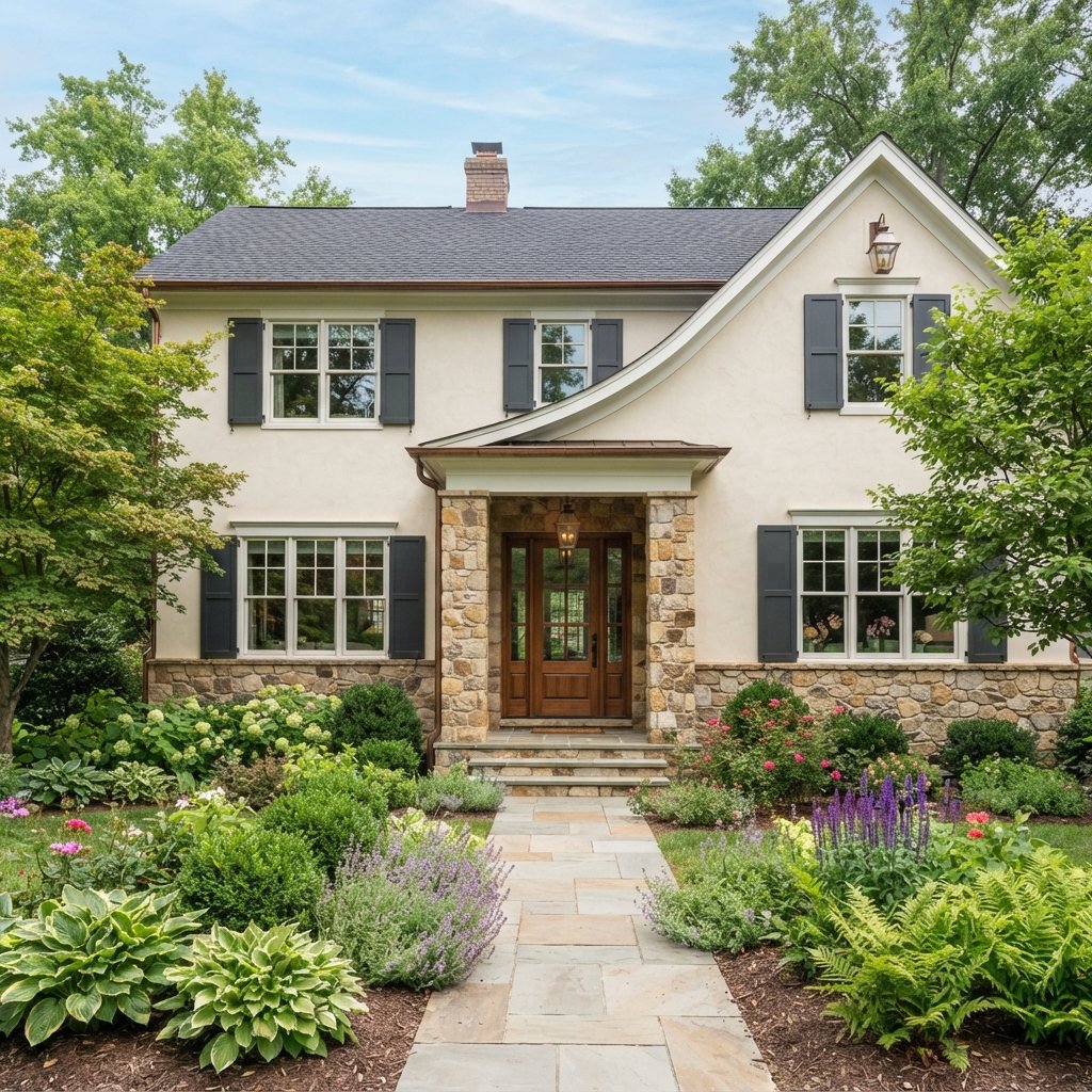
1. Warm White
Warm white is one of the most versatile exterior colors.
It can make a home feel:
- Bright
- Clean
- Classic
- Airy
- Timeless
Unlike a stark blue-white, a warm white often works more naturally with stone, brick, wood, and beige roofing.
Pair it with:
- Black shutters
- Wood front door
- Greige trim
- Bronze lighting
- Natural landscaping
Warm white works especially well on farmhouse, traditional, coastal, and transitional homes.
2. Soft Greige
Greige combines gray and beige, making it a useful choice when you want something neutral but not plain white.
It can coordinate well with:
- Warm stone
- Brown roofs
- Black windows
- Cream trim
- Wood accents
A soft greige can help bridge cool and warm exterior materials.
This makes it especially useful on homes with a mix of siding, brick, stone, or wood.
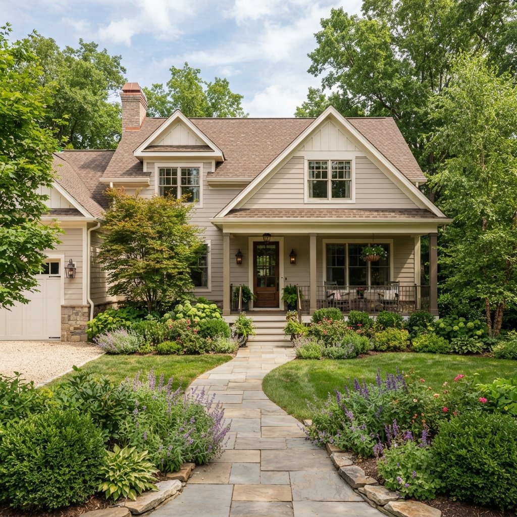
3. Light Taupe
Taupe is slightly richer and earthier than greige.
It works well on exteriors with:
- Warm gray stone
- Tan brick
- Brown roofing
- Bronze fixtures
Pair light taupe siding with cream trim and a deep brown or muted green front door for a grounded look.
4. Classic Beige
Beige exterior paint can still feel current when the undertone is balanced and the trim is fresh.
Choose a beige that complements the roof and stone rather than leaning strongly yellow or pink.
Pair it with:
- Soft white trim
- Dark brown shutters
- Black fixtures
- Natural wood
A simple beige palette can be especially attractive on traditional homes.
5. Soft Gray
A soft gray exterior can feel clean and sophisticated.
Look for a gray that works with your home’s fixed finishes.
If the roof and stone are warm, a slightly warmer gray may coordinate better than a blue-gray.
Pair soft gray with:
- White trim
- Black shutters
- Natural wood door
- Charcoal accents
Gray works particularly well on colonial, craftsman, and modern homes.
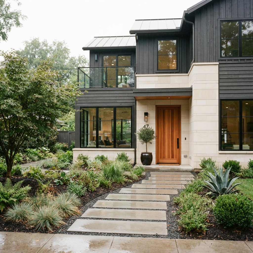
6. Charcoal Gray
Charcoal creates more drama than light gray while still feeling neutral.
It can look especially striking on:
- Modern homes
- Small cottages
- Contemporary farmhouses
- Homes with simple architecture
Pair charcoal with warm wood, light trim, or pale stone so the exterior does not feel overly dark.
7. Deep Navy
Navy is a strong alternative to gray or black.
It adds color while remaining relatively classic.
Deep navy pairs beautifully with:
- White trim
- Warm wood
- Brass or bronze hardware
- Light stone
It can work on coastal homes, cottages, traditional houses, and modern exteriors.
Use a restrained palette around it so the color feels intentional.
8. Muted Blue-Gray
If navy feels too dark, muted blue-gray offers a softer look.
This shade can feel:
- Calm
- Coastal
- Fresh
- Relaxed
Pair it with warm white trim and a natural wood or dark gray front door.
Blue-gray works particularly well with pale stone and cool-toned roofing.
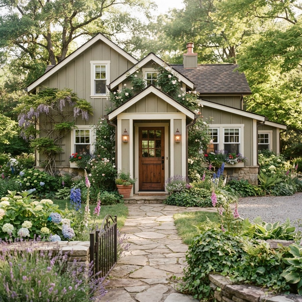
9. Sage Green
Sage green is a beautiful choice when you want subtle color.
It works naturally with outdoor surroundings because it relates to landscaping.
Pair sage with:
- Cream trim
- Warm stone
- Wood door
- Bronze lighting
This color can be especially attractive on cottages, craftsman homes, and traditional exteriors.
10. Olive Green
Olive is deeper and warmer than sage.
It works well with:
- Tan stone
- Brick
- Wood
- Black accents
An olive exterior can feel sophisticated and earthy.
If the main color is dark, consider lighter trim to keep windows and architectural details defined.
11. Forest Green
Forest green can create a dramatic but natural exterior.
It works beautifully on homes surrounded by trees or landscaping.
Pair it with:
- Warm white trim
- Black windows
- Natural wood
- Stone
Forest green can be particularly striking on cabins, modern homes, and historic-inspired exteriors.
12. Cream
Cream is softer than bright white and can be especially useful on homes with warm architectural elements.
It pairs nicely with:
- Brown roofs
- Red or tan brick
- Warm stone
- Wood accents
Keep the cream from looking overly yellow by testing it in direct sunlight and shade.
13. Black
Black exterior paint creates strong visual impact.
It works best when the architecture and surroundings can support a very dark palette.
A black exterior can look beautiful with:
- Cedar or oak details
- Light concrete
- Pale stone
- Warm landscaping
Remember that dark colors absorb more heat and can reveal dust, pollen, and surface imperfections more readily.
Check product suitability and manufacturer recommendations for the specific siding or exterior material.
14. Soft Black
If true black feels too severe, a softer black or very deep charcoal may be easier to use.
This can create the same modern effect with slightly less contrast.
Pair it with:
- Warm wood
- Cream
- Light stone
- Natural landscaping
Soft black is a good option for contemporary, farmhouse, and cabin-style homes.
15. Brick Red
Muted red can be a beautiful exterior color when used carefully.
Look for earthy shades rather than bright primary red.
Pair brick red with:
- Cream trim
- Charcoal roofing
- Warm wood
- Bronze accents
This can work particularly well on traditional or historic-inspired homes.
16. Warm Brown
Brown exterior paint can feel rich and organic.
Choose a tone that works with the surrounding landscape and roof.
Pair it with:
- Cream trim
- Stone
- Black accents
- Wood
A warm brown palette can look especially appropriate on craftsman homes and rustic exteriors.
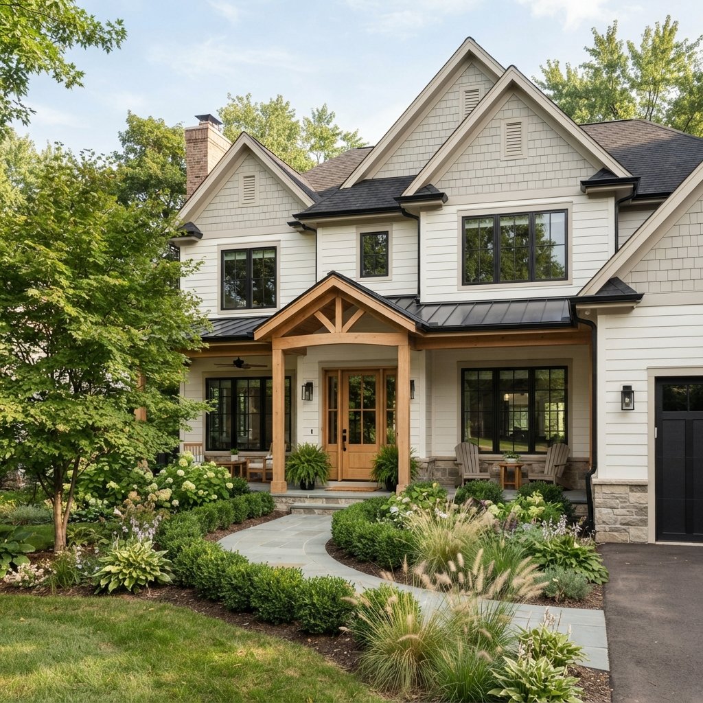
17. Two-Tone Exterior Colors
You do not have to paint the entire home one color.
Two-tone schemes can add depth.
Try combinations such as:
- Warm white + greige
- Sage green + cream
- Charcoal + warm white
- Navy + soft white
- Taupe + deeper brown
Use the darker color on areas you want to visually emphasize, such as:
- Lower level
- Gable
- Garage
- Architectural bump-out
Keep the palette simple so the house does not look chopped into too many sections.
How to Choose Exterior Paint Colors
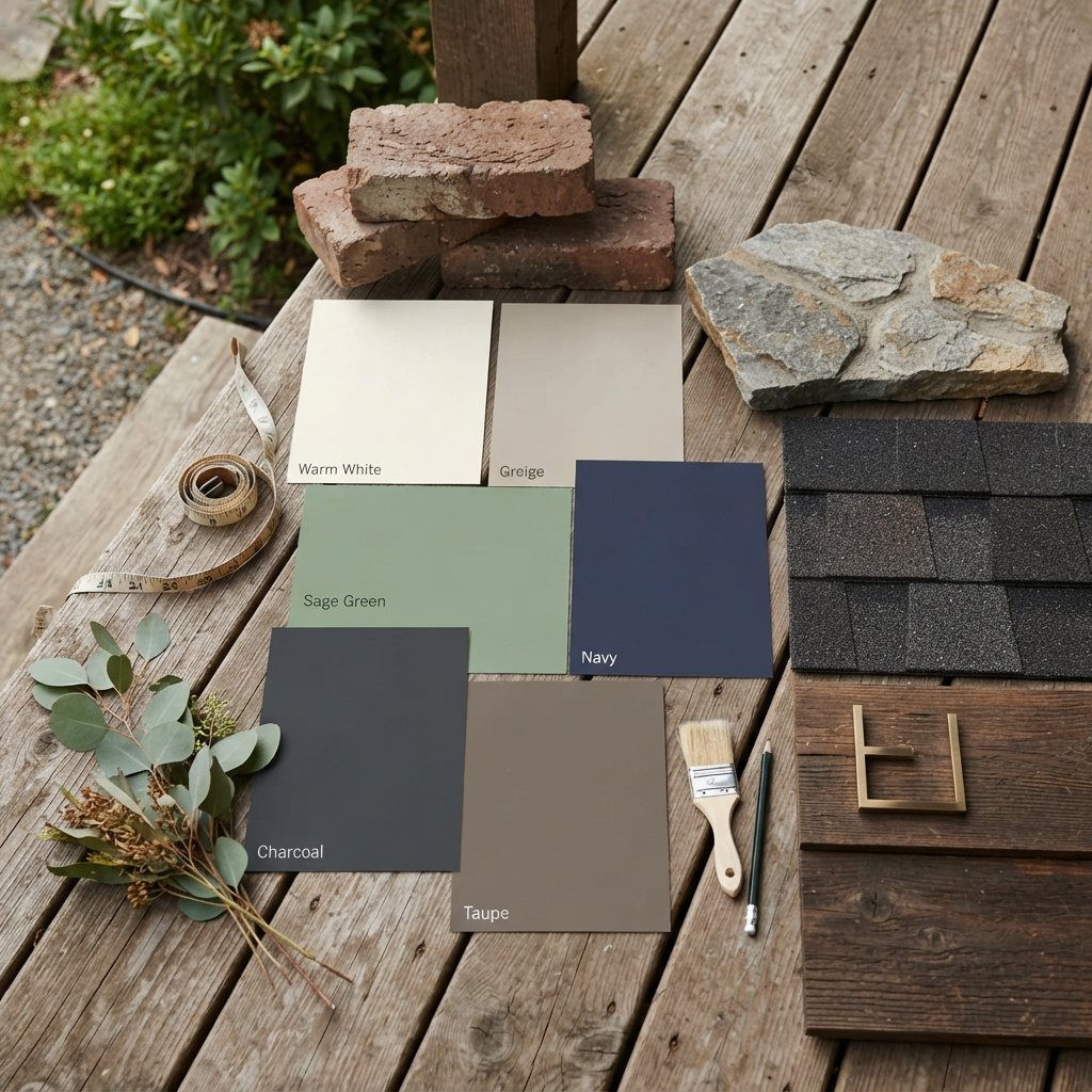
Choosing exterior paint starts with the elements you are not changing.
Look at:
- Roof
- Brick
- Stone
- Windows
- Gutters
- Driveway
- Hardscaping
These fixed materials should influence your color palette.
If the roof is warm brown, a cool blue-gray may feel disconnected.
If the stone is cool gray, a strongly yellow beige may clash.
Start with the permanent surfaces, then choose paint around them.
How Many Exterior Colors Should You Use?
For many homes, three colors are enough.
Main Color
Used on siding or the largest surface.
Trim Color
Used around windows, rooflines, and architectural details.
Accent Color
Used on the front door, shutters, or smaller features.
Some homes only need two colors.
Others with more complicated architecture may use more, but too many colors can make the exterior look busy.
Best Trim Colors for Exterior Paint
Trim does not have to be bright white.
Consider:
- Warm white
- Cream
- Soft greige
- Charcoal
- Same color as siding in a different depth
White trim creates strong contrast.
Tonal trim creates a quieter, more modern look.
Match the level of contrast to the style of the house.
Front Door Colors
The front door is a great place to add personality.
Popular directions include:
- Black
- Deep green
- Navy
- Warm wood
- Muted red
- Soft blue
Choose a color that stands out but still relates to the rest of the exterior.
If the house already has multiple materials and colors, a simple door may work better than a bold one.
Exterior Paint Colors With Brick
Brick has strong undertones that should guide your paint choices.
Red Brick
Often works with:
- Warm white
- Cream
- Greige
- Charcoal
- Muted green
Brown Brick
Often works with:
- Taupe
- Beige
- Warm gray
- Cream
Painted or Light Brick
Can pair beautifully with:
- Black
- Wood
- Soft green
- Greige
Always test the paint directly beside the brick.
Exterior Paint Colors With Stone
Stone often contains several colors at once.
Look closely for repeated undertones.
You may see:
- Beige
- Gray
- Brown
- Cream
- Rust
- Green
Choose exterior paint that connects with one of those colors rather than fighting it.
Do not try to match the stone exactly.
A related but slightly lighter or deeper shade usually creates better contrast.
Exterior Paint Colors With a Brown Roof
A brown roof generally works well with warmer colors.
Consider:
- Cream
- Beige
- Taupe
- Warm white
- Sage green
- Warm greige
Avoid assuming that every gray will work.
Some cooler grays may make a warm brown roof look disconnected.
Exterior Paint Colors With a Black Roof
Black roofs are flexible.
They can work with:
- White
- Greige
- Gray
- Navy
- Green
- Taupe
Because the roof is already dark, you can choose either a light body color for contrast or a deeper color for a more dramatic look.
Exterior Paint Colors With Black Windows
Black windows create strong contrast.
You can either emphasize that contrast or soften it.
For a crisp look:
- Warm white
- Light greige
- Pale taupe
For a moodier look:
- Charcoal
- Navy
- Forest green
Avoid adding too many other competing dark elements.
Exterior Paint Colors for Small Houses
Small houses can handle color beautifully.
You do not have to paint a small home white.
Try:
- Sage
- Navy
- Charcoal
- Greige
- Cream
Keep the color scheme relatively simple.
Too many contrasting areas can make a small exterior feel visually fragmented.
Exterior Paint Colors for Large Houses
Large homes can sometimes look flat when painted entirely one color.
Use subtle contrast to highlight architecture.
For example:
- Main siding in warm white
- Gables in greige
- Front door in wood
- Trim in cream
Avoid turning every architectural detail into a different color.
The goal is definition, not decoration overload.
Exterior Paint Colors for Farmhouse Homes
Farmhouse-style exteriors often work well with:
- Warm white
- Cream
- Greige
- Charcoal
- Soft black
- Sage
Add warmth through natural wood.
A white house with black trim can look striking, but softer combinations may feel more timeless.
Exterior Paint Colors for Craftsman Homes
Craftsman architecture works beautifully with earthy colors.
Try:
- Olive green
- Sage
- Taupe
- Brown
- Cream
- Charcoal
These colors pair naturally with stone, brick, and wood details.
Exterior Paint Colors for Coastal Homes
Coastal colors do not have to be bright blue.
Try:
- Warm white
- Soft blue-gray
- Muted navy
- Pale greige
- Sage
Use simple trim and natural materials for a relaxed look.
How Sunlight Changes Exterior Paint Colors
Outdoor light is much stronger than indoor light.
Exterior colors may appear lighter and brighter than expected in direct sun.
In deep shade, the same color may appear:
- Darker
- Cooler
- Grayer
This is why large outdoor samples are so important.
Paint sample areas on different sides of the house if possible.
Check them:
- Morning
- Midday
- Late afternoon
- Cloudy weather
You may find that a color you loved indoors looks completely different outside.
How to Test Exterior Paint Colors
Do not rely on a paper chip alone.
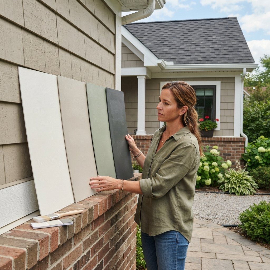
Use large samples.
Compare them directly against:
- Roof
- Brick
- Stone
- Trim
- Windows
If painting directly on the house, remember the existing color may influence your perception.
Large movable sample boards can make comparison easier.
How to Make Exterior Paint Look More Expensive
Keep the Palette Restrained
Two or three coordinated colors often look more polished than many competing shades.
Use Contrast Intentionally
Highlight the front door or architecture rather than every detail.
Work With Permanent Materials
Paint should coordinate with the roof, brick, and stone.
Repeat Accent Colors
If the door is black, repeating black in lanterns or house numbers can create cohesion.
Maintain the Finish
Peeling paint and damaged caulk will make even a beautiful color scheme look unfinished.
Common Exterior Paint Color Mistakes
Choosing From a Tiny Swatch
Exterior lighting can dramatically change color.
Ignoring the Roof
The roof is a major visual surface and should influence the palette.
Fighting Brick or Stone Undertones
Work with existing materials instead of forcing a completely separate color story.
Using Too Many Colors
A complicated palette can make the exterior look busy.
Choosing a White That Is Too Stark
Bright blue-white can clash with warm stone, brick, or roofing.
Using Dark Paint Without Considering the Surface
Some materials and manufacturers may have limitations or recommendations for darker colors.
Forgetting About Landscaping
Trees, greenery, and hardscaping influence how exterior colors feel.
Exterior Painting Tips
Preparation matters just as much as color.
Before painting:
- Clean the exterior.
- Repair damaged areas.
- Remove or stabilize loose paint.
- Address moisture problems.
- Caulk appropriate gaps.
- Prime where required.
- Use products rated for the exterior material.
- Follow manufacturer instructions for temperature, humidity, drying, and recoating.
Do not paint over damaged siding or unresolved water intrusion and expect paint to solve the problem.
Older homes may also require extra precautions when disturbing existing coatings.
If you are unsure about the age or condition of old paint, follow appropriate safety guidance before sanding or scraping.
Exterior Painting Safety
Exterior painting can involve ladders, height, chemicals, and weather.
Keep these considerations in mind:
- Use stable ladders on firm ground.
- Follow ladder safety guidelines.
- Avoid painting in unsafe wind or weather.
- Wear suitable eye and skin protection.
- Use respiratory protection when required by the product or task.
- Maintain ventilation around enclosed porch areas.
- Follow product labels for preparation and cleanup.
- Keep paint away from children and pets.
- Use qualified professionals for difficult rooflines, very high areas, or damaged surfaces.
- Take appropriate precautions when disturbing unknown older coatings.
FAQ About Exterior Paint Colors
What exterior paint colors are timeless?
Warm white, greige, taupe, soft gray, navy, muted green, and cream are versatile choices that can suit many architectural styles.
What color makes a house look more expensive?
There is no single color that guarantees this. A cohesive palette that coordinates with the roof, stone, windows, and architecture usually looks more polished than choosing a trendy color without considering the whole exterior.
Should exterior trim always be white?
No. Cream, greige, charcoal, or a tonal version of the main body color can also work beautifully.
What exterior colors work with brick?
Warm white, cream, greige, taupe, muted green, and charcoal can all work, depending on the brick’s undertones.
Should the garage door match the house or trim?
Either can work. Matching the main body color helps the garage recede visually, while matching the trim creates stronger contrast.
What is a good exterior color for a small house?
Warm white, sage, navy, greige, charcoal, and cream can all work. Keep the number of colors limited to avoid making the exterior feel fragmented.
Should the front door match the shutters?
It can, but it does not have to. A different but coordinating front door color often creates more interest.
How do I choose exterior paint with a brown roof?
Start with warmer tones such as cream, beige, taupe, sage, warm white, or warm greige, then test them beside the roof.
Final Thoughts
The best exterior paint colors work with the home rather than competing with it.
Start by studying the features that will remain: the roof, brick, stone, windows, landscaping, and architectural style.
Then build a simple color palette around them.
Warm white can create a bright, timeless look. Greige and taupe offer soft neutrality. Sage and olive bring an earthy feel, while navy, charcoal, and black create stronger contrast and drama.
Most importantly, test everything outside.
Exterior light can make a color look much lighter, cooler, or brighter than expected.
With large samples, a restrained palette, and careful attention to existing materials, you can choose an exterior color scheme that feels cohesive, welcoming, and suited to your home for years to come.