

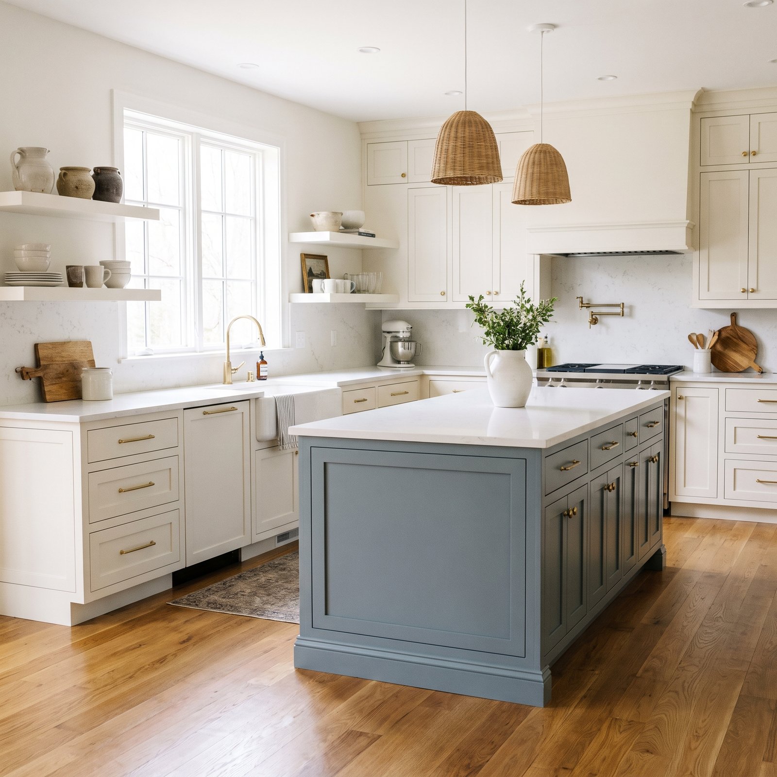
Choosing the right kitchen island colors can completely change the look of a kitchen.
An island is already a natural focal point, so giving it a different color from the surrounding cabinets is an easy way to add contrast, personality, and depth without committing to a bold shade across the entire room.
The best color depends on the rest of the kitchen.
White perimeter cabinets may look beautiful with a navy, sage, charcoal, greige, or natural wood island. A kitchen with warm wood cabinets may benefit from a creamy painted island. Even a mostly neutral kitchen can feel much more custom when the island has its own distinct finish.
The goal is not to make the island stand out at any cost.
A good island color should still connect with the countertops, flooring, backsplash, hardware, and surrounding cabinetry.
Here are 17 kitchen island color ideas, plus tips for choosing the right undertone, working with white cabinets, pairing color with countertops, and avoiding common mistakes.
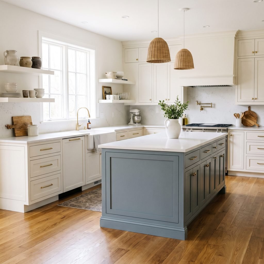
1. Navy Blue
Navy is one of the easiest ways to add contrast to a light kitchen.
It works especially well with:
- White cabinets
- Marble-look countertops
- Brass hardware
- Warm wood floors
- White backsplash tile
Navy feels classic rather than overly trendy when the rest of the kitchen stays simple.
Choose a slightly softened navy if you want a more relaxed look.
A very dark blue can feel dramatic, while a medium navy often feels more approachable.
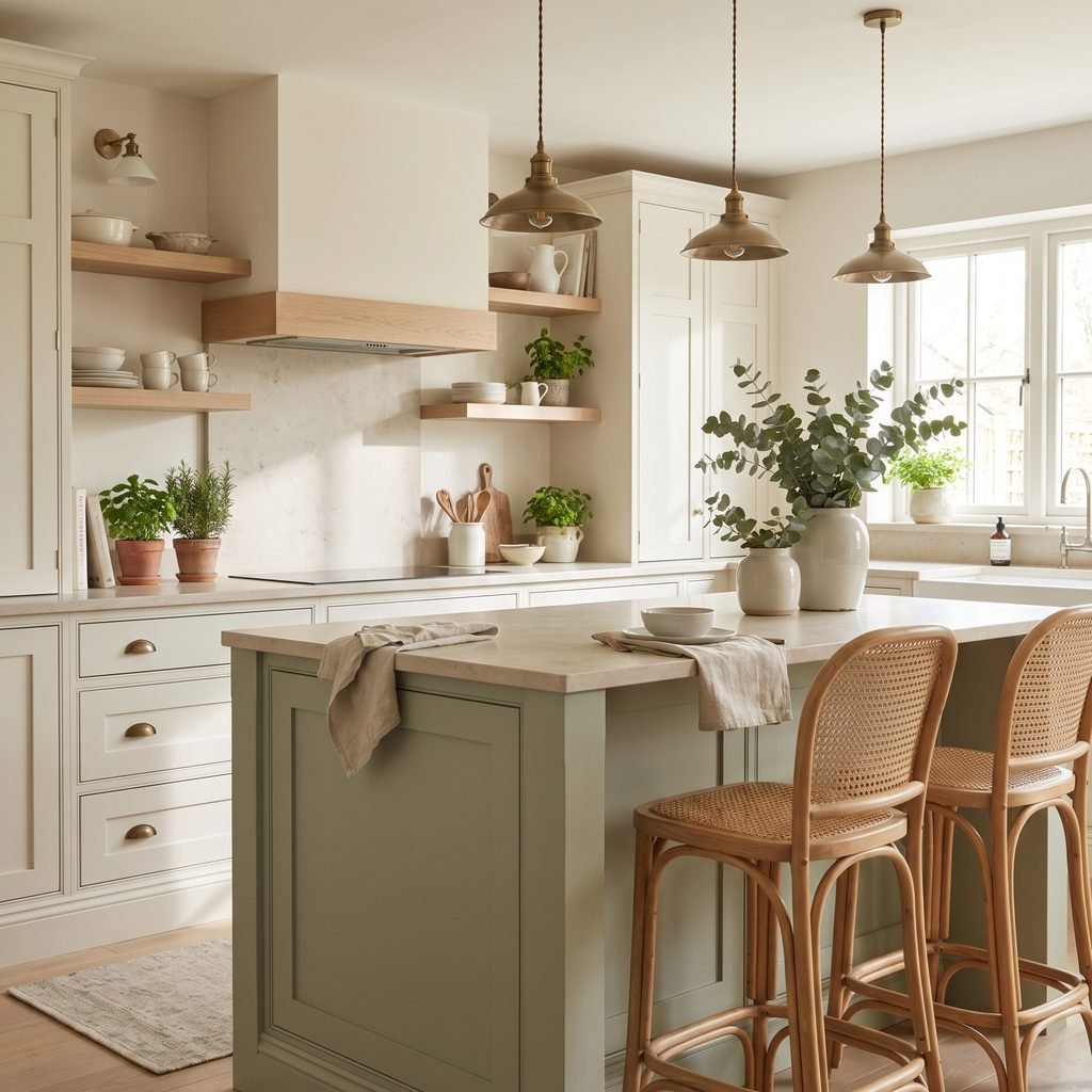
2. Soft Sage Green
Sage is a beautiful option if you want color without making the kitchen feel too bold.
It pairs naturally with:
- Warm white cabinets
- Natural wood
- Cream countertops
- Brass
- Black hardware
- Stone-look finishes
Because sage is muted, it can work in farmhouse, cottage, traditional, and organic modern kitchens.
Look for a green with enough gray or warmth to keep it from feeling too bright.
3. Charcoal Gray
Charcoal adds strong contrast without the intensity of pure black.
It works well in modern, transitional, and industrial-inspired kitchens.
Pair it with:
- White cabinets
- Light countertops
- Black hardware
- Warm wood accents
- Simple backsplash tile
If the kitchen gets limited natural light, test the color carefully.
A very deep charcoal can look much darker once applied to a large island.
4. Warm Greige
Greige is ideal if you want contrast that still feels soft and neutral.
A warm greige island can create subtle separation from white perimeter cabinets without becoming the dominant feature in the room.
It works especially well with:
- Creamy whites
- Warm quartz
- Taupe backsplash tile
- Brass hardware
- Oak flooring
Greige is also a good choice if you want a kitchen that feels layered but calm.
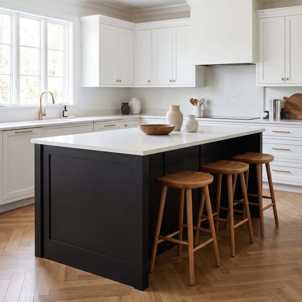
5. Black
A black kitchen island can look dramatic and sophisticated.
Use it when the room has enough visual balance to support a strong dark element.
Black pairs beautifully with:
- White cabinetry
- Natural wood
- Veined stone
- Brass
- Matte black hardware
Keep the rest of the kitchen fairly light so the island does not make the room feel heavy.
6. Natural Wood
Paint is not the only option.
A natural wood island can add warmth and texture to an otherwise painted kitchen.
Try:
- White oak
- Medium oak
- Walnut-look finish
- Warm stained wood
A wood island works especially well when it repeats another material already in the room, such as flooring, open shelves, or dining furniture.
Avoid trying to match every wood tone perfectly.
A coordinated mix often looks more natural.
7. Deep Forest Green
Forest green creates a richer, moodier effect than sage.
It works beautifully in kitchens with:
- White or cream cabinets
- Brass hardware
- Warm stone
- Dark countertops
- Medium wood floors
This color can make a large island feel substantial and elegant.
Use it carefully in smaller kitchens with limited daylight.
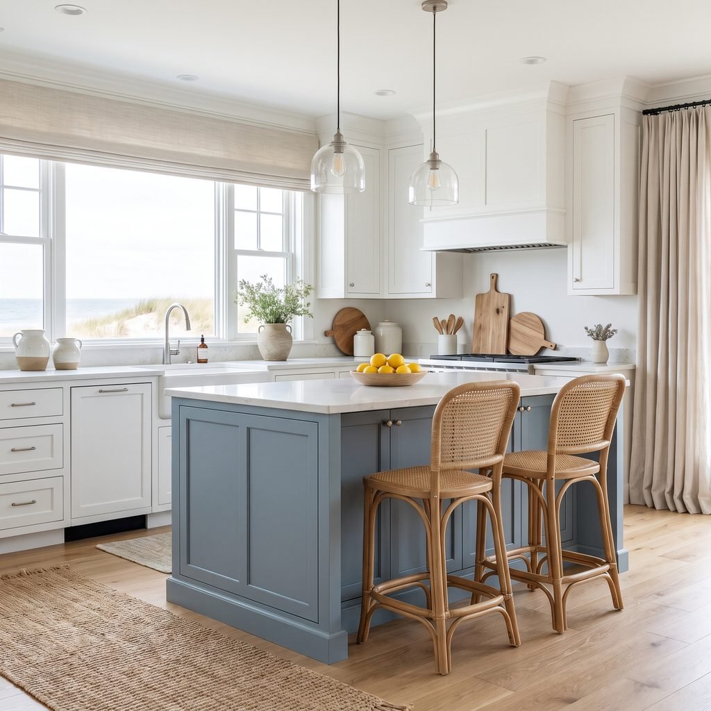
8. Dusty Blue
Dusty blue gives a kitchen a softer, more relaxed look than navy.
It works well in:
- Coastal kitchens
- Cottage kitchens
- Traditional spaces
- Transitional interiors
Pair it with white, cream, warm wood, and simple metal finishes.
Avoid overly bright blues unless you intentionally want a more colorful room.
9. Cream
If the perimeter cabinets are a stronger color or natural wood, a creamy island can provide a lighter focal point.
Cream feels warmer than crisp white.
It works nicely with:
- Walnut cabinets
- Medium oak
- Deep green cabinetry
- Warm stone
- Antique brass
Check the undertone carefully so the cream does not clash with the countertops.
10. Mushroom Taupe
Mushroom is a soft brown-gray neutral that brings warmth without looking beige.
It can be a sophisticated alternative to gray.
Use it with:
- Warm white cabinets
- Cream stone
- Natural oak
- Bronze or brass hardware
- Soft white walls
This is a good choice for homeowners who want a neutral island but do not want stark contrast.
11. Deep Blue-Gray
A blue-gray island can bridge the gap between classic navy and soft gray.
It feels slightly moody but still neutral enough to live with long term.
This shade works well with:
- White quartz
- Carrara-style stone
- Warm wood
- Black or brass fixtures
- Pale gray backsplash
It can also help tie together cool and warm elements in the same kitchen.
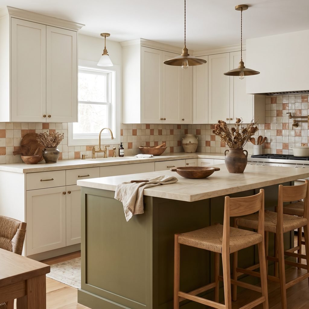
12. Olive Green
Olive has an earthy, relaxed quality.
Compared with sage, it usually feels warmer and deeper.
Pair it with:
- Cream cabinetry
- Wood tones
- Terracotta accents
- Warm stone
- Aged brass
Olive works especially well in kitchens with natural materials and slightly rustic finishes.
13. Soft Gray
A soft gray island is a subtle choice for a mostly white kitchen.
It creates definition without demanding too much attention.
Look for a gray with an undertone that works with the rest of the room.
Some grays lean:
- Blue
- Green
- Beige
- Violet
Always test the color beside the actual countertops and cabinets.
A gray that looks neutral on a paint chip may shift once surrounded by other finishes.
14. Rich Brown
A deep brown painted or stained island can create a grounded, furniture-like appearance.
It works well in kitchens with:
- Warm white cabinets
- Cream stone
- Brass
- Traditional trim
- Medium to dark flooring
Brown is especially useful when you want contrast but black feels too harsh.
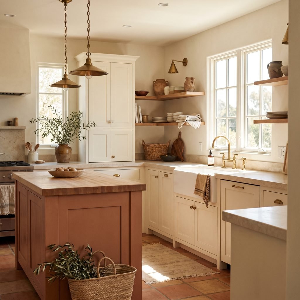
15. Terracotta or Muted Clay
For a warmer and more distinctive kitchen, consider a muted clay or terracotta-inspired island.
This works best when the rest of the room stays restrained.
Pair it with:
- Warm white
- Cream
- Natural oak
- Handmade-look tile
- Aged brass
Choose a softened, earthy version rather than a bright orange-red.
This creates warmth without making the island feel overly trendy.
16. Dark Teal
Dark teal brings together blue and green.
It can be a beautiful statement color when you want something richer than sage but less expected than navy.
Use it with:
- White cabinets
- Light stone
- Warm brass
- Walnut
- Cream walls
Because teal can shift dramatically depending on lighting, testing is especially important.
17. Same Color as the Cabinets, Different Finish
The island does not have to be a different color.
You can create subtle contrast by using the same cabinet color but changing the material or finish.
For example:
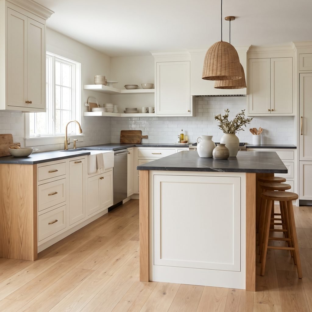
- White cabinets + white island with wood end panels
- Greige cabinets + matching island with darker hardware
- Painted cabinets + stained island base
- Same color + contrasting countertop
This creates cohesion while still helping the island feel special.
Best Kitchen Island Colors With White Cabinets
White cabinets give you the most flexibility.
Popular directions include:
- Navy
- Sage
- Charcoal
- Black
- Warm greige
- Dusty blue
- Forest green
- Natural wood
The key is deciding how much contrast you want.
For subtle contrast, use greige, soft gray, or light sage.
For stronger contrast, choose navy, charcoal, black, or deep green.
For warmth, natural wood is one of the easiest options.
Kitchen Island Colors With Cream Cabinets
Cream cabinets generally look best with colors that share a warm or softened undertone.
Try:
- Olive
- Mushroom taupe
- Warm gray
- Forest green
- Natural wood
- Deep brown
- Muted blue-gray
Be cautious with icy blues or extremely cool grays.
They can make warm cream cabinets look yellow by comparison.
Kitchen Island Colors With Wood Cabinets
If the perimeter cabinets are wood, a painted island can break up the visual weight.
Good options include:
- Cream
- Warm white
- Deep green
- Black
- Soft gray
- Muted blue
Look at the undertones in the wood first.
Warm golden wood usually works best with colors that have some warmth rather than stark icy tones.
How to Match a Kitchen Island Color to Countertops
The countertop is one of the most important fixed finishes to consider.
Look closely at the undertones.
Does the countertop lean:
- Warm beige
- Cool gray
- Cream
- Blue-gray
- Brown
- Green-gray
Your island does not need to match those colors exactly, but it should relate to them.
For example, a stone with warm beige veining may pair beautifully with greige, olive, cream, or warm wood.
A cooler gray-veined countertop may work well with navy, charcoal, or blue-gray.
How to Coordinate Island Color With Flooring
Flooring often covers more visual area than anything else in the kitchen.
If you have warm wood floors, consider:
- Navy
- Sage
- Warm white
- Black
- Greige
- Deep green
For gray flooring, be cautious about adding too many unrelated gray tones.
A warmer island color, natural wood, muted green, or dark blue may create better balance.
Always evaluate the color in context rather than choosing it independently.
How to Choose Between a Light and Dark Island
A lighter island may work better when:
- The kitchen is small
- Natural light is limited
- Floors are already dark
- Cabinets are medium or dark
A dark island may work well when:
- Perimeter cabinets are light
- The room gets good natural light
- You want a strong focal point
- The island is large enough to carry the color
There are no absolute rules, but contrast should feel balanced.
How to Test Kitchen Island Colors
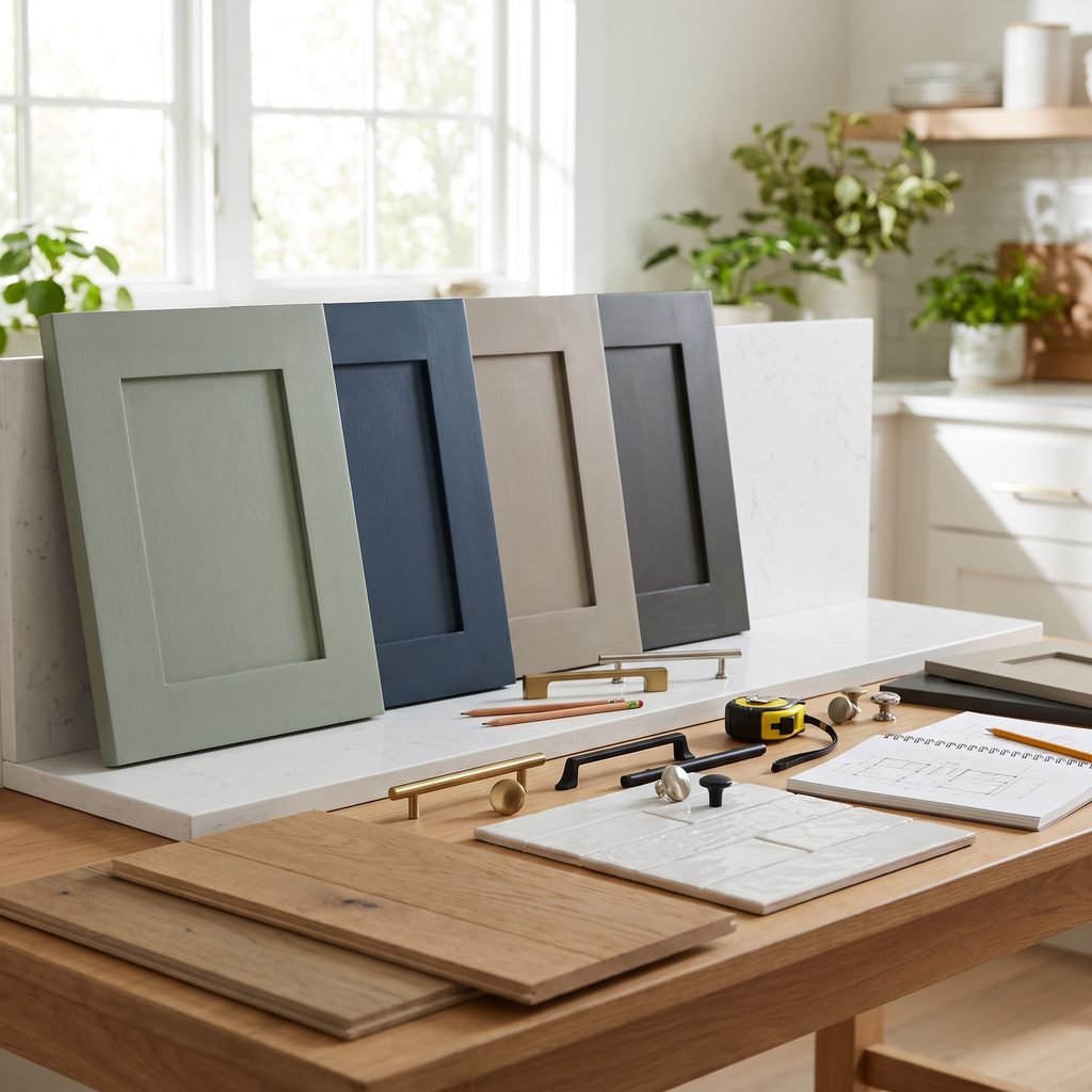
Never rely only on a small paint chip.
Paint a large sample board or use a removable sample where appropriate.
Move it around the island and observe it during:
- Morning
- Afternoon
- Evening
- Artificial lighting
Place the sample beside:
- Countertop
- Cabinets
- Flooring
- Backsplash
- Hardware
This helps reveal undertones that may not be obvious in the store.
Should the Kitchen Island Match the Lower Cabinets?
It can, but it does not have to.
Matching the island to lower cabinets creates a cohesive look.
Using a different island color creates more contrast and can make the island feel like a furniture piece.
Both approaches can work.
Choose based on the overall amount of color and visual movement already in the room.
Should the Island Match the Backsplash?
Not exactly.
It is usually better for the island color to coordinate with the backsplash rather than copy it.
If the backsplash is busy, choose a quieter island.
If the backsplash is simple, the island can carry more color.
Should Kitchen Island and Pantry Cabinets Match?
Again, this depends on the design.
Repeating the island color on a pantry wall or small cabinet section can create visual continuity.
But using the island as the only contrasting color can also look clean and intentional.
Avoid scattering too many unrelated cabinet colors throughout the kitchen.
Kitchen Island Colors for Small Kitchens
In a small kitchen, color can still work.
Try:
- Soft sage
- Dusty blue
- Warm greige
- Natural oak
- Cream
- Muted gray
You do not automatically need a white island.
A medium or dark island can also work if the rest of the room stays bright and the contrast feels deliberate.
Kitchen Island Colors That Look Expensive
Colors often feel more polished when they are slightly muted.
Instead of choosing the brightest version of a color, consider:
- Dusty blue instead of bright blue
- Sage instead of emerald
- Mushroom instead of beige
- Charcoal instead of flat gray
- Deep olive instead of lime green
Sophisticated kitchens also tend to limit the total number of competing finishes.
Let the island be one strong element instead of adding multiple bold colors at once.
Two-Tone Kitchen Tips
A two-tone kitchen can look custom when the colors feel connected.
A simple formula is:
Light perimeter cabinets + medium or dark island
Another is:
Wood perimeter cabinets + light painted island
Or:
Neutral cabinetry + natural wood island
Repeat the island color or material somewhere else in small doses through:
- Stools
- Lighting
- Shelves
- Decor
- Hardware
This helps the contrast feel intentional.
Common Kitchen Island Color Mistakes
Choosing Color Before Looking at Undertones
Always compare the paint with fixed finishes.
Using Too Many Bold Colors
The island does not need to compete with the backsplash, walls, and decor.
Ignoring Natural Light
Colors can change significantly throughout the day.
Picking a Gray That Clashes With the Countertop
Gray undertones are especially important.
Matching Every Finish Exactly
A kitchen often looks more natural with coordinated variation.
Choosing a Trendy Shade You Do Not Actually Like
The island occupies a lot of visual space.
Choose a color you can comfortably live with.
Skipping a Large Sample
Small paint chips rarely show how a color will feel on a large island.
Practical Tips Before Painting a Kitchen Island
If you are repainting an existing island, preparation matters.
Depending on the existing finish, the project may require:
- Cleaning
- Degreasing
- Light sanding or deglossing
- Repairing damage
- Suitable primer
- Cabinet-compatible paint or coating
- Proper drying and curing
Follow the paint or coating manufacturer’s preparation instructions.
If your cabinets have an unknown factory finish, specialty coating, laminate, or another difficult surface, verify compatibility before painting.
Protect floors and countertops during the project.
Use ventilation and appropriate protective equipment when required.
FAQ About Kitchen Island Colors
What is the most versatile kitchen island color?
Warm greige, muted blue, sage, navy, and natural wood are all versatile because they coordinate with many common kitchen finishes.
What color island looks best with white cabinets?
Navy, sage, charcoal, black, warm greige, natural wood, and blue-gray all work well with white cabinets.
Should a kitchen island be darker than the cabinets?
It can be. A darker island against lighter cabinets creates strong contrast, but a lighter or matching island can also look beautiful.
Is a black kitchen island too dark?
Not necessarily. Black works especially well in a bright kitchen with lighter cabinets, countertops, and flooring.
Are green kitchen islands still stylish?
Muted greens such as sage, olive, and forest green work well because they behave almost like neutrals when paired with natural materials.
Should the island color match the walls?
No. The colors should coordinate, but they do not need to match.
How do I choose a timeless island color?
Look for slightly muted colors, natural wood, or classic neutrals that work with your fixed finishes rather than choosing a color based only on a short-term trend.
Final Thoughts
The best kitchen island colors add personality while still feeling connected to the rest of the room.
Start with the fixed finishes you already have.
Look at the countertops, backsplash, flooring, perimeter cabinets, and hardware before choosing a color.
Then decide how much contrast you want.
For a subtle look, try warm greige, mushroom, soft gray, or sage.
For stronger contrast, consider navy, charcoal, forest green, or black.
And if the kitchen needs warmth more than color, a natural wood island can be one of the most effective choices.
Most importantly, test the color in your actual kitchen before committing.
A paint color can look completely different depending on natural light, artificial lighting, surrounding finishes, and the size of the island.
When the undertones work together, the island can become a beautiful focal point that makes the entire kitchen feel more layered, intentional, and finished.