

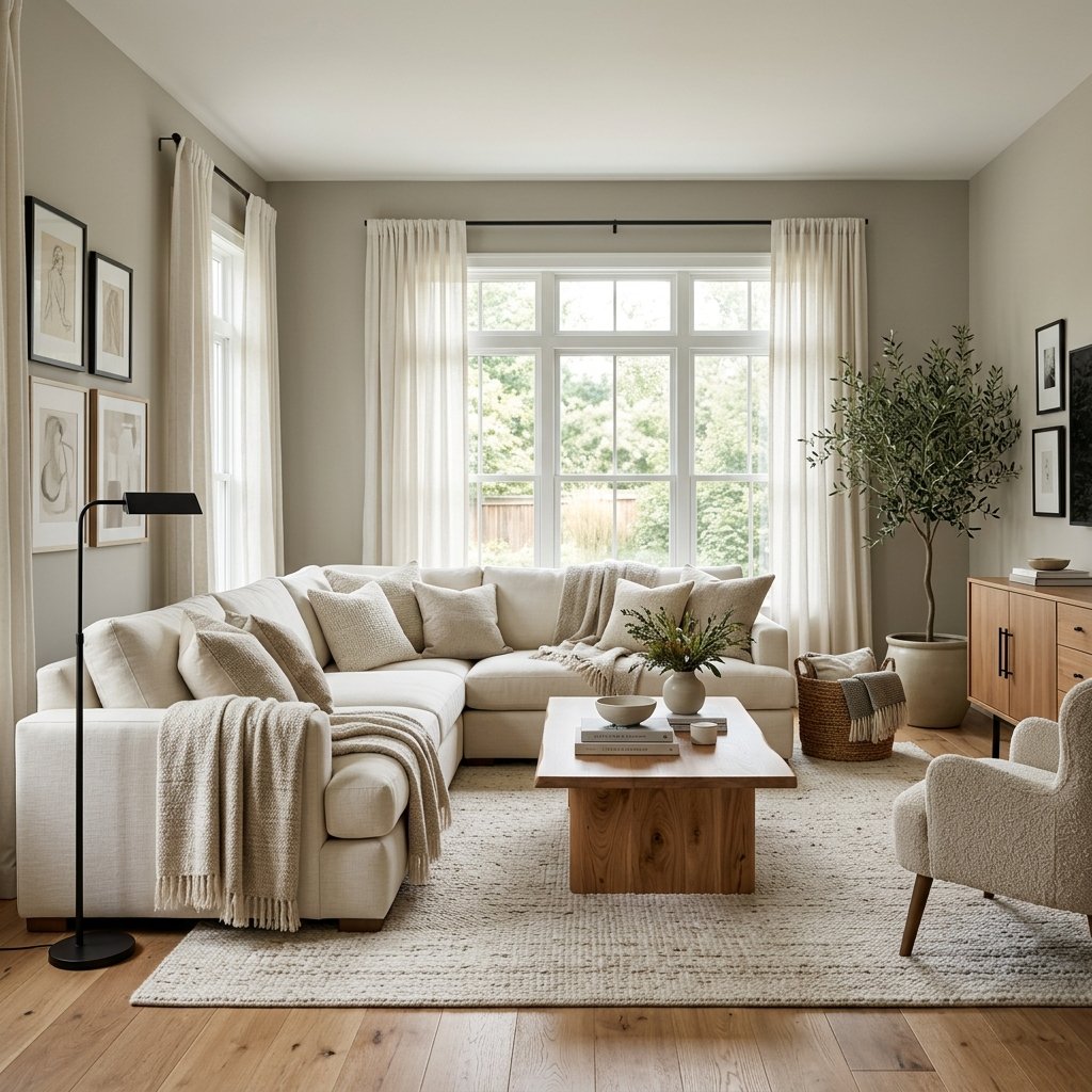
If gray feels a little too cool but beige feels a little too warm, greige might be exactly what you’re looking for.
Greige sits somewhere between gray and beige, giving you the versatility of gray with some of the warmth of beige. Depending on the specific color, lighting, furnishings, and surrounding finishes, a greige can look warmer, cooler, lighter, darker, or more taupe.
That flexibility is also what makes choosing the best greige paint colors tricky.
The greige that looks perfectly balanced in a bright living room may appear considerably warmer in another home. A color that looks beige beside a cool white countertop might suddenly look gray beside warm wood flooring.
Benjamin Moore describes greige as the intersection of gray and beige and notes that gray-dominant greiges read cooler while beige-dominant greiges read warmer. Sherwin-Williams likewise includes many familiar greige-style colors among its popular warm neutrals.
The answer isn’t finding one universally perfect greige.
It’s finding the right balance of gray, beige, depth, and undertone for your room.
Below are 15 greige paint colors worth considering, followed by practical advice for choosing between them.
What Is Greige Paint?
Greige is essentially a neutral that blends characteristics of gray and beige.
Some greiges lean strongly beige and feel warm and earthy.
Others have more gray and look cleaner or slightly cooler.
You may also notice secondary undertones that can appear:
- Green
- Violet
- Pink
- Taupe
Those undertones aren’t necessarily a problem.
They’re part of what gives neutral paint color its complexity.
The important thing is choosing undertones that cooperate with your home’s fixed finishes.
1. Sherwin-Williams Agreeable Gray SW 7029
Agreeable Gray is one of the first colors many homeowners encounter when searching for greige.
Sherwin-Williams identifies Agreeable Gray as SW 7029, describes it as a gray with a beige undertone and subtle warmth, and currently lists it as an Expert Pick and among its popular interior neutrals.
It can be a useful color to sample when you want a neutral that bridges warmer and cooler elements.
Consider testing it in:
- Living rooms
- Open-concept spaces
- Bedrooms
- Hallways
Agreeable Gray is particularly worth comparing against your flooring because the surrounding wood, tile, or carpet can influence how warm the color appears.
2. Benjamin Moore Edgecomb Gray HC-173
If you want your greige to lean warmer, Edgecomb Gray deserves a sample.
Benjamin Moore specifically identifies Edgecomb Gray HC-173 as an example of a greige where beige has the stronger influence.
That makes it an interesting option for homes filled with warm finishes such as:
- Natural wood
- Cream upholstery
- Warm stone
- Beige tile
If cooler greiges look too gray in your room, Edgecomb Gray may move you closer to the warm neutral you’re imagining.
3. Benjamin Moore Revere Pewter HC-172
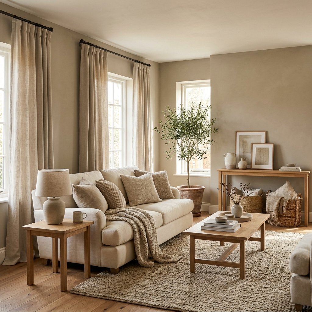
Revere Pewter is another longtime greige favorite.
Benjamin Moore describes Revere Pewter HC-172 as a soft greige that can read warmer or cooler depending on the room’s lighting and identifies it as a homeowner favorite and bestseller.
That shifting quality is a perfect example of why sampling matters.
If you have a room where the light changes dramatically throughout the day, look at your sample in the morning, afternoon, and evening.
Don’t make the decision based on one moment.
4. Sherwin-Williams Accessible Beige SW 7036
Don’t let the word “beige” automatically eliminate Accessible Beige from your greige search.
Sherwin-Williams includes Accessible Beige SW 7036 among its popular warm neutrals and describes it elsewhere as a warm neutral that leans toward taupe.
Accessible Beige can be worth testing if you’re trying to move away from cool gray but don’t want a traditional yellow-beige look.
It can work especially well as a sample alongside warmer wood tones and earthy decor.
5. Sherwin-Williams Repose Gray SW 7015
If you prefer the gray side of greige, consider Repose Gray.
Sherwin-Williams includes Repose Gray SW 7015 among its popular warm neutrals, Expert Picks, and current Top Interior Colors.
Compared with beige-forward neutrals, this is one to test when you want the room to retain more of a gray appearance while still exploring warmer neutrals.
Pair your sample with the actual white trim, flooring, cabinetry, and fabrics that will remain in the room.
6. Benjamin Moore Classic Gray OC-23
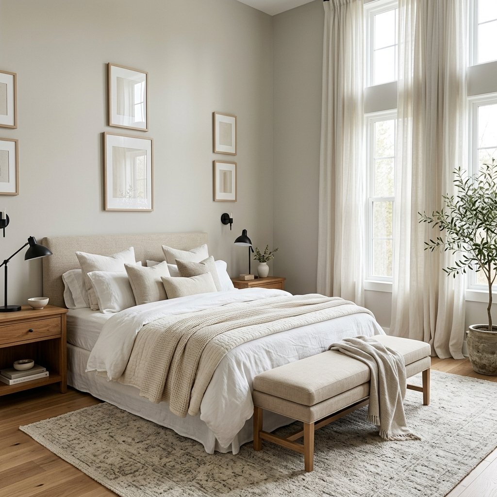
For someone who wants a very light neutral effect, Classic Gray OC-23 belongs on the sample list.
Benjamin Moore includes Classic Gray among its most popular greige paint colors.
A very light greige can be useful when you want more softness than a crisp white but don’t want the walls to become a dominant feature.
Consider it for:
- Bedrooms
- Hallways
- Living spaces
- Rooms where you want a subtle wall-to-trim contrast
As with any light neutral, surrounding whites can dramatically affect how you perceive it.
7. Benjamin Moore Balboa Mist OC-27
Balboa Mist OC-27 is another light option included in Benjamin Moore’s list of popular greige colors.
It’s worth comparing with Classic Gray if you want a subtle neutral rather than an obviously beige wall color.
Place the two samples next to:
- Flooring
- Trim
- Sofa fabric
- Countertops
You’ll learn far more from that comparison than from looking at isolated color chips.
8. Sherwin-Williams Worldly Gray SW 7043
Worldly Gray SW 7043 is another Sherwin-Williams neutral worth putting on a greige sample board.
Sherwin-Williams currently includes Worldly Gray among its popular warm neutrals, Expert Picks, and Top Interior Colors.
It can be particularly useful to compare Worldly Gray with Agreeable Gray when you’re narrowing down whole-home neutral options.
Don’t assume that two colors categorized similarly will behave the same way in your room.
9. Sherwin-Williams Anew Gray SW 7030
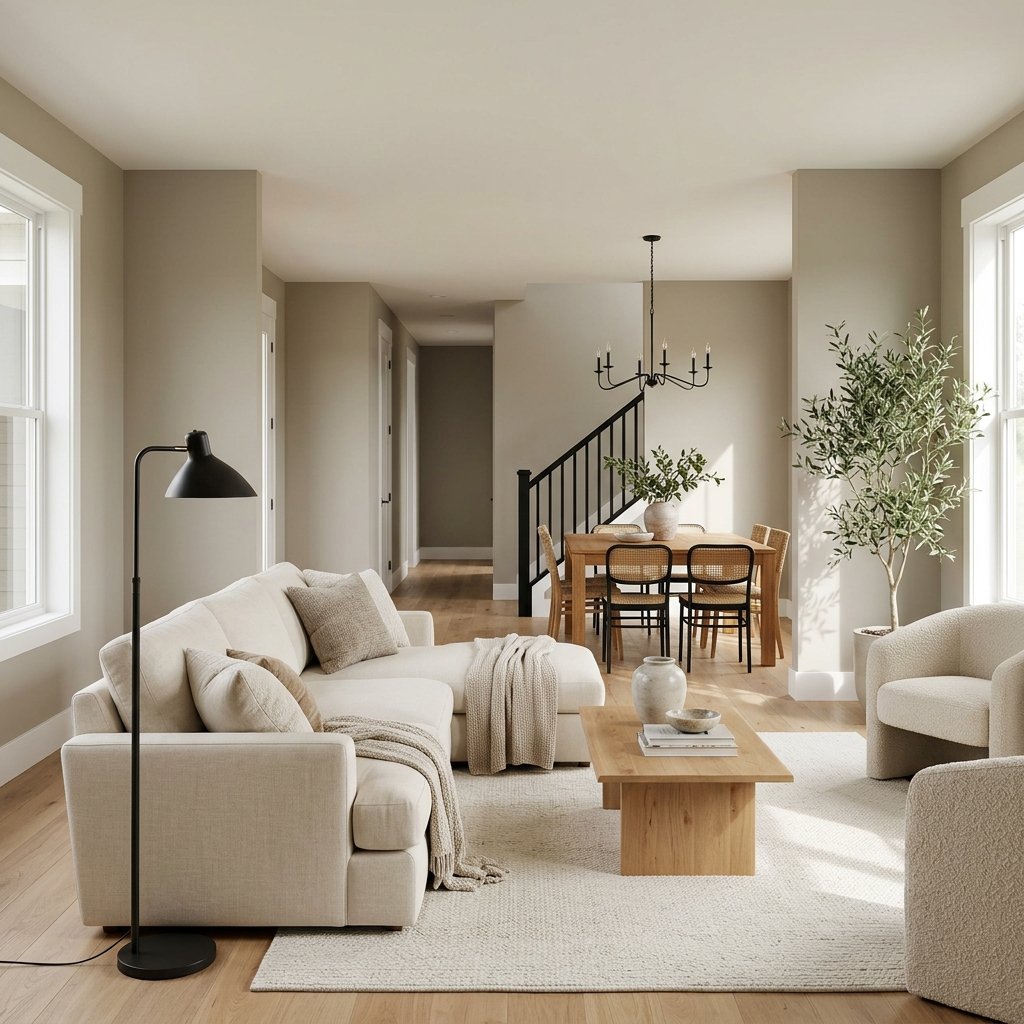
Anew Gray SW 7030 appears in Sherwin-Williams’ popular warm neutral collection as well as its Living Well Renew palette of warm grays.
If very light greiges feel washed out in your home, sampling something with more visual presence can help.
A deeper neutral can look beautiful in:
- Dining rooms
- Bedrooms
- Offices
- Rooms with substantial natural light
It can also create more contrast with light trim.
10. Benjamin Moore Natural Cream OC-14
Natural Cream OC-14 is included in Benjamin Moore’s popular greige collection.
As the name suggests, this is one to investigate if you’re searching for a soft, warm neutral rather than something that looks distinctly gray.
Warm greiges can be particularly useful when your home contains creamier whites and warm woods that don’t cooperate with icy gray walls.
11. Benjamin Moore Pashmina AF-100
If you want more depth, look at Pashmina AF-100.
Benjamin Moore includes Pashmina among its popular greige paint colors.
Deeper greiges can create a cozy, grounded effect that lighter neutrals don’t always provide.
Try them in:
- Dining rooms
- Offices
- Bedrooms
- Accent areas
The darker the color, the more important it becomes to evaluate how your room’s lighting affects it throughout the day.
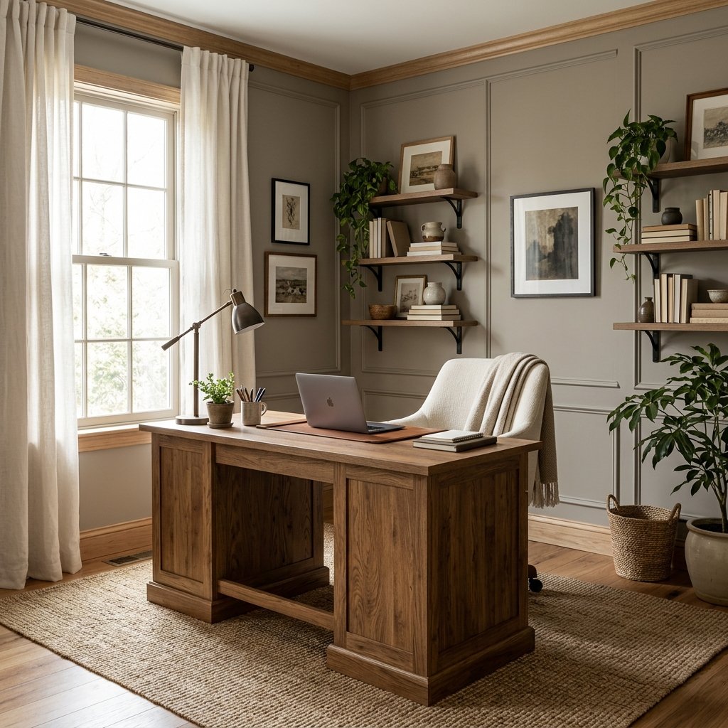
12. Benjamin Moore Thunder AF-685
Thunder AF-685 is another deeper greige highlighted by Benjamin Moore in its greige guidance.
This type of richer neutral can work well when you’re intentionally looking for contrast rather than trying to make the walls disappear.
Use light furnishings, warm wood, or white trim to create balance if the room needs it.
13. Sherwin-Williams Gossamer Veil SW 9165
Gossamer Veil SW 9165 is included among Sherwin-Williams’ popular light neutral selections and its Renew collection of soft warm grays.
It’s worth adding to your comparison if you’re looking for a lighter, understated neutral.
Try it beside Agreeable Gray, Repose Gray, and your favorite light Benjamin Moore greige.
Comparing several colors at once can make their differences much easier to see.
14. Sherwin-Williams Amazing Gray SW 7044
Amazing Gray SW 7044 is included in Sherwin-Williams’ popular warm neutral collection.
It’s another useful option when you want something with more depth than the palest greiges.
Deeper neutrals can be especially effective when a room has:
- Plenty of natural light
- Light upholstery
- White trim
- Warm wood furniture
Just remember that every paint color will look darker when the available light decreases.
15. Behr Sculptor Clay PPU5-08
If you’re also considering Behr, Sculptor Clay PPU5-08 is worth sampling.
Behr describes Sculptor Clay as a light greige in its current neutral palette.
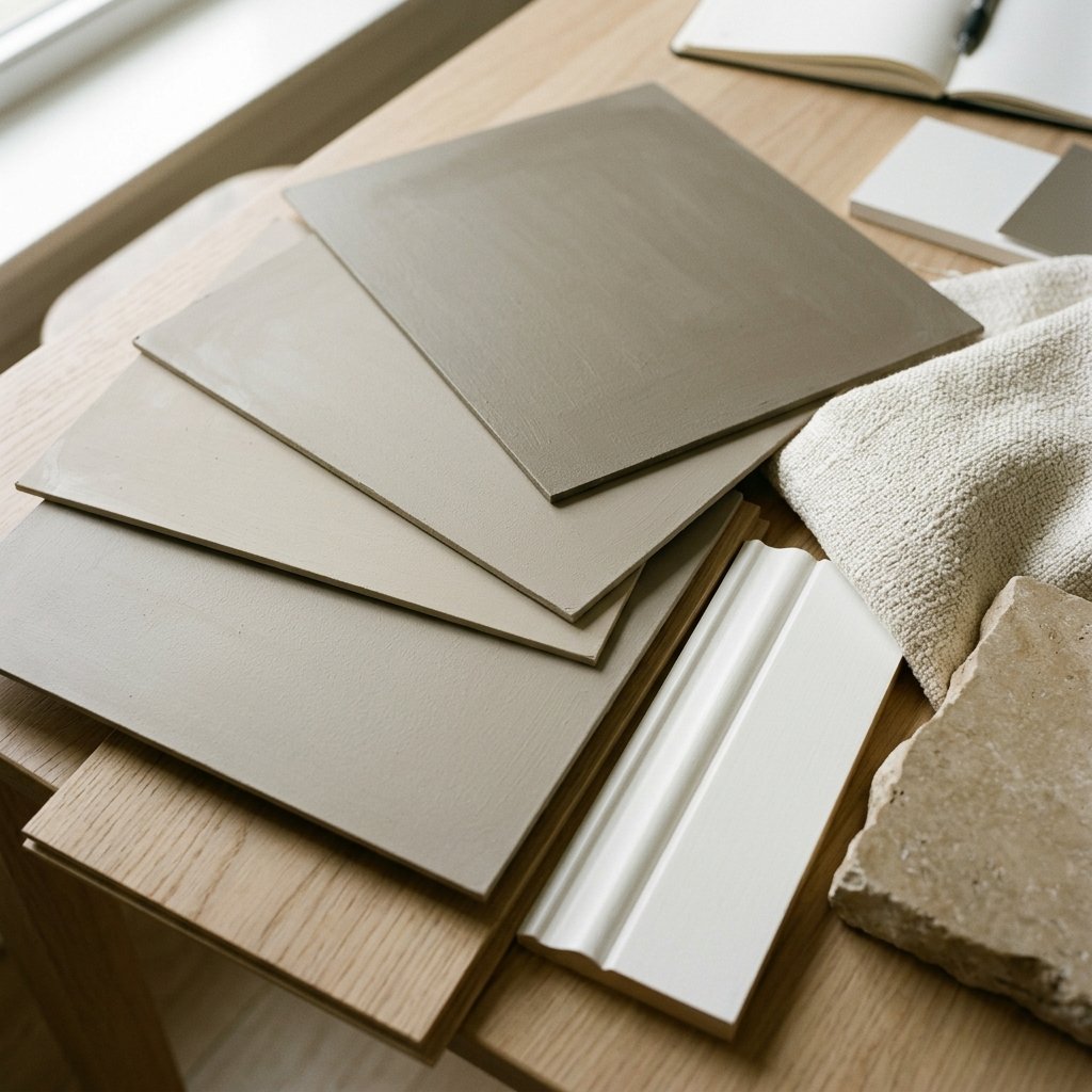
Rather than trying to compare colors from different brands using a phone or computer screen, get physical samples.
Screen color is not a reliable substitute for evaluating paint in the actual room.
Quick Guide to Choosing a Greige
If you’re overwhelmed by all the options, first decide which direction you want to go.
For a Warmer Greige
Start by sampling:
- Benjamin Moore Edgecomb Gray
- Sherwin-Williams Accessible Beige
- Benjamin Moore Natural Cream
For a Balanced Greige
Consider comparing:
- Sherwin-Williams Agreeable Gray
- Benjamin Moore Revere Pewter
- Sherwin-Williams Worldly Gray
For a Gray-Leaning Neutral
Consider:
- Sherwin-Williams Repose Gray
- Benjamin Moore Classic Gray
- Benjamin Moore Balboa Mist
For More Depth
Sample:
- Sherwin-Williams Anew Gray
- Benjamin Moore Pashmina
- Benjamin Moore Thunder
- Sherwin-Williams Amazing Gray
These groupings should be treated as starting points, not guarantees. Your lighting and surrounding finishes can change how each color reads.
How to Find the Undertones in Greige Paint
One of the easiest ways to understand a neutral is to stop looking at it alone.
Compare it with another neutral.
Place several samples side by side and differences become more obvious.
One may suddenly look:
- Greener
- Pinker
- More violet
- More beige
- More gray
Then compare your favorite with permanent finishes in the room.
This is especially important around:
- Stone
- Tile
- Countertops
- Flooring
- Carpet
- Cabinetry
Your paint doesn’t need to perfectly match these surfaces.
It should simply avoid fighting with them.
How Lighting Changes Greige Paint
Lighting can completely change your perception of greige.
North-Facing Rooms
The cooler quality of the available light may make some neutrals appear cooler.
A warmer greige may help create balance.
South-Facing Rooms
Abundant warm light can emphasize warmth in a greige.
A color that seems balanced elsewhere may look noticeably beige.
East-Facing Rooms
Expect stronger morning light and changing conditions later in the day.
West-Facing Rooms
The room may become significantly warmer-looking during afternoon and evening sunlight.
These are useful tendencies, but every home is different.
Trees, neighboring buildings, window size, glass, overhangs, flooring, and artificial lighting all affect the result.
Best Greige Paint Colors for a Living Room
Living rooms often contain many different materials, making greige particularly useful.
Before choosing, look at:
- Sofa
- Rug
- Flooring
- Fireplace
- Curtains
- Built-ins
If these elements are mostly warm, start with a warmer greige.
If they’re cooler or more mixed, test balanced and gray-leaning options.
For an open floor plan, also consider what the color looks like from adjacent rooms.
Best Greige Paint Colors for Bedrooms
Bedrooms can handle both light and deeper greiges.
For an airy bedroom, sample colors such as Classic Gray or Balboa Mist.
For a warmer, cozier room, compare something with greater depth.
Then layer the room with:
- Cream
- White
- Wood
- Linen
- Muted greens or blues
Greige creates the backdrop; texture keeps the room interesting.
Best Greige Paint Colors for Kitchen Cabinets
Greige cabinetry can be beautiful, but cabinets are a larger commitment than walls.
Compare your sample directly against:
- Countertops
- Backsplash
- Flooring
- Wall color
- Appliances
- Hardware
Don’t choose a cabinet color from an isolated paint chip.
A subtle undertone conflict that barely registers on one wall can become much more obvious across an entire kitchen.
Best Greige for an Open Floor Plan
For a whole-house or open-concept neutral, prioritize flexibility.
Sample several candidates in multiple locations rather than testing them on one wall.
A color can look balanced in the living room and noticeably warmer down the hallway.
Popular Sherwin-Williams options such as Agreeable Gray, Repose Gray, Accessible Beige, and Worldly Gray all currently appear in the brand’s neutral or popular-color collections, making them sensible starting points for sampling rather than automatic winners.
What White Trim Goes With Greige?
Don’t automatically pair every greige with the brightest white you can find.
The right white depends on the greige.
A warmer greige may look more harmonious with a softer white, while another may work beautifully with a cleaner white.
Compare the actual trim color and greige sample side by side.
Also consider existing white elements such as:
- Cabinets
- Doors
- Countertops
- Tile
- Window frames
If those items stay, they should influence your choice.
What Colors Go With Greige?
One reason greige remains so useful is its flexibility.
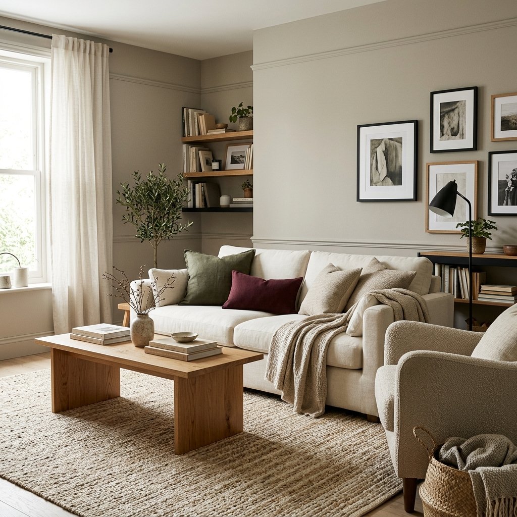
Depending on the specific undertones, try pairing greige with:
Warm Wood
Oak, walnut, and medium brown woods can add warmth.
Black
Black provides crisp contrast.
Green
Olive, sage, and deeper forest greens can work beautifully with warm neutrals.
Blue
Muted blue or navy can provide cooler contrast.
Burgundy
A deep red can make a neutral room feel rich and layered.
Cream
Cream textiles soften a greige room.
Brown
Chocolate and cognac tones can make greige feel warmer and more grounded.
How to Test Greige Paint Correctly
This is the step I would never skip.
1. Narrow the List
Choose three or four colors.
2. Get Physical Samples
Don’t choose paint based on an online image. Sherwin-Williams specifically warns that on-screen representations can vary from the actual paint color.
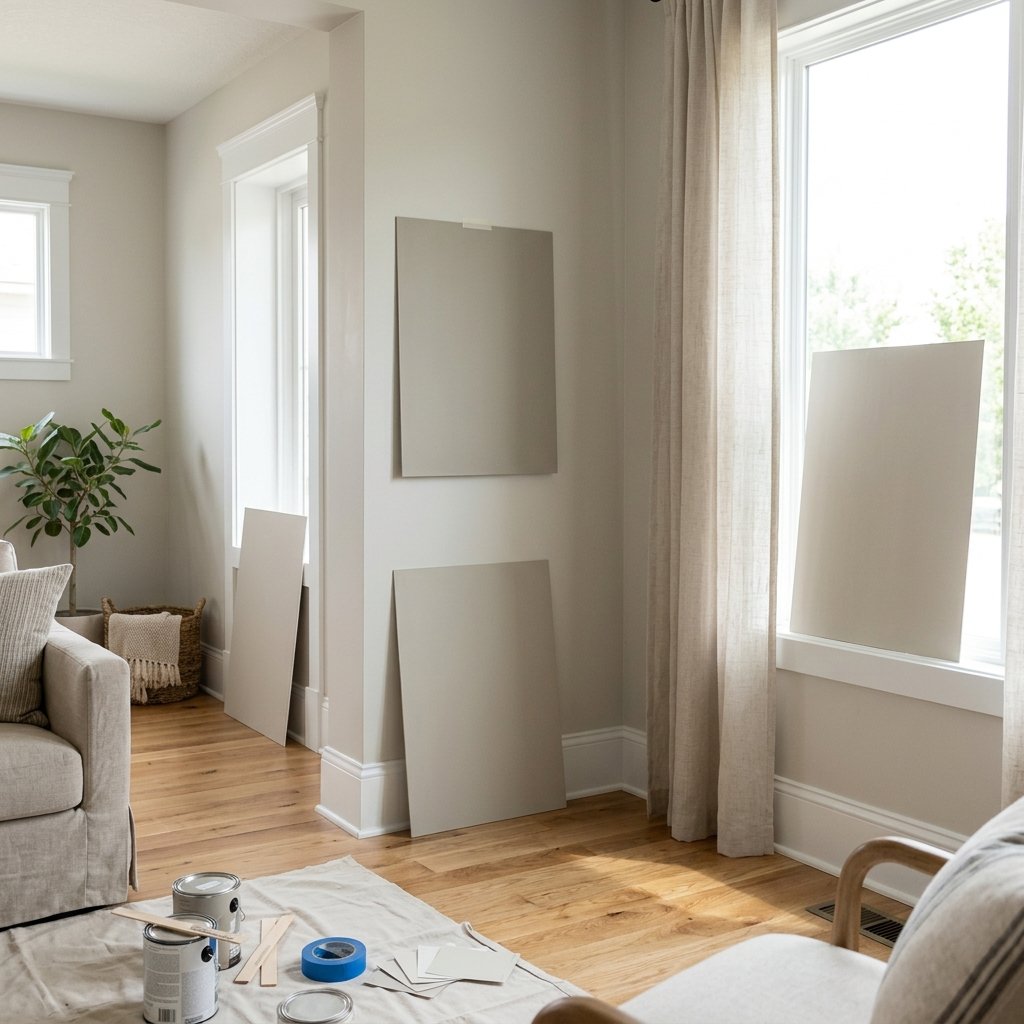
3. Make the Samples Large
Tiny paint chips make subtle undertones difficult to evaluate.
4. Test More Than One Location
Look near the window and farther from it.
5. Compare Against Fixed Finishes
Put samples next to the floor, fireplace, countertop, or cabinets.
6. Check Throughout the Day
Look in morning, afternoon, evening, and artificial light.
7. Compare Finalists Side by Side
The differences often become obvious once you’re comparing colors directly.
Common Greige Paint Mistakes
Choosing From Pinterest Photos Alone
Photography, editing, screens, lighting, and surrounding decor can all alter how a paint color appears.
Assuming Popular Means Perfect
A bestselling color can still be wrong for your room.
Ignoring Flooring
Floors cover a huge visual area and strongly influence wall color.
Looking at Only One Wall
Different walls receive different amounts of light.
Ignoring Artificial Lighting
You probably use the room after sunset, too.
Picking the Trim White Separately
Evaluate wall and trim colors together.
Assuming Greige Has No Undertones
Every complex neutral relates to surrounding colors in some way.
Painting the Whole House Before Testing
Sample first.
Paint is easier to change than flooring, but repainting an entire home is still a lot of work.
FAQ About the Best Greige Paint Colors
What is the most popular greige paint color?
There isn’t one universal ranking across all manufacturers, but Sherwin-Williams currently identifies Agreeable Gray SW 7029 as its best-selling paint color, while Benjamin Moore identifies Revere Pewter HC-172 as a homeowner favorite and bestseller within its greige guidance.
What is a good warm greige paint color?
Benjamin Moore specifically describes Edgecomb Gray HC-173 as a greige where beige has a stronger influence. Sherwin-Williams Accessible Beige SW 7036 is another warm neutral worth sampling.
What greige should I try if I don’t want my walls to look beige?
Start by testing greiges with more gray influence, such as Repose Gray, alongside lighter options such as Classic Gray or Balboa Mist. Always test them in your own room because lighting can alter the balance considerably.
Is greige still a good neutral for a whole house?
It can be. Greige can bridge warm wood, white trim, stone, black accents, and a wide range of furnishings. The best whole-house choice is the one that works across your home’s different lighting conditions and fixed finishes.
Does greige work with wood floors?
Yes, but the wood’s undertones matter. Compare paint samples directly against your flooring before choosing.
Can greige look green or purple?
Some complex neutrals can reveal green, violet, pink, or other undertones depending on the comparison colors and lighting. Large samples help you identify these shifts before painting.
Should I use the same greige in every room?
You can, particularly in an open floor plan, but test the color in every major lighting condition first. The same paint can appear different from room to room.
Should I paint a sample directly on the wall?
Large movable sample boards or removable manufacturer samples can make comparison easier because you can view the color in several locations. If you paint directly on a wall, use a sufficiently large test area and remember the existing wall color surrounding it may affect your perception.
Final Thoughts
The best greige paint colors aren’t necessarily the ones with the most recommendations online.
They’re the ones that work with your home’s lighting, flooring, countertops, cabinetry, furniture, and trim.
For a warmer direction, start by sampling colors such as Edgecomb Gray, Accessible Beige, or Natural Cream.
For something more balanced, compare Agreeable Gray, Revere Pewter, and Worldly Gray.
If you prefer a grayer appearance, add Repose Gray, Classic Gray, or Balboa Mist to your sample list.
And if your room needs more depth, look at Anew Gray, Pashmina, Thunder, or Amazing Gray.
But don’t pick the winner from a photo.
Order or make large physical samples, move them around the room, and look at them throughout the day.
Greige is subtle.
That subtlety is exactly why it can work so beautifully—but it’s also why testing matters.
Once you find the right balance between gray and beige for the finishes already in your home, greige can create a warm, flexible backdrop that works with changing furniture, decor, and color accents for years.