

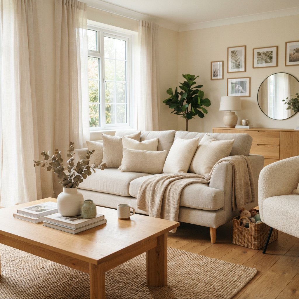
Finding the perfect cream paint color sounds easy until you realize just how many different shades of cream exist.
Some look almost white. Others lean beige, yellow, peach, or even gray. A cream that looks beautifully soft in one room might appear surprisingly yellow in another.
That’s why choosing the best cream paint colors is about more than finding a pretty paint chip.
You need to understand undertones, natural lighting, flooring, trim colors, and how the paint will look next to your furniture.
Cream is a wonderful alternative to bright white because it adds warmth without necessarily making a room feel dark. It can create a soft, inviting background for natural wood, warm neutrals, muted greens, deep blues, and even rich burgundy accents.
Whether you’re painting a living room, bedroom, kitchen, hallway, or an entire house, there are beautiful cream shades worth considering.
Below are 17 cream and creamy off-white paint colors from Sherwin-Williams and Benjamin Moore, followed by practical advice for choosing the right one.
What Is a Cream Paint Color?
Cream is a warm neutral that falls somewhere between white and beige.
Most cream paints have some yellow influence, although the amount varies considerably.
Some creams look like warm whites.
Others are noticeably richer and more buttery.
You may also find creams softened by beige, gray, or other undertones.
The key is deciding how much warmth you want.
A very pale cream can make a room feel light and airy.
A deeper cream can create a cozier, more traditional atmosphere.
Neither is automatically better.
The right choice depends on your space.
Cream vs. White vs. Beige
These colors are closely related, but they create different effects.
Cream
Usually warmer than a true white, often with yellow or beige influences.
Warm White
Looks primarily white but has enough warmth to avoid feeling stark.
Beige
Generally has more noticeable depth and color than cream.
Greige
Combines gray and beige influences, often creating a more muted neutral.
If you love white rooms but want something softer, start with creamy whites.
If you want the walls to have a little more presence, explore deeper cream and beige-leaning shades.
17 Best Cream Paint Colors to Consider
The following colors include true creams, creamy whites, and warm off-whites. That distinction matters because some are much lighter and less yellow than others.
1. Sherwin-Williams Creamy SW 7012
Best for: A classic, soft cream look
Creamy is one of the first shades worth sampling if you want a traditional cream without choosing a very deep beige.
It has a warm, welcoming appearance that works beautifully with wood and neutral textiles.
Sherwin-Williams includes Creamy in its warm-white collections.
Try it with:
- Warm wood floors
- Natural oak furniture
- Cream upholstery
- Muted sage green
- Brown accents
If you want a cream-colored room that feels soft rather than stark, this is a useful starting point.
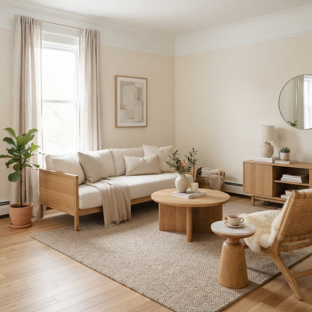
2. Sherwin-Williams Alabaster SW 7008
Best for: A creamy white that still looks light
Alabaster is a beautiful option when you want warmth but don’t want the walls to look obviously yellow.
Sherwin-Williams describes Alabaster as a soft, balanced warm white.
It’s especially versatile for:
- Living rooms
- Bedrooms
- Hallways
- Open-concept spaces
Pair it with natural wood, soft beige, warm brown, or muted green.
3. Benjamin Moore Swiss Coffee OC-45
Best for: A timeless creamy off-white
Swiss Coffee is a beautiful choice if you want an off-white with warmth.
It appears in Benjamin Moore’s cream color collection and is also among the company’s popular white paint colors.
This type of creamy neutral can work especially well with:
- Traditional interiors
- Transitional decor
- Natural wood
- Cream and beige textiles
Be sure to compare it with your existing trim.
Two different warm whites can look surprisingly different when placed side by side.
4. Sherwin-Williams Greek Villa SW 7551
Best for: A bright, warm off-white
Greek Villa is another shade worth considering if you want something lighter than a traditional cream.
It’s included in Sherwin-Williams’ white paint collections and is a popular warm-white option.
Use it when you want the room to feel bright but not overly cool.
It works beautifully with natural textures and warm wood finishes.
5. Benjamin Moore White Dove OC-17
Best for: A soft white with subtle warmth
White Dove isn’t a deep cream, but it belongs on this list because it’s a useful alternative for anyone who loves the warmth of cream without wanting obvious yellow.
Benjamin Moore identifies White Dove as one of its most popular white paint colors.
It’s worth comparing with creamier shades if you’re deciding between warm white and cream.
6. Benjamin Moore Ballet White OC-9
Best for: A muted cream with more depth
Ballet White is a beautiful option when you want a creamy neutral that feels a little more substantial than a typical warm white.
Benjamin Moore includes it in its cream paint color collection.
It’s especially worth sampling in rooms with:
- Wood flooring
- Warm neutral furniture
- Cream curtains
- Natural woven accents
Because it has more visual depth than a bright white, it can create a soft, enveloping look.
7. Sherwin-Williams Shoji White SW 7042
Best for: A muted cream that leans toward greige
Shoji White is a wonderful option if you like cream but worry about yellow undertones.
Sherwin-Williams describes it as a warm, creamy white that borders on greige.
That makes it particularly interesting for homes with a mix of warm and cool finishes.
Try it with:
- Natural oak
- Dark wood
- Black accents
- Cream textiles
- Muted green
8. Benjamin Moore White Down OC-131
Best for: A gentle traditional cream
White Down is another soft cream option from Benjamin Moore’s cream collection.
It can be a useful shade to compare with Swiss Coffee and Ballet White when you want a warm, relaxed room.
Try it in bedrooms, living rooms, or traditional spaces with warm wood furniture.
9. Sherwin-Williams Dover White SW 6385
Best for: A warmer, more yellow-influenced cream
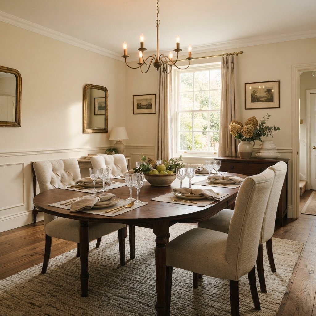
Dover White is worth considering if you genuinely like the golden warmth of traditional cream.
Sherwin-Williams notes that its yellow influence gives it a soft, inviting appearance.
This is a shade to test carefully if you’re trying to avoid yellow.
It may look beautiful with warm wood and traditional furnishings but less suitable beside certain cooler finishes.
10. Benjamin Moore Soft Chamois OC-13
Best for: A subtle creamy neutral
Soft Chamois is included in Benjamin Moore’s cream paint collection.
It’s a shade worth sampling when you want something understated and flexible.
Consider it for a room with a combination of white, wood, and neutral furnishings.
11. Sherwin-Williams Steamed Milk SW 7554
Best for: A richer, warmer cream
Steamed Milk appears in Sherwin-Williams’ warm-white collection.
It’s worth exploring when you want a more noticeable creamy color rather than a barely-there off-white.
It can look particularly beautiful in a room with warm wood flooring and natural fabrics.
12. Benjamin Moore Natural Cream OC-14
Best for: A cream-beige neutral
Natural Cream is a useful option for homeowners who want a warm neutral with more depth than white.
Benjamin Moore includes it in its cream paint collection.
Try it when your home contains beige carpet, warm stone, or wood finishes and you want a wall color that coordinates without being too bright.
13. Sherwin-Williams Antique White SW 6119
Best for: A traditional warm cream
Antique White appears in Sherwin-Williams’ warm-white collection.
It’s worth considering if you like a classic, cozy interior rather than a crisp modern white.
It can pair beautifully with:
- Medium and dark wood
- Warm neutral upholstery
- Traditional furniture
- Earthy accent colors
14. Benjamin Moore Navajo White OC-95
Best for: A classic creamy look
Navajo White is a longstanding warm off-white option included in Benjamin Moore’s color collections.
If you want a room with noticeable warmth, add it to your sample list.
Compare it with lighter creamy whites before deciding how much yellow influence you prefer.
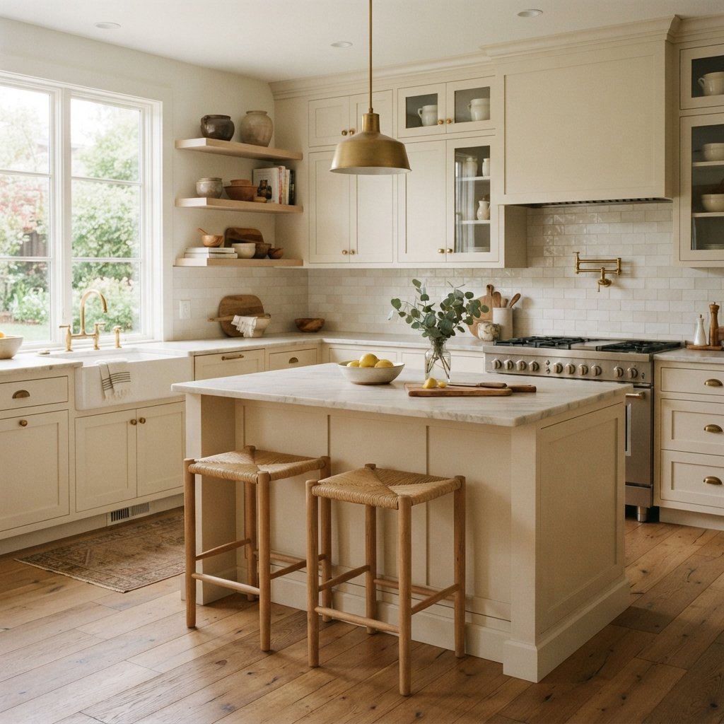
15. Sherwin-Williams Natural Choice SW 7011
Best for: A soft cream with a more muted appearance
Natural Choice appears in Sherwin-Williams’ white paint collections.
It’s worth sampling if you want a gentle neutral that sits between creamy white and light beige.
Try it in rooms with natural wood, woven textures, and warm white upholstery.
16. Benjamin Moore Creamy White OC-7
Best for: A classic cream-colored room
Creamy White is another option from Benjamin Moore’s off-white collection.
It belongs on your shortlist if you’re looking for a distinctly warm neutral rather than a crisp white.
Compare it beside your trim and flooring to see how much warmth comes through.
17. Sherwin-Williams White Duck SW 7010
Best for: A creamier neutral with a muted, beige-leaning direction
White Duck appears in Sherwin-Williams’ white collections.
It’s a good shade to compare with Shoji White and Natural Choice if you want warmth without committing to a strongly yellow cream.
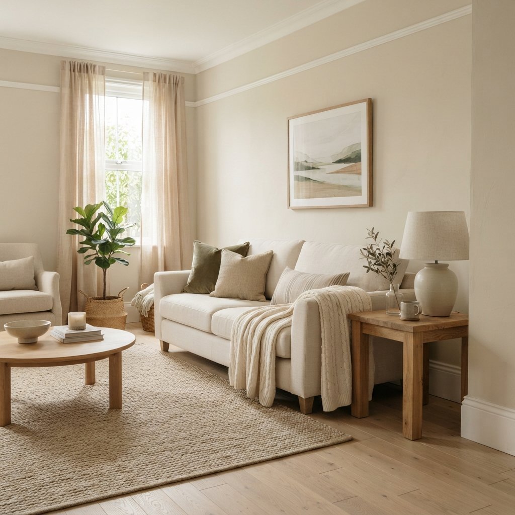
Best Cream Paint Colors Without Too Much Yellow
If you’re concerned about cream looking buttery or yellow, start with the softer, more muted options.
Consider sampling:
- Sherwin-Williams Alabaster
- Benjamin Moore White Dove
- Sherwin-Williams Shoji White
- Benjamin Moore Ballet White
- Sherwin-Williams White Duck
These colors don’t all have the same undertones.
The point is to compare lighter or more muted alternatives against stronger traditional creams.
Don’t assume a color will be yellow-free simply because it looks neutral online.
Every warm white has its own undertone behavior.
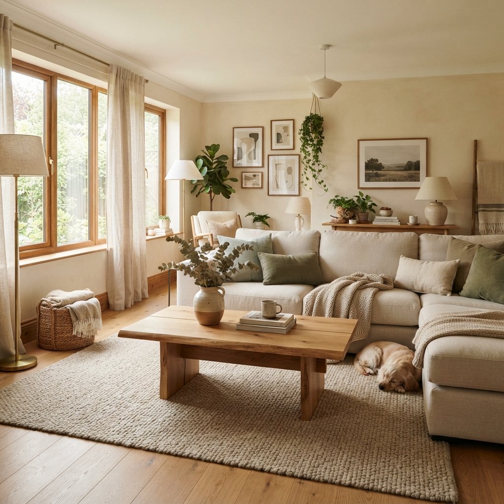
Best Cream Paint Colors for Living Rooms
Living rooms are one of the easiest places to use cream.
Cream walls work beautifully with:
- Neutral sofas
- Natural wood
- Warm brown
- Sage green
- Burgundy
- Muted blue
- Black accents
For a light living room, start with Alabaster, Greek Villa, or Swiss Coffee.
For more depth, consider Ballet White, Natural Cream, or Shoji White.
Best Cream Paint Colors for Bedrooms
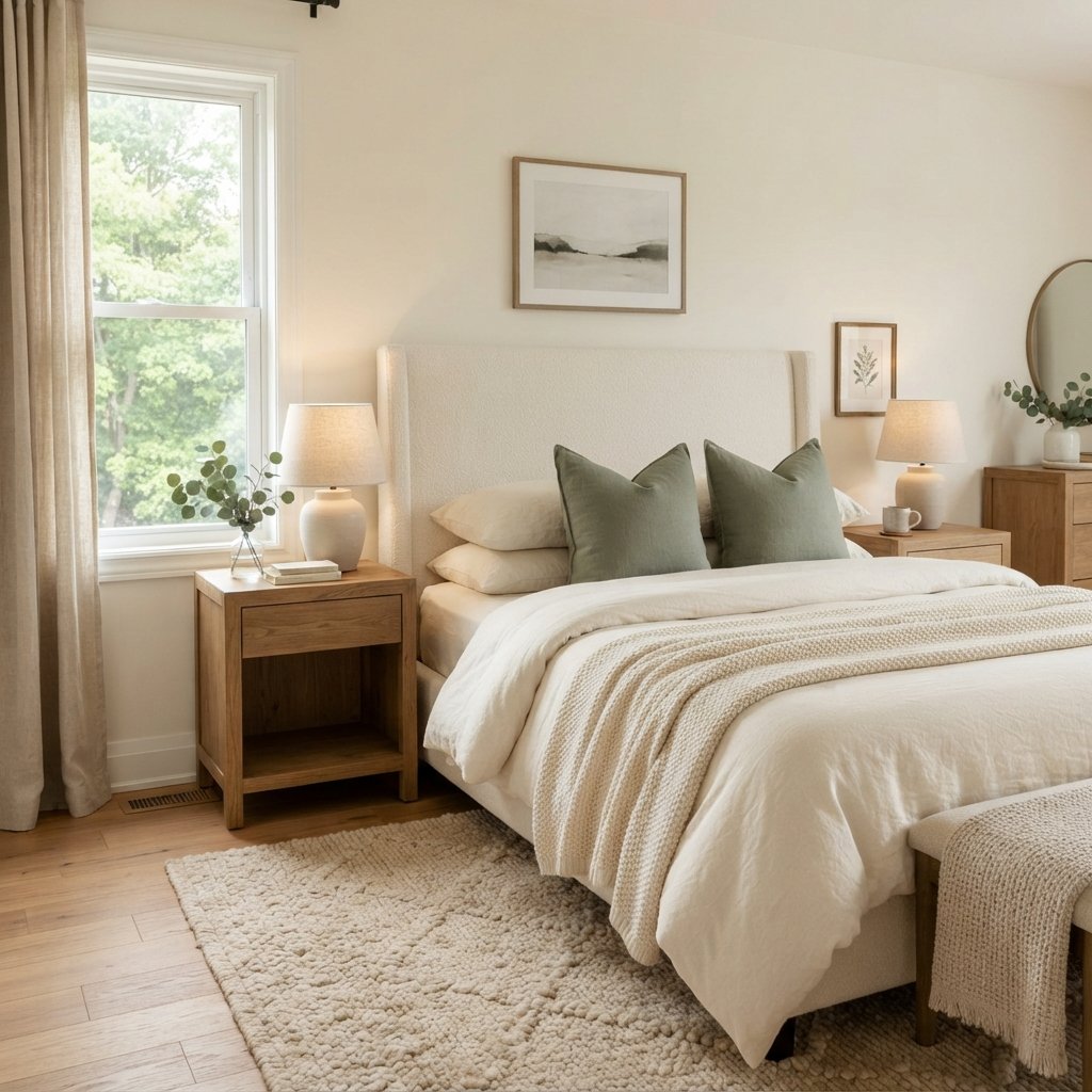
Cream is especially beautiful in bedrooms because it creates a soft background for layered bedding.
Try combining cream walls with:
- White or ivory bedding
- Warm wood nightstands
- Textured throws
- Beige curtains
- Muted green or blue accents
For a lighter look, sample Alabaster or White Dove.
For something cozier, compare Creamy, Ballet White, and Steamed Milk.
Best Cream Paint Colors for Kitchens
Cream kitchen walls or cabinets can create a warmer alternative to bright white.
Before choosing a color, compare it with:
- Countertops
- Backsplash
- Flooring
- Existing trim
- Cabinet hardware
If you’re painting cabinets, use a coating system specifically suitable for cabinetry and follow the manufacturer’s preparation, priming, application, and curing instructions.
Cream cabinets can be beautiful, but they need to coordinate carefully with the backsplash and countertop.
Best Cream Paint Colors for a Whole House
A whole-house cream should work with several lighting conditions and finishes.
Consider testing:
- Alabaster
- Swiss Coffee
- Shoji White
- White Dove
- Natural Choice
The best choice depends on how warm you want the walls to feel and how much contrast you want with the trim.
For an open-concept home, view large samples in every connected space before committing.
Best Cream Paint Colors for North-Facing Rooms
North-facing rooms often receive cooler natural light.
That can make some warm whites look more neutral and some muted creams appear grayer.
Try comparing:
- Creamy
- Alabaster
- Swiss Coffee
- Steamed Milk
However, don’t automatically choose the yellowest shade.
A strongly warm cream can still look unexpectedly yellow under certain artificial lights.
Test in the actual room.
Best Cream Paint Colors for South-Facing Rooms
South-facing rooms often receive abundant, warmer daylight.
That can emphasize yellow or golden undertones.
If you’re worried about the walls looking too yellow, consider comparing:
- Shoji White
- White Dove
- Ballet White
- White Duck
Observe the samples throughout the day.
Window treatments, flooring, and surrounding colors can all affect the final appearance.
Best Cream Paint Colors for East- and West-Facing Rooms
East-facing rooms often receive warmer morning light and cooler light later.
West-facing rooms can become especially warm in the afternoon.
This matters because a cream that looks perfect at breakfast may appear quite different by dinner.
Check samples at several times before choosing.
Cream Paint Colors With Wood Floors
Cream and wood are a natural combination, but the undertones matter.
Light Oak Floors
Try soft creamy whites and muted creams.
Honey-Toned Wood Floors
Compare carefully because both the floor and wall paint may contain yellow or orange influences.
Dark Wood Floors
Light cream can create beautiful contrast and keep the room feeling balanced.
Gray-Toned Wood Floors
Muted creams may coordinate more comfortably than strongly yellow shades.
Don’t rely on general rules alone.
Place your samples directly beside the floor.
What Trim Color Goes With Cream Walls?
This is one of the most important decisions.
There are three common approaches.
1. Cream Walls With Crisp White Trim
Creates noticeable contrast.
However, a very cool white can sometimes make warm cream walls appear yellower.
2. Cream Walls With Soft White Trim
Creates a gentler, more blended look.
This often works beautifully in traditional and transitional homes.
3. Cream Walls and Trim in the Same Color
Using the same color on walls and trim can create a cohesive look.
You can vary the sheen where appropriate for the surface and product.
Always check the manufacturer’s recommendations for trim and wall finishes.
What Colors Go With Cream Paint?
Cream is versatile because it pairs with many colors.
Sage Green
Creates a soft, natural palette.
Olive Green
Adds earthy depth.
Burgundy
Creates a rich, elegant contrast.
Chocolate Brown
Makes cream feel warm and grounded.
Dusty Blue
Adds a gentle cooler accent.
Navy
Creates a stronger, more traditional contrast.
Black
Adds definition to a light room.
Warm Wood
Enhances the cozy quality of cream.
How to Choose the Right Cream Paint Color
Step 1: Decide How Creamy You Want the Walls
Do you want a warm white or a noticeable cream?
This helps narrow the choices.
Step 2: Identify Your Fixed Finishes
Look at flooring, countertops, tile, and large furniture.
Step 3: Choose Three to Five Samples
Don’t bring home twenty colors unless you enjoy comparing them.
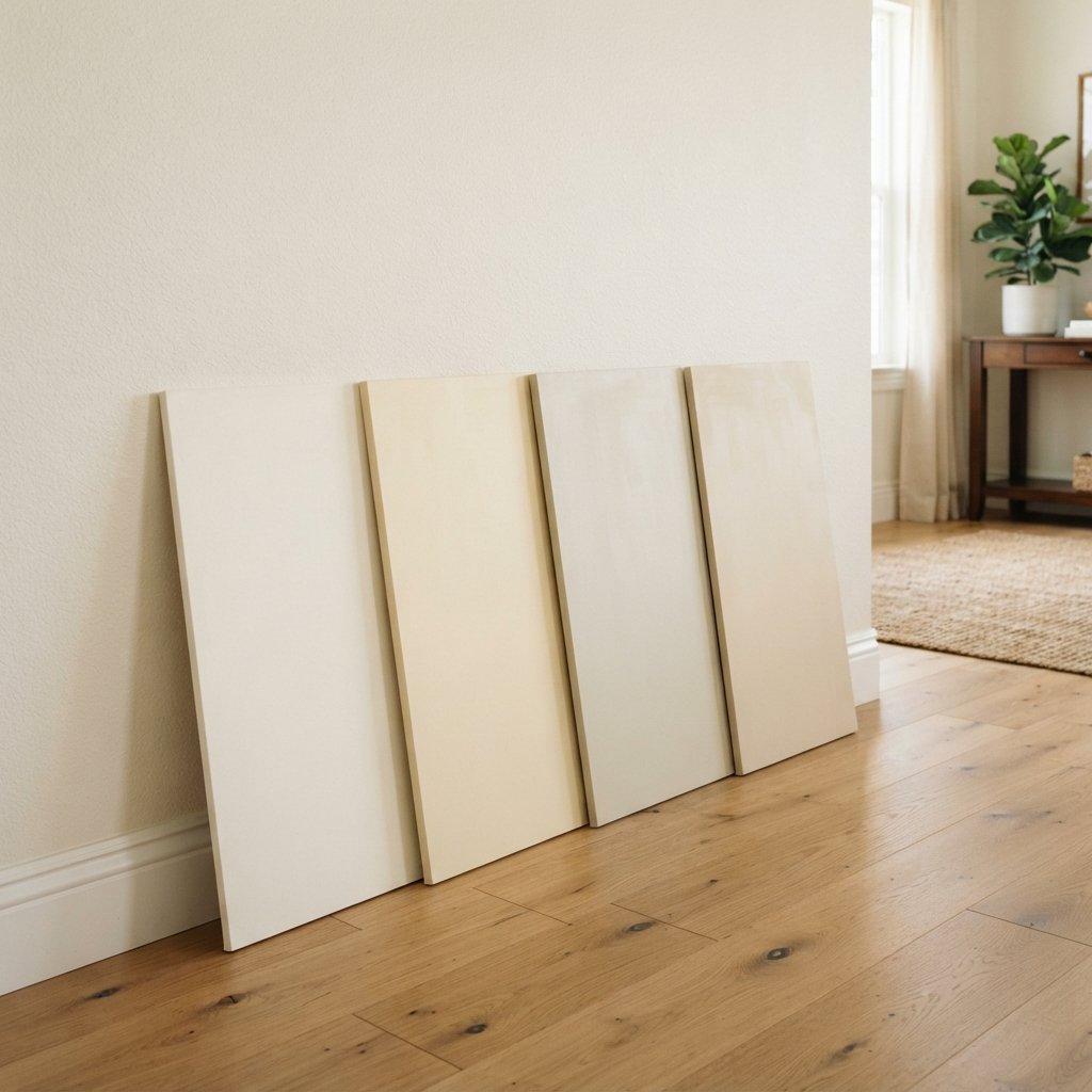
Step 4: Use Large Samples
Small chips make subtle undertones difficult to judge.
Step 5: Compare Against Trim
The trim can make cream look warmer or cooler.
Step 6: Check Morning, Afternoon, and Evening
Lighting changes how cream appears.
Step 7: Check Artificial Lighting
Warm and cool bulbs can affect the appearance of your samples.
Step 8: Make the Final Decision in the Room
Don’t choose based only on an online photograph.
Benjamin Moore specifically recommends testing white and off-white colors at home because their appearance can change throughout the day and under different lighting.
Common Mistakes When Choosing Cream Paint
Choosing From a Small Paint Chip
Undertones are easier to see on large samples.
Ignoring Existing Trim
Warm walls beside cool trim can create unexpected contrast.
Choosing Cream Before Flooring
The floor can change how the wall color appears.
Assuming Every Cream Is Yellow
Some creams are much more muted than others.
Assuming Every Warm White Is Cream
Some warm whites still read primarily white.
Choosing Based on Online Photos
Screens and photography can distort paint color.
Forgetting Artificial Lighting
The room may look different at night.
Testing Only One Wall
Different walls can receive different amounts of light.
FAQ About the Best Cream Paint Colors
What is the best cream paint color?
There isn’t one best cream for every home. Sherwin-Williams Creamy, Alabaster, and Shoji White, along with Benjamin Moore Swiss Coffee and Ballet White, are useful starting points depending on how light, warm, or muted you want the color.
What cream paint color doesn’t look too yellow?
If you want a less yellow appearance, compare muted creamy whites such as Alabaster, Shoji White, White Dove, Ballet White, and White Duck. Always test them in your lighting.
Is cream paint outdated?
No. Cream is a versatile neutral that works with traditional, transitional, farmhouse, organic modern, and many other decorating styles. The key is choosing a shade that coordinates with your home’s finishes.
Is cream better than white?
Neither is automatically better. Cream creates more warmth, while a crisper white can create stronger contrast. The best choice depends on the room and your decorating preferences.
Does cream paint go with gray?
Yes, but pay attention to undertones. A muted cream often coordinates more easily with cool gray than a strongly yellow cream.
Does cream paint go with white trim?
Yes. The amount of contrast depends on the specific cream and white you choose. Test them together before painting.
What is the difference between cream and beige?
Cream is generally lighter and closer to white, while beige usually has more noticeable color and depth.
What is the best cream paint for a dark room?
A warm cream can create a cozy appearance in a darker room, but the best shade depends on the lighting. Try several samples rather than assuming the brightest white will work best.
Final Thoughts
The best cream paint colors can make a home feel warm, welcoming, and timeless without relying on stark white or dark beige.
If you want a light creamy white, start with Alabaster, Greek Villa, White Dove, or Swiss Coffee.
If you want a more noticeable cream, compare Creamy, Steamed Milk, White Down, or Antique White.
And if you love cream but worry about yellow undertones, consider muted options such as Shoji White, Ballet White, Natural Choice, or White Duck.
The most important step is testing.
Compare the paint with your floors, trim, furniture, and lighting.
Look at it throughout the day.
And remember that the same cream can look completely different in two homes.
A beautiful cream paint color isn’t necessarily the one that looks prettiest online.
It’s the one that makes your own home feel exactly the way you want it to feel.