

Choosing a paint color for your living room sounds simple until you’re standing in front of hundreds of nearly identical paint chips.
Should you choose warm white or cream? Is gray still a good choice? Would beige make the room feel dated? Can you use green or blue without making the space feel too colorful?
The best living room paint colors aren’t determined by what’s currently popular. They’re the colors that work with your home’s lighting, flooring, furniture, fixed finishes, and overall decorating style.
For many homes, warm whites, creams, soft beiges, greiges, muted greens, and gentle blues create comfortable, flexible backgrounds. But deeper colors such as navy, charcoal, and earthy green can be equally beautiful when you want a living room with more drama.
The key is understanding how paint interacts with everything already in the room.
Below are 21 beautiful paint color ideas—from versatile neutrals to richer statement shades—plus practical tips for narrowing down the right color for your living room.
How to Choose a Living Room Paint Color
Before looking at specific colors, look at your room.
Your paint needs to coordinate with the finishes that are difficult or expensive to change.
These may include:
- Flooring
- Fireplace stone or brick
- Built-in cabinetry
- Large furniture
- Area rug
- Window treatments
- Adjacent rooms
Start with those elements instead of choosing paint in isolation.
If your rug contains cream, muted green, and warm brown, for example, you already have a useful color palette.
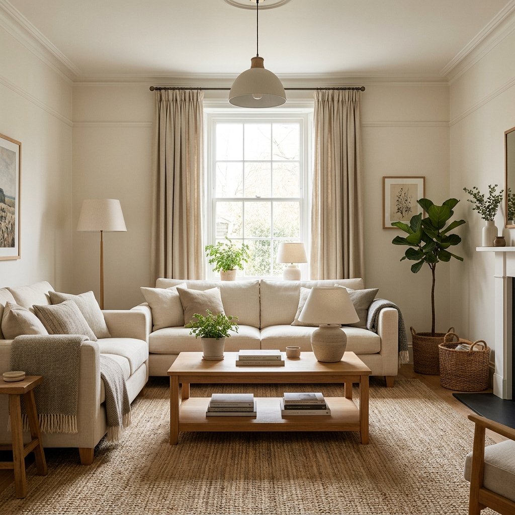
1. Warm White
Warm white is one of the most versatile living room paint color ideas.
It can keep a room feeling light without the starkness that some crisp whites create.
Warm white works particularly well with:
- Natural wood
- Beige upholstery
- Cream textiles
- Warm metals
- Earthy colors
It’s a beautiful choice for transitional, traditional, coastal, organic modern, and casual living rooms.
The challenge is finding the right white.
Some whites have yellow, pink, gray, green, or other undertones, so always compare samples against your room’s permanent finishes.
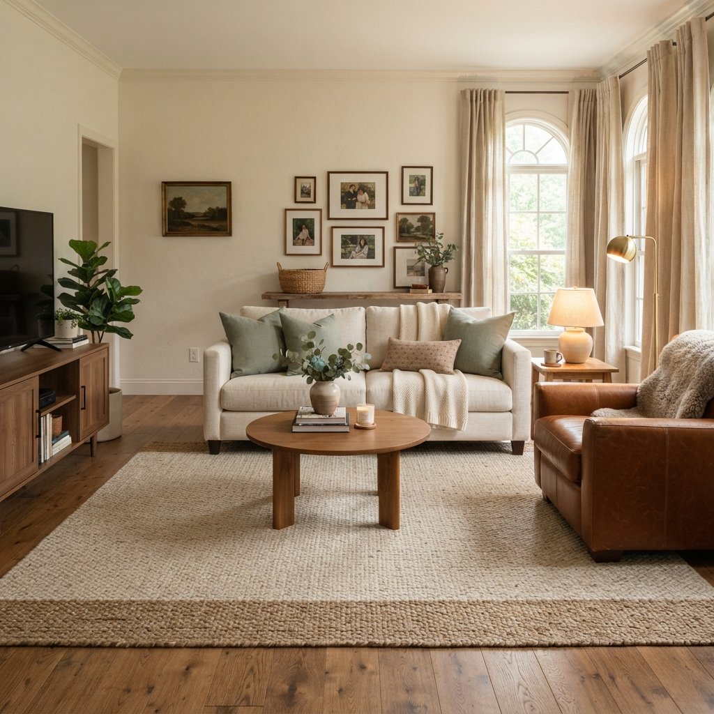
2. Soft Cream
Cream creates a little more warmth than off-white.
It’s especially useful when your living room contains:
- Warm wood floors
- Beige stone
- Brown leather
- Cream furniture
- Antique wood pieces
A soft cream can create a cozy backdrop without making the room feel dark.
Avoid selecting cream based on the paint chip alone. Some creamy colors can become noticeably more yellow in certain lighting.
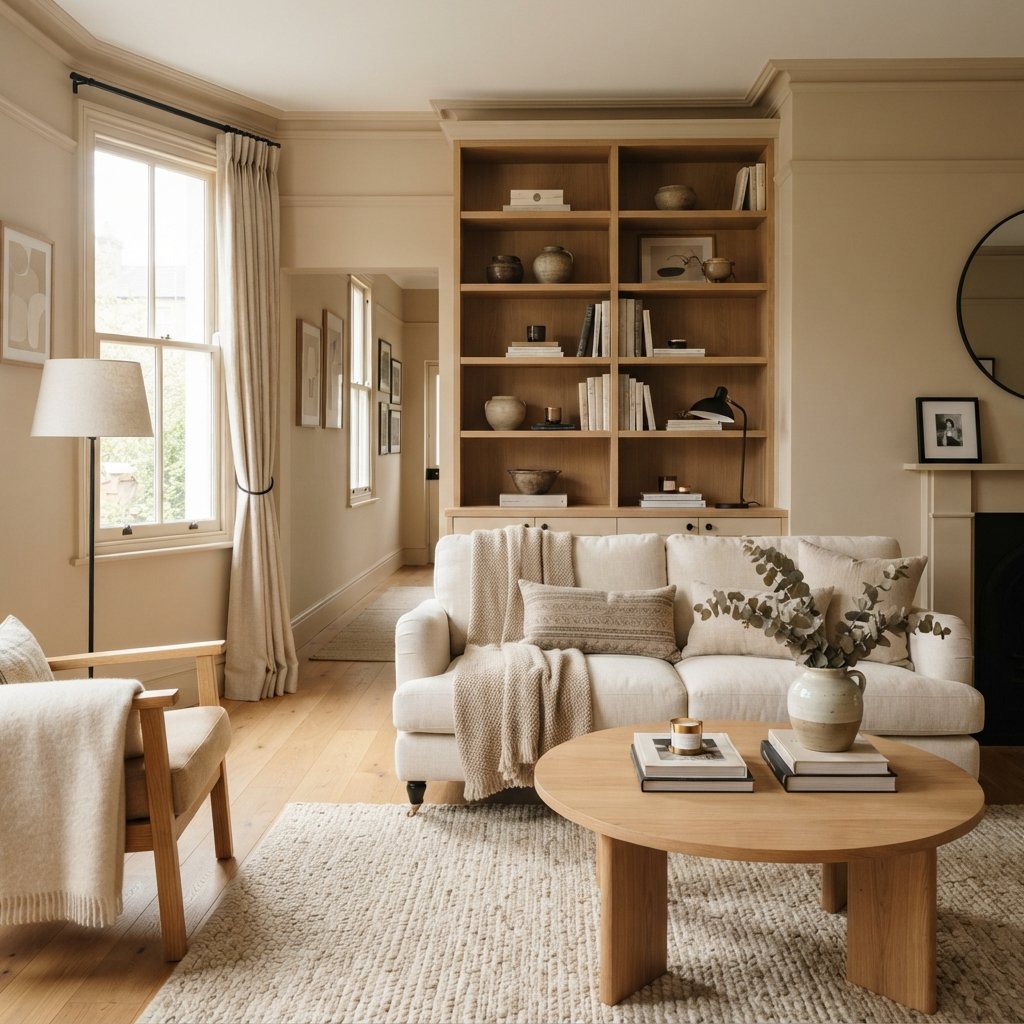
3. Light Beige
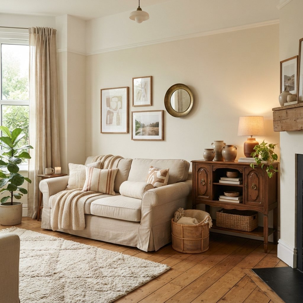
Beige can create an incredibly sophisticated living room when the undertones work with the room.
Today’s beige interiors often combine light warm walls with:
- Cream
- Camel
- Natural oak
- Dark wood
- Black accents
- Linen
- Woven textures
Instead of trying to match every beige exactly, layer several related neutral tones.
That creates depth.
4. Pale Greige
Can’t decide between gray and beige?
Try greige.
A pale greige can bridge warm and cool finishes in a room.
It’s particularly useful when you have a combination such as:
Warm wood floor + light gray sofa + cream rug
The right greige can help those elements feel more connected.
Just remember that greige isn’t one universal color. Some versions lean noticeably gray, while others appear much warmer.
5. Taupe
Taupe is a sophisticated neutral that can provide more depth than pale beige or greige.
Depending on the specific color, taupe can contain gray, brown, violet, or other undertones.
It works beautifully with:
- Cream furniture
- Medium and dark wood
- Black accents
- Warm metallic finishes
- Muted greens
Taupe is worth considering if your living room needs warmth but you don’t want obvious beige.
6. Mushroom
Mushroom colors sit somewhere in the world of beige, taupe, and brown.
They can create a grounded, cozy atmosphere without being extremely dark.
Pair mushroom walls with:
- Cream upholstery
- Warm white trim
- Medium wood
- Natural textures
It’s a particularly attractive direction for traditional and organic-inspired interiors.
7. Soft Gray
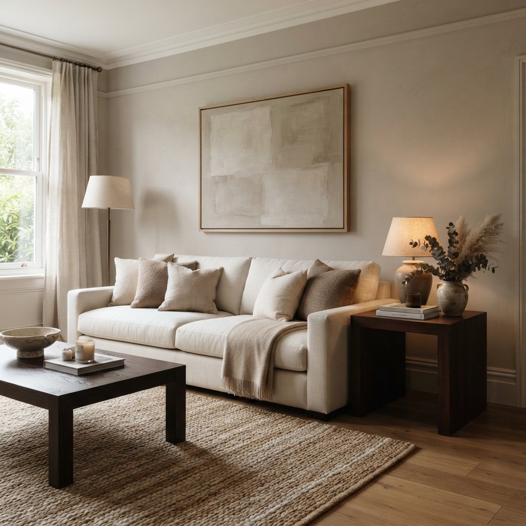
Gray can still be a beautiful living room color.
The key is choosing a gray that works with your finishes rather than using gray simply because it’s neutral.
Soft gray can work well with:
- Cooler stone
- Blue textiles
- Black accents
- Crisp or neutral whites
If your living room contains warm beige flooring and orange-toned wood, however, a very cool gray may feel disconnected.
Consider the whole room.
8. Blue-Gray
Blue-gray adds subtle color while still behaving like a neutral.
It’s a good option for living rooms with:
- White trim
- Blue textiles
- Cool stone
- Medium wood
- Coastal influences
A muted blue-gray can create a calm, relaxed atmosphere.
In rooms with limited natural light, some blue-grays can become cooler or more pronounced, so sampling is especially important.
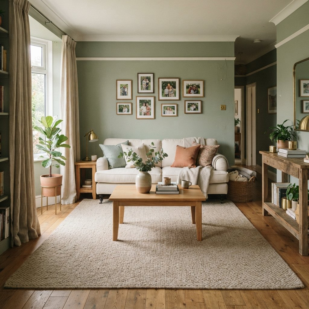
9. Sage Green
Sage green is one of the easiest greens to decorate around because it’s usually soft and muted.
It can pair beautifully with:
- Cream
- Warm white
- Natural oak
- Walnut
- Brass-toned accents
- Terracotta
Use it when you want the living room to have color without feeling overly bold.
10. Muted Olive Green
Olive brings more depth and earthiness than pale sage.
It works particularly well with warm interiors.
Try olive walls with:
- Cream upholstery
- Cognac leather
- Dark wood
- Warm brass-toned details
- Natural stone
If painting the entire room feels like too much, test it on a focal wall or built-ins first.
11. Soft Blue
A soft muted blue can create an airy, peaceful living room.
It can work particularly well in:
- Coastal homes
- Traditional homes
- Cottage-inspired rooms
- Rooms with plenty of warm wood
Warm wood furniture can prevent blue walls from feeling too cold.
12. Dusty Blue
Dusty blue has more gray and depth than a pale sky blue.
It’s a beautiful choice if you want noticeable color while maintaining a relaxed atmosphere.
Pair it with:
- Cream
- Tan
- Medium wood
- Muted brass-toned accents
- Warm white
Repeating the blue subtly in artwork or textiles can make the palette feel intentional.
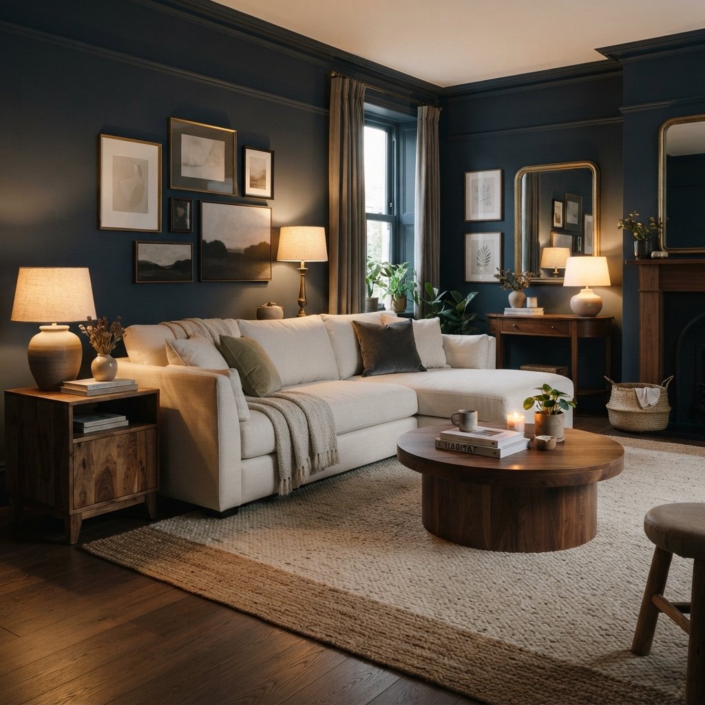
13. Navy Blue
A dark navy living room can feel sophisticated and cozy.
Navy works particularly well in spaces with:
- Plenty of natural light
- Warm wood
- Cream furniture
- White or warm white trim
- Metallic accents
You can also use navy in a darker room if you’re intentionally creating a moody atmosphere.
Don’t assume every small or dark room must be painted white.
14. Deep Green
Deep green can make a living room feel enveloping and elegant.
Try it with:
- Cream
- Brown leather
- Walnut
- Oak
- Brass-toned finishes
- Natural woven textures
Because deep colors absorb more light visually, pay attention to lighting.
Add table lamps, floor lamps, and other appropriate sources to create layers of illumination.
15. Charcoal
Charcoal can create a dramatic living room without the starkness of pure black.
It works especially well in rooms with:
- Light upholstery
- Natural wood
- Warm lighting
- Large windows
- Architectural details
Choose a charcoal with an undertone that relates to the rest of your room.
Some lean blue.
Others lean brown or green.
16. Warm Brown
Brown walls can create an exceptionally cozy room.
Think beyond traditional chocolate brown.
Consider:
- Soft cocoa
- Mushroom brown
- Earthy clay-brown
- Muted coffee tones
Pair them with cream upholstery and lighter textiles to provide contrast.
17. Terracotta
Terracotta can bring warmth and personality to a living room.
It works particularly well with:
- Cream
- Beige
- Olive green
- Natural wood
- Black accents
If a full terracotta room feels too intense, use a muted clay shade.
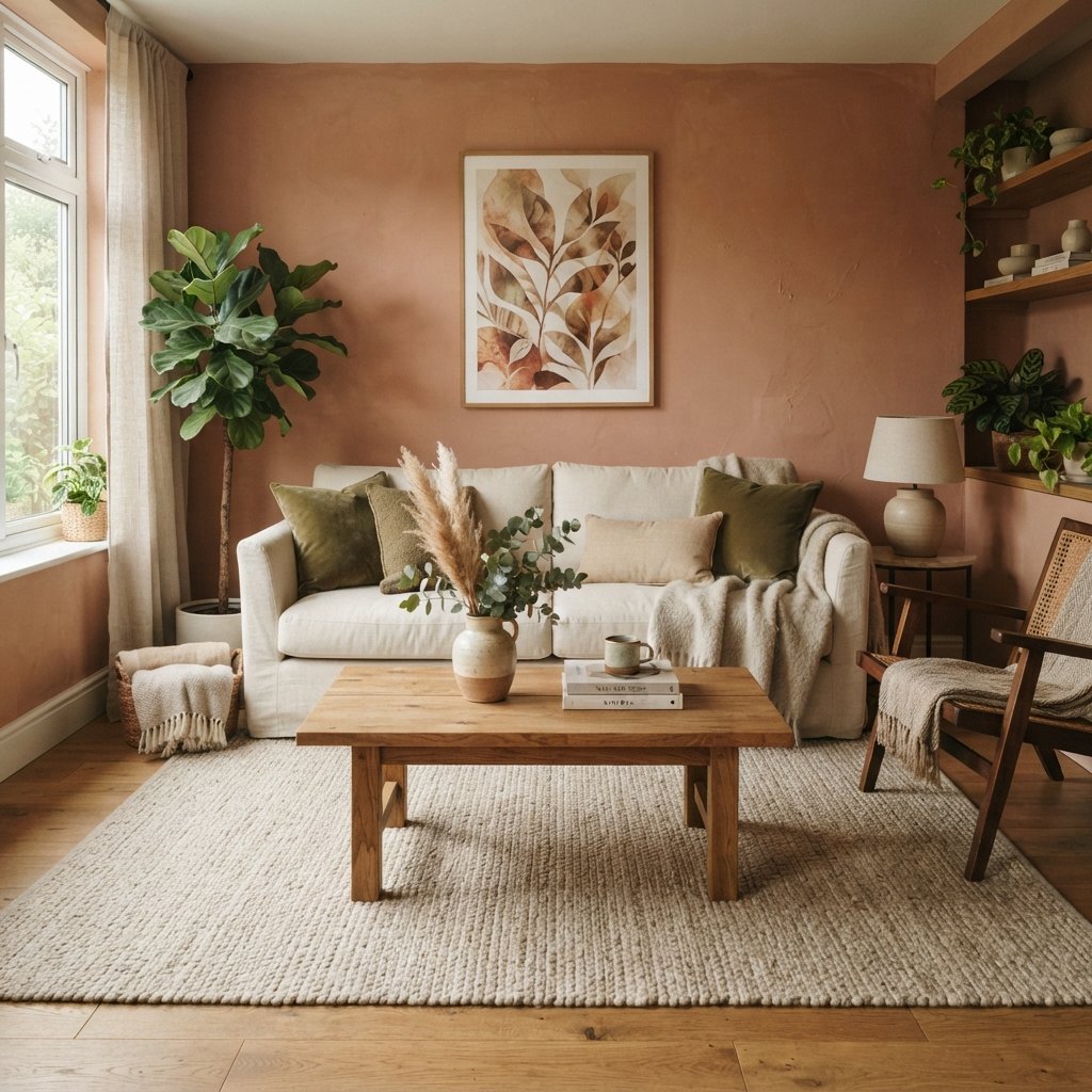
18. Muted Clay
Clay colors sit between warm beige, brown, peach, and terracotta.
A muted version can add warmth without becoming overwhelmingly colorful.
These colors can be especially beautiful in rooms with abundant natural materials.
19. Pale Pink-Beige
Pink doesn’t have to make a living room feel overly sweet.
A pale, muddy pink-beige can function almost like a warm neutral.
Pair it with:
- Brown
- Cream
- Walnut
- Burgundy
- Black
Look for subdued shades rather than bright pink if you want a sophisticated effect.
20. Soft Black
For a dramatic living room, consider a softer off-black rather than a harsh true black.
It can create a beautiful backdrop for:
- Art
- Cream furniture
- Wood furniture
- Metallic details
Lighting becomes especially important with very dark walls.
21. Color-Drenched Neutrals
One interesting approach is using a single neutral or closely related shades across walls, trim, doors, and built-ins.
Instead of strong white trim against beige walls, you might use:
Warm beige walls + slightly lighter beige trim
or a coordinated tonal scheme.
This can create a calm, cohesive look.
Paint products and sheen requirements may differ between walls, trim, doors, and cabinetry, so select products appropriate for each surface.
Best Living Room Paint Colors for a Small Room
A small living room doesn’t automatically need white walls.
Light colors can create an airy appearance, but deeper colors can create intimacy.
If you want the room to feel bright, consider:
- Warm white
- Cream
- Pale greige
- Light beige
- Soft blue
If you want it to feel cozy, try:
- Olive
- Navy
- Deep green
- Charcoal
- Warm brown
Choose based on the atmosphere you want rather than an arbitrary rule about room size.
Best Living Room Paint Colors for a Dark Room
If your living room receives limited natural light, you have two main options.
Option 1: Lighten It
Try warm white, cream, pale beige, or another light neutral.
These won’t magically create sunlight, but they can keep the room from feeling visually heavy.
Option 2: Embrace It
Choose a richer shade such as:
- Navy
- Deep green
- Charcoal
- Brown
Then create a cozy room with layered lighting.
Sometimes working with the room’s natural character creates a better result than fighting it.
Best Living Room Paint Colors With Wood Floors
Wood flooring strongly influences wall color.
Light Oak Floors
Try:
- Warm white
- Cream
- Pale greige
- Sage
- Light beige
Honey or Golden Wood
Compare warm whites, creams, greens, and muted neutral shades.
Be careful with cool grays that may exaggerate orange tones in the floor.
Dark Wood Floors
Light walls can create contrast.
Try cream, warm white, pale beige, or muted green.
Gray-Toned Wood Floors
Soft neutral whites, greiges, blue-grays, and muted greens may coordinate well depending on the flooring undertones.
Best Living Room Paint Colors With a Beige Sofa
A beige sofa gives you many options.
For a light neutral room:
Cream walls + beige sofa + natural wood
For subtle color:
Sage walls + beige sofa + warm wood
For contrast:
Deep green walls + beige sofa + brass-toned accents
For a tonal look:
Light beige walls + beige sofa + brown and cream textiles
Vary texture and value so the room doesn’t look flat.
Best Living Room Paint Colors With a Gray Sofa
Gray sofas can be more complicated because gray upholstery varies dramatically.
Some gray sofas lean:
- Blue
- Green
- Purple
- Brown
Identify the undertone first.
Then consider warm white, greige, muted blue, green, or another coordinating neutral.
Avoid assuming any gray wall will automatically match gray furniture.
Best Living Room Paint Colors With Brown Furniture
Brown furniture looks beautiful with warm, earthy wall colors.
Try:
- Cream
- Warm white
- Beige
- Sage
- Olive
- Dusty blue
For a dramatic palette, combine brown leather with deep green or navy walls.
How Lighting Changes Living Room Paint Colors
Light can dramatically change paint.
North-Facing Rooms
These rooms can receive cooler, indirect light.
Warm colors may help balance that effect, but every room is different.
South-Facing Rooms
Strong warm light can make colors appear warmer and brighter during parts of the day.
East-Facing Rooms
Colors may look warmer in the morning and cooler later.
West-Facing Rooms
Afternoon and evening light can create significant warmth.
Artificial lighting matters too.
A paint color you love at noon may look completely different at 8 p.m.
That’s why sampling is essential.
How to Test Living Room Paint Colors
Don’t choose from a tiny chip if you can avoid it.
Instead:
- Narrow your choices to several colors.
- Obtain appropriate physical samples.
- View large samples vertically in the room.
- Move them to different walls.
- Compare them beside the flooring and furniture.
- Look during morning, afternoon, and evening.
- Turn on the lamps you normally use.
- Compare the color with adjacent rooms.
Don’t judge a sample in isolation.
You’re choosing a color for your room, not for a paint card.
Should the Living Room Match the Kitchen?
The rooms don’t need to be identical.
They should simply feel related, especially in an open floor plan.
You can create continuity by repeating:
- Undertones
- Accent colors
- Wood tones
- Metals
- Textiles
For example, a warm white kitchen can flow beautifully into a pale greige living room when both share similar warmth.
Should the Living Room Be Lighter or Darker Than the Hallway?
Either can work.
A lighter living room can create an open transition from a darker hall.
A deeper living room can make the space feel more defined.
Instead of trying to make every room the same value, look at the sightlines.
Stand in the hallway and see several rooms at once.
Do the colors look intentional together?
That’s more important than making them match.
How to Choose Paint Color Around a Fireplace
A fireplace is often a major fixed element.
Look carefully at the stone, tile, or brick.
Does it contain:
- Cream?
- Gray?
- Brown?
- Beige?
- Red?
- Black?
Choose a wall color that relates to those undertones.
For example, warm beige stone may look disconnected from icy blue-gray walls but beautiful with cream, greige, or muted green.
Warm vs. Cool Living Room Paint Colors
If you’re unsure whether to choose warm or cool paint, look at the permanent materials.
Warm finishes often include:
- Golden wood
- Cream stone
- Beige tile
- Brown furniture
Cooler finishes may include:
- Blue-gray stone
- Cool gray flooring
- Blue textiles
You don’t have to make everything warm or everything cool.
A successful room can mix both.
You simply need enough repetition to make the combination feel intentional.
How to Create a Living Room Color Palette
A simple method is to choose:
1 main wall color
1 dominant neutral
1 secondary color
1–2 accent colors
For example:
Walls: Warm white
Sofa: Cream
Secondary: Natural wood
Accents: Sage + black
Or:
Walls: Deep green
Sofa: Cream
Secondary: Walnut
Accents: Brown + brass-toned details
This is easier than choosing every object independently.
Common Living Room Paint Color Mistakes
Choosing Paint First
It’s usually easier to coordinate paint with existing furniture, rugs, and flooring than the other way around.
Ignoring Undertones
White, beige, gray, and even black have undertones.
Copying a Color From a Photo
Lighting and screens can make colors look different.
Using Only Tiny Paint Chips
Test larger samples.
Forgetting Artificial Lighting
Check the room at night.
Assuming Small Rooms Need White
Dark colors can work beautifully in small rooms.
Matching Everything
Rooms usually look more interesting when colors coordinate rather than match exactly.
Forgetting Adjacent Rooms
Check important sightlines.
Painting a Living Room: Practical Tips
Once you’ve chosen a color, prepare properly.
Depending on the existing wall condition, this may include:
- Cleaning the walls appropriately.
- Repairing holes and imperfections.
- Protecting floors and furniture.
- Preparing existing coatings as required.
- Priming when appropriate.
- Applying the selected paint according to manufacturer instructions.
- Allowing proper drying and recoating time.
Choose a paint product and finish appropriate for interior living room walls and your household’s cleaning needs.
Provide ventilation and use appropriate protective equipment as directed.
In older homes, don’t sand or disturb questionable existing coatings until you’ve determined whether hazardous materials such as lead may be present and what safe procedures apply.
FAQ About Living Room Paint Colors
What are the best colors to paint a living room?
Warm white, cream, beige, greige, sage, muted blue, taupe, and other soft neutrals are versatile choices. Deeper colors such as navy, green, charcoal, and brown can create a cozy, dramatic room.
What is the most relaxing color for a living room?
Soft greens, muted blues, warm whites, and gentle earth tones often create a calm atmosphere, but the effect depends on lighting and surrounding finishes.
What color makes a living room feel warmer?
Cream, warm beige, taupe, earthy green, terracotta, clay, and warm brown can all add visual warmth.
What paint color makes a small living room look bigger?
Light colors can create an airy appearance, particularly when paired with uncluttered furnishings and good lighting. However, furniture scale and layout matter just as much as wall color.
Should the living room and dining room be the same color?
They can be, especially in an open floor plan, but they don’t have to be. Coordinating colors can create separation while maintaining visual flow.
What colors go with a beige couch?
Cream, warm white, greige, sage, olive, muted blue, brown, and deeper greens can all coordinate beautifully depending on the sofa’s undertone.
What colors go with a gray couch?
Warm white, greige, muted green, blue-gray, and other coordinating neutrals may work. Determine whether your sofa’s gray undertone is blue, green, violet, or warm before choosing.
How many paint samples should I test?
There’s no required number, but narrowing your choices to a manageable group and comparing large physical samples is generally more useful than testing dozens of similar shades.
Final Thoughts
Choosing living room paint colors becomes much easier when you stop looking for one universally perfect shade.
Start with the room you already have.
Look at the flooring.
Study the sofa.
Consider the fireplace.
Pay attention to natural light.
Then decide how you want the living room to feel.
For a light and flexible space, consider warm white, cream, pale beige, or greige.
For subtle color, try sage, olive, dusty blue, or blue-gray.
For a cozy, dramatic room, explore navy, deep green, charcoal, brown, or even soft black.
Most importantly, test the color in your own home.
Look at it during the day.
Look at it at night.
Move the sample around the room.
The perfect living room color isn’t necessarily the shade that looks best on a paint card or in someone else’s house.
It’s the color that makes your furniture, flooring, lighting, and favorite things look better together.