

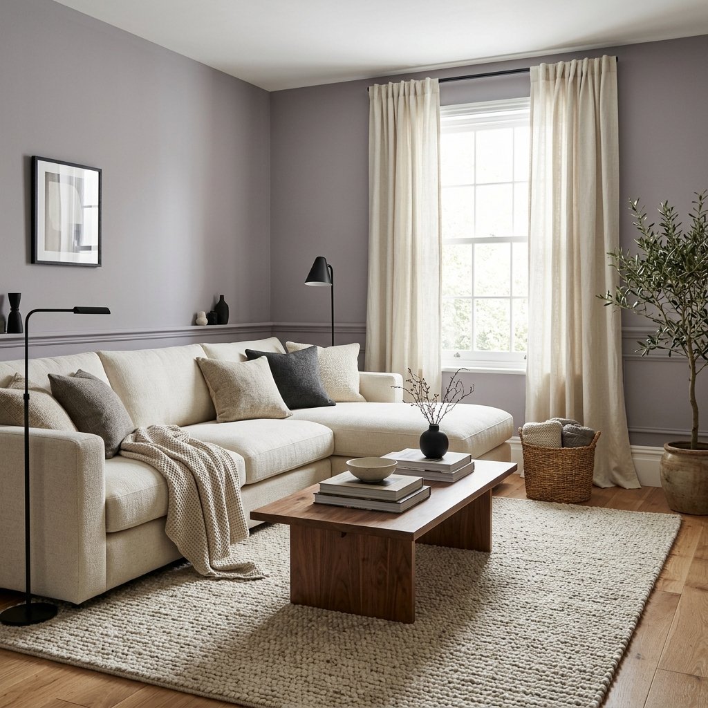
If you’re considering Sherwin-Williams Grayish SW 6001, the name doesn’t tell you the whole story.
Grayish is a soft, muted gray, but it isn’t a perfectly neutral gray without undertones. Like many complex neutrals, it can shift noticeably depending on the lighting, flooring, furniture, and colors around it.
One of the most important things to know about Grayish is that it can show a violet or purple influence. In some rooms that undertone is subtle and gives the color a sophisticated softness. In others, especially when it’s placed beside certain warm finishes, the violet side can become much easier to see.
That doesn’t make Grayish difficult to use. It simply means this is a color you should sample carefully rather than choosing from its name or an online photo.
If you’re wondering whether Sherwin-Williams Grayish is right for your living room, bedroom, bathroom, kitchen, or whole-house palette, here’s what to know about its undertones, lighting, coordinating colors, and the finishes that can affect how it looks.
What Color Is Sherwin-Williams Grayish?
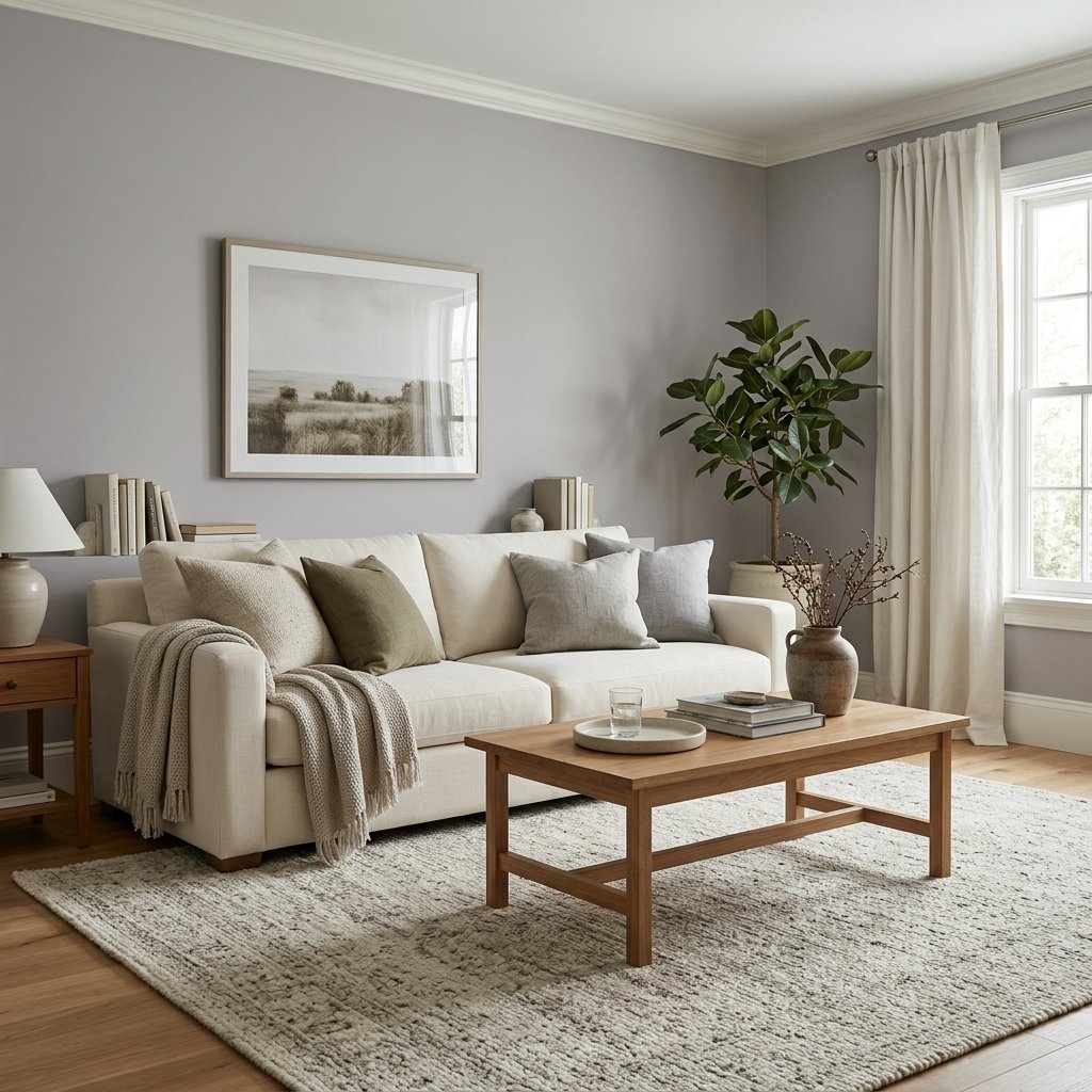
Sherwin-Williams Grayish SW 6001 is a light-to-medium muted gray.
Rather than reading as a crisp blue-gray or a warm beige-gray, Grayish has a softer, more complex character.
Depending on the room, it may appear:
- Soft gray
- Slightly taupe-gray
- Violet-gray
- Subtly purple-gray
This is why Grayish can be beautiful in the right setting but surprising if you’re expecting a completely neutral gray.
What Are the Undertones of Sherwin-Williams Grayish?
Grayish can show violet or purple undertones.
These undertones may be very subtle in one room and much more apparent in another.
They can become easier to see when the paint is compared with:
- Yellow-toned wood
- Golden beige
- Green
- Certain warm whites
- Orange-toned flooring
Color relationships matter.
A gray with violet influence can look relatively neutral until it’s placed next to a color that emphasizes that undertone.
That’s why large physical samples are so important.
Is Sherwin-Williams Grayish Warm or Cool?
Grayish sits in a nuanced area.
Its violet influence can keep it from behaving like a straightforward warm greige, while its muted character can feel softer than a crisp blue-gray.
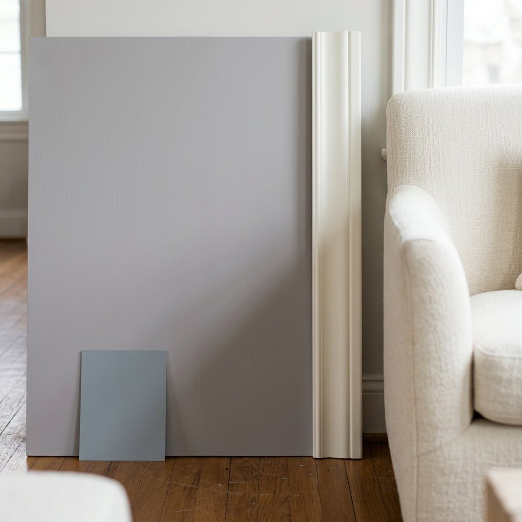
Rather than choosing it based on a simple warm-versus-cool label, compare it with the materials already in your room.
Ask:
- Does it work with the floor?
- Does it coordinate with the trim?
- Does it complement the sofa?
- Does it relate to the countertops?
- Does it look right beside the fireplace?
Those comparisons will tell you more than the category alone.
Does Grayish Look Purple?
It can.
This is probably one of the most important questions to answer before using Grayish.
In the right environment, the violet undertone may simply make the gray look soft and complex.
In another room, it may become noticeably purple.
This is particularly important if you strongly dislike purple undertones.
If that’s the case, don’t assume Grayish will become more neutral once it’s on all four walls.
Sample it first.
Does Grayish Look Pink?
Depending on the surrounding colors and lighting, a violet-influenced gray can occasionally appear slightly pinkish or mauve.
That doesn’t mean Grayish is a pink paint color.
It’s a matter of undertones and comparison.
Warm yellow or green surroundings can sometimes make a violet-based characteristic easier to notice.
If you’re seeing pink or mauve in your sample, trust what you’re seeing in your room.
Is Sherwin-Williams Grayish a Greige?
Grayish isn’t the first color I’d choose if your goal is a classic beige-heavy greige.
Although it can have some taupe-like softness, its violet-gray character distinguishes it from many popular warm greiges.
If you want a gray-beige neutral with stronger warmth, compare Grayish with several greige options before deciding.
Putting colors side by side is one of the easiest ways to reveal their differences.
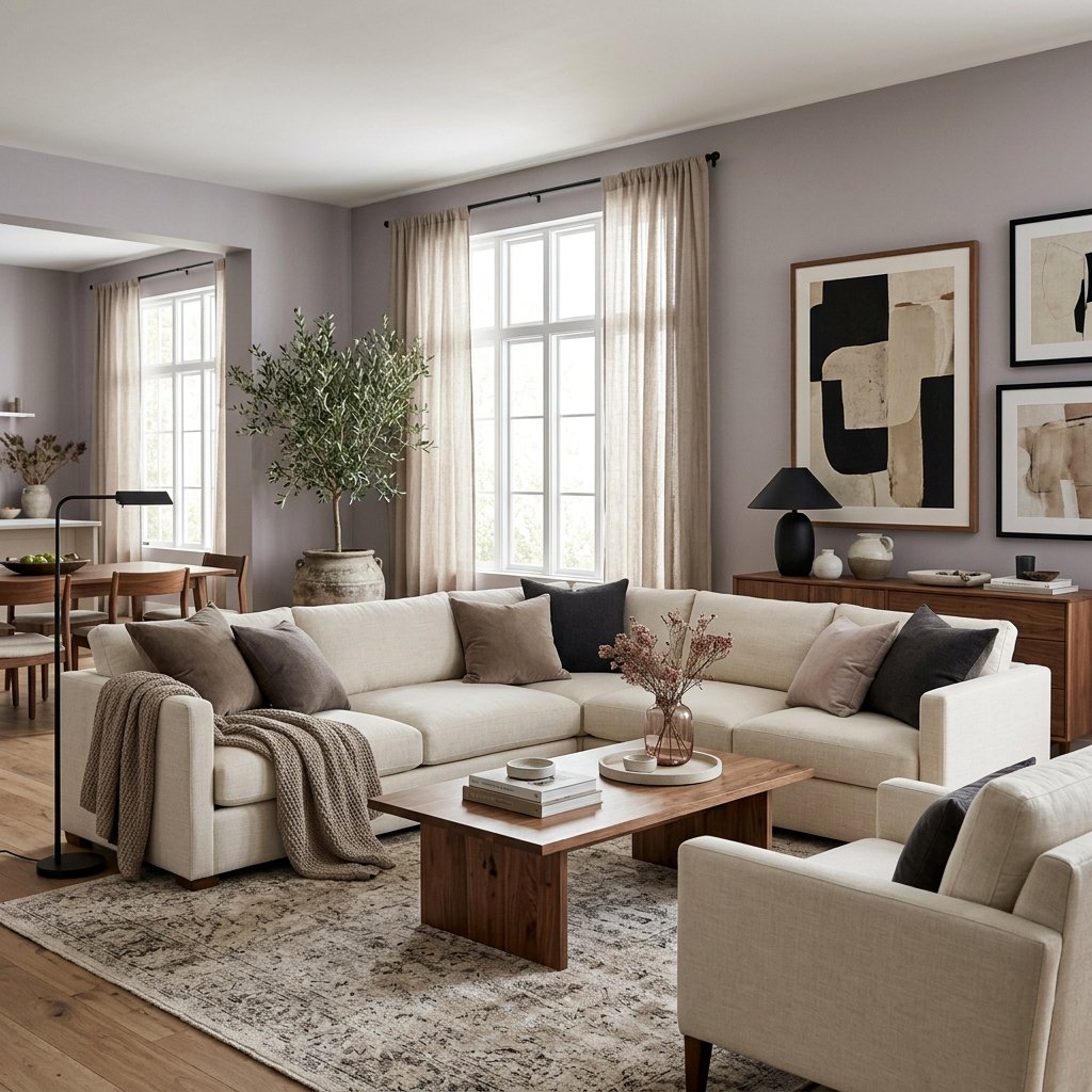
Grayish in a Living Room
Grayish can create a sophisticated living room when its undertones work with the furniture and flooring.
Try it with:
- Cream upholstery
- Warm white
- Medium brown wood
- Walnut
- Black accents
- Muted dusty colors
The sofa and rug are especially important.
They’re large surfaces, and their undertones can significantly change how Grayish appears.
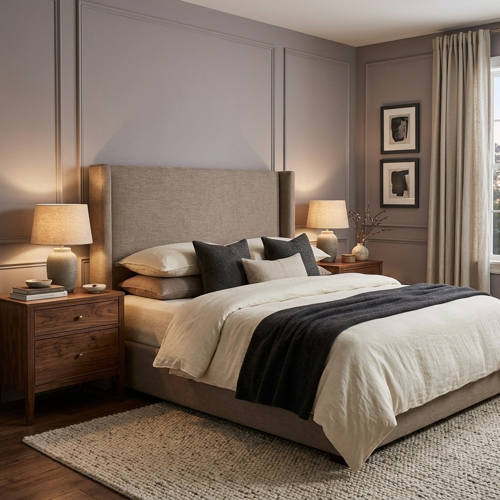
Grayish in a Bedroom
Bedrooms can be a great place for complex muted colors.
Grayish may create a quiet backdrop that feels softer than a crisp gray.
Pair it with:
- Cream bedding
- Warm white
- Taupe
- Walnut
- Charcoal
- Dusty rose
If you want to emphasize the sophisticated violet-gray character, muted mauve or plum accents can create a tonal palette.
If you’d rather minimize it, keep surrounding colors quieter and test combinations carefully.
Grayish in a Bathroom
Bathrooms can make paint undertones especially noticeable because they often contain several fixed finishes close together.
Compare Grayish with:
- Floor tile
- Shower tile
- Vanity
- Countertop
- Tub
- Trim
A violet-gray may coordinate beautifully with some cool stone and clash with warmer yellow-beige tile.
Don’t choose bathroom paint without physically comparing it with the tile.
Grayish in a Kitchen
Grayish may work in a kitchen when its undertones coordinate with the cabinets, counters, backsplash, and floor.
Potential combinations to explore include:
- White cabinetry
- Some gray stone
- Black accents
- Medium or dark wood
- Compatible neutral tile
Be more cautious if the kitchen contains strong yellow, orange, or golden undertones.
Those warm colors may increase the visual contrast with Grayish.
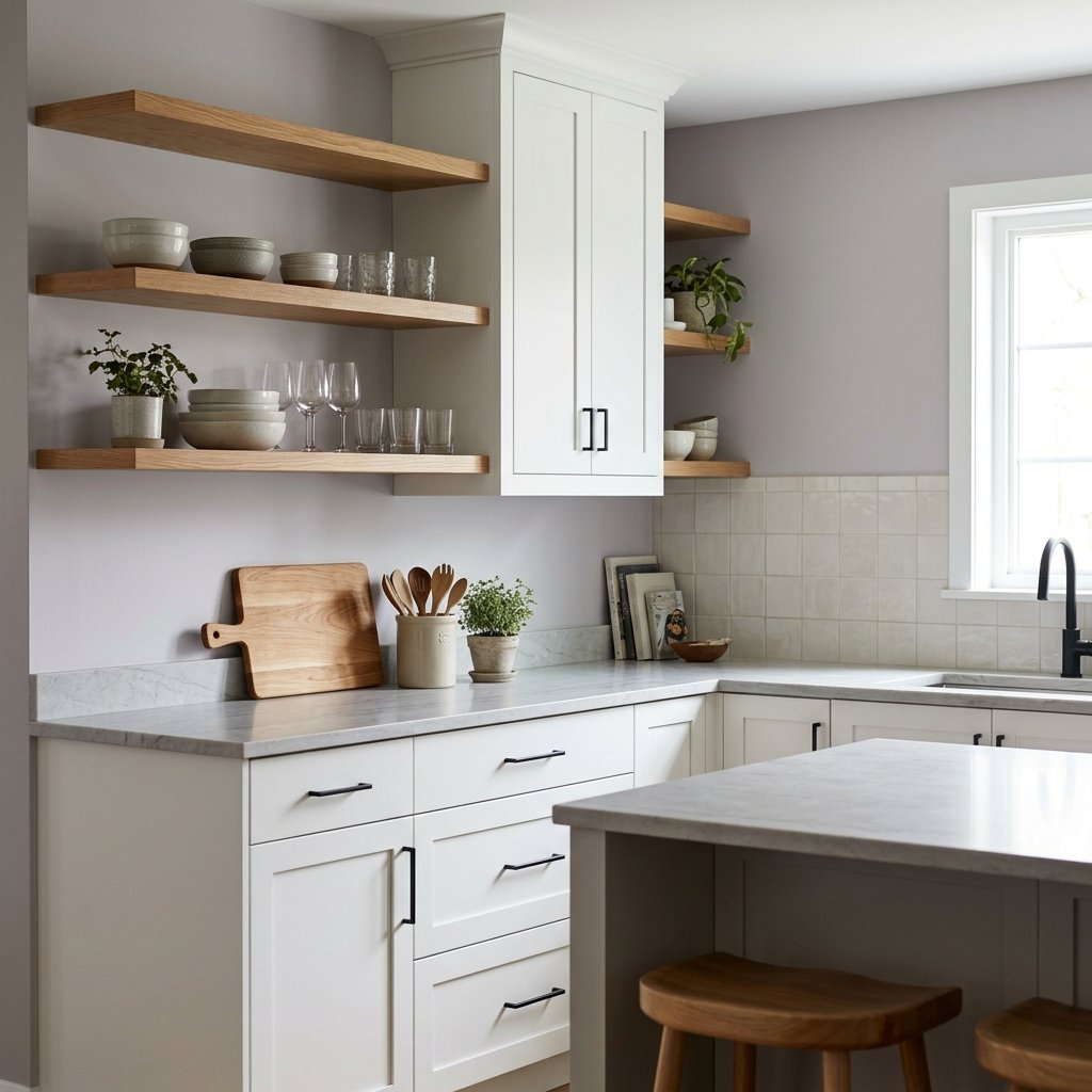
Grayish With White Cabinets
Grayish can create noticeable but soft contrast against white cabinetry.
The specific white matters.
White paint may have:
- Blue undertones
- Yellow undertones
- Pink undertones
- Gray undertones
- Green undertones
Put the Grayish sample directly against the cabinet door.
The goal is to evaluate the two colors together rather than deciding whether each one looks good separately.
Grayish With Wood Cabinets
Wood cabinetry requires careful comparison.
Light Oak
Grayish may work with some light oak, but golden or yellow undertones can make its violet influence more noticeable.
Honey Oak
Proceed carefully.
The relationship between warm orange-yellow wood and violet-gray walls can create more contrast than expected.
Medium Brown Wood
Neutral brown wood may create a sophisticated pairing.
Dark Wood
Grayish can provide lighter contrast while maintaining a muted palette.
Grayish With Wood Floors
Flooring is one of the most important elements to consider.
Natural Oak
Compare carefully for yellow undertones.
Honey Oak
Expect the warm wood to potentially emphasize Grayish’s cooler violet side.
Medium Brown Floors
These may provide a more neutral foundation.
Dark Walnut
The combination can look sophisticated when supported by cream and other neutral furnishings.
Gray-Washed Floors
Don’t assume gray flooring automatically matches gray walls.
Two grays with incompatible undertones can clash.
Grayish With Carpet
Carpet can have surprisingly strong undertones.
A carpet that appears “beige” might actually lean:
- Yellow
- Pink
- Green
- Gray
- Taupe
Put the paint sample directly beside the carpet.
If either color suddenly looks dramatically pink, purple, green, or yellow, their undertones may be competing.
Grayish With a Fireplace
Fireplace materials often contain several colors.
Look for:
- Gray
- Beige
- Cream
- Brown
- Red
- Blue-gray
Grayish may coordinate well with stone containing compatible cool gray or violet-gray notes.
If the fireplace is strongly warm beige, yellow, or orange, test carefully.
The fireplace is usually too visually important to ignore.
What Trim Color Goes With Sherwin-Williams Grayish?
Light trim can create a clean contrast with Grayish.
Neutral or compatible white is generally a useful direction to explore.
But there isn’t one trim white that automatically works in every home.
If your trim is already painted, start there.
Place a large Grayish sample beside it.
If the trim looks unexpectedly yellow or the wall suddenly looks strongly violet, you may need a different combination.
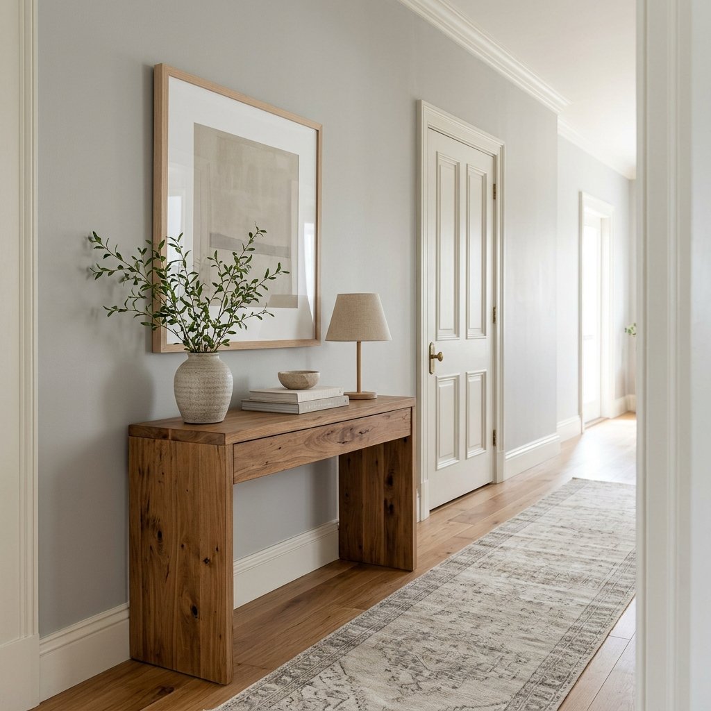
What Colors Go With Sherwin-Williams Grayish?
Because Grayish has a violet-gray character, coordinating colors should be chosen intentionally.
Here are several directions worth exploring.
Cream
Cream can soften the room and add warmth.
Test the specific cream to make sure it doesn’t become excessively yellow beside the walls.
Charcoal
Charcoal adds depth without introducing a competing bright color.
Black
Black works well as a small contrast through lighting, hardware, furniture, and frames.
Walnut
Dark natural wood can ground Grayish beautifully.
Dusty Rose
A muted dusty rose can relate to the warmer violet side of the paint.
Plum or Aubergine
For a richer tonal palette, deep muted purple can reinforce Grayish’s undertone intentionally.
Muted Blue
Some subdued blues may work, although they can make Grayish’s warmer violet character more apparent by comparison.
Does Grayish Go With Green?
Green needs careful testing.
Green and violet can create noticeable contrast.
A muted gray-green may work very differently from a yellow-green or bright sage.
If you’re considering green upholstery, cabinetry, or decor, place the samples together before making a decision.
Don’t assume two muted colors automatically coordinate.
Does Grayish Go With Blue?
Potentially.
Muted blue can create a calm palette with Grayish.
But cooler blue may make Grayish look warmer or more violet by comparison.
This isn’t necessarily undesirable.
It depends on whether you like seeing that undertone.
Does Grayish Go With Beige?
Some beiges can work, but this combination requires attention to undertones.
A strongly yellow beige may make Grayish appear more violet.
A taupe-leaning beige may create a smoother relationship.
Again, samples are essential.
Does Grayish Go With Black?
Yes.
Black can provide crisp visual definition against soft gray walls.
Try it through:
- Light fixtures
- Frames
- Cabinet hardware
- Furniture legs
- Doors
Use black strategically rather than feeling obligated to repeat it on every surface.
Grayish With Cream and Wood
One of the easiest ways to make Grayish feel warmer is to layer it with natural materials.
Try:
Grayish walls + cream sofa + walnut furniture + warm neutral rug
The wood provides warmth.
The cream softens the gray.
And darker accents create enough contrast to keep the room from looking flat.
Sherwin-Williams Grayish vs. Agreeable Gray
Sherwin-Williams Agreeable Gray SW 7029 is a well-known warm greige.
Compared with Grayish, Agreeable Gray belongs more clearly in the warm gray-greige conversation.
Grayish has a different undertone profile and can show more violet influence.
If you’re deciding between them, compare the samples directly.
This can quickly reveal whether your room prefers a warmer greige or a violet-influenced gray.
Grayish vs. Repose Gray
Sherwin-Williams Repose Gray SW 7015 is another popular gray.
Although both colors are gray neutrals, they shouldn’t be considered interchangeable.
Place them next to:
- Flooring
- Trim
- Upholstery
- Stone
The differences become much easier to understand when the colors are compared within your room rather than on separate online photos.
Grayish vs. Popular Gray
Sherwin-Williams Popular Gray SW 6071 is another warm, nuanced neutral.
Both colors can reveal complex undertones, but their overall balance isn’t identical.
Comparing Grayish and Popular Gray can be useful if you’re trying to decide how much warmth or taupe character you want.
Don’t select between them based on the word “gray” in their names.
Grayish vs. Mindful Gray
Sherwin-Williams Mindful Gray SW 7016 provides another gray-neutral option to compare.
If Grayish appears too violet in your home, comparing it with a different gray family can help you identify the undertone your room actually needs.
This is one of the biggest benefits of side-by-side sampling.
The “wrong” color can help reveal why the right color works.
Grayish vs. Worldly Gray
Sherwin-Williams Worldly Gray SW 7043 belongs to the broader warm neutral category.
If you’re comparing it with Grayish, pay attention to which color relates more naturally to your fixed finishes.
Warm flooring may respond very differently to the two shades.
Is Sherwin-Williams Grayish Good for a Whole House?
Possibly.
But a whole-house color needs to survive several lighting conditions.
Test Grayish in:
- Bright living spaces
- Dark hallways
- Bedrooms
- Kitchen
- Stairwell
- Rooms facing different directions
The violet influence may be subtle in one area and much more visible in another.
You don’t have to use the same paint everywhere to create a cohesive home.
A coordinated palette can sometimes work better.
Grayish in North-Facing Rooms
North-facing rooms often receive cooler indirect light.
Grayish may feel cooler or more subdued under these conditions.
Its undertones may also become easier to notice.
If the room already feels cold, compare Grayish with warmer neutrals before deciding.
Grayish in South-Facing Rooms
South-facing light can add warmth and brightness.
This may soften the cooler characteristics of Grayish during parts of the day.
But strong sunlight can also make subtle undertones easier to distinguish.
Check the sample throughout the day.
Grayish in East-Facing Rooms
East-facing rooms receive stronger morning light and generally become less directly illuminated later.
Grayish may therefore appear warmer or brighter in the morning and more subdued later.
Evaluate it during the hours when you use the room most.
Grayish in West-Facing Rooms
West-facing rooms often become warmer in the afternoon and evening.
This warm light may change the balance of Grayish noticeably.
A sample you liked in the morning may look different at 5 p.m.
That’s normal.
The question is whether you like both versions.
Grayish in a Dark Room
Grayish won’t create light where none exists.
In a room with little natural light, it may appear deeper and moodier than expected.
You can either:
- Choose a lighter neutral
- Improve layered lighting
- Embrace the depth
There’s no rule that says a dark room must be painted white.
Grayish in a Small Room
Small rooms can absolutely handle gray.
If you want the space to feel light, pair Grayish with lighter furnishings and good lighting.
If you want a cozy atmosphere, lean into the color with deeper textiles and wood.
Room size should be only one consideration.
How Artificial Lighting Affects Grayish
Gray paint can shift noticeably after sunset.
Evaluate Grayish under your actual:
- Ceiling fixtures
- Lamps
- Vanity lighting
- Under-cabinet lighting
Artificial lighting can change how warm, cool, gray, or violet the walls appear.
Don’t finalize a paint color after looking at it only during daylight.
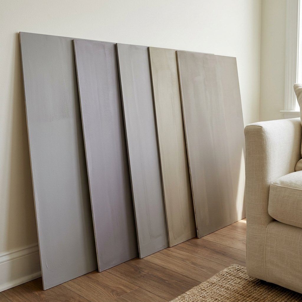
How to Test Sherwin-Williams Grayish
Grayish is a color I would definitely sample before committing.
Try this process:
- Get an accurate physical sample.
- Use a large sample area or sample board.
- View it vertically.
- Place it next to the flooring.
- Compare it with trim.
- Check it beside the sofa or bedding.
- Compare it with tile, stone, or countertops.
- Move it to different walls.
- Check morning, afternoon, and evening.
- View it under artificial lighting.
Don’t surround your sample with several unrelated test colors if you’re trying to judge it accurately.
Those colors can affect your perception.
A Simple Color Palette for Grayish
One possible palette could include:
Walls
Grayish-inspired soft violet-gray
Trim
Compatible soft white
Upholstery
Cream
Wood
Walnut or medium brown
Secondary Neutral
Taupe
Contrast
Charcoal or black
Accent
Dusty rose or another compatible muted shade
This creates a sophisticated palette without fighting the undertone.
How to Decorate With Grayish
If Grayish is already on your walls, work with its undertone rather than trying to hide it.
Add warmth with:
- Natural wood
- Cream textiles
- Brown leather
- Woven baskets
- Warm neutral rugs
Then create contrast with:
- Charcoal
- Black
- Deep brown
If you like the violet side, repeat it subtly in artwork, textiles, or accessories.
Repetition can make an undertone look intentional.
Common Mistakes With Sherwin-Williams Grayish
Assuming It’s a Neutral Gray
Grayish has undertones that matter.
Ignoring the Violet Influence
If you dislike purple undertones, sample carefully.
Pairing It With Strong Yellow-Beige Without Testing
The contrast may emphasize violet.
Assuming Gray Flooring Will Match
Different gray undertones can clash.
Choosing From a Screen
Digital color isn’t reliable enough for a final decision.
Testing a Tiny Sample
Large samples reveal undertones more clearly.
Ignoring the Trim
Trim can dramatically affect how Grayish appears.
Looking Only During the Day
Check the color at night too.
Choosing It Because You Like It in Someone Else’s House
Their lighting and finishes aren’t yours.
Painting Tips for Grayish
Once you’re confident in the color, proper preparation matters.
Depending on the existing surface:
- Clean the walls appropriately.
- Repair holes and damaged areas.
- Protect flooring, furniture, and trim.
- Prepare glossy or problematic surfaces as needed.
- Prime where required.
- Apply paint according to manufacturer instructions.
- Follow recommended drying and recoating times.
Choose a paint product and finish suitable for the room and surface.
Bathrooms, kitchens, trim, cabinetry, and general living-area walls may have different requirements.
Provide appropriate ventilation and use recommended protective equipment.
If you’re working in an older home, avoid sanding or disturbing questionable existing coatings until you’ve determined whether hazardous materials such as lead may be present and what safe procedures apply.
FAQ About Sherwin-Williams Grayish
What color is Sherwin-Williams Grayish?
Sherwin-Williams Grayish SW 6001 is a soft muted gray with a nuanced appearance that can show violet or purple influence.
What undertones does Sherwin-Williams Grayish have?
Grayish can show violet or purple undertones. Depending on lighting and surrounding finishes, these may occasionally read slightly pink or mauve.
Is Sherwin-Williams Grayish warm or cool?
Grayish is a complex neutral. Its violet influence makes it behave differently from both classic warm greiges and straightforward cool blue-grays, so evaluating it with your fixed finishes is more useful than relying solely on a warm/cool label.
Does Sherwin-Williams Grayish look purple?
It can. The violet undertone may be subtle in some rooms and more noticeable in others.
Does Grayish work with white cabinets?
It can when the undertones coordinate. Compare a large Grayish sample directly with the cabinet white before painting.
Does Grayish work with wood floors?
Potentially. Medium and darker brown woods may work nicely, while strongly golden or orange wood can emphasize Grayish’s violet character.
What colors go with Grayish?
Cream, taupe, charcoal, black, walnut, dusty rose, and other compatible muted colors are useful directions to explore.
Is Grayish a greige?
Grayish may show some taupe-like softness, but it isn’t a straightforward beige-heavy greige. Its violet-gray undertone is an important part of the color.
Is Grayish good for a bedroom?
It can be beautiful in a bedroom, especially with cream bedding, walnut or medium wood, taupe textiles, and darker neutral accents.
Should I sample Grayish before painting?
Yes. Large physical samples are especially important with complex gray colors because their undertones can change noticeably depending on light and surrounding materials.
Final Thoughts
Sherwin-Williams Grayish SW 6001 is much more nuanced than its simple name suggests.
Rather than a completely neutral gray, Grayish can reveal a soft violet or purple influence that changes with the room.
That complexity can make it sophisticated and interesting.
It can also make it the wrong gray if your flooring, tile, furniture, or personal preferences don’t work with violet undertones.
The best way to know is to test it.
Compare Grayish directly with your flooring.
Put it beside your trim.
Look at it next to the sofa, cabinets, countertops, tile, or fireplace.
Check it in the morning.
Check it again in the afternoon.
Then turn on the lights and look at it after dark.
If you still love the color—and its undertones work with the permanent finishes—Grayish can create a soft, sophisticated neutral backdrop with considerably more personality than a basic gray.