

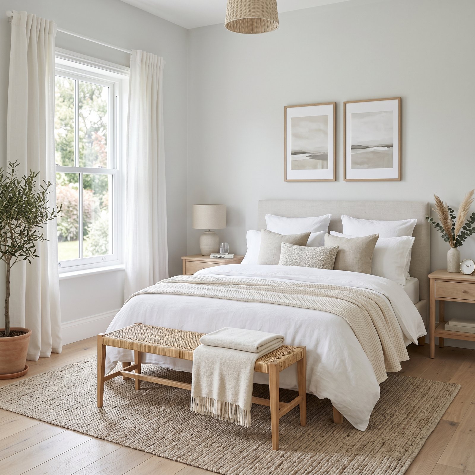
Gray paint is one of those decorating choices that looks simple until you start comparing samples. One gray can appear warm and almost beige in one room, while another can lean blue, green, or even violet depending on the light, flooring, furniture, and surrounding finishes.
That is why choosing the best gray paint colors for your home is less about finding one universally perfect shade and more about finding a gray whose undertones work with your space.
Gray can still be an incredibly useful neutral. It can create a soft backdrop in a living room, make cabinetry feel more sophisticated, add calm to a bedroom, or bring drama to an office or dining room. Current paint collections also span everything from very pale gray-whites to deep charcoals.
Below are 12 beautiful gray paint colors worth considering, including warm grays, cool grays, greiges, and darker options. Before committing to any of them, always sample the actual paint in your own room—screen colors and photographs are not reliable enough for a final decision.
Before Choosing a Gray Paint Color
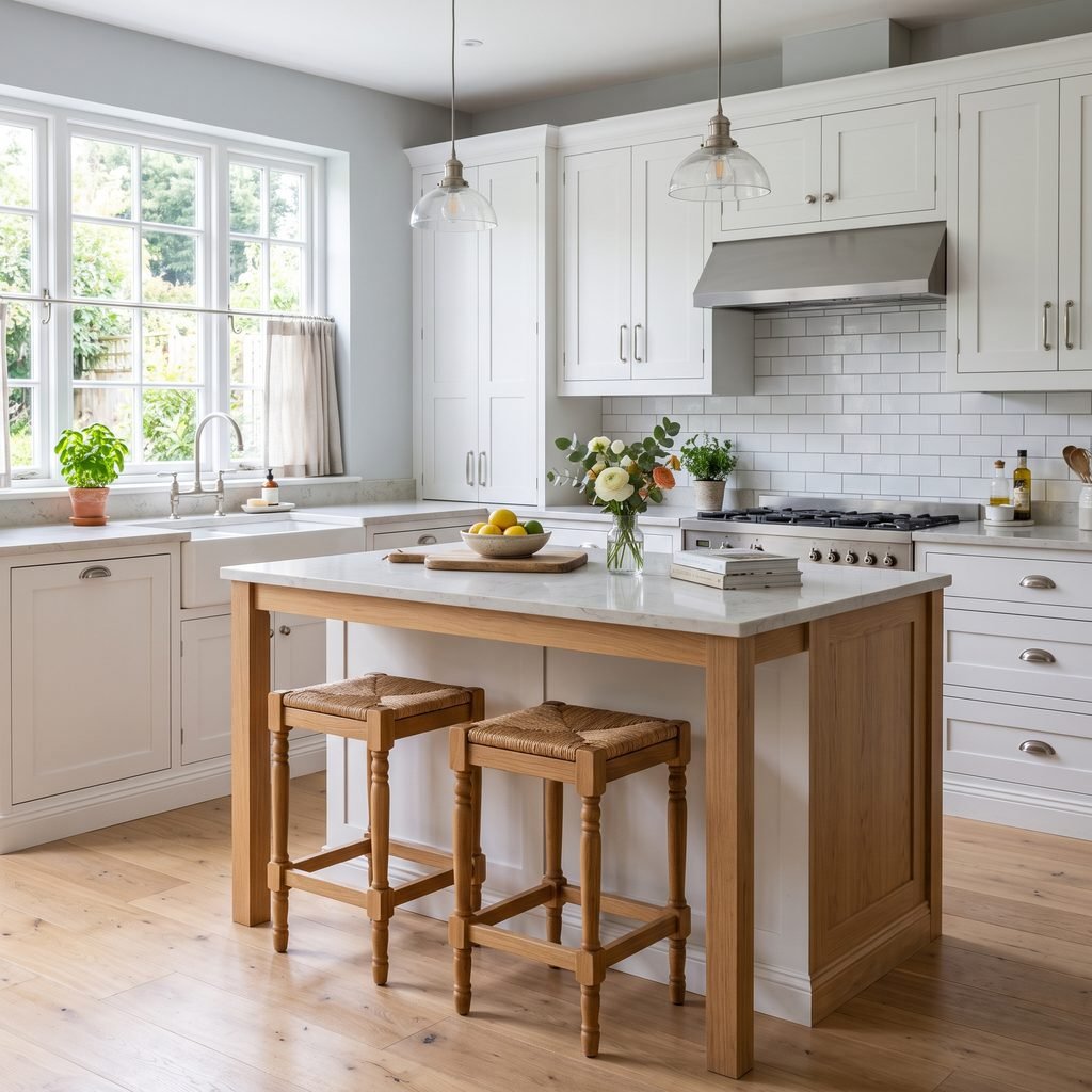
The biggest mistake people make with gray is assuming gray has no undertone.
Almost every gray leans somewhere.
You may notice hints of:
- Beige
- Brown
- Blue
- Green
- Violet
- Taupe
Those undertones become more noticeable next to flooring, countertops, tile, upholstery, and trim.
A gray that looks beautifully balanced in a paint store may look noticeably blue next to warm oak flooring. Another may suddenly look beige beside a crisp white kitchen.
Natural light matters too.
North-facing rooms often receive cooler light, which can emphasize cool undertones. Warm afternoon sunlight can make the same color look much softer and warmer.
That is why testing paint is worth the extra step.
Paint a generously sized sample—or use a manufacturer sample product—and look at it during the morning, afternoon, and evening before deciding.
1. Sherwin-Williams Agreeable Gray SW 7029
If you want a gray that leans warm rather than icy, Agreeable Gray SW 7029 is an excellent place to begin.
Sherwin-Williams describes Agreeable Gray as having a beige undertone that gives the color subtle warmth, and the company currently lists it among its trending colors.
That combination makes Agreeable Gray closer to a greige than a crisp blue-gray.
It can work particularly well in homes containing:
- Warm wood flooring
- Beige or cream upholstery
- Natural fibers
- Warm white trim
- Brown or taupe finishes
Because it has warmth, it can be easier to integrate into traditional, transitional, farmhouse-inspired, and relaxed contemporary interiors than some cooler grays.
However, do not assume it will always look beige. Lighting and surrounding colors can shift its appearance considerably.
Best for: Living rooms, bedrooms, hallways, open-concept spaces, and warm neutral interiors.
2. Sherwin-Williams Repose Gray SW 7015
Repose Gray SW 7015 is another widely used neutral from Sherwin-Williams.
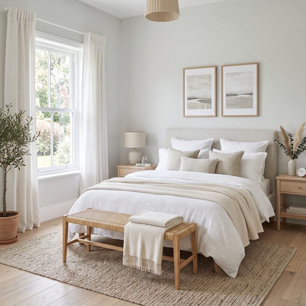
Sherwin-Williams describes Repose Gray as a light gray with a warm undertone that can still appear slightly cool, which is exactly why it can work in such a broad range of rooms.
Compared with warmer greiges, Repose Gray generally gives you more of a recognizable gray appearance without automatically feeling cold.
It can pair beautifully with:
- White trim
- Medium and dark wood
- Black hardware
- Neutral upholstery
- Muted greens
- Natural textures
It can be a good option when you want the walls to feel neutral but do not want them to disappear completely.
In some rooms, subtle undertones may become more noticeable, so testing is still important.
Best for: Living rooms, bedrooms, home offices, dining rooms, and whole-home neutral palettes.
3. Benjamin Moore Classic Gray OC-23
If you want something exceptionally light and understated, Benjamin Moore Classic Gray OC-23 deserves consideration.
Benjamin Moore includes Classic Gray among its most popular gray interior paint colors.
This is the type of gray to consider when a medium gray feels too heavy but plain white feels too stark.
A pale gray can provide just enough contrast against white trim to create subtle definition while keeping a room bright.
Classic Gray is particularly appealing for soft, quiet interiors where the goal is to create a neutral backdrop rather than make the wall color the main feature.
Pair it with materials such as:
- Light oak
- Warm white textiles
- Linen
- Natural stone
- Soft beige
- Muted green
Because extremely light neutrals can change dramatically depending on nearby finishes, compare your sample directly with your trim, cabinets, flooring, and countertops.
Best for: Bedrooms, living rooms, bright hallways, quiet neutral spaces, and rooms where you want an almost-white gray.
4. Benjamin Moore Gray Owl OC-52
Gray Owl OC-52 is another Benjamin Moore gray that consistently appears among the company’s popular gray options. Benjamin Moore also names Gray Owl as one of its recommended gray shades when discussing how to find the right gray.
Gray Owl works well for homeowners who prefer a fresher, slightly cooler gray rather than a beige-heavy greige.
Depending on the room, cooler undertones can become more apparent.
That makes Gray Owl particularly worth sampling if your home already contains cool elements such as:
- White marble
- Cool stone
- Silver-toned metals
- Blue accents
- Cool white cabinetry
It can create a clean, airy background without requiring stark white walls.
Avoid choosing it solely from an online photo. A gray that appears perfectly neutral beside one homeowner’s flooring may look noticeably different beside yours.
5. Benjamin Moore Stonington Gray HC-170
For a more recognizable, classic gray, consider Benjamin Moore Stonington Gray HC-170.
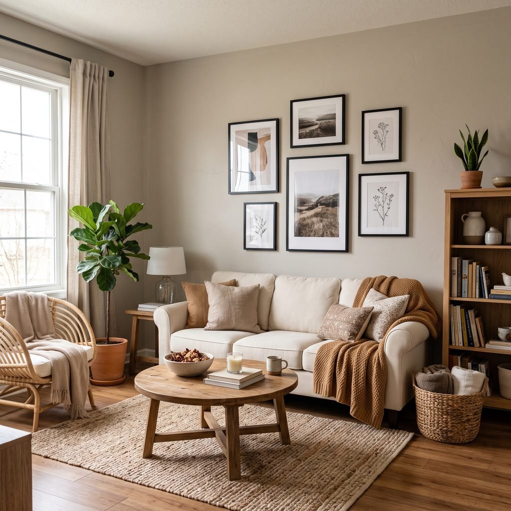
Benjamin Moore describes Stonington Gray as an all-purpose silvery gray with relatively neutral undertones and lists its LRV at 59.36.
LRV stands for Light Reflectance Value. In simple terms, it indicates how much light a color reflects compared with how much it absorbs.
Stonington Gray sits comfortably in the light-to-mid gray range, making it more substantial than an almost-white gray while still reflecting a good amount of light.
It works nicely with:
- Crisp white trim
- Black accents
- Charcoal
- Blue
- Silver-toned metals
- Light and medium woods
If you want a room to clearly read as gray rather than greige, Stonington Gray can be a useful sample to compare.
Best for: Bathrooms, bedrooms, offices, living rooms, and contemporary or transitional interiors.
6. Sherwin-Williams Light French Gray SW 0055
Light French Gray SW 0055 is worth considering when you want a cleaner gray that does not lean heavily toward beige.
Sherwin-Williams currently includes Light French Gray among its trending colors, and the company’s design guidance specifically references it as a lighter gray option.
This shade can create a classic, architectural appearance, particularly when paired with contrasting white trim.
Use it when you want:
- Gray walls that actually look gray
- A crisp neutral backdrop
- Contrast against white molding
- A calm foundation for black furniture
- A neutral for modern or transitional rooms
Because cleaner grays can feel cooler in certain lighting, sample this one carefully in north-facing or naturally dim rooms.
Adding warm wood furniture, woven textures, warm metals, or creamy textiles can help balance a cooler gray room.
Best for: Dining rooms, kitchens, offices, bedrooms, and homes with cooler finishes.
7. Sherwin-Williams Mindful Gray SW 7016
If very pale gray feels washed out, Mindful Gray SW 7016 offers a little more depth.
Sherwin-Williams currently includes Mindful Gray within its neutral palettes, including a collection of soothing warm grays.
This deeper neutral can work beautifully when you want walls to contribute more to the room rather than disappearing into the background.
Consider Mindful Gray alongside:
- Cream upholstery
- Wood furniture
- Black fixtures
- Warm white trim
- Leather
- Natural woven materials
Medium grays can be especially effective in rooms with plenty of daylight.
In darker spaces, however, the color may feel considerably deeper than it does on a small sample card.
Best for: Offices, dining rooms, bedrooms, cabinetry, and medium-to-large rooms with good light.
8. Sherwin-Williams Dorian Gray SW 7017
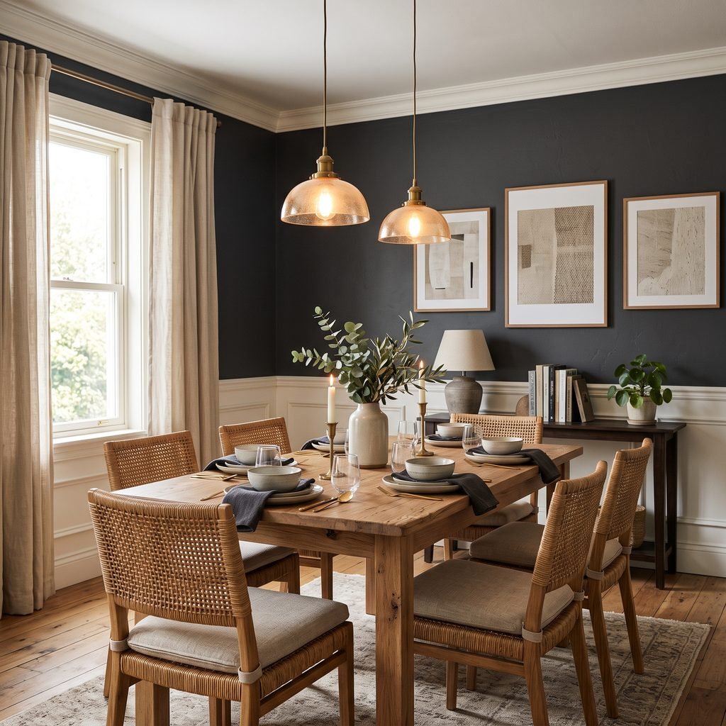
Dorian Gray SW 7017 is a warmer, deeper gray for homeowners who want something more grounded.
Sherwin-Williams describes Dorian Gray as a greige with brown undertones, making it useful where warm and cool tones need to coexist.
Those brown undertones can complement natural materials particularly well.
Try it alongside:
- Walnut or medium wood
- Leather furniture
- Cream walls
- Brass-toned accents
- Black metal
- Natural stone
Dorian Gray can be striking on walls, but it is also a useful cabinet or vanity color when you want more contrast.
In a small dark room, it may become quite moody, while good natural light can reveal more of its warmth.
9. Benjamin Moore Edgecomb Gray HC-173
If you’re torn between beige and gray, Benjamin Moore Edgecomb Gray HC-173 belongs on your sample list.
Benjamin Moore currently includes Edgecomb Gray among its most popular gray interior colors.
This is another option that sits comfortably in greige territory rather than behaving like a crisp, cool gray.
Warm greiges are useful when your home includes many natural or earthy materials.
Think:
- Oak flooring
- Cream stone
- Tan upholstery
- Wicker
- Linen
- Brown furniture
- Warm white cabinetry
A warmer neutral can often create a smoother transition between these finishes than a blue-based gray.
Edgecomb Gray is particularly attractive in relaxed, layered interiors where you want warmth without committing to obvious beige walls.
Best for: Open living areas, bedrooms, hallways, dining rooms, and homes with warm finishes.
10. Benjamin Moore Chelsea Gray HC-168
Sometimes the right gray is not light at all.
Chelsea Gray HC-168 is one of Benjamin Moore’s popular gray interior shades and provides significantly more visual weight than pale neutral grays.
A deeper gray can make a strong statement on:
- Bathroom vanities
- Kitchen islands
- Built-ins
- Interior doors
- Accent walls
- Offices
- Dining rooms
Deep colors often become particularly effective when surrounded by lighter finishes.
For example, dark gray cabinetry against creamy white walls and natural wood flooring can create substantial contrast without relying on black.
You can also use a deeper gray throughout a small room to create an intentionally cozy atmosphere rather than trying to make every compact space look larger.
Best for: Cabinetry, vanities, offices, dining rooms, accent areas, and dramatic interiors.
11. Sherwin-Williams Peppercorn SW 7674
For a charcoal gray with serious depth, consider Sherwin-Williams Peppercorn SW 7674.
Sherwin-Williams describes Peppercorn as a rich charcoal and recommends contrasting it with crisp white for a dramatic effect.
This is not the kind of color that quietly fades into the background.
Use it intentionally.
Peppercorn can work especially well on:
- Built-in bookcases
- Fireplace walls
- Kitchen islands
- Interior doors
- Powder rooms
- Home offices
- Bedroom feature walls
Pair it with warm wood if you want to soften the contrast.
With white and black furnishings, it can feel modern and graphic. With wood, leather, and brass-toned accents, it can feel warmer and more traditional.
12. Sherwin-Williams Dovetail SW 7018
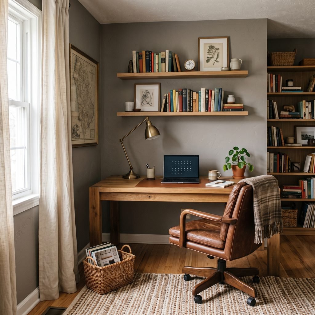
Dovetail SW 7018 is another strong choice when pale gray does not provide enough contrast.
Sherwin-Williams describes Dovetail as a darker gray with brown undertones and suggests pairing it with warm whites for an inviting monochromatic look.
The brown influence makes it particularly useful in homes with warm natural materials.
It can be a sophisticated choice for:
- Exterior accents
- Cabinetry
- Interior doors
- Fireplace surrounds
- Offices
- Bedroom walls
- Dining rooms
Because darker paint absorbs more light, consider the room’s natural and artificial lighting before painting every wall.
In some spaces, using Dovetail on built-ins or cabinetry may provide exactly the amount of depth you want without making the entire room dark.
Warm Gray vs. Cool Gray: Which Should You Choose?
This distinction matters more than the word “gray” printed on the paint chip.
Choose a Warm Gray or Greige If You Have:
- Warm oak flooring
- Cream or beige tile
- Brown furniture
- Warm white countertops
- Gold or brass-toned accents
- Warm stone
- Earthy textiles
Agreeable Gray, Edgecomb Gray, Dorian Gray, and similar warm neutrals may be easier to coordinate with these finishes.
Choose a Cooler or Cleaner Gray If You Have:
- Crisp white cabinetry
- White marble
- Cool stone
- Blue decor
- Chrome or nickel-toned finishes
- Black-and-white interiors
- Cooler flooring
Gray Owl, Stonington Gray, and Light French Gray are useful starting points to sample.
These are not rigid rules.
A room can successfully mix warm and cool materials. The goal is simply to avoid selecting a wall color that creates an unwanted undertone next to permanent finishes.
Best Light Gray Paint Colors
If you want a bright room without using plain white walls, start with lighter shades.
Three useful samples are:
- Benjamin Moore Classic Gray OC-23
- Benjamin Moore Gray Owl OC-52
- Sherwin-Williams Repose Gray SW 7015
Light gray works particularly well when you want furniture, artwork, cabinetry, or architectural details to receive more attention than the wall color.
A light gray can also provide gentle contrast against white trim that would disappear against white walls.
Best Warm Gray Paint Colors
Warm gray is often the easiest version of gray to incorporate into a home filled with beige, brown, wood, and cream.
Good options to sample include:
- Sherwin-Williams Agreeable Gray SW 7029
- Benjamin Moore Edgecomb Gray HC-173
- Sherwin-Williams Dorian Gray SW 7017
- Sherwin-Williams Mindful Gray SW 7016
Warm gray is particularly useful if traditional blue-gray paint feels too cold against your flooring.
The result can feel neutral without returning completely to beige.
Best Dark Gray Paint Colors
Dark gray can add architectural interest and contrast.
Consider:
- Benjamin Moore Chelsea Gray HC-168
- Sherwin-Williams Peppercorn SW 7674
- Sherwin-Williams Dovetail SW 7018
Use dark gray wherever you want the painted surface to feel intentional.
Cabinetry, vanities, doors, offices, dining rooms, and built-ins can all benefit from deeper paint colors.
Just make sure the room has enough lighting to support the look you want.
How Lighting Changes Gray Paint
Gray is particularly sensitive to lighting.
The same paint can look very different throughout the day.
North-Facing Rooms
North-facing light often feels cooler and can make cool grays appear even cooler.
If your sample suddenly looks blue, try comparing it with a warmer gray or greige.
South-Facing Rooms
South-facing rooms typically receive warmer, stronger daylight during much of the day.
That extra warmth can soften cooler grays and make warm grays feel even warmer.
East-Facing Rooms
Morning light can be warm and bright, while the room may become cooler later in the day.
Check your samples during both periods.
West-Facing Rooms
West-facing rooms can appear more neutral earlier and become significantly warmer as afternoon sunlight enters.
This is another reason not to choose a color after seeing it once.
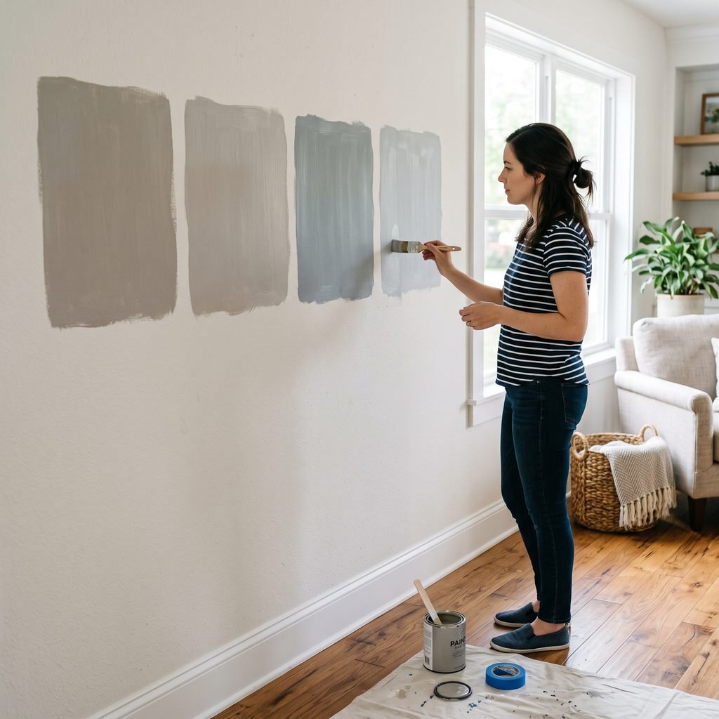
How to Test Gray Paint Before Painting the Room
Never choose gray using only a phone screen or tiny paint chip.
Digital displays vary, and paint manufacturers themselves warn that on-screen representations can differ from actual paint colors.
Instead:
- Choose three or four promising colors.
- Obtain actual paint samples or manufacturer sample products.
- Test a large enough area to understand the undertone.
- Compare the samples with flooring and permanent finishes.
- Look at them in morning light.
- Check again during afternoon light.
- Turn on your normal lamps and fixtures at night.
- Narrow your options only after seeing the colors under several conditions.
Do not compare twenty grays simultaneously.
Too many options make subtle differences harder to judge.
What White Trim Works With Gray Walls?
White trim can help define gray walls, but the undertone of the white still matters.
A cool gray may pair beautifully with a crisp white, while a warmer greige may look better beside a slightly softer white.
Sherwin-Williams’ own guidance, for example, suggests whites such as Pure White SW 7005 and Extra White SW 7006 with gray walls, while warmer taupe-leaning walls may work with warmer whites such as Alabaster SW 7008 or Creamy SW 7012.
Instead of choosing the trim color independently, place both samples side by side.
You want the combination to look intentional rather than having the white unexpectedly emphasize an undertone you dislike in the gray.
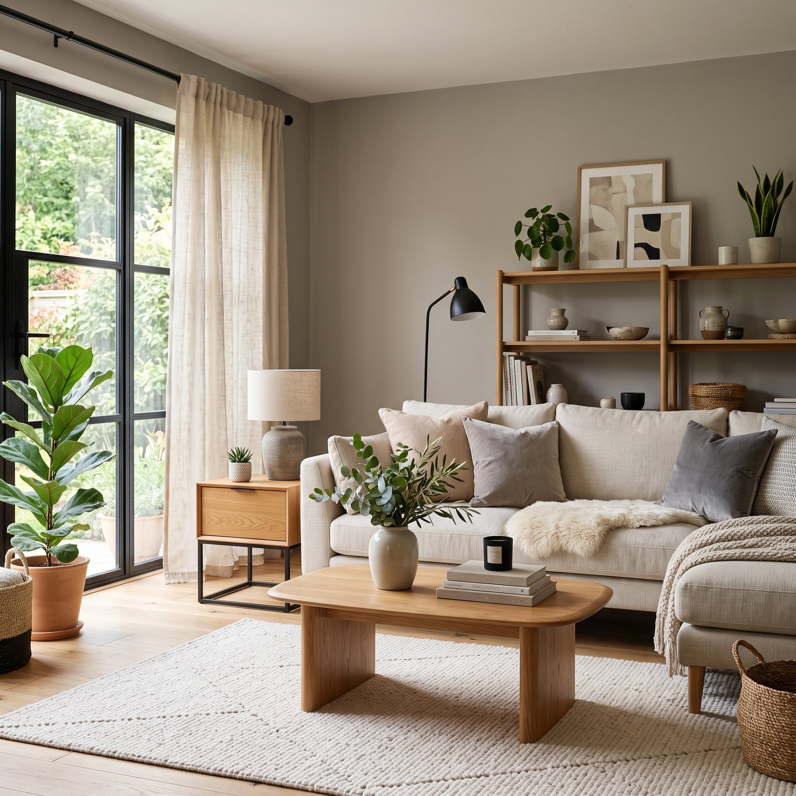
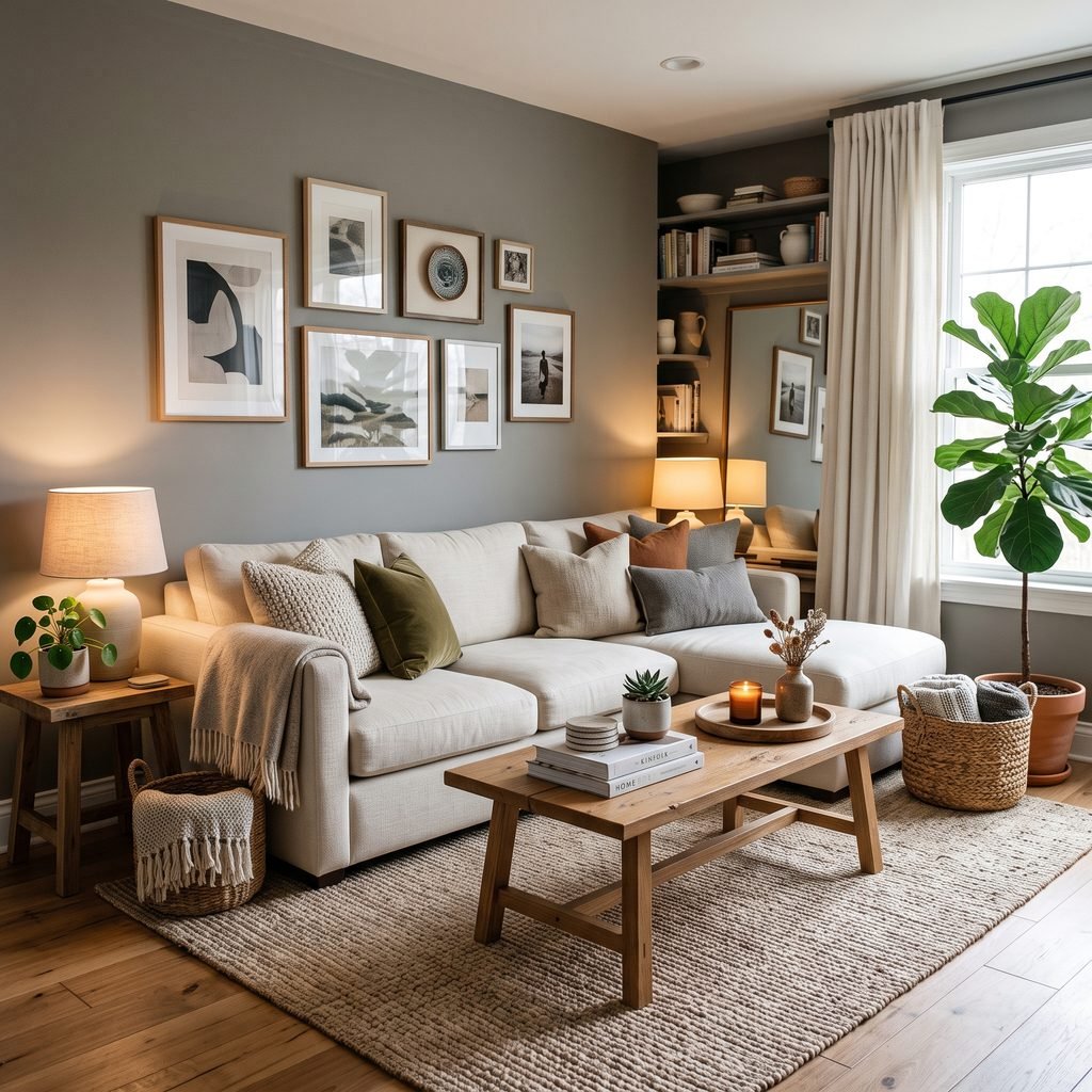
How to Keep Gray Rooms From Feeling Cold
If your gray walls look beautiful but the overall room feels too cool, you may not need to repaint.
Introduce warmer materials.
Try:
- Natural wood
- Woven baskets
- Linen curtains
- Cream upholstery
- Leather
- Warm-toned rugs
- Brass-toned accents
- Plants
- Warm lamps
Texture is particularly important.
A gray room filled only with smooth gray furniture and hard surfaces can feel flat. Layering wood, fabric, ceramics, rugs, and greenery gives the neutral backdrop more life.
Common Mistakes When Choosing Gray Paint
Choosing From an Online Photo
Photography, editing, screens, lighting, and surrounding furnishings all alter how paint appears.
Use online rooms for inspiration—not final color selection.
Ignoring Existing Flooring
The floor is one of the largest surfaces in the room.
Place your paint sample directly beside it before making a decision.
Comparing Gray Only Against White
A color can appear beautifully neutral next to a plain white card but shift dramatically beside your kitchen countertops or sofa.
Always test against real finishes.
Choosing a Gray That Is Too Dark for the Goal
Dark gray can be gorgeous, but make sure you actually want a moody room.
If your goal is bright and airy, choose a lighter color instead of hoping lighting will make dark paint behave like light paint.
Assuming Warm Gray Means Beige
Warm gray can still read clearly as gray. It simply contains warmer undertones that may make it easier to coordinate with wood and earthy finishes.
Painting the Entire House Before Sampling
Gray changes noticeably from room to room.
A whole-home neutral still needs testing in several spaces with different orientations and lighting conditions.
FAQ About Gray Paint Colors
What is a good warm gray paint color?
Sherwin-Williams Agreeable Gray SW 7029 is one option to sample. Sherwin-Williams describes it as having a beige undertone that creates subtle warmth.
What is a good true-looking gray paint?
No gray looks perfectly neutral in every room, but Benjamin Moore describes Stonington Gray HC-170 as a silvery gray with relatively neutral undertones. It can be a useful comparison color if you want something less beige.
What gray paint works with warm wood floors?
Start by sampling warmer grays and greiges such as Agreeable Gray, Edgecomb Gray, Dorian Gray, or Mindful Gray. Compare them directly with the wood because orange, red, yellow, and brown undertones vary dramatically between floors.
Are gray walls still a good decorating choice?
Gray remains a versatile neutral rather than one single decorating trend. Paint manufacturers continue to feature both warm and cool grays in their current palettes, including popular shades such as Agreeable Gray, Classic Gray, Gray Owl, and Stonington Gray. The key is choosing a gray that relates well to the permanent materials in your home rather than selecting one simply because it is popular.
What color furniture looks good with gray walls?
That depends on the gray, but common pairings include cream, white, tan, brown, black, muted green, blue, natural wood, and leather. Warm grays generally pair easily with earthy furnishings, while cooler grays work beautifully with crisp whites, blues, and cooler finishes.
Should gray paint be lighter or darker than the floor?
There is no universal rule. Contrast usually matters more than which surface is darker. A medium wood floor with lighter gray walls can feel airy, while dark gray walls with pale flooring can create a dramatic look.
Final Thoughts on the Best Gray Paint Colors for Your Home
The best gray paint colors for your home are the ones that work with your lighting, flooring, furniture, countertops, and other permanent finishes.
If you want warmth, start by sampling colors such as Agreeable Gray, Edgecomb Gray, Dorian Gray, or Mindful Gray.
For something lighter or cleaner, compare Classic Gray, Gray Owl, Stonington Gray, Repose Gray, and Light French Gray.
And if you’re ready for more drama, Chelsea Gray, Peppercorn, and Dovetail can add beautiful depth to cabinetry, offices, dining rooms, doors, and accent areas.
Most importantly, sample before committing.
Gray is remarkably responsive to its surroundings. The color that looks perfect in a photograph may behave completely differently in your room.
Once you’ve narrowed the choices to a few promising shades, compare them against your permanent finishes and observe them throughout the day. That extra testing can make the difference between a gray you tolerate and one that makes the entire room feel more cohesive.