

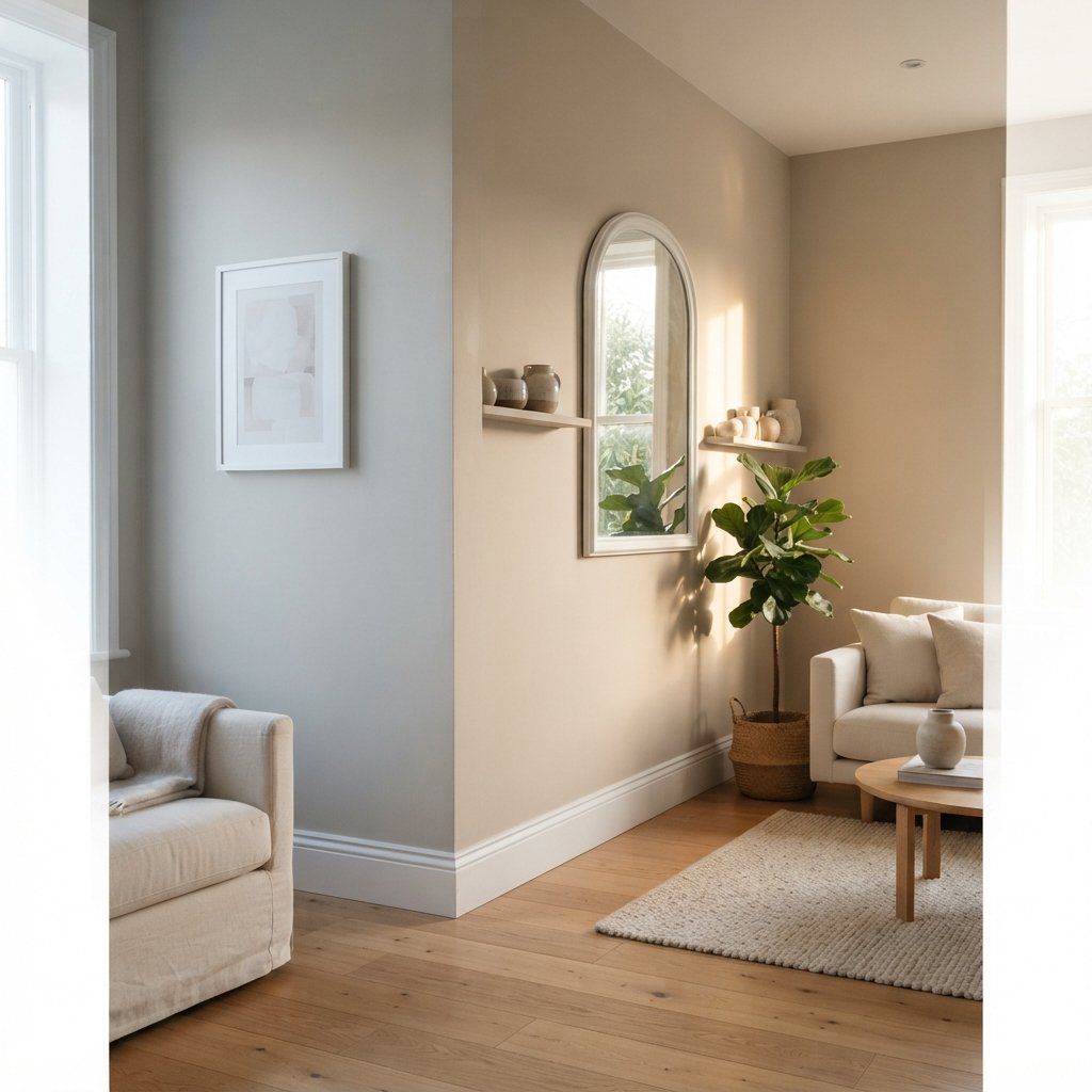
Have you ever picked a beautiful beige paint only to discover it looks pink on your wall? Or chosen a soft gray that suddenly looks blue, green, or purple once the room is painted?
That is usually where paint undertones enter the picture.
Learning how to find undertones in paint colors can make choosing wall paint much easier. Instead of looking at a color and simply deciding that it is “gray,” “white,” or “beige,” you start noticing the quieter colors influencing it.
A gray may lean blue, green, violet, or warmer. A beige may have yellow, pink, peach, or other warm influences. Even white paint can shift noticeably depending on its undertone, the surrounding finishes, and the light in the room.
The challenging part is that undertones are not always obvious on a small paint chip.
Fortunately, you do not need to become a professional color expert to spot them. Comparison, lighting, and your home’s fixed materials can reveal a surprising amount.
Here are 15 practical ways to identify paint undertones before committing to an entire room.

What Is an Undertone in Paint?
A paint color has the main color you immediately perceive and subtler color influences that affect how it appears.
For example, two paints may both look gray at first glance.
Place them next to each other, however, and one may suddenly appear slightly blue while the other looks warmer or greener.
That underlying influence is what people commonly mean when discussing an undertone.
This is particularly important with neutrals because their differences can be subtle.
Undertones often become much easier to notice when the paint is compared against another color.
Why Paint Undertones Matter
Undertones can determine whether a paint color works with the permanent materials already in your home.
Imagine a room with:
- Warm oak flooring
- Cream tile
- Beige stone
- Off-white cabinets
A cool blue-gray wall could create much stronger contrast with those materials than you expected.
That does not automatically make the combination wrong. Warm and cool colors can look beautiful together.
The important part is understanding the relationship before painting the entire room.
Once you know what a paint color is likely to do, you can decide whether that contrast is intentional.
1. Stop Looking at Paint Colors Individually
This is one of the most useful tricks for finding undertones.
Do not look at one gray by itself.
Compare it with several other grays.
Do not look at one white.
Compare it with other whites.
When colors are isolated, their subtle differences can disappear.
When you place them side by side, those differences become easier to see.
A white that looked perfectly neutral may suddenly look creamy beside a cleaner white.
A gray may reveal a blue or green influence beside a different gray.
Comparison gives your eyes context.
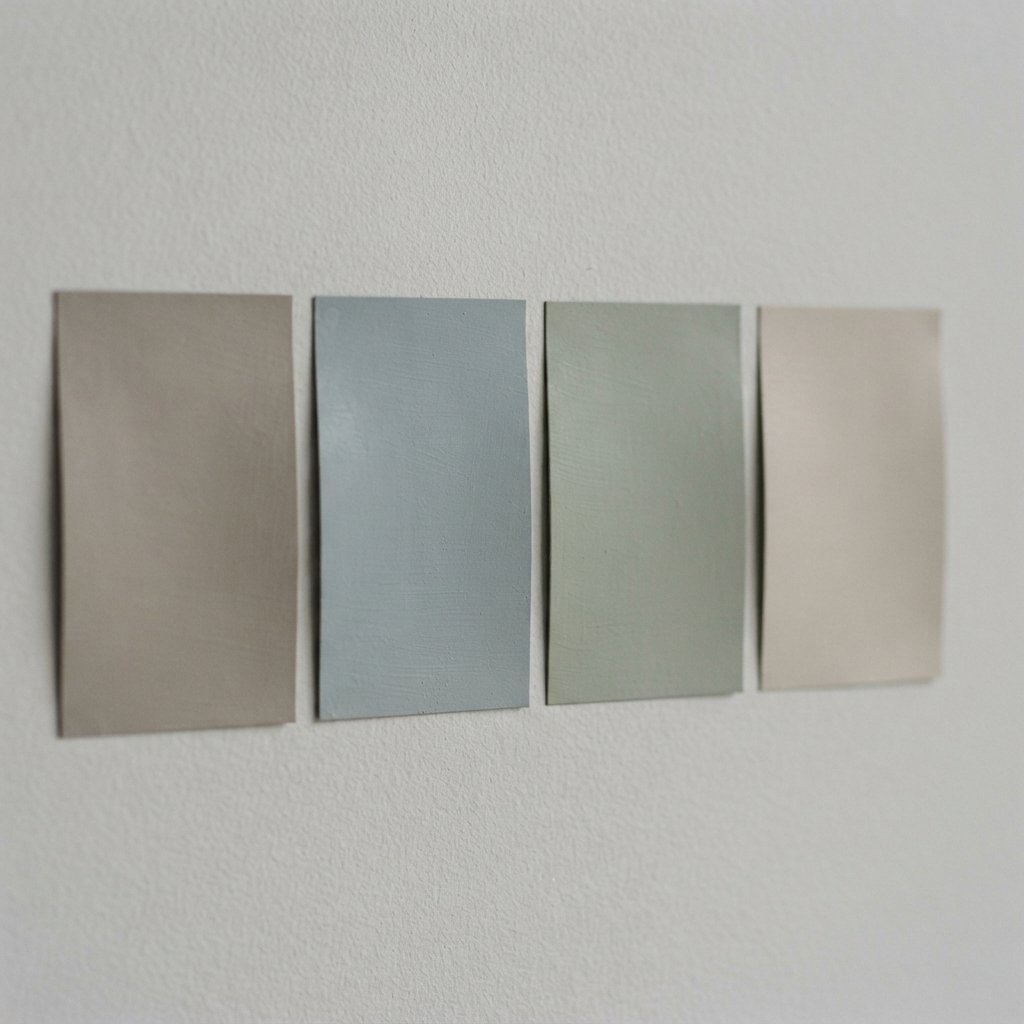
2. Compare the Color With a Known Neutral
If you are struggling to identify an undertone, compare the paint against something simpler.
A clean white sample can be particularly useful.
Place the paint beside the white and ask:
Does the color suddenly look more yellow?
More blue?
More green?
More pink?
More violet?
You are not necessarily looking for an exact answer immediately.
You are training your eye to notice the direction the color moves.
3. Compare Several Colors From the Same Family
Suppose you are considering beige.
Gather several beige samples and compare them together.
One may appear:
- More yellow
- More pink
- More peach
- More muted
- More gray
The same method works with white, gray, taupe, and greige.
The differences that were invisible on the paint display often become surprisingly clear once several samples are together.
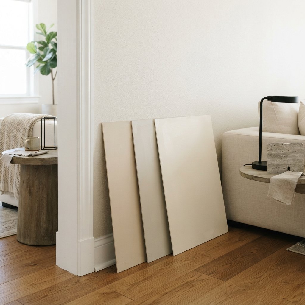
4. Look at Larger Paint Samples
Tiny paint chips are useful for narrowing down options, but larger samples make subtle color characteristics easier to evaluate.
Once you have a shortlist, look at a larger sample area.
The more surface area you see, the easier it is to understand how the color actually reads.
This is particularly helpful with very light neutrals.
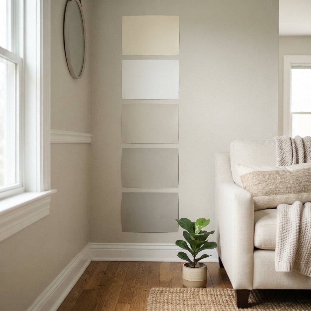
5. Look at the Darker Colors on a Paint Strip
When colors are arranged as part of a related progression, looking at deeper colors can sometimes help reveal the direction of the lighter shades.
A very pale color may seem almost neutral.
A darker related color may make its character easier to recognize.
Use this as one clue rather than assuming every paint collection or strip is organized identically.
The actual paint sample in your room remains more important.
6. Compare the Paint to Your Flooring
Flooring is one of the largest fixed surfaces in most rooms.
It should be part of your paint decision from the beginning.
Place your sample close to the floor and look at the relationship.
With wood flooring, notice whether the wood appears:
- Golden
- Orange
- Red
- Brown
- Gray
- Neutral
Then observe what happens to the paint beside it.
A paint color that seemed neutral may suddenly look cooler when placed near warm wood.
That does not mean you cannot use it.
It means you should decide whether you like the contrast.
7. Compare Paint With Countertops and Stone
Countertops and stone can contain several colors at once.
Look closely at:
- Countertops
- Fireplace stone
- Marble
- Quartz
- Tile
Instead of focusing only on the overall color, notice the veining, flecks, and background tone.
If your countertop has a creamy background with warm beige veining, a very cool wall color may create a noticeably different relationship than a warmer neutral.
Bring the paint sample directly to the material whenever possible.
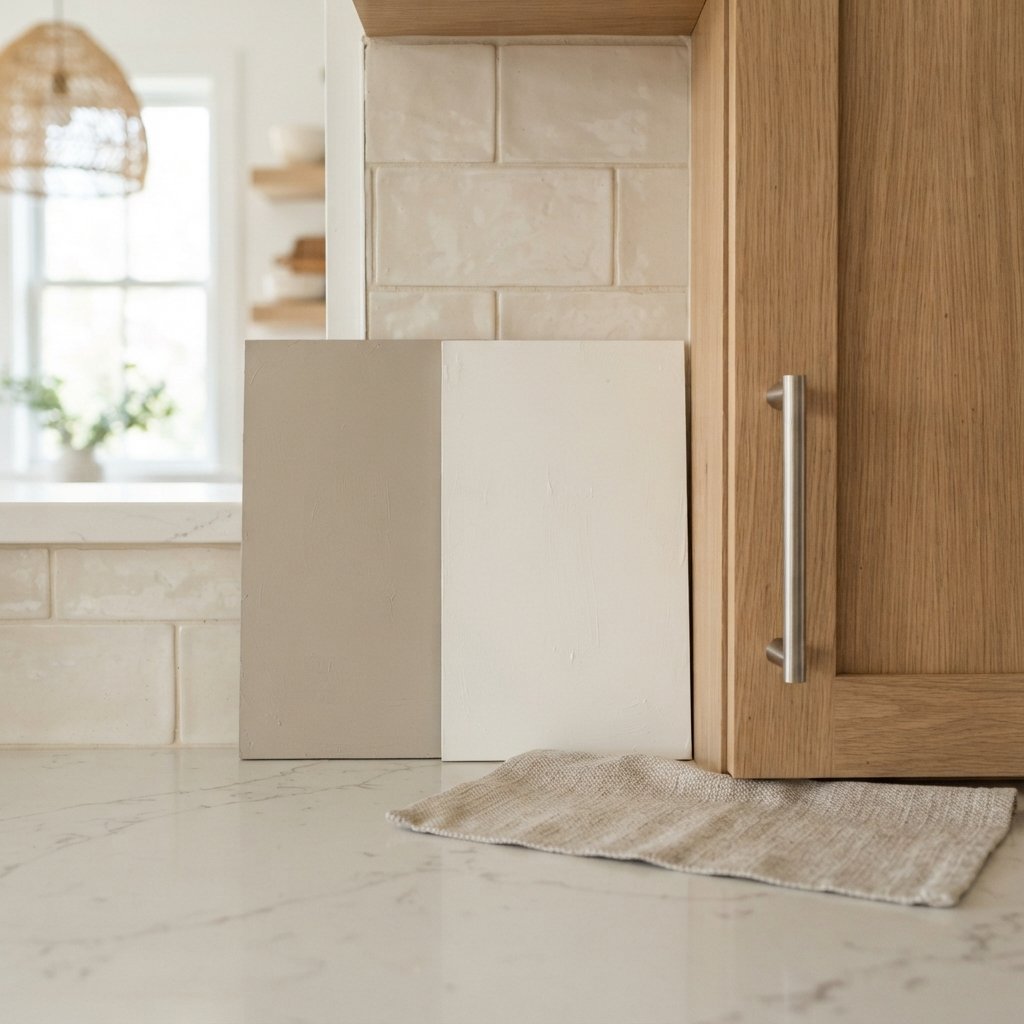
8. Look at Paint in Natural Daylight
Natural light can reveal color characteristics that are difficult to see under store lighting.
Take your samples home.
Look at them near the room where you plan to use the paint.
Evaluate them in natural daylight without relying solely on overhead lights.
Then check them again later.
Paint is highly responsive to its environment, and the color you saw at the store is not necessarily what you will perceive in your home.
9. Check the Color at Different Times of Day
Never judge paint at one moment.
Look at your sample:
- In the morning
- Around midday
- In the afternoon
- In the evening
- After dark with lights on
A neutral can appear dramatically different throughout the day.
The goal is not necessarily to find a paint that looks identical at all times.
Most colors will shift.
The goal is finding one whose different appearances you still like.
10. Consider the Direction of the Windows
Room orientation affects the quality of natural light entering a space.
A room with cooler natural light may emphasize cool characteristics in a paint color.
Warmer sunlight may make the same color feel softer or warmer.
This is one reason the exact same paint can look different in two rooms of the same house.
Do not assume that because a color worked in your friend’s living room—or even your own kitchen—it will look identical in your bedroom.
11. Check Your Artificial Lighting
Your paint color still needs to look good after sunset.
Artificial lighting can significantly change how colors appear.
Warmer lighting may make some colors feel creamier or more golden.
Cooler lighting may emphasize blue or gray qualities.
Evaluate the paint under the actual lighting you plan to use.
If you intend to replace your lighting soon, it can be helpful to make that decision before finalizing wall paint.
12. Compare Paint With Your White Trim
White trim is one of the easiest ways to reveal a wall color’s undertone.
Place the sample directly beside:
- Baseboards
- Crown molding
- Door casing
- Cabinets
A beige may suddenly look much warmer.
A gray may become noticeably cooler.
A white wall paint may appear creamier than the white trim.
This is especially important when choosing white-on-white combinations.
Two whites that look nearly identical separately can appear very different once they touch.
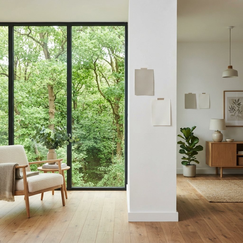
13. Pay Attention to Reflected Color
Sometimes what looks like a paint undertone is actually reflected color.
A room may contain:
- Green trees outside
- Red brick
- Colorful curtains
- Large rugs
- Wood floors
- Bright furniture
Light can bounce from these surfaces and influence how you perceive the wall.
If a white wall looks slightly green near a large window facing dense foliage, the paint itself may not be solely responsible.
Move the sample around the room before drawing conclusions.
14. Test Paint on More Than One Wall
One wall is not enough.
A wall facing the window receives light differently from a wall perpendicular to it.
A darker corner may make the paint look deeper.
Place large samples on multiple walls or use movable sample boards that you can reposition around the room.
Check areas:
- Near the window
- Across from the window
- Beside trim
- Near flooring
- In a darker corner
You are looking for the range of appearances the paint will have.
15. Test the Finalists in the Actual Room
Once you have narrowed the selection to two or three colors, stop trying to choose intellectually.
Test them.
Online photographs can help you discover colors, but they cannot tell you exactly how a paint will look in your house.
Screens vary.
Photography changes colors.
Editing changes colors.
And another person’s lighting and finishes are different from yours.
The final test should always happen in the room where the paint will actually be used.
How to Find Undertones in White Paint
White paint is often where undertones become especially frustrating.
Start by collecting several whites.
Compare them against one another.
You may notice one appears:
- Creamier
- Cleaner
- Cooler
- Warmer
- Slightly gray
- Slightly colored
Then compare your finalists with the permanent white surfaces in the room.
These might include:
- Kitchen cabinets
- Tile
- Countertops
- Trim
- Plumbing fixtures
The relationship between the whites matters more than whether a color is generally described as “warm white” or “cool white.”
How to Find Undertones in Gray Paint
Gray can be particularly tricky because it can shift toward several color families.
When comparing grays, you may notice influences that read as:
- Blue
- Green
- Violet
- Warmer gray
Place several gray samples side by side.
Then compare them against the flooring and other large materials.
If one gray suddenly looks blue beside another, you have learned something useful—even if you could not see that quality when viewing the sample alone.
How to Find Undertones in Beige Paint
Beige is not automatically neutral in every room.
Compare several beiges together and watch for warm influences such as:
- Yellow
- Pink
- Peach
Some beige colors can also feel more muted or grayed than others.
Warm fixed finishes can amplify or soften those characteristics.
Test the beige near flooring, stone, upholstery, and cabinetry.
How to Find Undertones in Greige Paint
Greige combines characteristics of gray and beige, but different greiges can lean in very different directions.
One may appear mostly gray.
Another may look distinctly beige.
Another may reveal a greenish, violet, or other subtle influence under certain conditions.
Comparison is especially important.
Place several greiges together, then compare the finalists against your fixed finishes.
Do not assume “greige” means universally compatible.
How to Tell if a Paint Color Is Warm or Cool
Start with comparison.
Warm colors often feel influenced by yellow, red, orange, or warmer beige characteristics.
Cool colors often move toward blue, green, violet, or cooler gray characteristics.
But temperature is relative.
A paint can look warm beside one color and cooler beside another.
That is why choosing paint based only on labels such as “warm gray” can be misleading.
Look at the actual relationship in your room.
The White Paper Trick
A clean white surface can help reveal subtle color differences.
Place a neutral paint sample against plain white.
The contrast may make the paint’s color direction easier to see.
This is useful when comparing:
- Whites
- Off-whites
- Beiges
- Grays
- Greiges
However, the white reference is only a diagnostic tool.
Your final decision should still be based on how the paint coordinates with the room.
The Comparison Trick
If you remember only one idea from this guide, make it this:
Undertones become easier to see through comparison.
If a gray looks completely neutral, put it beside other grays.
If a white looks neutral, put it beside warmer and cooler whites.
If a beige is confusing, compare it with several other beiges.
Your eye is much better at detecting differences than identifying subtle undertones in isolation.
How to Find Undertones in Paint Online
Online research is useful for narrowing your options.
You can look at:
- Manufacturer descriptions
- Color families
- Coordinating colors
- Designer examples
- Room photos
But treat these as research rather than proof.
Your screen cannot reliably reproduce an exact paint color.
Use online information to create a shortlist, then evaluate physical samples at home.
How to Use Coordinating Colors as Clues
Manufacturer-recommended coordinating colors can sometimes provide useful context.
For example, seeing whether a neutral is presented alongside warmer or cooler colors may help you understand the palette it was designed to complement.
But do not reverse-engineer an exact undertone solely from coordinating colors.
Use them as supporting information.
Physical comparison remains more reliable for your actual room.
How Fixed Finishes Affect Paint Undertones
Paint is one of the easiest parts of a room to change.
Flooring, countertops, tile, cabinetry, and stone are usually much more difficult or expensive to replace.
That means paint should generally respond to those materials—not the other way around.
Before choosing wall paint, identify the major fixed elements.
Lay your samples beside them.
You do not necessarily need every undertone to match perfectly.
You simply need the relationship to look intentional.
How Furniture Affects Paint Color
Furniture can also influence how a wall color appears.
A large cream sofa may emphasize the coolness of a gray wall.
A charcoal sofa may make that same gray look lighter.
A warm wood bed may bring out different characteristics than a painted white bed.
Large furnishings matter more than tiny accessories because they occupy more visual space.
If you already own the furniture, evaluate your paint samples beside it.
How to Choose Paint When Your Room Has Mixed Undertones
Real homes are rarely perfectly coordinated.
You might have:
- Warm wood floors
- Cooler countertop
- White cabinets
- Beige sofa
- Black hardware
Do not panic.
Look for the largest and most permanent surfaces first.
Then find a wall color that creates the most comfortable overall relationship.
You do not need to match every small object.
Accessories can help bridge warm and cool colors once the major palette is established.
Common Paint Undertone Mistakes
Choosing Paint at the Store
Store lighting is not your room lighting.
Looking at One Sample
Comparison makes undertones easier to identify.
Using a Tiny Chip as the Final Test
Move to larger samples once you have a shortlist.
Ignoring Flooring
Floors strongly influence the room palette.
Ignoring White Trim
White trim can expose undertones immediately.
Choosing From a Pinterest Photo Alone
Use photos for inspiration, not exact color prediction.
Testing Only During the Day
Check artificial lighting too.
Assuming Neutral Means No Undertone
Neutrals can still have noticeable color influences.
Trying to Match Everything
Aim for coordination rather than making every undertone identical.
Painting the Whole House Before Testing
A little extra sampling can prevent a very large repainting project.
A Simple Paint Undertone Testing Process
If color analysis feels overwhelming, use this process.
Step 1: Identify Fixed Finishes
Look at floors, countertops, cabinetry, tile, and stone.
Step 2: Collect Several Paint Options
Choose multiple candidates instead of one.
Step 3: Compare Them Together
Look for differences between the samples.
Step 4: Narrow the Selection
Remove colors that obviously conflict with major finishes.
Step 5: Use Larger Samples
Evaluate the finalists at a more realistic scale.
Step 6: Move Them Around
Look at samples on multiple walls.
Step 7: Check Them Throughout the Day
Include nighttime artificial lighting.
Step 8: Compare Against Trim
Make sure the wall and trim relationship works.
Step 9: Live With the Samples Briefly
Notice which color continues to work as the light changes.
Step 10: Choose Based on Your Room
Not the store, screen, trend, or someone else’s house.
How to Make Paint Sampling More Accurate
Keep the surroundings as realistic as possible.
If the room is currently filled with brightly colored moving boxes, temporary curtains, or construction materials, those colors may affect your perception.
Evaluate the sample near the finishes that will actually remain.
Also avoid holding one tiny sample directly against a dramatically different wall color and making an immediate decision.
Existing wall paint can influence how the new sample appears.
A larger movable sample can help you evaluate the color with more context.
Do Paint Undertones Change?
The paint formula does not simply develop a new undertone as the day progresses, but your perception of the color can change significantly because the lighting and surroundings change.
That distinction is useful.
Instead of asking, “Why did my gray turn blue?” ask:
“What in this room is making the blue quality more visible right now?”
It could be:
- Cooler daylight
- Artificial lighting
- Flooring
- Adjacent colors
- Reflected outdoor color
Understanding the cause makes paint selection less mysterious.
Can You Eliminate Paint Undertones?
You do not necessarily need to.
Undertones are part of color.
The goal is not finding a magical neutral with absolutely no color influence.
The goal is finding a color whose characteristics work with your home.
Sometimes a subtle green influence is exactly what helps a neutral connect to stone or wood.
Sometimes a warmer white makes a room feel softer.
Sometimes a crisp cool white creates the contrast you want.
Choose intentionally rather than chasing a theoretically perfect neutral.
FAQ About Finding Undertones in Paint Colors
What is the easiest way to see paint undertones?
Compare several similar colors side by side. Differences are often much easier to identify through comparison than by looking at one color alone.
How can I tell if gray paint has blue undertones?
Place it beside other gray samples and a clean neutral reference. If it consistently appears bluer by comparison, that is a useful clue. Then test it in your actual room.
How do you find undertones in white paint?
Compare multiple whites together and then place the finalists beside permanent white finishes such as trim, cabinetry, countertops, or tile.
Why does my paint look different at home?
Natural light, artificial lighting, flooring, furniture, surrounding wall colors, and reflected exterior colors can all change how you perceive paint.
Should paint undertones match flooring?
They do not have to match exactly. The colors simply need to create a relationship you like. Testing the paint directly beside the flooring is the easiest way to judge that relationship.
Why does gray paint look purple?
Some grays can have a violet influence that becomes more noticeable under particular lighting or beside other colors. Compare the gray with other samples and evaluate it throughout the day.
Can plants or trees outside change how wall paint looks?
They can affect perception through reflected light. Strong exterior colors, including greenery, brick, or nearby painted surfaces, may cast color into a room.
Should I choose paint from an online photo?
Use online photos for inspiration and narrowing your choices, but make the final decision using physical samples in your room.
Final Thoughts
Learning how to find undertones in paint colors becomes much easier once you stop trying to identify every color in isolation.
Compare similar paints side by side.
Look at them against a clean reference and, more importantly, against the permanent finishes in your home.
Check your flooring, countertops, cabinets, tile, stone, and white trim.
Then test larger samples on multiple walls and observe them throughout the day and under your actual artificial lighting.
Remember that a paint color does not exist by itself.
The colors surrounding it—and the light hitting it—affect how you perceive it.
Once you start using comparison instead of trying to guess an undertone from a tiny paint chip, choosing whites, grays, beiges, and greiges becomes much more manageable.
The goal is not to find a neutral with no undertones.
It is to find the paint color whose undertones work beautifully with the home you already have.