

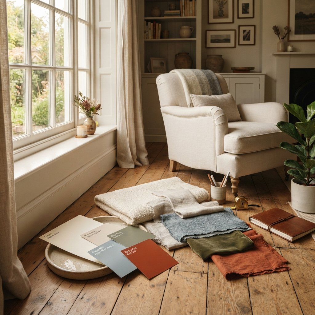
One of the easiest ways to make a room feel layered and inviting is to mix warm and cool colors.
The problem is that it can also feel intimidating.
Maybe you have a cool gray sofa but love warm wood furniture. Perhaps your floors have golden undertones, but you want to decorate with blue. Or you painted the walls a cool color and now the room feels colder than you expected.
The good news is that warm and cool colors do not have to match perfectly to look beautiful together.
In fact, rooms filled entirely with warm colors can sometimes feel heavy, while spaces dominated by cool colors may feel stark. Combining both creates contrast and balance.
Learning how to mix warm and cool colors in a room is less about following a rigid formula and more about understanding undertones, repetition, visual weight, and the fixed finishes already in your home.
You do not need to replace your floors because they are warm or get rid of a cool-colored sofa.
Instead, use those differences intentionally.
Here is how to combine warm and cool colors so your room feels cohesive rather than mismatched.
What Are Warm and Cool Colors?
Before mixing them, it helps to understand the basic difference.
Warm Colors
Warm colors are generally associated with red, orange, and yellow.
Examples include:
- Red
- Rust
- Terracotta
- Orange
- Mustard
- Golden yellow
- Warm beige
- Camel
- Caramel
- Many brown tones
Warm colors tend to visually bring energy and coziness into a room.
Cool Colors
Cool colors are generally associated with blue, green, and violet.
Examples include:
- Blue
- Navy
- Blue-gray
- Teal
- Some greens
- Lavender
- Cool gray
Cool colors can create a calm, fresh, or airy feeling.
But this is only the beginning.
Undertones make color considerably more nuanced.
Warm and Cool Undertones Matter
A color family is not automatically warm or cool in every variation.
Green is a good example.
A yellow-green or olive may read relatively warm.
A blue-green or eucalyptus shade can read cooler.
White can also lean warm or cool.
Warm whites often have creamy, yellow, beige, or subtle red undertones.
Cool whites may lean blue, gray, or sometimes green.
Gray can be warm or cool too.
That is why simply saying, “blue is cool and beige is warm,” is not enough when decorating a real room.
You need to compare the actual colors.
1. Start With the Room’s Fixed Finishes
Before choosing throw pillows or paint, look at the things that are difficult or expensive to change.
These may include:
- Flooring
- Fireplace stone
- Tile
- Countertops
- Built-in cabinetry
- Large furniture
- Exposed brick
Determine whether these finishes lean primarily warm or cool.
For example, honey oak flooring is visually warm.
If that flooring covers a large portion of the room, it already creates a substantial warm foundation.
You can introduce cooler colors without fighting the floor.
In fact, a muted blue can provide beautiful contrast against warm wood.
2. Let One Temperature Lead
A room can contain both warm and cool colors without using them equally.
Usually, it helps to let one temperature dominate.
For example:
Warm-dominant room:
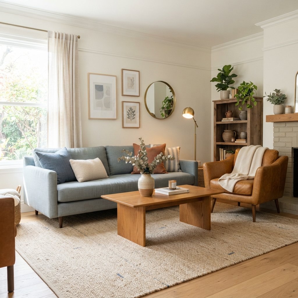
Cream walls + oak floors + beige sofa + blue accents.
Or:
Cool-dominant room:
Blue-gray walls + gray sofa + white curtains + warm wood and camel accents.
The smaller contrasting temperature creates interest without making the room feel divided.
This is often easier than trying to make the room exactly half warm and half cool.
3. Use Neutrals to Bridge the Two
Neutrals can act as visual connectors between warm and cool colors.
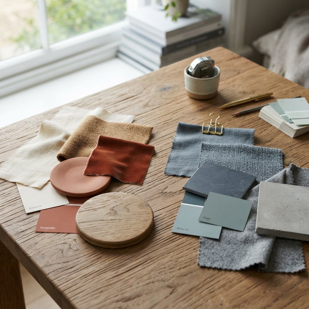
Useful bridging neutrals include:
- Warm white
- Soft greige
- Mushroom
- Taupe
- Natural linen
- Balanced beige
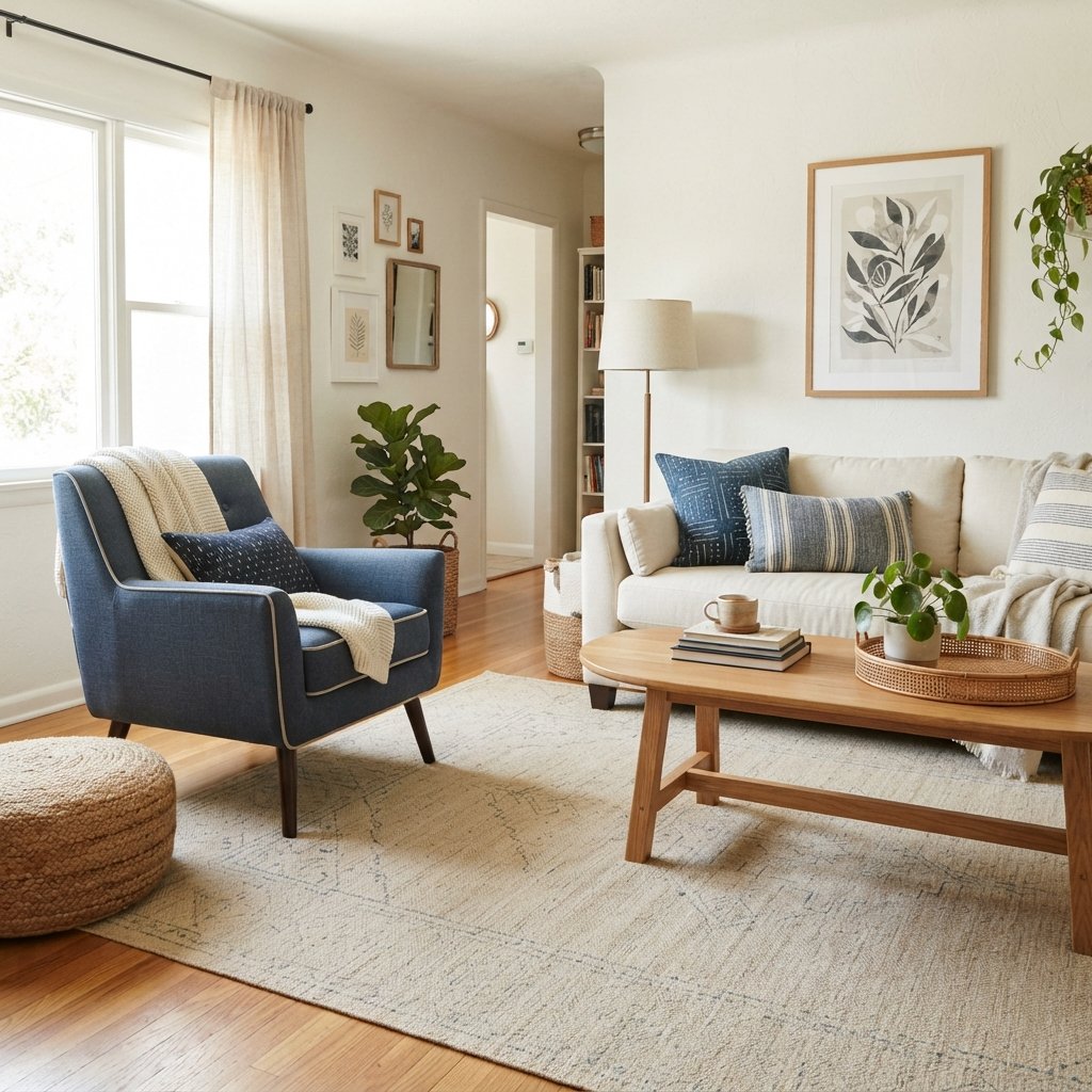
For example, imagine a room with a navy chair and a warm oak table.
A natural linen rug containing cream, beige, and subtle blue can help connect the two.
The neutral does not have to perfectly match either color.
It simply creates a visual transition.
4. Repeat Warm and Cool Colors Around the Room
One isolated color can look accidental.
Repeated color looks intentional.
If you have a cool blue chair, repeat blue somewhere else:
- Pillow
- Artwork
- Vase
- Rug
- Throw
If you introduce warm cognac leather, repeat similar warmth through:
- Wood
- Basket
- Picture frame
- Pillow
- Lamp
You do not need exact matches.
The goal is visual rhythm.
When your eye sees a color family several times around the room, it understands that the contrast is part of the design.
5. Mix Warm Wood With Cool Colors
Warm wood and cool colors are one of the easiest combinations to use successfully.
Warm oak, walnut, and other brown wood tones can look beautiful beside:
- Navy
- Dusty blue
- Slate
- Blue-gray
- Muted green
- Charcoal
The cool color provides contrast while the wood keeps the room from feeling cold.
This is particularly helpful if your home already has warm wood floors that you do not want to replace.
Rather than trying to neutralize the floors with more beige everywhere, use a cool accent color to create intentional contrast.
6. Use Warm Wood to Soften a Cool Room
The reverse strategy works too.
If your room already has cool gray walls, blue upholstery, or a lot of white, wood can introduce warmth.
Try:
- Wood coffee table
- Wood console
- Woven baskets
- Cane furniture
- Warm picture frames
Natural materials often bridge color temperatures beautifully because they introduce warmth through texture as well as color.
7. Combine Blue With Warm Brown
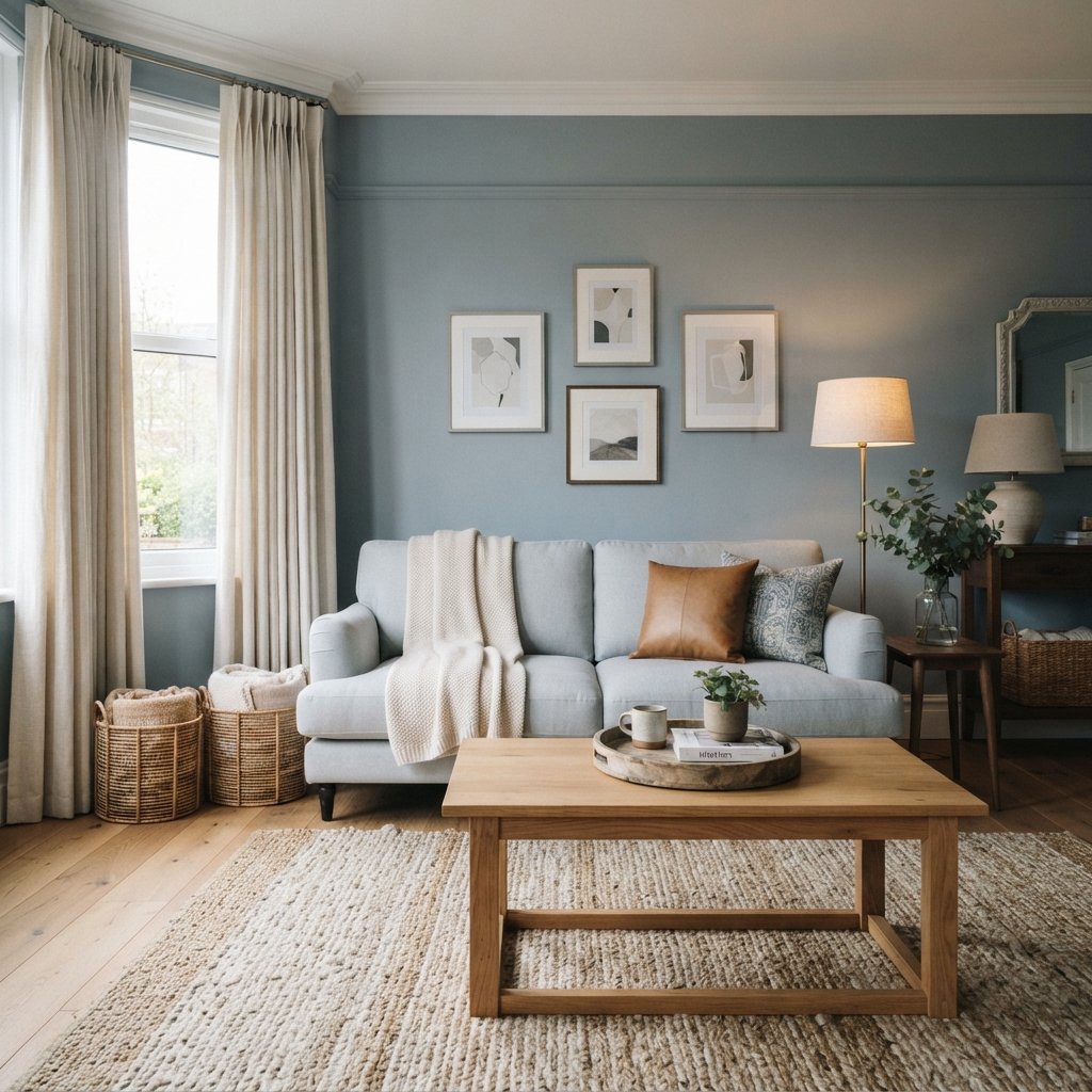
Blue and brown are a particularly useful warm-cool combination.
Try:
- Navy + cognac
- Dusty blue + warm oak
- Slate blue + camel
- Pale blue + walnut
Brown prevents blue from becoming overly cold, while blue keeps brown from feeling too heavy.
This combination can work in traditional, coastal, transitional, modern, and organic interiors.
8. Pair Green With Warm Neutrals
Green is especially versatile because its temperature changes dramatically depending on the shade.
Cooler greens can pair beautifully with:
- Camel
- Warm beige
- Walnut
- Terracotta
- Cream
Warmer olive greens can work with cooler grays and blue accents.
Always compare the actual green against your existing finishes rather than relying solely on its color name.
9. Add Terracotta to a Cool Palette
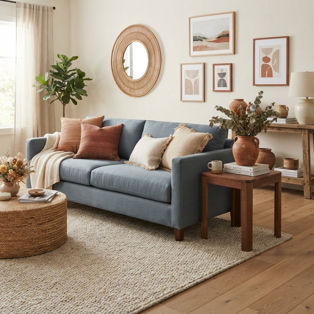
If a blue or gray room feels a little cold, terracotta can add warmth quickly.
You do not need much.
Try terracotta through:
- Throw pillows
- Pottery
- Artwork
- Blanket
- Small decorative object
Muted rust can serve the same purpose.
These earthy orange-red colors sit opposite blue on the color wheel, which helps explain why the combination can create strong, appealing contrast.
10. Use Textiles to Blend Color Temperatures
Rugs, pillows, curtains, and upholstery are some of the easiest tools for connecting warm and cool elements.
Look for textiles containing both.
For example, a rug might include:
- Cream
- Beige
- Muted blue
- Rust
That one piece now provides a color roadmap for the rest of the room.
You can pull blue from the rug for pillows and artwork, then repeat rust or camel through a chair or accessories.
A multicolored textile can make combinations that seemed unrelated suddenly feel connected.
11. Choose a Rug That Connects the Palette
The rug is particularly useful because it covers so much visual space.
Suppose your room has:
- Warm wood floors
- Cool gray sofa
- Cream walls
Choose a rug containing both warm and cool tones.
Maybe it has a beige base with faded gray-blue and rust details.
Now the sofa relates to the blue-gray in the rug, while the flooring relates to the beige and rust.
This is one of the easiest ways to solve a room with mixed undertones.
12. Use Throw Pillows as Small Color Bridges
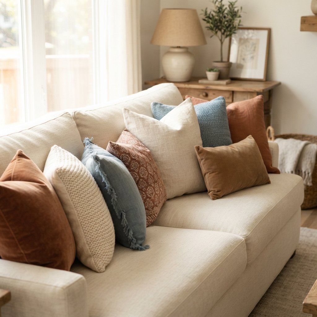
Throw pillows are an inexpensive way to experiment before making larger commitments.
Instead of buying five pillows in exactly the same shade, create a layered palette.
For example:
- Cream textured pillow
- Muted blue patterned pillow
- Camel velvet pillow
- Rust lumbar pillow
Now you have warm and cool tones connected through one small arrangement.
Repeat some of those colors elsewhere in the room.
13. Pay Attention to White Paint
White is not always neutral in the way people expect.
A very cool white next to warm beige, cream, and golden wood can sometimes create more contrast than intended.
Similarly, a very creamy white may look yellow beside icy blue-gray finishes.
Compare the white directly against:
- Flooring
- Cabinets
- Upholstery
- Countertops
- Tile
Paint a large sample and observe it at different times of day.
Do not choose white paint from a tiny swatch alone.
14. Be Careful When Mixing Beige and Gray
Beige and gray can absolutely work together.
The easiest approach is often to use a bridging color.
Greige and taupe naturally sit between many beige and gray families.
You can also use textiles containing both.
For example:
Warm beige sofa + gray-blue chair + greige rug.
Or:
Cool gray sofa + warm wood + taupe pillows.
The goal is not to force beige and gray to match.
It is to create enough repetition that both feel intentional.
15. Mix Metals Intentionally
Metal finishes also contribute to the overall warm-cool balance.
Warmer metals include:
- Brass
- Aged brass
- Copper
- Some bronze finishes
Cooler metals often include:
- Chrome
- Polished nickel
- Stainless steel
Black can work with either.
You can mix metal finishes, but repeat each finish rather than using every possible metal once.
For example, brass lighting and brass frames can bring warmth to a room with chrome or nickel hardware.
16. Use Black to Ground Warm and Cool Colors
Black is useful when a room contains several undertones.
A little black can add definition without requiring another warm or cool color.
Try black in:
- Picture frames
- Lamp bases
- Curtain rods
- Furniture legs
- Small accessories
You do not need much.
Repeated black accents can provide a visual structure that helps a mixed palette feel deliberate.
17. Pay Attention to Lighting
Lighting can completely change how warm and cool colors appear.
Natural light varies depending on:
- Window direction
- Time of day
- Weather
- Surrounding exterior surfaces
Artificial lighting also changes color perception.
That means a beige that looks perfectly neutral in a store may become much warmer at home.
A blue may become grayer.
A white may suddenly look creamy.
Always test important paint, fabric, and flooring colors in the actual room.
Look at them in both daylight and artificial light.
Warm and Cool Colors in a Living Room
Living rooms usually contain several large surfaces, which makes them ideal for layering color temperatures.
Imagine:
- Warm oak floor
- Cream sofa
- Navy chair
- Beige-and-blue rug
- Walnut coffee table
- Rust pillows
The warm elements prevent the blue from feeling cold.
The blue prevents all the brown and beige from feeling flat.
Neither temperature needs to win completely.
Warm and Cool Colors in a Bedroom
Bedrooms often benefit from softer contrast.
Try:
Warm version:
Cream walls + warm wood bed + blue-gray bedding.
Or:
Cool version:
Muted blue walls + white bedding + oak nightstands + camel pillows.
Keep the palette relatively restrained to maintain a restful feeling.
Warm and Cool Colors in a Kitchen
Kitchens often contain several fixed finishes with different undertones.
For example:
- Warm wood flooring
- White cabinets
- Cool stone countertop
- Stainless appliances
Instead of treating those differences as problems, repeat them.
Bring the warm floor upward through wood stools or cutting boards.
Repeat cooler countertop tones through backsplash or accessories.
Use wall color to help bridge the two.
Mixing Warm and Cool Colors With Wood Floors
Warm wood flooring does not mean the entire room has to use warm colors.
Cool blue, muted green, charcoal, and even some grays can provide beautiful contrast.
The key is making sure the cool color relates to something else in the room.
Likewise, cooler or gray-toned wood floors can benefit from warm upholstery, wood furniture, woven textures, and warmer neutrals.
How to Mix Warm and Cool Neutrals
This is where many rooms become tricky.
You may have:
- Warm beige
- Cool gray
- Warm white
- Taupe
- Brown
The easiest strategy is to create a progression instead of jumping abruptly from one extreme to another.
For example:
Cream → beige → taupe → gray-blue.
Taupe acts as the bridge.
Another approach is to use a patterned rug or fabric that contains several of the neutrals together.
Can You Mix Warm and Cool Whites?
Yes, but compare them carefully.
Two whites with dramatically different undertones can make one look unexpectedly yellow, gray, pink, or blue.
If you are combining multiple whites, look at them side by side in the actual space.
Sometimes a slight difference creates appealing depth.
Other times it looks like an accidental mismatch.
There is no substitute for sampling.
How to Fix a Room That Feels Too Warm
If a room contains lots of beige, brown, cream, and warm wood, it may need contrast.
Try adding:
- Blue
- Blue-gray
- Muted cool green
- Charcoal
- Crisp neutral accents
Start small.
A blue rug, artwork, or several pillows may be enough.
You do not necessarily need to repaint the entire room.
How to Fix a Room That Feels Too Cool
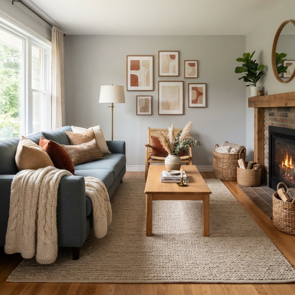
If the room contains gray, blue, white, and chrome and feels a little stark, add warmth through:
- Natural wood
- Camel
- Cognac
- Cream
- Terracotta
- Brass
- Woven fibers
Texture is particularly helpful.
A chunky cream throw, woven basket, wood table, and camel pillow can make a cool palette feel much more inviting without changing the main colors.
A Simple Formula for Mixing Warm and Cool Colors
When you are stuck, try this approach:
Step 1: Identify the Dominant Temperature
Is the room primarily warm or cool?
Step 2: Keep the Large Fixed Elements
Work with what you already own whenever possible.
Step 3: Introduce the Opposite Temperature
Add it through one meaningful element such as a chair, rug, or wall color.
Step 4: Find a Bridge
Use taupe, greige, cream, natural linen, or a multicolored textile.
Step 5: Repeat Both Temperatures
Scatter related colors around the room.
Step 6: Add Texture
Wood, linen, wool, baskets, stone, and other natural-looking textures can soften strong color contrasts.
Step 7: Sample Everything Together
Look at the complete palette in the actual room.
Common Mistakes When Mixing Warm and Cool Colors
Trying to Make Everything Match
A layered room needs variation.
Using One Cool Accent in an Otherwise Warm Room
Repeat it at least a few times so it looks intentional.
Ignoring Undertones
Not all grays, whites, blues, greens, or beiges behave the same way.
Buying Paint Before Considering Fixed Finishes
Start with the things you cannot easily change.
Using Too Many Unrelated Colors
Warm and cool does not mean every color in the rainbow.
Forgetting About Wood
Wood contributes significantly to the color palette.
Ignoring Lighting
Colors can shift dramatically throughout the day.
Choosing From Tiny Samples
Larger samples make undertones easier to see.
Making Everything Equally Dominant
Let one temperature lead and use the other for contrast.
FAQ About Mixing Warm and Cool Colors
Can you mix warm and cool colors in the same room?
Yes. Mixing warm and cool colors can create a more layered and balanced room. The key is repeating both temperatures and using neutrals or textiles to connect them.
Should a room be mostly warm or mostly cool?
It often helps to let one temperature dominate rather than splitting the palette evenly. Use the opposite temperature as contrast.
Can you mix cool gray with warm wood?
Yes. Warm wood can be an excellent way to soften cool gray. Repeat the wood’s warmth through other small elements such as camel textiles, baskets, or warm metals.
Can you use blue with warm wood floors?
Absolutely. Blue creates attractive contrast with many warm woods. Repeat the blue elsewhere so it feels intentional.
Can beige and gray go together?
Yes. Taupe, greige, natural linen, or a patterned textile containing both colors can help bridge beige and gray.
How do you warm up a cool-colored room?
Introduce natural wood, cream, camel, cognac, terracotta, woven textures, or warm metal accents.
How do you cool down a room with too much beige?
Try adding muted blue, blue-gray, cooler green, charcoal, or another restrained cool accent.
Can you mix warm and cool metals?
Yes. Repeat each metal finish in more than one place where possible so the mix feels intentional rather than random.
Final Thoughts
Learning how to mix warm and cool colors in a room can make decorating much easier because you no longer have to worry that every finish must have exactly the same undertone.
Your warm wood floors can work with a blue sofa.
Cool gray can sit beside cognac leather.
Cream can work with navy.
Terracotta can warm up blue.
And warm brass can add character to a room with cooler finishes.
The key is creating relationships between those colors.
Start with the fixed elements you already have. Decide whether the room leans warmer or cooler overall, then introduce the opposite temperature intentionally.
Use rugs, pillows, artwork, wood, and neutral colors to bridge the two.
Most importantly, repeat your colors.
When a warm or cool tone appears in several places, it stops looking like a mismatch and becomes part of the room’s palette.
You do not need a perfectly matched room.
A little temperature contrast may be exactly what makes the space feel finished, layered, and interesting.