

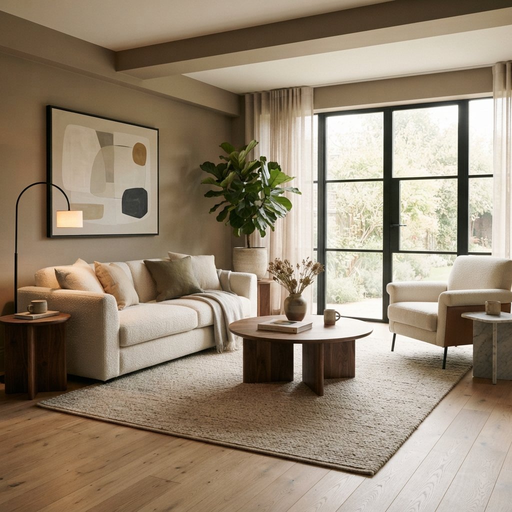
Choosing modern house colors can completely change the way your home feels.
A dated beige can become a warmer, more sophisticated neutral. A stark white room can feel softer with a creamy off-white. And a little sage, olive, muted blue, or charcoal can add personality without making your home feel overly trendy.
Modern color palettes have also moved beyond the idea that every contemporary home needs white walls, cool gray floors, and black accents. Warm neutrals, natural wood, earthy colors, and deeper statement shades can all feel fresh and current.
The trick is creating a palette that works with your home’s permanent finishes rather than choosing colors individually.
Whether you’re planning an entire house or updating one room at a time, these modern house colors can help you create a cohesive home that feels stylish now and adaptable in the years ahead.
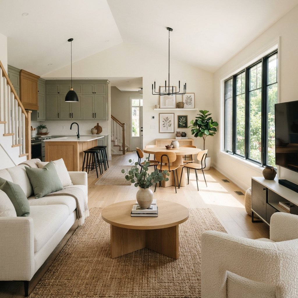
How to Choose Modern House Colors
Before choosing individual paint shades, look at what you already have.
Pay attention to permanent or expensive-to-replace elements such as:
- Flooring
- Kitchen cabinets
- Countertops
- Backsplash
- Fireplace materials
- Built-ins
- Large furniture
- Trim
These finishes create the foundation for your palette.
If your home has warm oak floors, cream stone, and beige upholstery, for example, a palette of warm white, mushroom, olive, and brown may feel more cohesive than a collection of icy grays.
If you have cooler stone, crisp white cabinetry, and blue accents, cooler neutrals may be easier to incorporate.
1. Warm White
Warm white is one of the easiest modern house colors to use throughout multiple rooms.
It creates a light background while providing a little more softness than a stark white.
Warm white works beautifully with:
- Natural oak
- Walnut
- Cream
- Beige
- Brown
- Sage
- Olive
- Black accents
It’s especially useful if your home has an open floor plan because it can provide continuity from one space to another.
Always sample whites carefully.
A warm white that’s perfect beside one floor may look too yellow beside another.
2. Soft Off-White
Off-white provides slightly more depth than a bright white.
It can be a good choice when you want walls to remain light but don’t want the interior to feel overly crisp.
Pair off-white with:
- Cream upholstery
- Light or medium wood
- Natural stone
- Muted green
- Black
For subtle contrast, use an off-white on the walls with a compatible lighter white on trim.
3. Cream
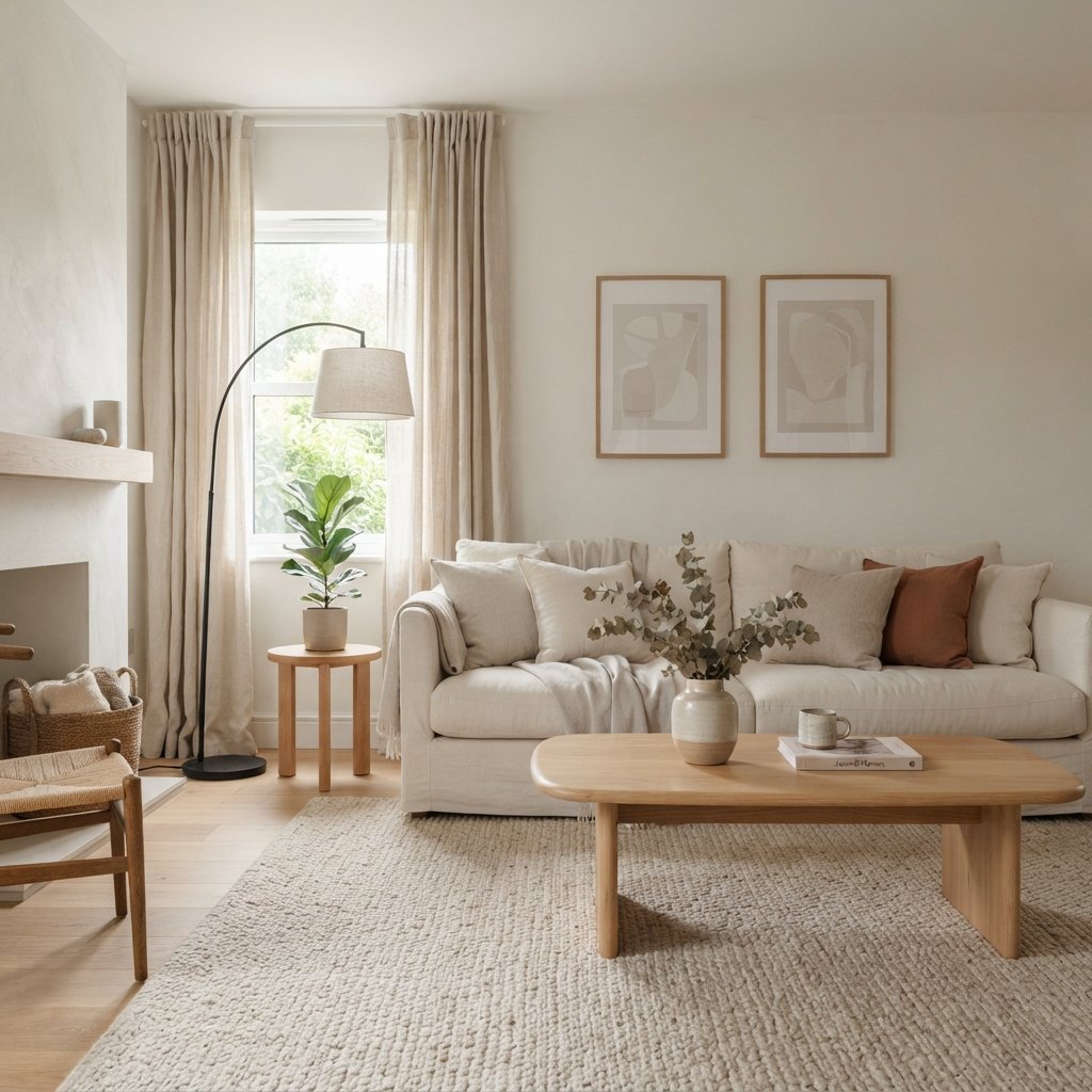
Cream is ideal for homes that need more warmth.
A soft cream can create a cozy backdrop without making the room feel dark.
It works particularly well with:
- Warm wood flooring
- Beige stone
- Brown leather
- Olive
- Terracotta
- Warm metal accents
The key is avoiding a cream that becomes more yellow than you want in your particular lighting.
Test it beside your flooring and trim.
4. Light Beige
Beige can feel extremely modern when used with contemporary furniture and natural materials.
Try combining light beige walls with:
- Cream furniture
- Medium wood
- Black accents
- Linen
- Woven textures
- Natural stone
Layering several related neutrals creates more dimension than trying to match every beige perfectly.
5. Pale Greige
Greige remains useful because it combines characteristics of gray and beige.
It can help bridge mixed finishes.
For example:
Warm wood floor + gray stone fireplace + cream sofa
may work beautifully with the right greige.
Some greiges are noticeably warm.
Others read primarily gray.
Choose according to your room rather than relying on the label.
6. Taupe
Taupe provides more depth than pale beige while remaining neutral.
Depending on the specific shade, it can have gray, brown, violet, or beige influences.
Taupe looks especially sophisticated with:
- Cream
- Dark wood
- Warm white
- Black
- Muted green
It can work in living rooms, bedrooms, dining rooms, hallways, and home offices.
7. Mushroom
Mushroom colors sit somewhere between taupe, beige, brown, and gray.
They’re an excellent choice when you want a neutral with noticeable depth but don’t want traditional gray.
Pair mushroom walls with:
- Cream
- Warm white
- Oak
- Walnut
- Olive
- Brown
This color family works especially well in organic modern and warm minimalist interiors.
8. Warm Gray
Gray hasn’t disappeared.
It’s simply no longer the only neutral option.
Warm gray can still be an excellent choice when it works with the permanent finishes.
Use it with:
- Natural wood
- Cream
- Black
- White
- Muted green
- Blue
If your home contains strongly warm materials, avoid choosing a gray that’s noticeably icy unless you intentionally want that contrast.
9. Sage Green
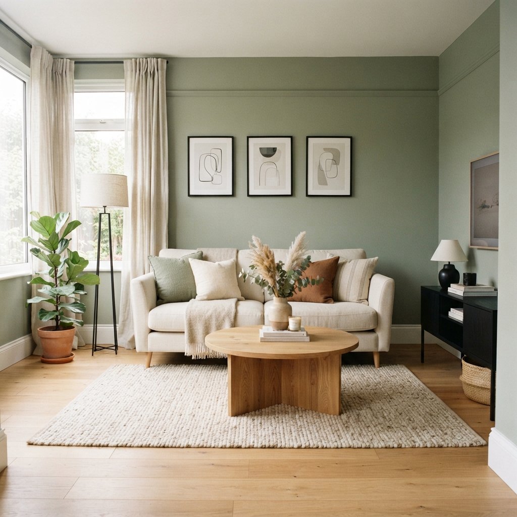
Sage has become a versatile decorating color because it adds personality without overwhelming a room.
It works almost like a neutral when the color is sufficiently muted.
Pair sage with:
- Warm white
- Cream
- Oak
- Walnut
- Brown
- Black
- Warm metal accents
Sage can work beautifully in kitchens, living rooms, bedrooms, bathrooms, and home offices.
10. Olive Green
Olive is deeper and warmer than sage.
It creates an earthy, grounded feeling.
Try olive with:
- Cream
- Brown leather
- Walnut
- Natural stone
- Warm white
- Black
It can be particularly effective in dining rooms, offices, and cozy living spaces.
11. Forest Green
For a more dramatic modern house color, consider deep forest green.
It can create a rich backdrop for lighter furniture and artwork.
Pair it with:
- Cream
- Light beige
- Walnut
- Oak
- Warm metals
Dark green can work in both large and small rooms.
A compact room doesn’t always need pale walls.
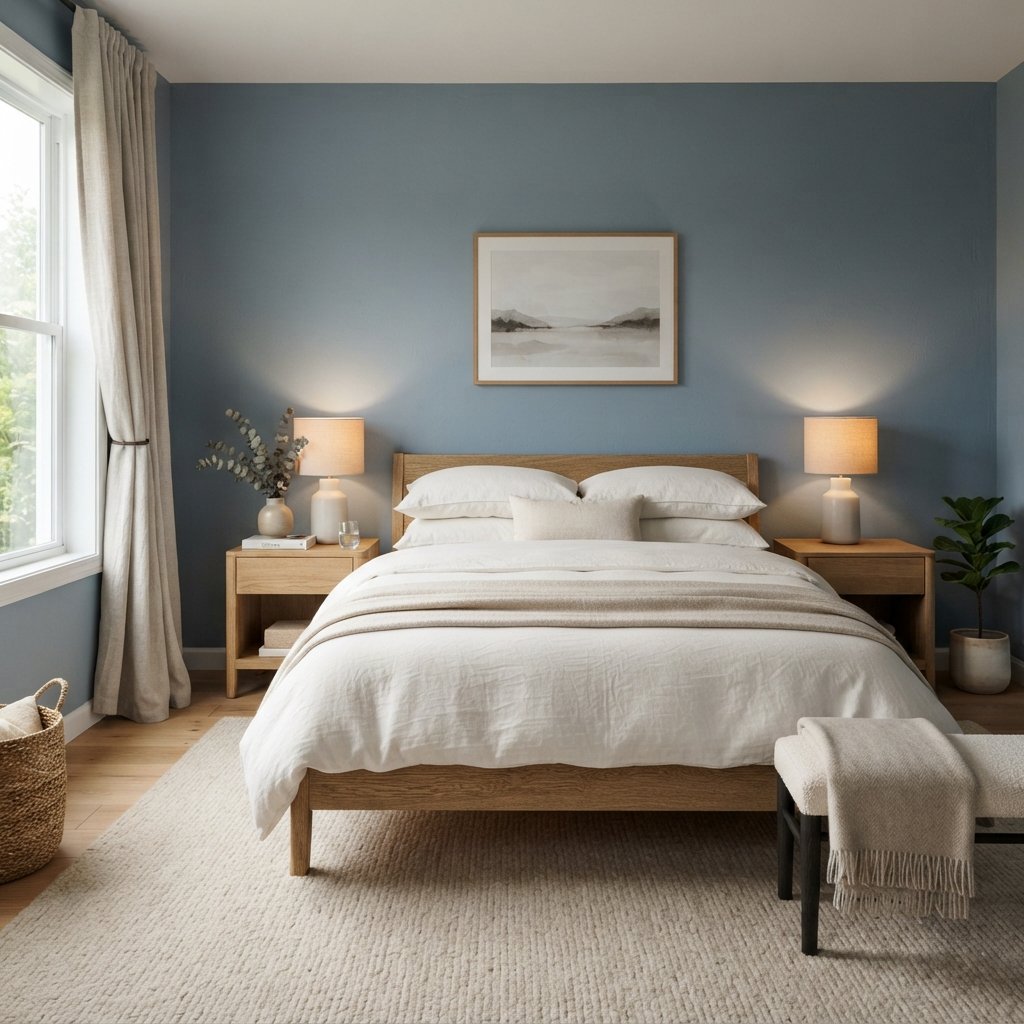
12. Muted Blue
A muted blue can make a modern home feel calm and relaxed.
Avoid highly saturated blue if you’re aiming for a quiet, sophisticated palette.
Try muted blue with:
- Cream
- Warm white
- Natural oak
- Walnut
- Brown
- Black
Warm wood is especially useful for balancing cooler blue tones.
13. Dusty Blue
Dusty blue offers a little more depth.
It can work beautifully in:
- Bedrooms
- Living rooms
- Bathrooms
- Home offices
Combine it with warm neutral textiles to keep the space from feeling too cool.
14. Navy
Navy creates a strong modern contrast while remaining easier to decorate around than some brighter colors.
Use it with:
- White
- Cream
- Camel
- Walnut
- Oak
- Warm metallic accents
Navy can work across all four walls or in a defined architectural area.
Good lighting becomes especially important when using deeper colors.
15. Warm Brown
Brown can create a beautiful contemporary interior.
Instead of automatically thinking of dark chocolate brown, consider:
- Cocoa
- Coffee
- Mushroom brown
- Earthy brown
Pair brown walls with cream upholstery and lighter textiles.
The result can feel warm and enveloping rather than dated.
16. Muted Terracotta
Terracotta brings an earthy warmth to a modern palette.
Choose a softened version if you want something easier to use throughout a room.
It coordinates beautifully with:
- Cream
- Warm white
- Olive
- Natural wood
- Black
Terracotta is particularly effective in dining rooms, bedrooms, and smaller accent spaces.
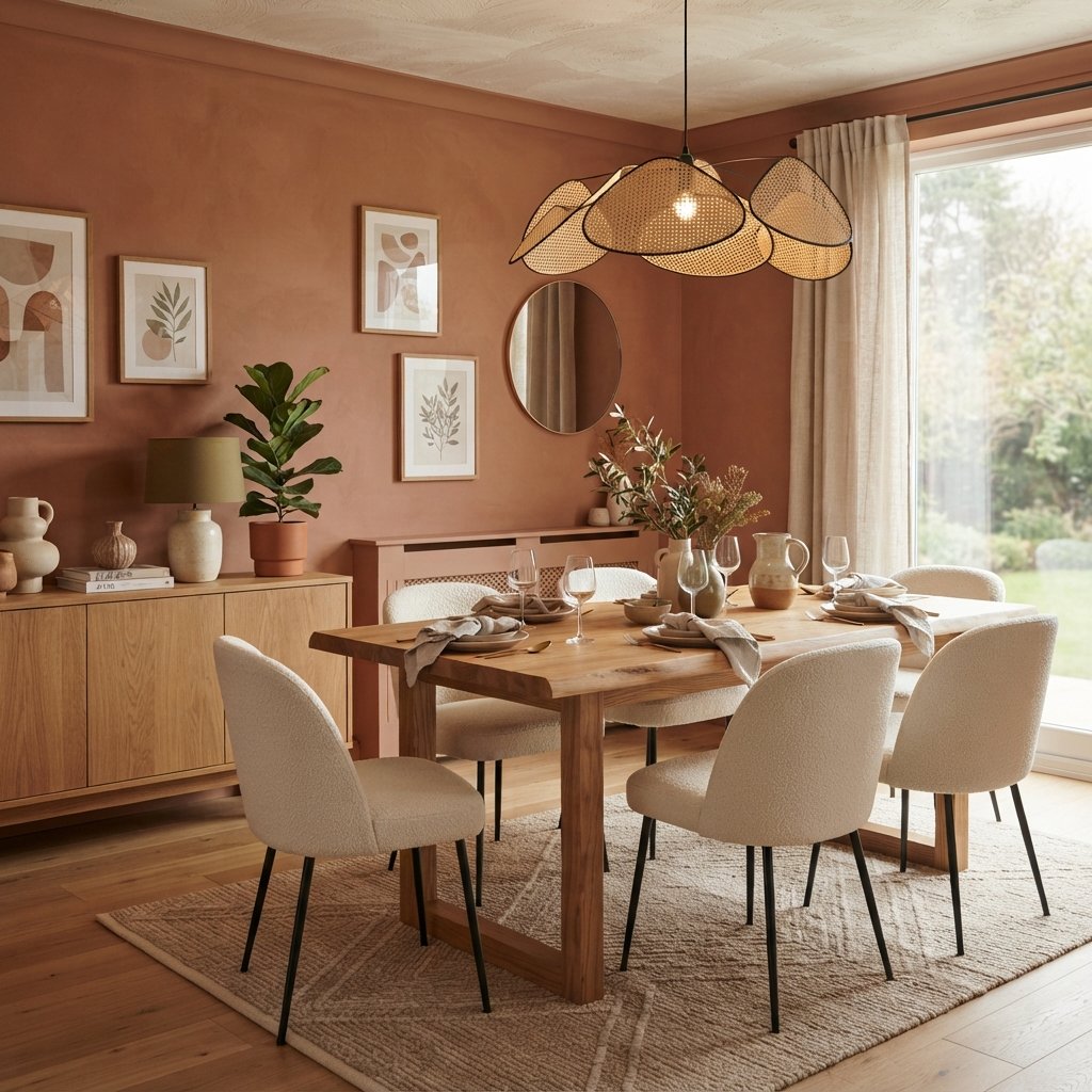
17. Soft Clay
Clay is often quieter than traditional terracotta.
Depending on the shade, it may contain brown, beige, peach, or muted red influences.
Clay walls can add warmth to rooms filled with:
- Natural wood
- Cream
- Linen
- Stone
- Green
It’s a good option if beige feels too safe but terracotta feels too strong.
18. Dusty Rose
Dusty rose or pink-beige can function almost like a neutral.
The key is choosing a muted, earthy shade rather than a bright pink.
Try it with:
- Walnut
- Cream
- Brown
- Burgundy
- Black
Dusty rose can work especially well in bedrooms, powder rooms, dining rooms, and offices.
19. Burgundy
For a richer palette, consider burgundy.
Deep muted red can add warmth and sophistication, particularly when used in a room with plenty of neutral elements.
Pair burgundy with:
- Cream
- Warm beige
- Walnut
- Brown
- Muted pink
It can also create a beautiful backdrop for artwork and vintage-inspired furniture.
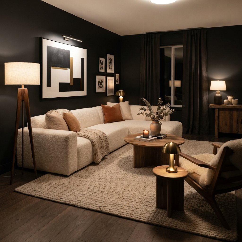
20. Charcoal
Charcoal gives you dramatic contrast without going all the way to black.
Use it with:
- Cream furniture
- Natural wood
- Light rugs
- Warm lighting
- White or off-white accents
Charcoal works especially well when repeated through smaller elements elsewhere in the home.
21. Soft Black
Soft black can create a striking, modern interior.
Instead of choosing the harshest black available, consider a nuanced off-black that relates to the other colors in your palette.
Pair it with:
- Cream
- Camel
- Natural oak
- Walnut
- Beige
- Warm lighting
The lighter elements provide enough contrast to keep the room from feeling visually flat.
Modern Whole-House Color Palette Ideas
Choosing one paint color is easier than choosing colors for an entire house.
The solution is to create a palette rather than treating every room as a separate project.
Palette 1: Warm Modern
Main color: Warm white
Secondary neutral: Light beige
Deeper neutral: Mushroom
Color: Olive
Contrast: Soft black
This combination works beautifully with natural wood.
Palette 2: Organic Modern
Main color: Cream
Secondary neutral: Taupe
Color: Sage
Deep color: Forest green
Warm accent: Terracotta
This creates an earthy, layered home.
Palette 3: Modern Coastal
Main color: Soft off-white
Secondary: Pale greige
Color: Muted blue
Deep color: Navy
Natural accent: Medium wood
Keep the blue muted to avoid creating an overly themed coastal look.
Palette 4: Moody Modern
Main neutral: Mushroom
Secondary: Warm beige
Color: Burgundy
Deep neutral: Charcoal
Light contrast: Cream
This palette can create a cozy, sophisticated interior.
Best Modern House Colors for the Living Room
Living rooms usually contain several large visual elements.
Consider your:
- Sofa
- Rug
- Flooring
- Fireplace
- Curtains
For a light modern living room, try:
- Warm white
- Off-white
- Beige
- Greige
- Taupe
For earthy color:
- Sage
- Olive
- Muted blue
For drama:
- Forest green
- Navy
- Charcoal
- Soft black
Best Modern House Colors for the Kitchen
Kitchen wall colors need to coordinate with cabinets and countertops.
Warm white, cream, beige, and greige create versatile backdrops.
For color, consider:
- Sage
- Olive
- Muted blue
- Deep green
If your cabinets are already colorful, a quieter wall color may allow them to remain the focal point.
Best Modern House Colors for Bedrooms
Bedrooms are an ideal place to introduce a slightly deeper color.
Consider:
- Mushroom
- Taupe
- Sage
- Dusty blue
- Olive
- Warm brown
- Deep green
A dark bedroom can feel cozy rather than small when the lighting and textiles are thoughtfully layered.
Best Modern House Colors for Bathrooms
Bathrooms can handle more color than many homeowners expect.
Try:
- Warm white
- Pale greige
- Taupe
- Sage
- Dusty blue
For drama, explore forest green, navy, or charcoal.
Coordinate paint carefully with tile and countertops because those fixed finishes can strongly influence undertones.
Modern House Colors With White Trim
White trim can create beautiful contrast, but the specific white matters.
Warm white trim usually coordinates naturally with warm beige, taupe, mushroom, and earthy colors.
Crisper whites may pair well with cooler gray and blue.
Put wall samples directly beside the existing trim.
If the trim suddenly appears yellow, pink, blue, or dingy, try another wall color.
Modern House Colors With Wood Floors
Wood flooring provides important warmth.
Light Oak
Try:
- Warm white
- Greige
- Beige
- Mushroom
- Sage
- Muted blue
Honey Oak
Consider warm white, cream, beige, and muted green.
Very cool gray may make the orange or yellow tones in the wood more noticeable.
Dark Wood
Light neutrals create contrast, while olive, navy, and deeper colors can produce a moodier effect.
Red-Toned Wood
Neutral walls may be easier if you don’t want to emphasize the wood’s red undertones.
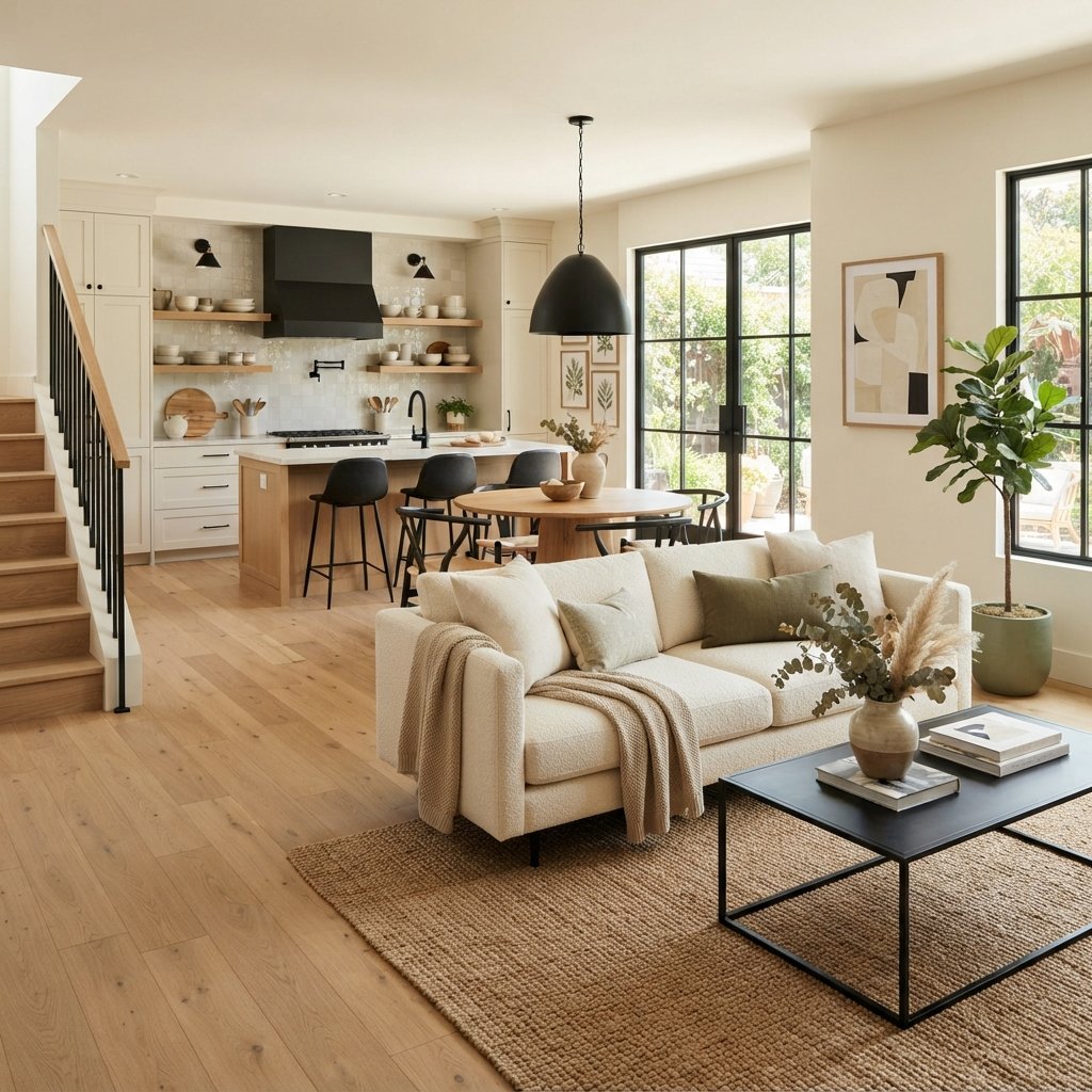
Modern House Colors With Black Accents
Black can help provide visual structure.
Use it selectively through:
- Window frames
- Lighting
- Hardware
- Furniture
- Doors
Pair black with warm white, beige, mushroom, sage, terracotta, or wood.
Repeating a small amount of black throughout connected rooms can help the home feel cohesive without making every space look identical.
How to Create a Modern Color Palette That Flows
A cohesive house doesn’t need one paint color everywhere.
Instead, choose a limited family of colors.
A simple formula is:
1 Main Neutral
Use this through large portions of the home.
1 Secondary Neutral
Add variation in selected rooms.
1–2 Muted Colors
Use sage, blue, clay, or another color that works with your finishes.
1 Deep Color
Choose something such as navy, forest green, brown, or charcoal.
1 Contrast Color
Often black, deep wood, or another dark neutral.
Repeat those colors in different ways.
For example, sage might appear on bedroom walls, as kitchen textiles, and in living room pillows.
Should Every Room Be the Same Color?
No.
Using the same paint throughout can simplify decorating, especially in an open floor plan, but it’s not required.
The goal should be connection rather than repetition.
Stand in important doorways and look through several rooms.
The colors should feel like they belong to the same house even when they’re different.
How to Use Color in an Open Floor Plan
Open-concept homes benefit from a strong main neutral.
Use that color through connected spaces, then introduce variation in areas with clear architectural boundaries.
For example:
Living room: Warm white
Dining room: Mushroom
Kitchen: Warm white with sage accents
Avoid randomly changing wall colors where there isn’t a logical stopping point.
Modern Color-Drenching Ideas
Color drenching can create a clean, modern look.
You might use:
Taupe walls + coordinated taupe trim
or:
Deep green walls + related green trim and doors
Using closely related colors reduces visual contrast and can make architectural details feel more integrated.
Different surfaces may require different paint products and sheens, so follow manufacturer guidance for walls, trim, doors, and cabinetry.
How Natural Light Changes House Colors
The same paint can look very different from room to room.
North-Facing Rooms
These often receive cooler indirect light.
Cool gray and blue may become more pronounced.
South-Facing Rooms
Strong warm light can make colors appear brighter and warmer.
East-Facing Rooms
Morning light can be bright and warm, while afternoons may feel cooler.
West-Facing Rooms
Warm afternoon and evening light can significantly change neutrals.
Artificial lighting matters too.
Always evaluate paint at night.
How to Test Modern House Colors
Before committing to a whole-house palette:
- Narrow down your choices.
- Get physical samples.
- Create or obtain large sample areas.
- View them vertically.
- Move samples around each room.
- Compare them with flooring.
- Check them beside trim.
- Compare them with cabinets and countertops.
- Look morning, afternoon, and evening.
- Check the color under artificial lighting.
- View connected colors together from important doorways.
If you’re applying actual test paint, allow it to dry according to manufacturer instructions before making your decision.
Common Mistakes When Choosing Modern House Colors
Assuming Modern Means White and Gray
Modern palettes can be warm, earthy, and colorful.
Choosing Each Room Independently
Create a whole-house palette first.
Ignoring Flooring
Floors influence every wall color.
Using Too Many Unrelated Colors
Limit the palette and repeat colors.
Matching Everything Exactly
Coordination is usually more interesting than exact matching.
Choosing Paint Before Major Furnishings
Paint is generally easier to change than flooring or a sofa.
Copying a Color From Social Media
Photography, screens, and lighting can distort paint.
Not Sampling
Always test color in your home.
Ignoring Artificial Light
Check paint after sunset.
Tips for Painting Interior Walls
Once you’ve chosen your colors, proper preparation helps create a better finish.
Depending on the existing surface:
- Clean walls appropriately.
- Repair holes and imperfections.
- Protect furniture and flooring.
- Prepare existing coatings as needed.
- Prime where appropriate.
- Apply paint according to manufacturer instructions.
- Follow recommended drying and recoating times.
Choose products and finishes suitable for the room and surface.
Kitchens, bathrooms, trim, doors, and cabinetry may have different requirements from typical living room or bedroom walls.
Provide appropriate ventilation and use protective equipment as directed.
In an older home, don’t sand or disturb questionable existing coatings until you’ve determined whether hazardous materials such as lead may be present and what safe procedures apply.
FAQ About Modern House Colors
What are good modern house colors?
Warm white, cream, beige, greige, taupe, mushroom, sage, olive, muted blue, brown, terracotta, charcoal, and soft black can all work beautifully in modern interiors.
What is the best modern whole-house paint color?
There isn’t one universal best shade. Warm white, soft off-white, pale greige, and light beige are flexible starting points, but the right choice depends on your flooring, trim, cabinetry, furniture, and lighting.
Are gray walls still modern?
Gray can still work when it coordinates with the home. Warm gray and greige often pair naturally with wood and warm neutrals, while cooler gray may suit homes with cooler finishes.
What colors make a house look more modern?
A limited palette of soft neutrals, earthy muted colors, natural wood, and carefully repeated darker accents can create a modern look without relying on one particular paint color.
What modern colors go with wood?
Warm white, cream, beige, mushroom, sage, olive, muted blue, charcoal, and soft black can all coordinate beautifully with wood, depending on its undertones.
What colors make a modern home feel cozy?
Cream, beige, mushroom, taupe, olive, brown, clay, terracotta, and deeper greens can create warmth and visual depth.
Can I use dark paint in a modern home?
Yes. Navy, deep green, burgundy, brown, charcoal, and soft black can create dramatic modern rooms. Balance them with appropriate lighting and lighter furnishings when desired.
How many colors should I use throughout my house?
There’s no fixed number. A limited palette consisting of a main neutral, secondary neutral, a few muted colors, and a deeper accent is often easier to repeat cohesively than many unrelated shades.
Final Thoughts
Choosing modern house colors is less about chasing trends and more about creating a palette that makes your home feel connected.
Start with the finishes you already have.
Look at the floors, cabinets, countertops, fireplace, trim, and major furniture.
Then build your colors around those elements.
Warm white, cream, beige, greige, taupe, and mushroom create flexible foundations.
Sage, olive, dusty blue, clay, and terracotta add personality without overwhelming the home.
Forest green, navy, burgundy, charcoal, brown, and soft black can provide the deeper contrast that keeps a neutral palette interesting.
Most importantly, think about the entire house instead of one room at a time.
Choose a limited palette.
Repeat colors and materials.
Pay attention to sightlines.
And test every paint color in your actual lighting.
That’s how you create a modern home that feels intentional, welcoming, and much more likely to age gracefully.