


If you are looking for a light gray that feels clean, versatile, and noticeably cooler than many popular greige paint colors, Sherwin-Williams On the Rocks SW 7671 deserves a closer look.
Sherwin-Williams describes On the Rocks as a bright gray with a subtle cool undertone that becomes more noticeable in strong lighting. The company also includes it in its cool-neutral palettes rather than its warm-neutral collections.
That distinction matters.
On the Rocks is not the kind of beige-heavy greige that automatically makes every room feel warm. It is a light, understated neutral that can shift depending on the direction of the windows, surrounding finishes, artificial lighting, and colors placed beside it.
Sherwin-Williams currently lists Extra White SW 7006, Greek Villa SW 7551, and Almond Roca SW 9105 as coordinating colors for On the Rocks.
The company also shows the color being used in bedrooms, living rooms, kitchens, bathrooms, and other real-home applications, which gives you an idea of its versatility.
But before painting an entire house, it is worth understanding how this color behaves.
Here is what to know about Sherwin-Williams On the Rocks, including its undertones, lighting considerations, coordinating colors, trim options, room ideas, and how to decide whether it works with your home’s existing finishes.
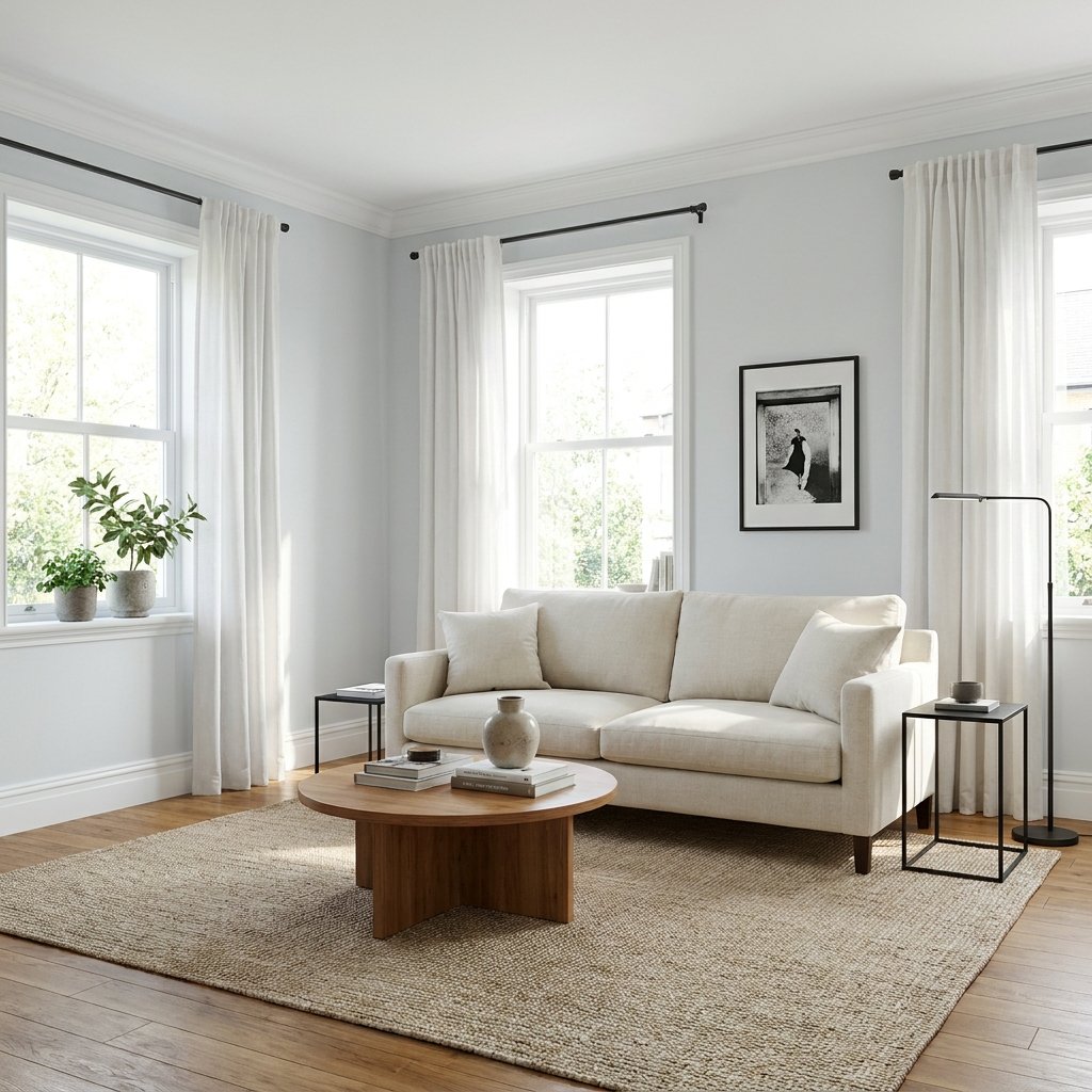
What Color Is Sherwin-Williams On the Rocks?
On the Rocks SW 7671 is a light gray neutral.
Sherwin-Williams describes it as a bright gray and specifically notes its subtle cool undertone.
The brand also places On the Rocks among its cool neutrals, a category Sherwin-Williams associates with blue, violet, or silver undertones.
That does not mean your walls will necessarily look blue or purple.
Most of the time, On the Rocks reads as a light gray.
However, those cooler undertones can become more apparent under certain lighting conditions or when the color is placed beside warm beige, yellow, orange, or creamy finishes.
That is why testing is particularly important with light gray paint.
Is On the Rocks Warm or Cool?
On the Rocks leans cool.
Sherwin-Williams explicitly categorizes SW 7671 as a cool neutral and includes it alongside shades such as Pewter Cast SW 7673, Proper Gray SW 6003, Slate Violet SW 9155, Mink SW 6004, and Snowfall SW 6000 in its neutral color guidance.
Still, paint temperature is relative.
Place On the Rocks next to a distinctly blue-gray and it may seem fairly neutral.
Place it beside a creamy beige and its cool character may become much easier to see.
Always compare paint colors against the permanent materials in the room rather than evaluating them in isolation.
What Are the Undertones of On the Rocks?
The official Sherwin-Williams description calls the undertone subtle and cool. Its broader guidance for cool neutrals references blue, violet, and silver undertones.
In a real room, the exact impression will depend on the surroundings.
You may notice On the Rocks feeling:
- Cleaner gray beside warm wood
- Cooler beside cream or beige
- Softer beside crisp white
- More neutral beside blue-gray finishes
Avoid choosing it based solely on photographs.
Screens, cameras, editing, surrounding colors, and lighting can all alter how a paint color appears.
Sherwin-Williams itself cautions that on-screen representations can differ from the actual paint color.
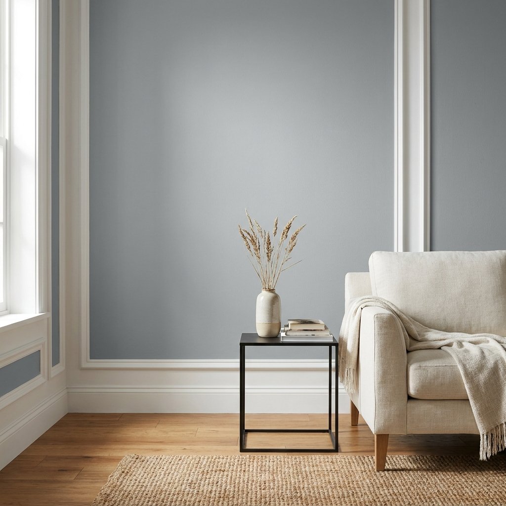
Is On the Rocks a Greige?
It is better described as a light cool gray than a strongly beige greige.
If your goal is a neutral with obvious beige warmth, there are warmer directions to explore.
On the Rocks is useful when you want something:
- Lighter
- Cleaner
- Less beige
- Subtly cool
- Easy to pair with crisp neutrals
It can still work beautifully with warm wood and natural textures—the contrast between warm materials and cooler walls can actually create a balanced room.
How Light Affects On the Rocks
Lighting can significantly change neutral paint.
Sherwin-Williams notes that light reflectance and room orientation affect how a color appears and recommends considering both natural and artificial lighting when selecting paint.
North-Facing Rooms
North-facing rooms typically receive cooler natural light.
Because On the Rocks already has cool characteristics, that environment can emphasize its cooler side.
Sherwin-Williams generally recommends considering warmer neutrals in north-facing rooms when the goal is to counteract cool light.
That does not mean On the Rocks cannot work there.
It means you should test it carefully.
If you want a crisp, cool, calm room, you may like the effect.
If you want the room to feel creamy and warm, another neutral may be a better direction.
South-Facing Rooms
Warmer, stronger natural light can help balance a cooler neutral.
On the Rocks may feel softer in this setting.
However, bright light can also reveal undertones more clearly, so do not assume the color will become completely neutral.
East-Facing Rooms
Morning light can make the color feel brighter earlier in the day.
As the direct light moves away, the room may become cooler.
Check your sample both morning and afternoon.
West-Facing Rooms
West-facing rooms can change considerably throughout the day.
A cooler gray may look restrained earlier and warmer as strong late-day light enters the room.
The only reliable way to judge the effect is to test the color in the actual space.
On the Rocks in a Living Room
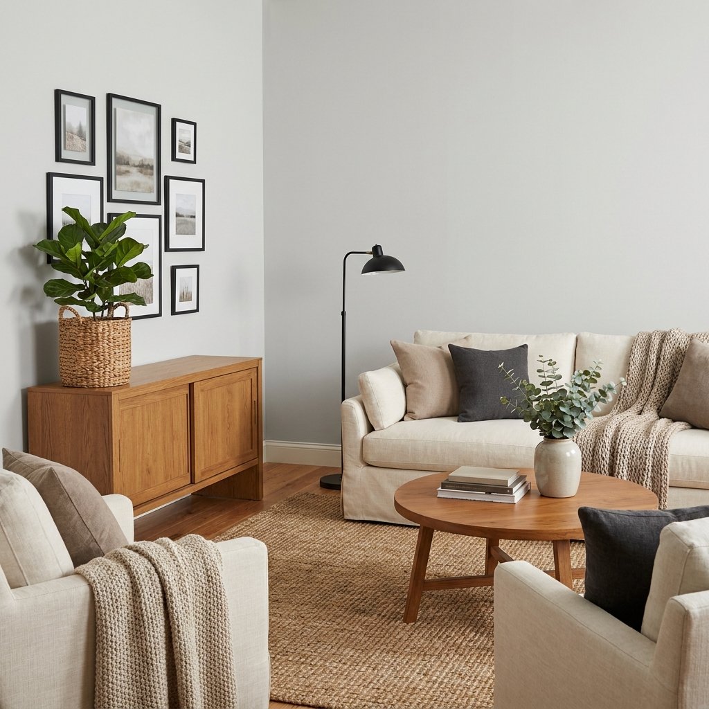
On the Rocks can work well in living rooms where you want a light neutral backdrop without moving deeply into beige.
Pair it with:
- Medium or light wood
- Cream upholstery
- Black accents
- Woven texture
- White trim
- Muted blue or green
The warmer natural materials help balance the cooler wall color.
If the living room already contains cool gray floors and cool gray furniture, be careful about adding even more gray.
Introduce wood, cream, tan, woven fibers, or another warmer texture to keep the space from feeling flat.
On the Rocks in a Bedroom
A bedroom is a natural place to use a quiet light gray.
Pair On the Rocks with:
- White bedding
- Warm wood
- Linen
- Muted blue
- Sage or dusty green
- Soft charcoal
For a softer look, add plenty of fabric and texture.
Curtains, upholstered furniture, bedding, and a large rug can keep a cool neutral bedroom from feeling stark.
Sherwin-Williams includes On the Rocks within its Reflect collection, which is built around airy whites and soft grays.
On the Rocks in a Kitchen
On the Rocks can work nicely on kitchen walls when the fixed finishes support a cooler neutral.
Consider it with:
- White cabinetry
- Black hardware
- Stainless finishes
- Cooler stone
- Medium wood
- Neutral backsplash tile
Be more cautious if the kitchen has strongly yellow cream cabinets, orange-toned stone, or very warm beige tile.
Those materials may make the cooler character of the paint more obvious.
Sherwin-Williams currently features real-home kitchen applications of On the Rocks on its official color page.
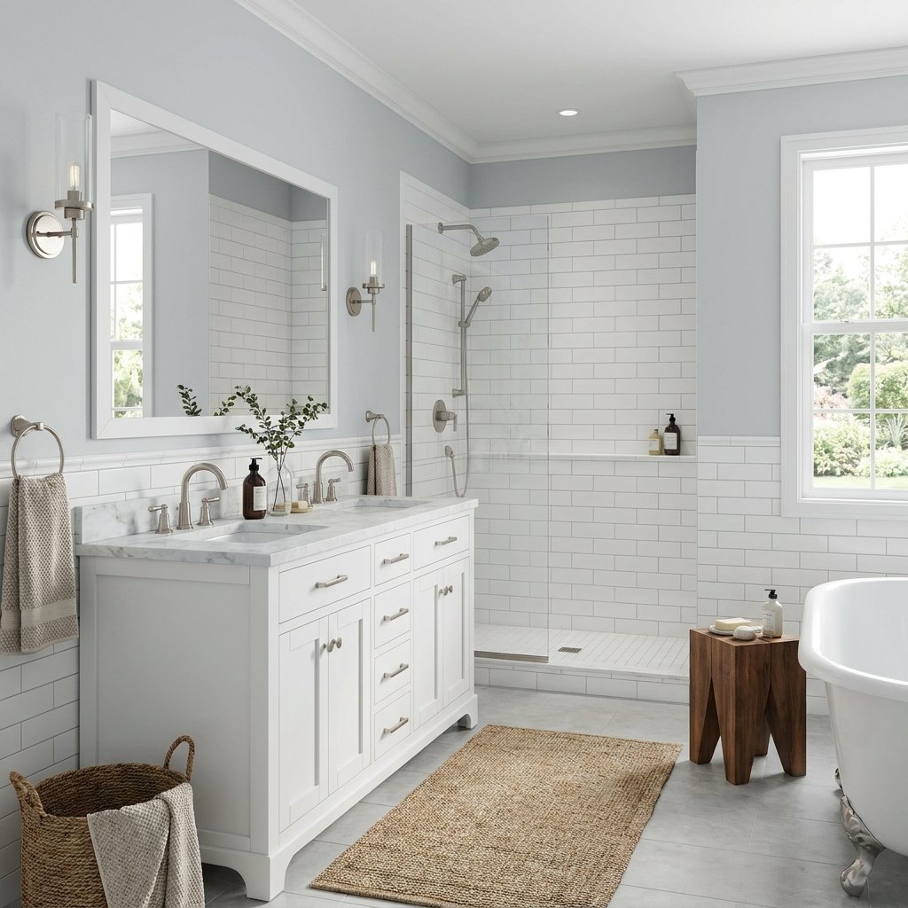
On the Rocks in a Bathroom
Bathrooms often contain white tile, stone, metal, and cooler finishes, making light gray a natural possibility.
On the Rocks can create a clean backdrop for:
- White tile
- Marble-look surfaces
- Black hardware
- Chrome
- Brushed nickel
- Warm wood vanity
Sherwin-Williams also includes On the Rocks in its bathroom color inspiration.
Remember that bathroom lighting can strongly affect gray paint.
Test the sample under both daylight and the actual vanity lighting.
On the Rocks in a Dining Room
A light gray dining room can create a quiet backdrop for furniture and art.
Try On the Rocks with:
- Walnut dining furniture
- Oak
- Black chairs
- Brass lighting
- Cream curtains
- Large artwork
The contrast between cooler walls and warmer wood can be particularly attractive.
For an open-concept dining and living area, repeating the same wall color can also simplify the transition between zones.
On the Rocks in a Hallway
Hallways often have less natural light than surrounding rooms.
On the Rocks can provide a soft neutral transition, but check the sample carefully if the hallway is very dark.
Artificial light temperature will affect the result.
Warmer bulbs can visually soften a cool neutral, while cooler lighting can reinforce its crispness.
Can You Use On the Rocks Throughout the House?
Potentially.
Its light, neutral appearance makes it a candidate for a whole-home wall color when the home’s fixed finishes work with cooler neutrals.
It may be especially useful if your home includes:
- White cabinetry
- Neutral stone
- Black accents
- Cooler countertops
- Medium or neutral wood floors
But whole-house colors need more testing than single-room colors.
The same paint can look different in a sunny living room, shaded hallway, north-facing bedroom, and windowless bathroom.
Test it in several locations before purchasing paint for the entire home.
What Colors Coordinate With On the Rocks?
Sherwin-Williams currently lists three official coordinating colors for SW 7671:
- Extra White SW 7006
- Greek Villa SW 7551
- Almond Roca SW 9105
These combinations demonstrate how flexible On the Rocks can be.
Extra White creates a cleaner, crisper relationship.
Greek Villa introduces a warmer white.
Almond Roca moves much deeper and warmer, adding contrast.
Beyond those official coordinating colors, you can build a room palette around the materials already in your home.
On the Rocks With Extra White
Extra White SW 7006 is one of Sherwin-Williams’ official coordinating recommendations for On the Rocks.
This pairing can create a clean distinction between:
- Walls
- Trim
- Doors
- Millwork
If you prefer a crisp, light interior, this is an obvious combination to sample.
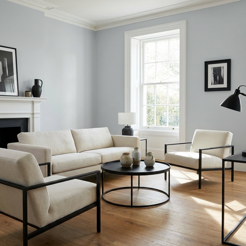
On the Rocks With Greek Villa
Greek Villa SW 7551 is another official coordinating color.
Because Greek Villa is a warmer white direction, the pairing can create more contrast in temperature.
That can be useful if you want to soften the overall room rather than making everything cool and crisp.
Test them together before painting because adjacent whites and grays can reveal undertones that were not obvious on individual swatches.
On the Rocks With Almond Roca
Sherwin-Williams also lists Almond Roca SW 9105 as a coordinating color.
A deeper warm neutral can provide contrast against the lighter On the Rocks walls.
You might consider that kind of relationship for:
- Furniture
- Accent areas
- Adjacent spaces
- Textiles
Again, sample the actual colors together in your home’s lighting.
What White Trim Goes With On the Rocks?
There is no single white that works for every house.
Extra White is an official Sherwin-Williams coordinating color, making it a logical starting point.
But your existing fixed finishes matter.
If the room contains very warm cream materials, a dramatically crisp white trim may exaggerate those differences.
Test wall and trim colors side by side rather than selecting the white independently.
On the Rocks With Wood Floors
Wood can be an excellent partner for On the Rocks.
Warm wood introduces contrast against the cooler wall color.
Consider it with:
- Light oak
- Medium brown wood
- Walnut
- Neutral wood tones
If your floor has very strong orange or red undertones, test carefully.
A cool gray can sometimes emphasize warm flooring more than expected.
This is not automatically bad—it simply creates stronger contrast.
On the Rocks With White Cabinets
White cabinetry and On the Rocks can create a clean, understated kitchen.
The success of the combination depends on the cabinet white.
Compare the paint sample directly against the cabinet finish.
Do not assume all white cabinetry is neutral.
Some whites are:
- Warm
- Creamy
- Cool
- Blue-white
The relationship matters more than the color names.
On the Rocks With Black Accents
Black is an easy way to give a pale gray room more definition.
Use it through:
- Window frames
- Lighting
- Picture frames
- Hardware
- Furniture legs
Keep the black accents repeated but restrained.
A little contrast can make the room feel much more intentional.
On the Rocks With Blue
Blue can reinforce the cool side of On the Rocks.
Muted blue works particularly well when you want a calm palette.
Try blue through:
- Pillows
- Art
- Upholstery
- Rugs
Add warm wood or cream so the room still feels balanced.
On the Rocks With Green
Muted greens can provide gentle color without fighting the neutral walls.
Consider:
- Sage
- Olive
- Deep forest green
Green also works naturally with wood, woven textures, and houseplants.
On the Rocks With Beige
Yes, you can mix cool gray and beige.
The easiest way is to create an intentional warm-and-cool balance rather than trying to make the two colors match.
Use beige through:
- Linen
- Rugs
- Upholstery
- Natural fibers
Repeat both warm and cool tones around the room.
This can create a layered neutral interior that feels much more interesting than an all-gray space.
On the Rocks vs. a Warm Greige
The biggest question is often not whether On the Rocks is attractive—it is whether you want a cool gray or a warmer greige.
Choose On the Rocks when you want something that generally feels:
- Light
- Clean
- Cool-neutral
- Understated
Look toward warmer greige territory if your home contains a lot of:
- Cream
- Warm beige
- Golden stone
- Orange-toned wood
Neither direction is universally better.
The fixed finishes and lighting should guide the decision.
Is On the Rocks Too Gray?
That depends on what you want.
If you are looking for a creamy warm neutral, On the Rocks may feel too gray or too cool.
If you specifically want a light gray that avoids becoming strongly beige, its gray character may be exactly what you like.
Sherwin-Williams itself identifies it as a bright gray and categorizes it among cool neutrals.
That is a better starting expectation than hoping it will behave like a warm beige.
Is On the Rocks Still a Popular Sherwin-Williams Color?
Sherwin-Williams currently includes On the Rocks SW 7671 in its online list of 50 popular colors.
That does not mean popularity should determine your paint choice.
A color needs to work with your house.
Floors, cabinetry, stone, tile, furniture, and natural light matter much more than whether a shade appears on a popular-color list.
How to Test On the Rocks Before Painting
Never make the final decision from your phone screen.
Sherwin-Williams notes that actual color can vary from on-screen representation, and its tools provide ways to evaluate colors under different lighting.
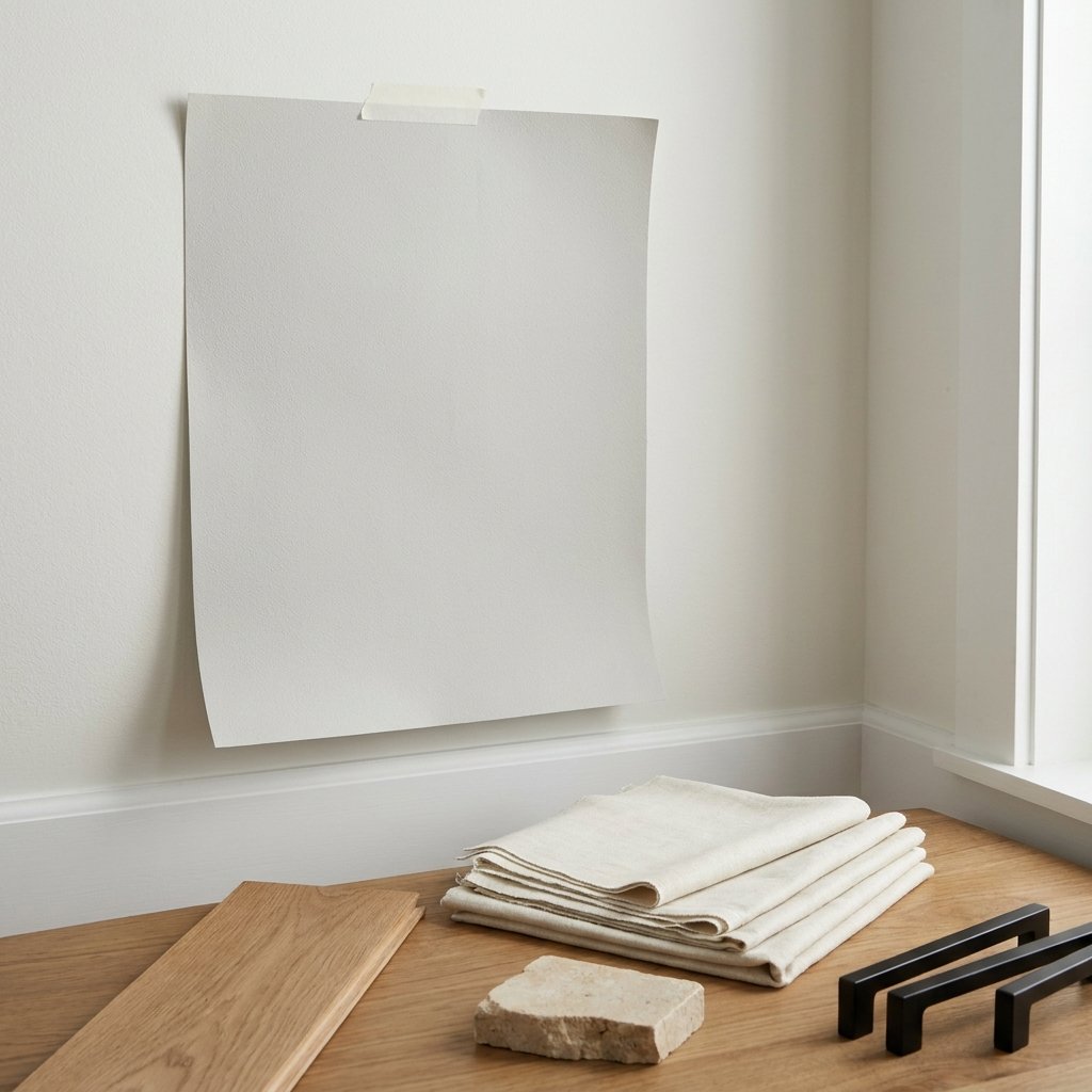
Test the color in the actual room.
Evaluate it:
- In the morning
- Around midday
- In the afternoon
- At night
- With lights turned on
Place the sample near important permanent finishes.
Compare it against:
- Flooring
- Cabinets
- Countertops
- Backsplash
- Fireplace stone
- Trim
A color that looks perfect on an isolated sample may behave differently once surrounded by your home’s finishes.
How to Decorate With On the Rocks
Once you have decided the paint works, use decor to control the overall temperature of the room.
For a Warmer Look
Add:
- Oak
- Walnut
- Cream
- Linen
- Woven fibers
- Warm brass
For a Cooler Look
Add:
- Blue
- Charcoal
- Crisp white
- Silver-toned metal
- Cooler stone
For a Balanced Look
Mix warm natural materials with a few crisp black or cool-gray accents.
This is often the easiest way to keep a light gray room from feeling overly cool.
How to Make On the Rocks Feel Cozy
Paint alone does not determine whether a room feels cozy.
Add:
- Curtains
- Large rug
- Wood furniture
- Upholstery
- Warm lighting
- Pillows
- Throws
- Art
Texture is particularly important.
A room with gray walls, gray sofa, gray rug, and silver accessories may feel much cooler than the same walls surrounded by wood, linen, cream, and woven materials.
Common Mistakes With On the Rocks
Assuming It Is a Warm Greige
Sherwin-Williams categorizes it as a cool neutral.
Choosing It From an Online Photo
Screens do not reliably reproduce paint color.
Ignoring Room Direction
Natural light can change how undertones appear.
Testing Only One Wall
Different walls can receive dramatically different light.
Ignoring Fixed Finishes
Flooring, countertops, cabinetry, and tile matter.
Using Too Much Gray
If everything in the room is cool gray, add warmer materials and texture.
Selecting Trim Separately
Evaluate wall and trim colors together.
Painting Tips for On the Rocks
Once you have chosen your color:
- Repair wall damage.
- Clean the surface appropriately.
- Sand where required.
- Prime where the substrate or previous finish requires it.
- Protect floors and furniture.
- Apply the chosen paint according to manufacturer instructions.
- Observe recommended drying and recoating requirements.
The appropriate primer, preparation, sheen, and number of coats can vary depending on the wall condition, previous coating, room, and specific paint product.
Follow the paint manufacturer’s directions rather than relying on one universal method.
Use appropriate ventilation and protective equipment while painting.
FAQ About Sherwin-Williams On the Rocks
What color is Sherwin-Williams On the Rocks?
On the Rocks SW 7671 is a bright light gray that Sherwin-Williams categorizes as a cool neutral.
What undertones does On the Rocks have?
Sherwin-Williams describes it as having a subtle cool undertone. Its cool-neutral guidance associates that category with blue, violet, or silver undertones.
Is On the Rocks warm or cool?
It leans cool and is officially included in Sherwin-Williams’ cool-neutral palettes.
What colors coordinate with On the Rocks?
Sherwin-Williams currently recommends Extra White SW 7006, Greek Villa SW 7551, and Almond Roca SW 9105 as coordinating colors.
Is On the Rocks good for a whole house?
It can be, particularly when your fixed finishes coordinate with a light cool neutral. Test it in rooms with different orientations before committing to a whole-house application.
Does On the Rocks work in north-facing rooms?
It can, but north-facing light tends to be cool, which may reinforce the cool character of the paint. Sherwin-Williams generally suggests warmer neutrals when the goal is to counteract cool northern light.
Does On the Rocks work with wood?
Yes. Wood can add warmth and contrast to the cooler gray walls. Always compare a sample with your specific flooring or furniture finish.
What trim color goes with On the Rocks?
Extra White SW 7006 is one of Sherwin-Williams’ official coordinating colors and is a useful option to sample for trim.
Final Thoughts
Sherwin-Williams On the Rocks SW 7671 is a light, versatile gray for homeowners who want a neutral that leans cleaner and cooler rather than noticeably beige.
Sherwin-Williams describes it as a bright gray with a subtle cool undertone and places it firmly within its cool-neutral family.
That makes it particularly worth considering with white cabinetry, neutral stone, black accents, and many medium or neutral wood finishes.
Its official coordinating colors—Extra White, Greek Villa, and Almond Roca—also show that it can move in both crisp and warmer decorating directions.
But lighting is the deciding factor.
Test On the Rocks in the actual room, beside the permanent finishes, and observe it from morning through evening.
If the cooler undertone works with your home, On the Rocks can provide a calm, light backdrop that leaves plenty of room for wood, textiles, art, furniture, and color to become the focus.