

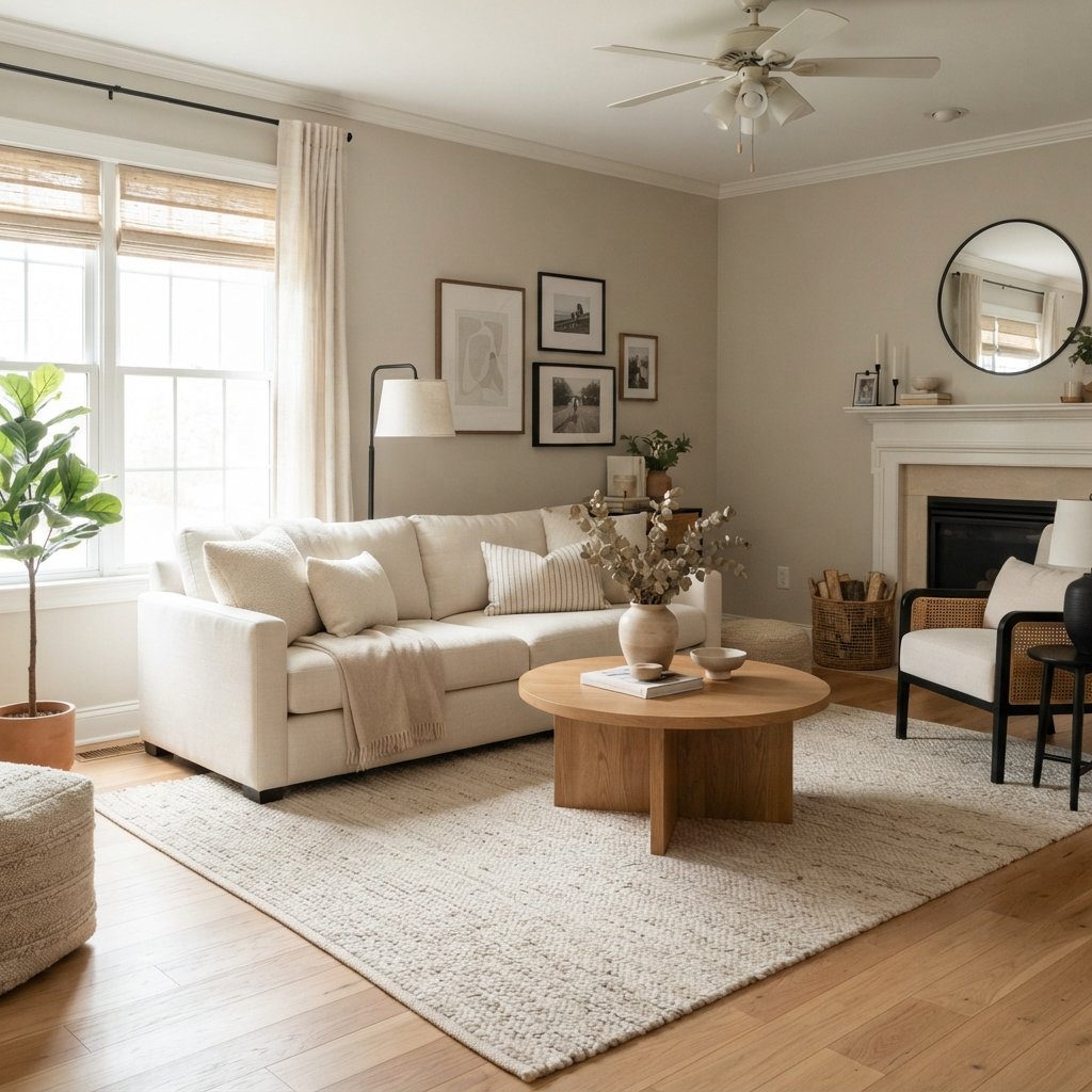
If you’re looking for a soft neutral that sits somewhere between gray and beige, Sherwin-Williams Popular Gray SW 6071 is a paint color worth considering.
Despite its name, Popular Gray isn’t the type of straightforward cool gray many people picture when they hear the word “gray.” It has noticeable warmth, giving it a softer greige appearance that can work beautifully with warm flooring, creamy textiles, wood furniture, and other comfortable neutrals.
That warmth is also why you need to sample it carefully.
Depending on the natural light and surrounding finishes, Popular Gray can shift warmer, look more beige, or reveal undertones you didn’t notice on the paint chip.
Before choosing it for your living room, bedroom, hallway, kitchen, or another space, let’s look at what Popular Gray is really like, where it works, what colors coordinate with it, and how to decide whether it’s right for your home.
What Color Is Sherwin-Williams Popular Gray?
Sherwin-Williams Popular Gray SW 6071 is a warm gray-neutral that can easily cross into greige territory.
It isn’t an icy gray.
Instead, its warmth makes it a good color to explore when traditional cool gray feels too cold but you don’t necessarily want an obvious beige.
Popular Gray can provide enough color to distinguish the walls from lighter trim while still functioning as a versatile neutral.
However, like almost every nuanced gray or greige, its appearance is strongly influenced by its environment.
What Are the Undertones of Popular Gray?
Popular Gray has warm undertones, and depending on the light and surrounding materials, it can reveal a subtle taupe or violet/pink influence.
That doesn’t mean your walls will automatically look purple or pink.
Undertones are subtle characteristics that become more or less noticeable depending on what you place beside the color.
For example, an undertone may become easier to see next to:
- Yellow-toned flooring
- Green paint
- Cool gray
- Certain beige fabrics
- Bright white
- Warm wood
This is why comparing Popular Gray with your permanent finishes is more useful than trying to judge it from a screen.
Is Popular Gray Warm or Cool?
Popular Gray is a warm gray.
If you’re comparing it with a cool blue-gray, the difference should become much easier to see.
Its warmth can make it useful in homes with:
- Warm wood floors
- Beige upholstery
- Cream fabrics
- Brown furniture
- Warm stone
- Other greige neutrals
However, don’t assume every warm finish will automatically work.
A warm neutral can still clash with another warm neutral when their undertones are different.
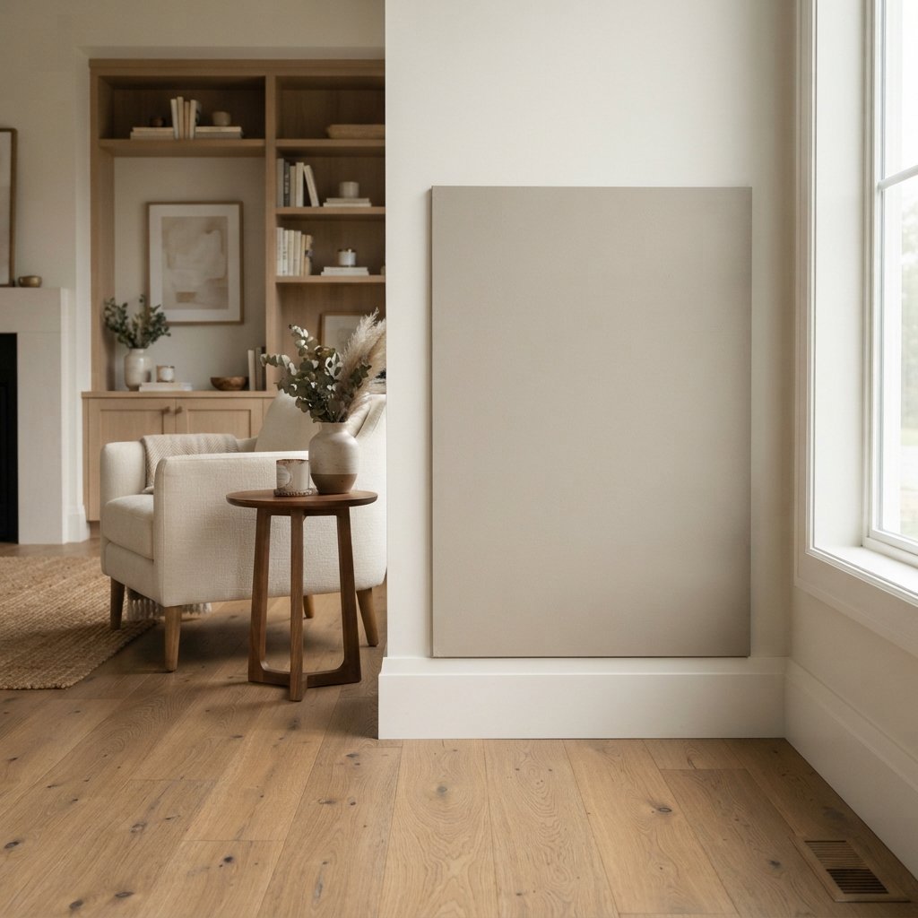
Does Popular Gray Look Beige?
It can.
In some rooms, Popular Gray may look more greige or beige than what you’d expect from its name.
This can be especially noticeable in warm natural light or when it’s surrounded by cooler colors.
If you’re searching for a clearly recognizable cool gray, Popular Gray probably isn’t the first direction I’d explore.
If you want a warmer neutral that blends characteristics of gray, beige, and taupe, it makes much more sense.
Does Popular Gray Look Purple or Pink?
It can reveal a subtle violet or pinkish-taupe influence under certain conditions.
Again, that doesn’t mean it will become a visibly purple room.
The undertone may simply become more noticeable beside materials with competing undertones.
If you’re especially sensitive to violet or pink undertones, large samples are essential.
Compare Popular Gray with:
- Flooring
- Sofa fabric
- Countertops
- Fireplace stone
- Trim
Don’t evaluate it by itself.
Is Sherwin-Williams Popular Gray a Greige?
Popular Gray can reasonably be described as a warm gray or greige.
The exact label isn’t particularly important.
What matters is that it isn’t a clean, cool gray.
If you’re decorating with warm neutrals and natural wood, that warmer character may be exactly what makes the color useful.
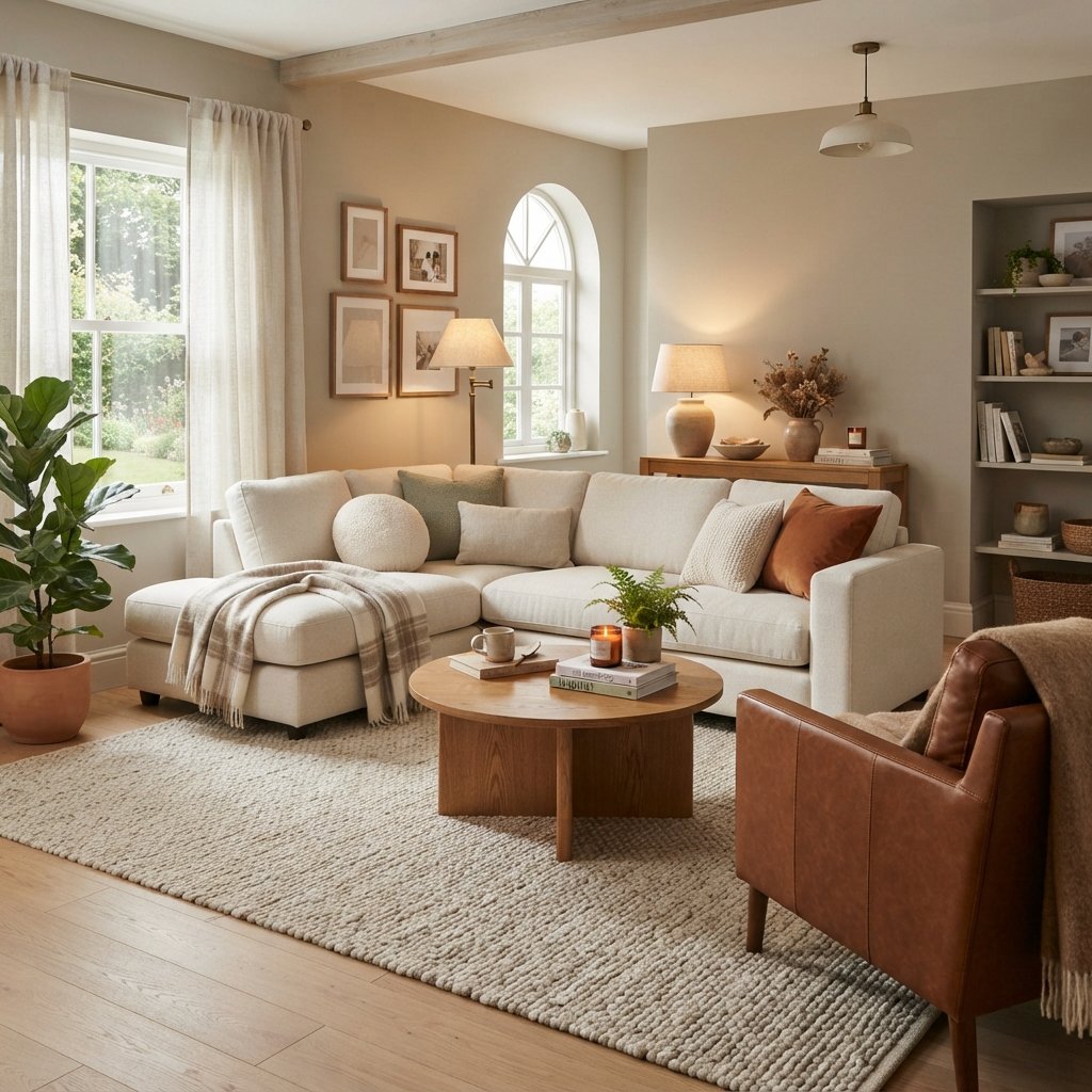
Sherwin-Williams Popular Gray in a Living Room
Popular Gray can create a soft, warm background in a living room.
Try pairing it with:
- Cream sofa
- Warm white trim
- Natural wood
- Brown leather
- Black accents
- Muted earthy textiles
The room’s largest surfaces matter.
A gray sofa, beige rug, stone fireplace, and wood flooring can each change the way Popular Gray appears.
If the living room opens into other spaces, check how the color looks from those rooms too.
Popular Gray in a Bedroom
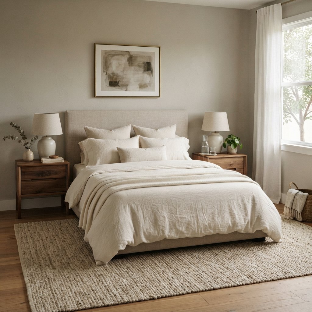
Bedrooms are a natural place for warm neutrals.
Popular Gray can provide more depth than off-white without creating the visual weight of a darker wall color.
Pair it with:
- Cream bedding
- Warm white
- Taupe
- Medium wood
- Walnut
- Muted rose
- Deep brown
For a quieter palette, layer several shades of cream, beige, and brown.
For contrast, introduce darker wood or black in small amounts.
Popular Gray in a Bathroom
Popular Gray can work in a bathroom, but bathroom finishes make undertones particularly important.
Compare it with:
- Floor tile
- Shower tile
- Vanity
- Countertop
- Tub
- Trim
Many bathrooms contain several shades of white, gray, or beige.
A warm gray can look beautiful with one tile and completely wrong beside another.
Always bring a large sample into the bathroom before committing.
Popular Gray in a Kitchen
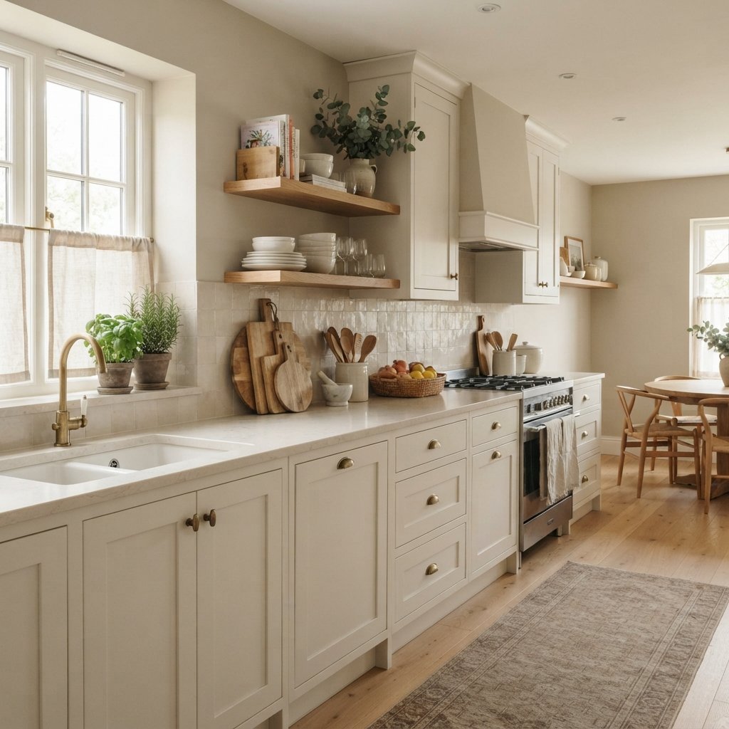
Popular Gray may work nicely in a kitchen with compatible warm finishes.
It can be worth sampling with:
- Warm white cabinets
- Cream cabinets
- Wood cabinets
- Warm stone
- Beige or taupe backsplash tile
If your kitchen contains crisp cool-white cabinetry and very cool gray stone, compare the undertones carefully.
Kitchen lighting can also affect the color substantially.
Look at the sample under daylight and your normal evening lighting.
Popular Gray With White Cabinets
Popular Gray can provide gentle contrast with white cabinetry.
The key is choosing compatible whites.
A warm or softly neutral white may create a smoother relationship than a white with a strongly conflicting undertone.
Put the Popular Gray sample directly beside the cabinet door.
If either color suddenly looks unusually yellow, pink, gray, or dingy, the combination may not be ideal.
Popular Gray With Wood Cabinets
Because Popular Gray is warm, it may coordinate nicely with some wood cabinetry.
But “wood” is not one color.
Cabinets can have:
- Yellow undertones
- Orange undertones
- Red undertones
- Brown undertones
- Gray undertones
Compare the paint directly with the cabinet.
This is particularly important with strongly orange or red wood, because the paint’s undertones may become more obvious beside it.
Popular Gray With Wood Floors
Popular Gray can be a useful color to sample with warm wood flooring.
Light Oak
The combination can create a light, warm interior.
Add cream and warm white for an understated palette.
Honey or Golden Wood
Sample carefully.
Strong yellow or orange tones in the flooring can change how Popular Gray’s undertones appear.
Medium Brown Wood
This can create a comfortable tonal palette, particularly with cream furniture.
Dark Wood
Popular Gray can provide lighter contrast against darker flooring.
Popular Gray With Carpet
Carpet undertones matter just as much as wood flooring.
If your carpet is:
- Beige
- Taupe
- Greige
- Warm gray
Popular Gray may be worth testing.
But don’t assume two neutral colors automatically coordinate.
Place the paint sample directly against the carpet and compare them in both daylight and artificial light.
Popular Gray With a Fireplace
Fireplace stone or brick can be one of the strongest influences in a living room.
Look closely at the fireplace.
Does it contain:
- Cream?
- Beige?
- Taupe?
- Gray?
- Brown?
- Red?
Popular Gray will generally make more sense when its warmth relates to the fireplace.
If the stone is extremely cool and blue-gray, you may prefer a different wall neutral.
What Trim Color Goes With Popular Gray?
Popular Gray can work beautifully with light trim, but don’t choose trim color in isolation.
You generally want enough contrast to make the relationship intentional.
Warm or neutral whites may be worth exploring because Popular Gray itself is warm.
If you already have painted trim, sample Popular Gray directly beside it rather than repainting all the trim automatically.
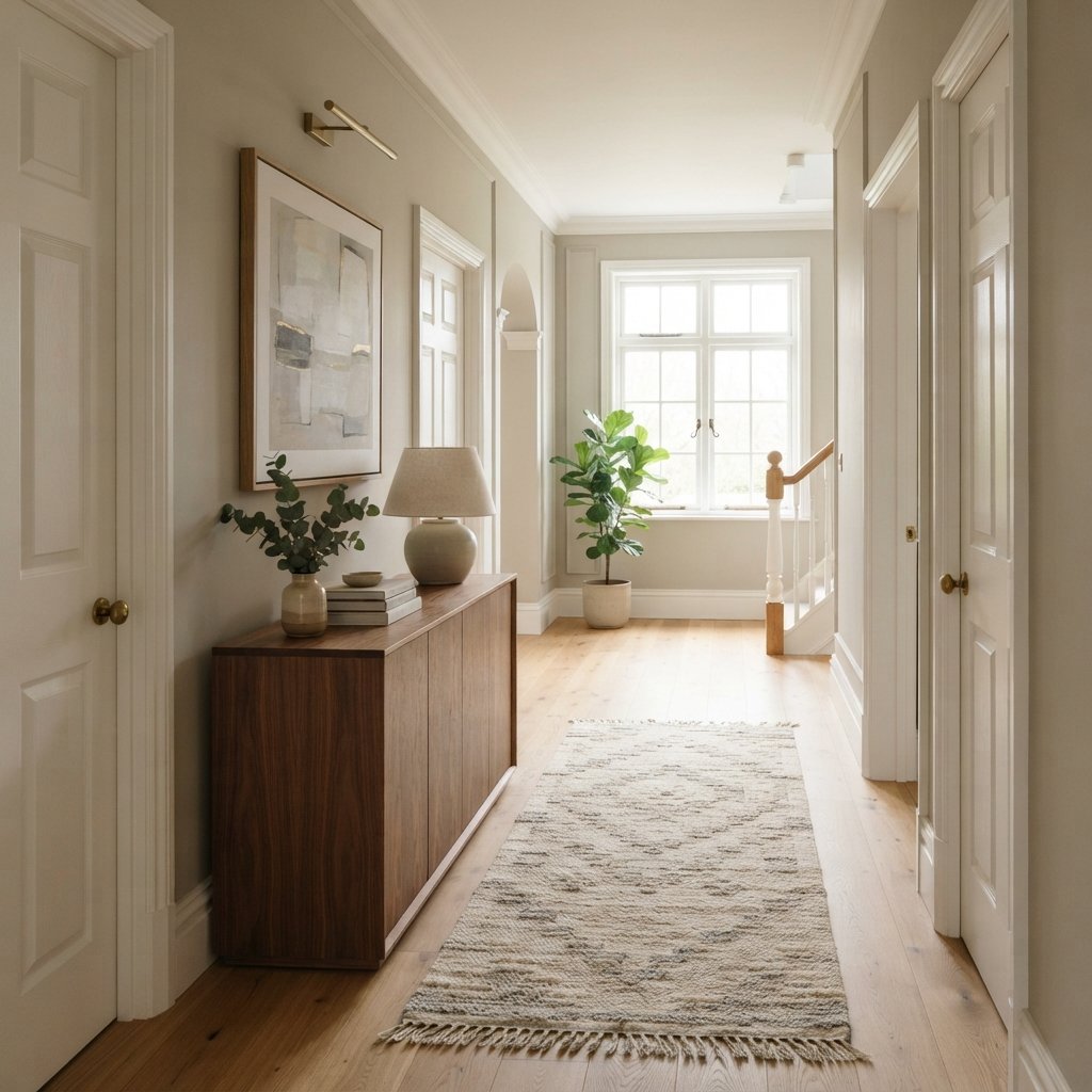
What Colors Go With Sherwin-Williams Popular Gray?
Popular Gray works best when the entire palette respects its warm character.
Here are several color directions to consider.
Warm White
Creates a soft, classic contrast.
Use it for trim, upholstery, or accessories.
Cream
Cream reinforces the warmth and can create a cozy tonal palette.
Taupe
A deeper taupe can add dimension without introducing a dramatically different color.
Brown
Brown leather, walnut, and medium wood can create a warm, grounded room.
Muted Rose
A dusty, muted pink or rose can relate beautifully to the warmer characteristics of Popular Gray.
Burgundy
Burgundy can create a richer accent when you want more contrast.
Black
Small amounts of black can provide definition.
Does Popular Gray Go With Green?
Possibly, but green should be tested carefully.
Because complementary undertones can make one another more obvious, some greens may emphasize the warmer pinkish or violet character in Popular Gray.
Muted olive may create a different effect from blue-green or sage.
Bring samples together before committing.
Does Popular Gray Go With Blue?
Blue can work, particularly in textiles and decor.
Muted or dusty blues may create a softer combination than highly saturated blue.
However, blue can make a warm gray appear warmer by comparison.
That may be exactly what you want—or it may make the undertones more noticeable.
Test the combination in the room.
Does Popular Gray Go With Black?
Yes, black can create useful contrast with warm gray walls.
Use it selectively through:
- Lighting
- Picture frames
- Hardware
- Furniture
- Doors
Black also works nicely when the room contains natural wood and cream.
Popular Gray With Cream and Beige
This is one of the easiest directions for creating a soft, warm interior.
Try:
Popular Gray walls + cream sofa + beige rug + medium wood
Add darker brown or black accents to prevent the palette from becoming too flat.
Use texture to separate similar colors.
Linen, wood, woven materials, and soft upholstery can create depth even when the palette is restrained.
Popular Gray vs. Agreeable Gray
Sherwin-Williams Agreeable Gray SW 7029 is another well-known warm neutral.
Both colors sit in the broad warm gray/greige family, but they aren’t interchangeable.
Their undertones and depth can behave differently in the same room.
If you’re deciding between them, place large samples side by side.
Don’t try to decide based solely on online photos.
One may relate much better to your flooring, furniture, or countertops.
Popular Gray vs. Repose Gray
Sherwin-Williams Repose Gray SW 7015 generally reads more like the gray family than some warmer greiges, while Popular Gray has a warmer taupe-like quality.
Comparing the two can be useful if you’re deciding whether your home needs:
A warmer greige/taupe direction
or
A more recognizable gray direction
The room itself should make the decision.
Popular Gray vs. Accessible Beige
Sherwin-Williams Accessible Beige SW 7036 moves further into the warm beige/greige-neutral direction.
If Popular Gray’s taupe or violet/pink influence isn’t working with your finishes, Accessible Beige may be another warm neutral to sample.
Conversely, if Accessible Beige feels too beige for the look you want, Popular Gray may provide a different balance.
Popular Gray vs. Worldly Gray
Sherwin-Williams Worldly Gray SW 7043 is another warm neutral commonly considered alongside greige colors.
Rather than assuming one is lighter, warmer, or more neutral from a digital image, compare physical samples in your room.
Subtle undertones can make two seemingly similar colors behave very differently beside the same flooring.
Popular Gray vs. Mindful Gray
Sherwin-Williams Mindful Gray SW 7016 offers another gray-neutral direction to compare.
If Popular Gray feels too warm for your finishes, looking at colors that read more distinctly gray can help you determine what your room actually needs.
Comparisons are useful because undertones are easier to see when colors are placed beside one another.
Is Popular Gray Good for a Whole House?
It can be, but don’t choose any whole-house color without testing it in multiple rooms.
A color may look beautiful in a bright south-facing living room and quite different in a darker hallway.
Test Popular Gray in:
- Main living area
- Hallway
- Kitchen
- Bedrooms
- Stairwell
You don’t necessarily need the same paint color everywhere.
Sometimes a coordinated palette works better than forcing one neutral into every room.
Popular Gray in North-Facing Rooms
North-facing rooms often receive cooler indirect light.
That cooler light may change how Popular Gray’s warmth appears.
Don’t assume the warmth will completely counteract a cool room.
Instead, test a large sample and compare it with your fixed finishes.
Popular Gray in South-Facing Rooms
South-facing rooms can receive stronger, warmer natural light.
Popular Gray may appear warmer under those conditions.
Its beige or taupe qualities may become more noticeable at certain times of day.
Check the room morning, midday, and afternoon before deciding.
Popular Gray in East-Facing Rooms
East-facing rooms can receive strong morning light and cooler light later.
Popular Gray may therefore change significantly throughout the day.
A color that looks warm and bright at breakfast can become more subdued by late afternoon.
Popular Gray in West-Facing Rooms
West-facing rooms often receive warmer afternoon and evening light.
That can bring out the warm side of Popular Gray.
Again, this isn’t necessarily bad.
It simply means you need to like the color at all times of day.
How Artificial Lighting Changes Popular Gray
Paint doesn’t stop changing after sunset.
Artificial lighting can affect how warm or cool Popular Gray appears.
Instead of choosing light bulbs solely to “fix” a paint color, evaluate the color under the lighting you actually use.
Check:
- Overhead lighting
- Table lamps
- Floor lamps
- Under-cabinet lighting where applicable
A whole-house neutral should work during your normal evening routine, not only in daylight.
How to Test Sherwin-Williams Popular Gray
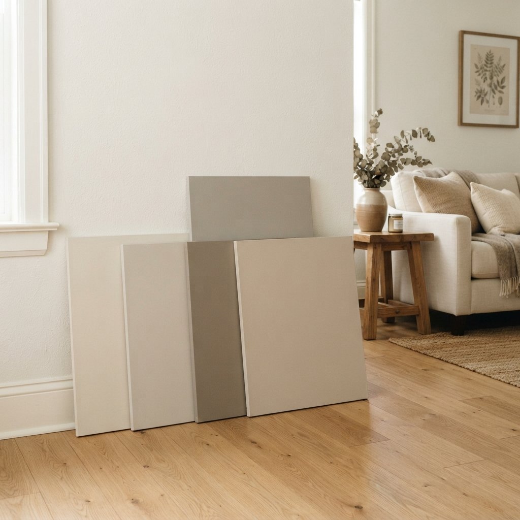
Don’t make your final decision from a phone screen or tiny paint chip.
Use large physical samples.
Try this process:
- Obtain an accurate sample of Popular Gray.
- View it vertically in the room.
- Compare it directly with flooring.
- Place it beside trim.
- Check it near the sofa or major furniture.
- Compare it with countertops and tile where applicable.
- Move it to different walls.
- View it morning, afternoon, and evening.
- Turn on your normal artificial lighting.
- Compare it with adjoining rooms.
If you’re painting a test area, follow the paint manufacturer’s application and drying instructions before judging the final appearance.
How to Build a Color Palette Around Popular Gray
One simple palette could be:
Main Wall Color
Popular Gray
Light Neutral
Warm white or cream
Wood
Medium oak or walnut
Secondary Neutral
Taupe or beige
Accent
Muted burgundy, dusty rose, or another compatible muted color
Contrast
Black or very dark brown
You don’t need to use every color equally.
Popular Gray can provide the background while the other colors appear through furniture, textiles, artwork, and accessories.
Decorating With Popular Gray
Because Popular Gray is neutral, texture becomes important.
Try combining it with:
- Linen
- Wood
- Woven baskets
- Wool or textured rugs
- Stone
- Leather
A room filled with similar flat beige-gray surfaces can feel dull.
Different textures create visual depth without requiring lots of bright color.
Is Popular Gray Too Dark for a Small Room?
Room size alone shouldn’t determine your paint color.
A small room can handle a warm gray.
What matters more is:
- Natural light
- Artificial lighting
- Furniture
- Flooring
- Desired atmosphere
If Popular Gray feels too heavy in your particular room, compare it with a lighter neutral.
Don’t automatically choose white simply because the room is small.
Is Popular Gray Good for a Dark Room?
It depends on the effect you want.
If a room receives very little daylight, Popular Gray won’t create sunlight.
It may look deeper or more muted than it does in a bright room.
You can either choose a lighter neutral or embrace the room’s coziness and use layered lighting.
Both approaches can work.
Common Mistakes With Popular Gray
Choosing It Because of the Name
Popular Gray isn’t a straightforward cool gray.
Ignoring the Warm Undertones
Its warmth is an important part of the color.
Choosing From Online Photos
Screens and photography aren’t reliable for exact paint color.
Not Comparing It With Flooring
Floors can make undertones much more obvious.
Assuming All White Trim Works
White has undertones too.
Testing Only One Wall
Different walls receive different light.
Ignoring Evening Lighting
Check the color after dark.
Assuming a Popular Color Works Everywhere
The right neutral depends on the home.
Tips for Painting With Popular Gray
Once you’ve decided the color works, prepare the walls properly.
Depending on the existing surface:
- Clean the walls appropriately.
- Repair holes and imperfections.
- Protect floors, trim, and furniture.
- Prepare glossy or damaged surfaces as required.
- Prime when necessary.
- Apply the selected paint according to manufacturer directions.
- Follow recommended drying and recoating times.
Choose an appropriate interior paint product and sheen for the room and surface.
Kitchens, bathrooms, trim, cabinetry, and typical living-area walls may have different requirements.
Provide adequate ventilation and use appropriate protective equipment.
In older homes, avoid sanding or disturbing questionable existing coatings until you’ve determined whether hazardous materials such as lead may be present and what safe procedures apply.
FAQ About Sherwin-Williams Popular Gray
What color is Sherwin-Williams Popular Gray?
Popular Gray SW 6071 is a warm gray-neutral that can read as greige or taupe depending on the lighting and surrounding finishes.
Is Popular Gray warm or cool?
Popular Gray is a warm gray.
Does Popular Gray have purple undertones?
It can reveal subtle violet, pink, or taupe influences depending on lighting and nearby colors. Always test it with your permanent finishes.
Does Popular Gray look beige?
It can appear more beige or greige in warm lighting or beside cooler colors.
Is Popular Gray a good living room color?
It can be. Popular Gray can create a warm neutral background for cream furniture, wood, brown, black, and other compatible colors.
Does Popular Gray work with white cabinets?
Potentially. Compare it directly with the specific cabinet white because undertones vary significantly between whites.
What colors coordinate with Popular Gray?
Warm white, cream, taupe, brown, black, muted rose, and deeper warm accents are useful directions to explore. Always test combinations in the actual room.
Is Popular Gray good for a whole house?
It may work as a whole-house neutral when its undertones coordinate with the home’s finishes. Test it in rooms with different exposures before committing.
What’s the difference between Popular Gray and Agreeable Gray?
Both are warm neutral colors, but they have different undertones and can look noticeably different in the same room. Large side-by-side samples are the best way to compare them.
Should I sample Popular Gray before painting?
Yes. Large physical samples viewed in your actual lighting are much more reliable than online images.
Final Thoughts
Sherwin-Williams Popular Gray SW 6071 is a warm neutral for homeowners who want something softer than a traditional cool gray.
Its greige and taupe character can work beautifully with cream, warm white, natural wood, brown, and other comfortable neutrals.
But its warmth is also the reason you should sample it carefully.
Popular Gray may reveal subtle violet, pink, or taupe influences depending on your flooring, furniture, lighting, and nearby colors.
Don’t choose it because the name says “gray.”
Choose it because its actual undertones work with your home.
Bring a large sample into the room.
Compare it with the floors.
Place it beside the trim.
Look at it next to the sofa, cabinets, countertop, or fireplace.
Then check it again after sunset.
If Popular Gray still looks beautiful beside the permanent elements of your home throughout the day, it can provide the warm, understated backdrop you’ve been looking for.