

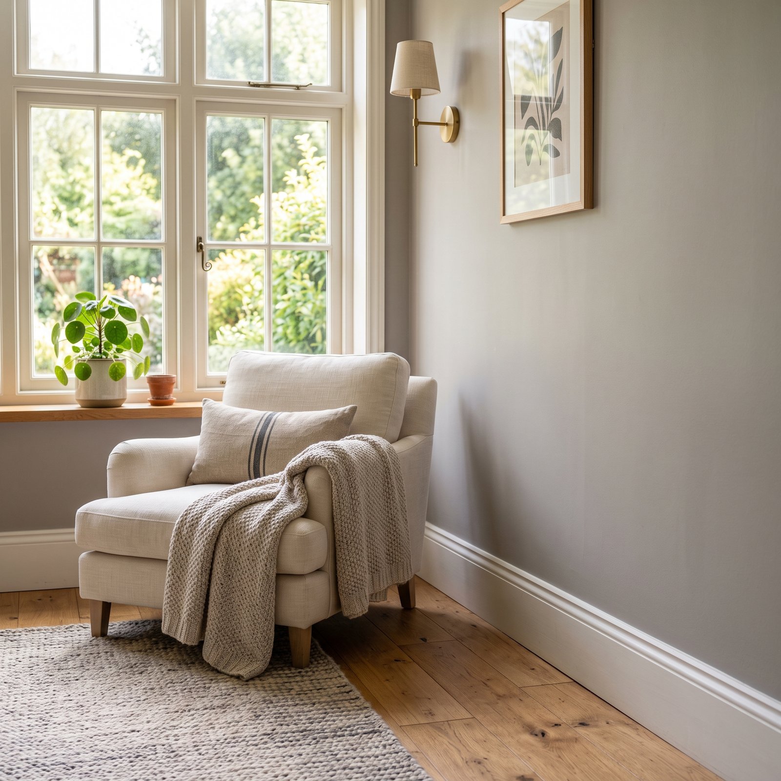
If you want a neutral paint color that feels warmer than a traditional gray but not as beige as many greiges, Sherwin-Williams Worldly Gray SW 7043 is worth putting on your sample list.
Sherwin-Williams describes Worldly Gray as a warm gray and currently lists it as an interior/exterior neutral. Its official color data gives it an LRV of about 57, which places it comfortably in the light-to-medium range rather than among very pale off-whites or deeper grays.
That combination is part of what makes Worldly Gray so useful. It has enough depth to create contrast against lighter trim, but it can still keep a room feeling relatively bright when the lighting is good.
Like almost every gray, however, Worldly Gray can change significantly depending on the room around it. Flooring, cabinetry, natural light, artificial lighting, furniture, and nearby paint colors can all emphasize different undertones.
So before buying gallons of paint, it helps to understand what Worldly Gray looks like, where it works best, what colors coordinate with it, and how it compares with nearby neutrals.
What Color Is Sherwin-Williams Worldly Gray?
Worldly Gray SW 7043 is a warm gray neutral that sits somewhere between classic gray and greige.
Sherwin-Williams specifically describes it as a warm gray and recommends pairing it with other warm tones for a sophisticated, comfortable look.
That warmth prevents it from feeling as crisp or blue as many cooler grays.
In practical decorating terms, you can expect Worldly Gray to work particularly well with materials such as:
- Warm wood
- Cream
- Beige
- Taupe
- Black
- Soft white
- Natural fibers
- Muted green
- Brown
- Certain blue-green accents
It generally makes a softer backdrop than a cooler silver-gray.
This can be useful in homes with traditional finishes, wood floors, beige stone, warm countertops, or furniture that would look disconnected beside a blue-based gray.
What Is the LRV of Worldly Gray?
Sherwin-Williams lists the LRV of Worldly Gray at approximately 57.2.
LRV stands for Light Reflectance Value.
The scale runs from 0 to 100, with lower numbers reflecting less light and higher numbers reflecting more. Sherwin-Williams explains that LRV affects how light or dark a color appears depending on the amount of light a room receives.
With an LRV around 57, Worldly Gray is not an almost-white paint color.
It has enough depth that you should clearly see color on the wall, especially beside bright white trim.
At the same time, it is not so dark that it automatically creates a moody room.
Sherwin-Williams includes Worldly Gray among neutrals in roughly the 50–60 LRV range that can create a clean, inviting atmosphere in spaces such as kitchens, bathrooms, and guest bedrooms.
What Are the Undertones of Worldly Gray?
This is where choosing gray paint becomes more complicated.
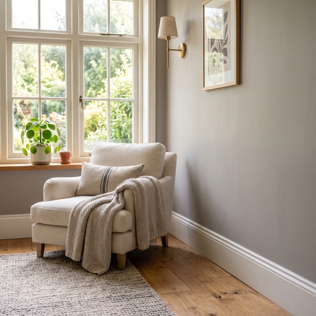
Worldly Gray is warmer than a traditional cool gray, and its RGB values—206 red, 198 green, and 187 blue—support the overall warm neutral appearance.
In real rooms, however, the exact undertone you notice depends heavily on what surrounds it.
Worldly Gray may sometimes appear:
- More greige
- More beige
- More gray
- Slightly taupe
- Subtly greenish in certain conditions
That does not mean the paint itself is constantly changing. Your perception of the color changes in response to lighting and nearby materials.
For example, place Worldly Gray beside warm oak flooring and it may look noticeably grayer.
Put it next to a crisp blue-gray surface and its warmth may become more obvious.
This is why comparing a paint sample directly with your flooring, cabinetry, countertop, backsplash, and upholstery is far more useful than looking at a photo online.
Is Worldly Gray Warm or Cool?
Worldly Gray is a warm gray.
Sherwin-Williams describes it that way directly.
That makes it a useful choice if you like gray walls but are concerned about your home feeling cold.
Warm gray also tends to work more naturally with traditional warm materials such as oak, tan leather, cream textiles, brass-toned accents, and earthy stone.
However, warm does not mean obviously beige.
Worldly Gray can still read clearly as gray, particularly in certain lighting conditions or beside warmer surfaces.
Think of it as a gray that has been softened by warmth rather than a beige paint with a hint of gray.
Does Worldly Gray Look Beige?
Sometimes it can lean in that direction.
Because it is warm, Worldly Gray may look more greige in rooms with warm afternoon sun, warm artificial lighting, or cooler furnishings that make its warmth stand out.
That can actually be an advantage.
If your home contains a mix of beige and gray finishes, Worldly Gray may help bridge the gap between them more successfully than a distinctly cool gray.
But if you want a crisp, unmistakably silver-gray room, Worldly Gray probably is not where I would start.
Sample cleaner or cooler grays alongside it so you can compare them directly.
How Worldly Gray Looks in Different Lighting
Paint colors do not exist independently of light.
Worldly Gray may look different in every room of the same house.
Worldly Gray in North-Facing Rooms
North-facing rooms often receive cooler natural light.
Because Worldly Gray has warmth, that can be helpful.
Sherwin-Williams actually features Worldly Gray among its suggested colors in its guidance for north-facing rooms, where it recommends warm neutrals to balance cooler light.
In this situation, Worldly Gray may appear a little grayer and more subdued than it does in strong warm sunlight.
Worldly Gray in South-Facing Rooms
South-facing rooms tend to receive stronger, warmer daylight.
That can emphasize the warm side of Worldly Gray.
Depending on the room, it may appear softer, lighter, and more greige during the brightest part of the day.
If you already have a lot of warm yellow or orange tones in the room, check carefully that the combination does not become warmer than you want.
Worldly Gray in East-Facing Rooms
East-facing rooms usually receive stronger light in the morning.
Worldly Gray may feel warm and bright early in the day and somewhat quieter later.
Check the sample in both morning and afternoon light before deciding.
Worldly Gray in West-Facing Rooms
Western light becomes considerably warmer later in the day.
That can bring out more of Worldly Gray’s greige quality during the afternoon and evening.
Sherwin-Williams Worldly Gray in a Living Room
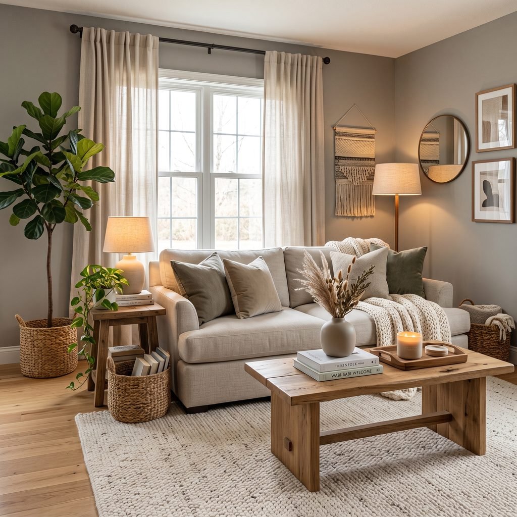
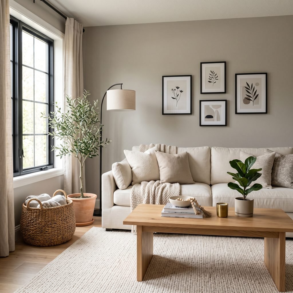
A living room is one of the easiest places to use Worldly Gray because you can balance it with plenty of texture and furniture.
For a warm, relaxed palette, pair it with:
- Cream sofa
- Natural oak
- Medium brown leather
- Ivory rug
- Black frames
- Woven baskets
- Greenery
The warmth of Worldly Gray can help those materials feel connected rather than creating a stark gray-and-brown contrast.
If the room receives plenty of daylight, white or soft off-white curtains can keep the palette feeling airy.
For contrast, introduce black or charcoal through lamps, picture frames, curtain rods, or small furniture pieces.
Worldly Gray in a Bedroom
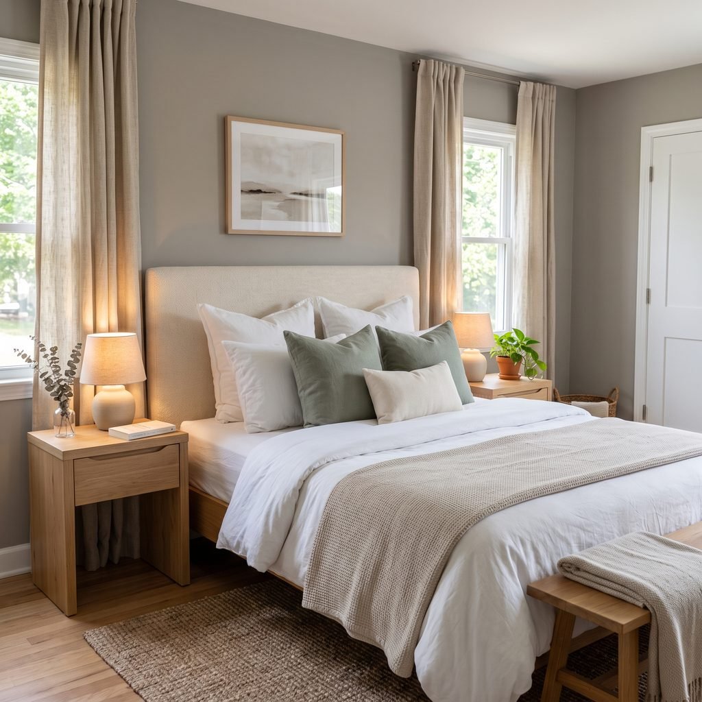
Worldly Gray can work beautifully in a bedroom where you want something soft and neutral without painting everything white.
Pair it with creamy bedding and warm wood for a calm traditional look.
For something moodier, add charcoal, dark olive, or deep brown.
For a softer palette, combine Worldly Gray with muted sage, warm white, oatmeal, and natural linen.
Keep artificial lighting in mind.
Warm lamps can make the color appear noticeably warmer at night than it does in daylight.

Worldly Gray in a Kitchen
Worldly Gray can be a useful kitchen wall color because it has enough presence to contrast with light cabinetry without feeling overly dramatic.
It can work particularly well with:
- Warm white cabinets
- Medium wood cabinets
- Black hardware
- Brass-toned hardware
- Warm stone
- Cream backsplashes
- Natural wood accents
If your kitchen has very cool white cabinets or strongly blue-gray countertops, sample carefully.
The contrast between cool permanent finishes and the warm undertone of Worldly Gray may become more noticeable.
That contrast can be beautiful when intentional, but awkward when it is accidental.
Worldly Gray With White Cabinets
Worldly Gray and white cabinetry can create a classic neutral kitchen.
The important question is which white.
A softer or warmer white generally creates a smoother transition, while a very cool, bright white can make Worldly Gray’s warmth appear more obvious.
Sherwin-Williams officially lists Shoji White SW 7042 as one of the coordinating colors for Worldly Gray.
Shoji White is therefore a useful starting point if you want an official coordinating neutral, although your cabinetry finish and lighting still need to be considered.
Worldly Gray in a Bathroom
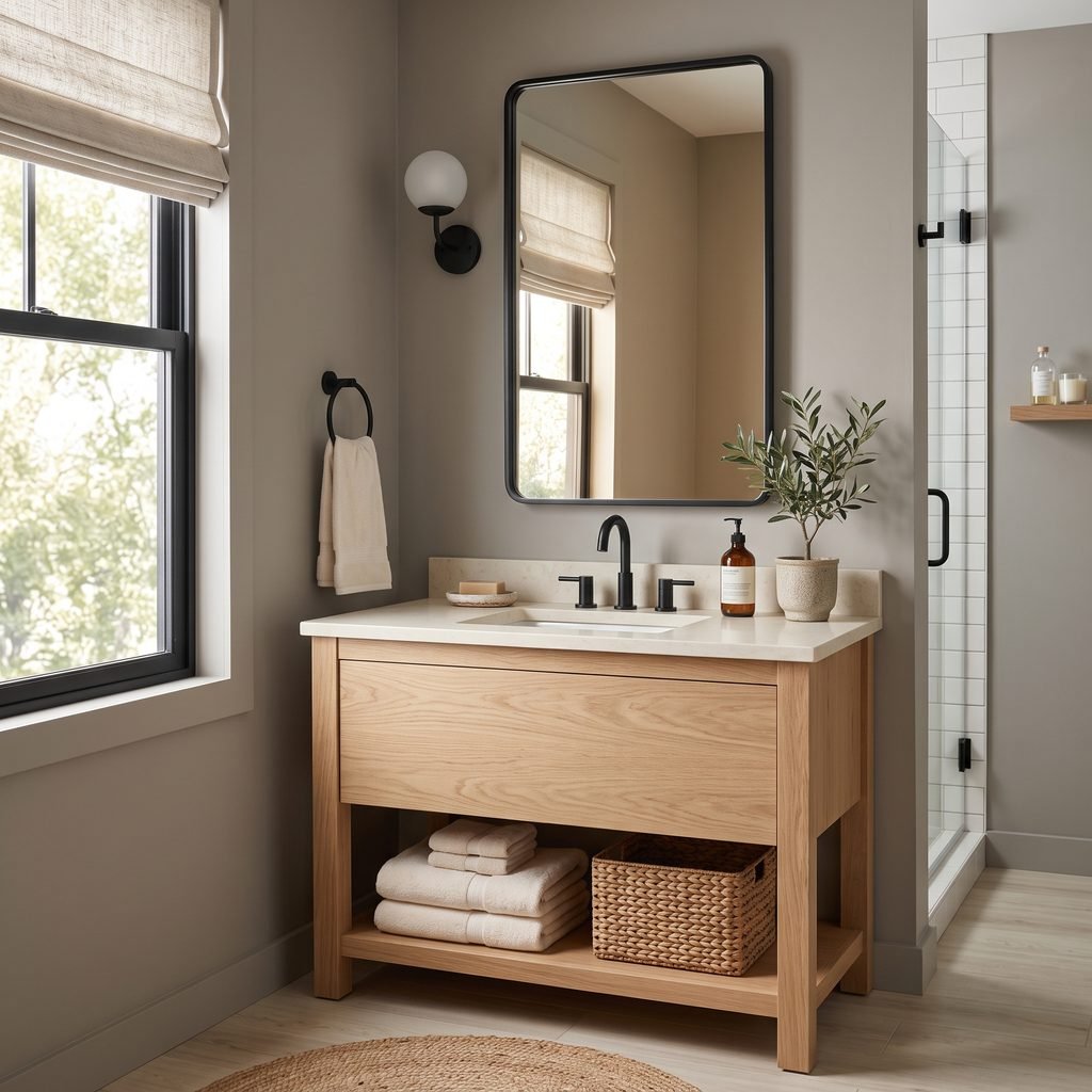
Worldly Gray can also work nicely in bathrooms, especially those with warm stone, wood vanities, cream tile, or black fixtures.
Against bright white porcelain, the wall color should have enough depth to remain visible.
This can make a bathroom feel softer than one painted pure white without turning it dark.
Before using it with marble or other cool-toned materials, compare actual samples.
Some marble contains blue, violet, or cool gray veining that may emphasize the warmer side of Worldly Gray.
Worldly Gray for an Open Floor Plan
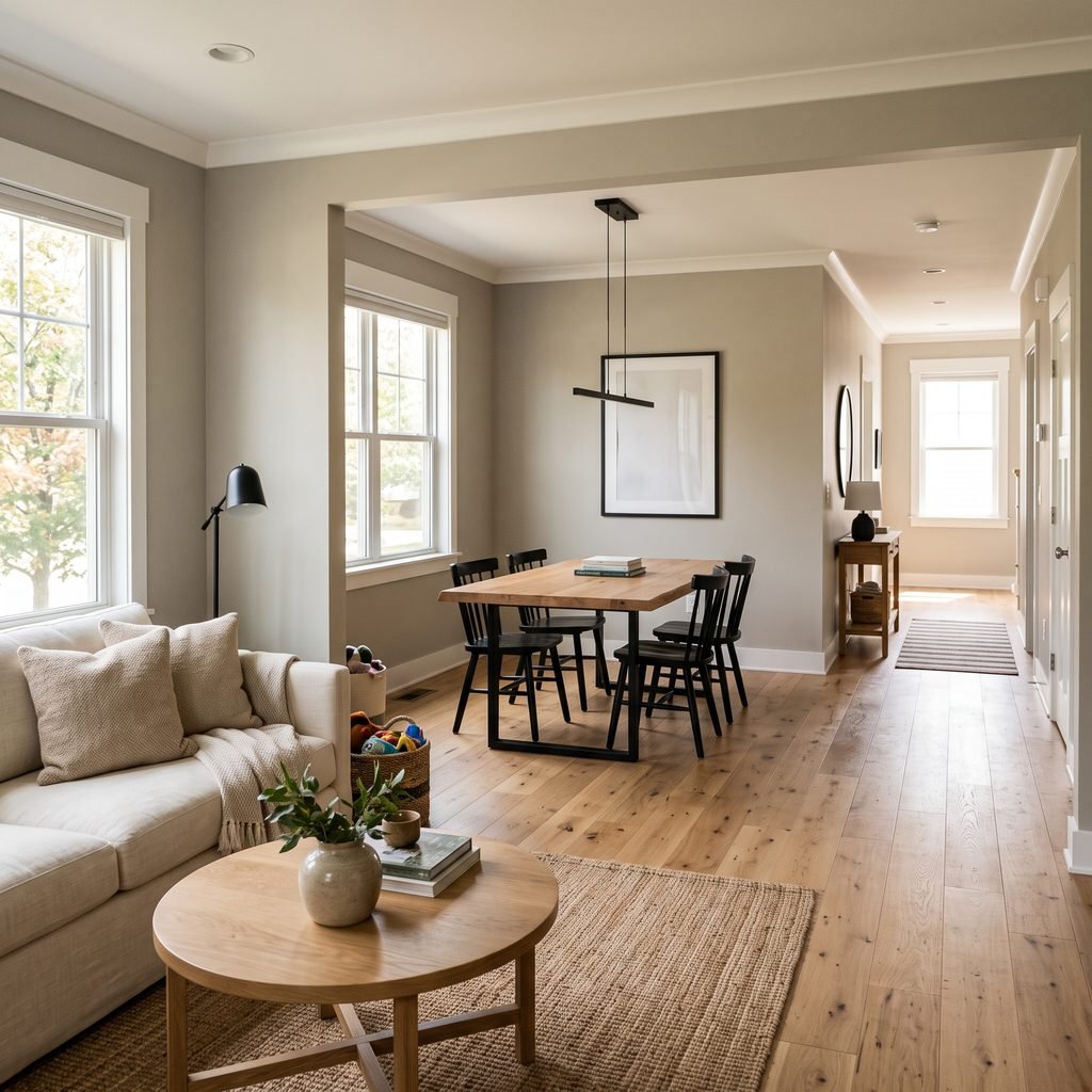
Choosing one paint color for an open floor plan can be challenging because the same shade is exposed to several types of light.
Worldly Gray can be useful because it sits in a moderate neutral range rather than being extremely light or dark.
The warm character also makes it easier to connect wood, cream, beige, and gray furnishings across several spaces.
Still, do not sample it on only one wall.
Place samples in the living room, dining area, hallway, and kitchen if those spaces connect visually.
A paint color that looks perfect beside one window could behave differently twenty feet away.
What Colors Coordinate With Worldly Gray?
Sherwin-Williams currently lists three coordinating colors with Worldly Gray:
- Shoji White SW 7042
- Amazing Gray SW 7044
- Whirlpool SW 9135
Those official pairings give you three useful directions.
Worldly Gray + Shoji White
This combination creates a soft neutral palette.
Use Shoji White for lighter walls, trim where appropriate, or adjacent spaces if the combination works with your home’s fixed finishes.
Worldly Gray + Amazing Gray
Amazing Gray is deeper and sits immediately beside Worldly Gray in Sherwin-Williams’ color sequence. The official data lists Amazing Gray SW 7044 directly after Worldly Gray.
Use the deeper shade when you want more contrast on cabinetry, built-ins, or another room.
Worldly Gray + Whirlpool
Whirlpool introduces a cooler blue-green direction that can give a warm neutral palette some contrast.
That type of combination can work well through cabinetry, textiles, artwork, or another painted surface.
What Wood Tones Work With Worldly Gray?
Worldly Gray is especially easy to decorate with natural wood.
Try it with:
- White oak
- Medium oak
- Walnut
- Weathered wood
- Medium brown furniture
- Warm wood cabinetry
Warm wood reinforces the comfortable side of the color.
If your wood flooring has strong yellow, orange, or red undertones, however, compare samples before committing.
Some combinations may look beautifully warm, while others may make the paint appear greener or more beige than expected.
The more dominant the flooring color, the more important this comparison becomes.
What Metal Finishes Work With Worldly Gray?
Because Worldly Gray is neutral, it can work with several metals.
Black
Black adds crisp contrast and keeps a warm gray room from becoming too soft.
Use it through:
- Light fixtures
- Frames
- Cabinet hardware
- Curtain rods
- Furniture legs
Brass and Gold Tones
Warm metals emphasize the cozy side of Worldly Gray.
They can work particularly well in traditional, transitional, or updated classic interiors.
Nickel and Chrome
Cooler metals create more contrast.
They can be useful in bathrooms and kitchens where you want a cleaner look.
You do not necessarily need to use only one metal finish throughout the entire room. Repeating each chosen finish intentionally can make mixed metals feel cohesive.
Worldly Gray vs. Agreeable Gray
Worldly Gray and Sherwin-Williams Agreeable Gray are often considered for similar projects because both fall into the warm neutral territory.
However, you should not assume they are interchangeable.
The easiest way to compare them is with large physical samples side by side.
Look at them beside:
- Flooring
- Trim
- Cabinets
- Countertops
- Sofa fabric
One may feel more balanced with your permanent finishes while the other brings out an undertone you do not want.
Avoid choosing simply because one color is more widely discussed online.
Worldly Gray vs. Repose Gray
Repose Gray is another Sherwin-Williams neutral frequently considered when homeowners want light-to-medium gray walls.
In general, if Worldly Gray feels too warm in your particular room, comparing it with a somewhat cleaner gray can help clarify what your space needs.
Again, actual samples are more useful than digital comparisons.
Two colors that look almost identical on a phone screen can separate dramatically when painted on the wall.
Worldly Gray vs. Amazing Gray
This comparison is easier because Sherwin-Williams places Amazing Gray SW 7044 next to Worldly Gray SW 7043, and its published RGB data shows Amazing Gray is deeper.
If you like the general family of Worldly Gray but want more depth, Amazing Gray is an obvious shade to sample beside it.
This pairing could also work within the same home.
For example:
- Worldly Gray walls
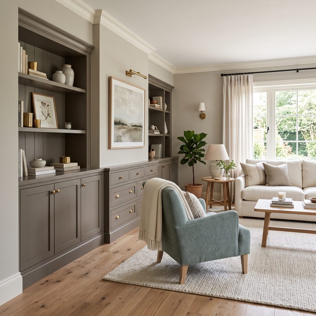
- Amazing Gray built-ins
- Soft off-white trim
That creates tonal contrast without introducing a completely unrelated color.
Is Worldly Gray a Good Whole-House Paint Color?
It can be, particularly if your home contains a lot of warm neutral finishes.
Its moderate LRV and warm-gray character make it more flexible than a very dark or strongly colored paint.
But whole-house paint colors still need whole-house testing.
Before using it everywhere, sample Worldly Gray in:
- North-facing rooms
- South-facing rooms
- Hallways
- Rooms with limited natural light
- Rooms with warm wood floors
- Rooms with tile
- Kitchen areas
- Bedrooms
You may love it throughout the majority of the house but prefer another neutral in one area where the lighting changes significantly.
How to Make Worldly Gray Feel Modern
Warm gray does not automatically mean traditional.
For a more contemporary look, pair Worldly Gray with cleaner shapes and stronger contrast.
Try:
- Matte black lighting
- Simple white trim
- Pale oak
- Minimal furniture
- Large abstract artwork
- Cream upholstery
- Charcoal accents
- Clean-lined cabinetry
Skip excessive distressed finishes or too many beige accessories if your goal is modern.
The paint can provide warmth while the furniture and architectural details provide the cleaner contemporary edge.
How to Make Worldly Gray Feel Cozy
If you want the room to feel softer, layer similar warm neutrals.
Combine Worldly Gray with:
- Oatmeal
- Cream
- Camel
- Brown
- Muted olive
- Natural wood
- Woven fibers
- Linen
- Warm ambient lighting
Texture matters.
A room with gray walls, gray flooring, gray furniture, and smooth surfaces can feel flat even if the paint color itself is attractive.
Wood, fabric, baskets, pottery, greenery, and textured rugs prevent that problem.
How to Test Worldly Gray Correctly
Sherwin-Williams notes that actual paint can vary from the way colors appear on a screen and recommends viewing a physical sample before making a final decision.
That is especially important with a nuanced warm gray.
Use this process:
- Obtain a real sample of Worldly Gray.
- Test a generous area rather than a tiny brushstroke.
- Place another sample close to the flooring.
- Compare it beside your trim.
- Check it near cabinetry or countertops.
- Look at the color in morning daylight.
- Check it again during the afternoon.
- Turn on your normal lighting at night.
- Compare it with one or two alternative neutrals.
- Make your decision only after seeing all of those conditions.
Avoid testing five or ten very similar colors at once.
Once too many gray samples cover a wall, your eyes can begin comparing them with one another rather than judging how each works with the actual room.
Common Mistakes With Worldly Gray
Expecting It to Look Exactly Like an Online Photo
Photography changes color.
So do screens, editing, exposure, furnishings, and daylight.
Use inspiration photos for general direction, not exact color predictions.
Ignoring the Flooring
Flooring has an enormous influence because it covers such a large area.
Always compare the paint directly with the floor.
Treating It as a Pure Gray
Worldly Gray is intentionally warm.
If you want a crisp silver-gray, you may prefer another color.
Choosing Trim Without Sampling It
The white beside your gray can dramatically affect how the wall color appears.
Compare both paints together.
Painting an Entire Open Floor Plan From One Sample
Different areas of an open space may receive dramatically different light.
Test in several locations.
Forgetting About Evening Lighting
A warm bulb can make Worldly Gray appear warmer at night.
A cooler bulb can shift its appearance in the other direction.
Evaluate the paint under the actual bulbs you plan to use.
FAQ About Sherwin-Williams Worldly Gray
Is Sherwin-Williams Worldly Gray warm or cool?
Worldly Gray is a warm gray. Sherwin-Williams describes it specifically as a warm gray intended to create a sophisticated and comfortable atmosphere.
What is the LRV of Worldly Gray?
Sherwin-Williams lists Worldly Gray SW 7043 with an LRV of approximately 57. That gives it noticeable depth while still allowing it to reflect a moderate amount of light.
Is Worldly Gray a greige?
It can behave like a greige because of its warmth, although Sherwin-Williams categorizes and describes it as a warm gray neutral.
What colors coordinate with Worldly Gray?
Sherwin-Williams lists Shoji White SW 7042, Amazing Gray SW 7044, and Whirlpool SW 9135 as coordinating colors.
Does Worldly Gray work in north-facing rooms?
It can. Sherwin-Williams includes Worldly Gray in its guidance for north-facing spaces, where warm neutrals can help balance cooler natural light. Always sample it in your actual room.
Can Worldly Gray work with wood floors?
Yes, particularly with many warm and medium wood tones. Because individual woods can have strong yellow, orange, red, or brown undertones, compare a physical paint sample directly against your flooring first.
Is Worldly Gray too dark for a small room?
Not necessarily. Its LRV is around 57, which Sherwin-Williams places within a moderate neutral range that can work in spaces including small guest bedrooms and bathrooms. The actual result will depend on natural light, artificial lighting, and surrounding finishes.
Can Worldly Gray be used on exteriors?
Sherwin-Williams currently lists Worldly Gray for interior and exterior use. Exterior colors can look dramatically lighter in direct daylight, so exterior sampling is particularly important.
Final Thoughts on Sherwin-Williams Worldly Gray
Sherwin-Williams Worldly Gray SW 7043 is a versatile warm gray for homeowners who want something softer than a cool gray but not overwhelmingly beige.
Its LRV of roughly 57 gives it enough depth to create visible contrast while keeping it within a relatively light, flexible neutral range. Sherwin-Williams also pairs it officially with Shoji White, Amazing Gray, and Whirlpool, giving you useful options for building a coordinated palette.
It can work particularly well with wood, cream, warm whites, black accents, natural textures, and earthy furnishings.
But the most important step comes before you paint the room.
Sample it.
Look at Worldly Gray beside your flooring and permanent finishes in morning, afternoon, and evening light. If you still like it under all of those conditions, you will have a much better idea of what the finished room will actually look like.