

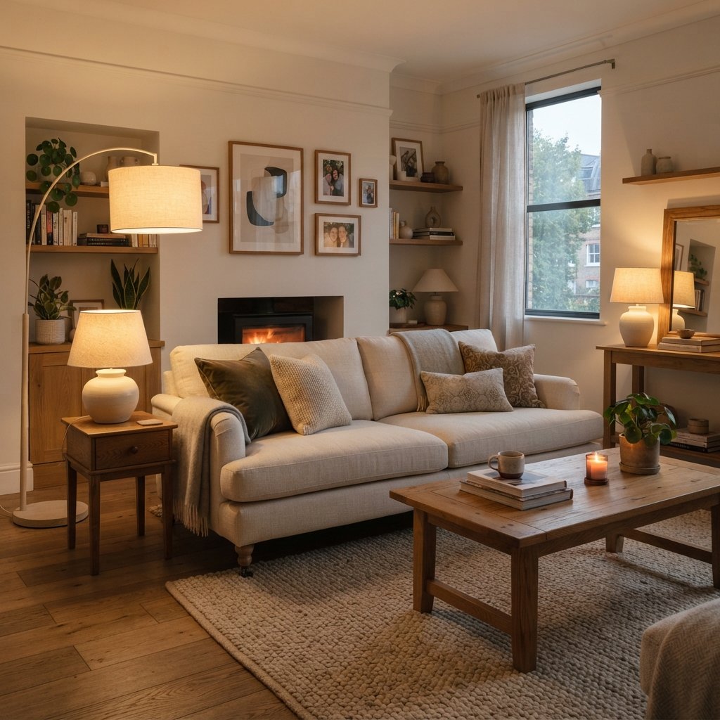
Choosing paint for a dark room can be surprisingly tricky.
A color that looks soft and inviting on a paint chip may become dull, gray, muddy, or much darker once it is on the walls. And painting everything bright white does not automatically solve the problem.
In fact, some whites can look flat or dingy in rooms without much natural light.
The secret to finding the best paint colors for dark rooms is to work with the room’s lighting rather than trying to pretend the lighting is not there.
Sometimes that means choosing a warm off-white that reflects available light and keeps the room feeling airy. Other times, a warm beige, soft greige, muted green, dusty blue, or even a deep moody color can look far more intentional.
The right direction depends on why the room is dark, how you use it, the fixed finishes already there, and the atmosphere you want to create.
Below are 15 paint color directions that can work beautifully in low-light rooms, plus tips for whites, undertones, artificial lighting, sampling, and avoiding common paint-color mistakes.
Why Paint Colors Look Different in Dark Rooms
Paint does not create natural light.
It responds to whatever light is available.
In a bright room, natural light can reveal subtle undertones and make colors feel more open.
In a darker room, the same paint may appear:
- Deeper
- Grayer
- Duller
- More saturated
- More obviously warm or cool
Window direction, surrounding buildings, covered porches, trees, window size, and artificial lighting can all affect how a color appears.
That is why choosing paint from an online photo or tiny store swatch is especially risky in a dark room.
Always sample it in the actual space.
Should You Paint a Dark Room White?
You can, but white is not automatically the best solution.
White walls reflect available light, but if the room receives very little natural light, there may not be much light to reflect.
Some crisp whites can also develop a cool, shadowy appearance in low-light conditions.
A softer off-white or cream may feel more inviting.
Alternatively, you can stop trying to make the room look bright and lean into its natural mood with a richer color.
Both approaches can work.
The question is whether you want to:
Lighten the feeling of the room
or
Embrace the room’s coziness.
1. Warm Off-White
A warm off-white is one of the most versatile choices for a dark room.
Instead of a stark, bright white, look for a white with subtle warmth.
Warm off-whites can work well with:
- Wood floors
- Beige upholstery
- Cream textiles
- Brass
- Warm stone
The warmth helps compensate for the flat or cool shadows that can appear in a room with limited daylight.
However, avoid choosing something so creamy that it looks yellow against your fixed finishes.
Test several options side by side.
2. Soft Cream
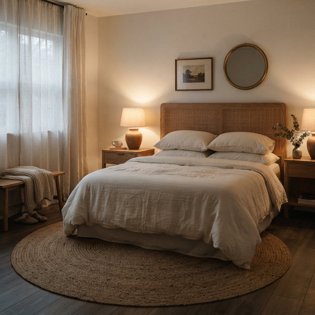
Cream can be a beautiful alternative to white.
It creates a warm glow and can make a low-light room feel cozy without making it dramatically darker.
Cream works especially well with:
- Traditional interiors
- Warm wood
- Antique furniture
- Brass
- Natural fibers
Be careful when the room contains cool gray tile, blue-white countertops, or other distinctly cool finishes.
A strongly yellow cream may emphasize the temperature difference.
3. Light Warm Beige
Beige is useful in darker rooms because it can provide warmth without requiring strong color.
Look for beige that relates to the room’s existing finishes.
A light warm beige can pair beautifully with:
- Oak
- Walnut
- Cream
- Muted blue
- Olive
- Black accents
If you have spent years avoiding beige because it seemed dated, remember that beige covers a huge range of undertones.
A soft, restrained beige can feel calm and current.
4. Pale Greige
Greige sits somewhere between gray and beige, making it useful when a room contains both warm and cool finishes.
In a dark room, avoid assuming every light greige will remain light.
Some can become noticeably grayer or deeper when natural light is limited.
Test the paint throughout the day and under your evening lighting.
A warmer greige can be particularly helpful when you have a cool sofa but warm wood flooring.
5. Mushroom
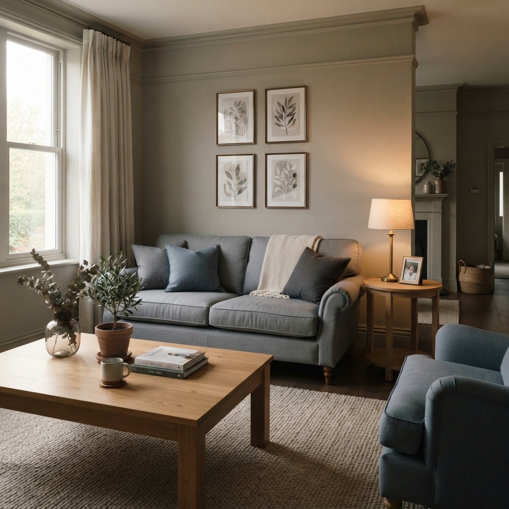
Mushroom is a sophisticated neutral that often combines brown, gray, and taupe qualities.
It can be a beautiful choice if you want more depth than off-white without making the room dramatically dark.
Mushroom works well with:
- Cream
- Brown
- Black
- Warm white
- Muted green
- Natural wood
Because mushroom shades can have complex undertones, sampling is particularly important.
6. Soft Taupe
Taupe can bridge warm and cool elements in a dark room.
It works especially well when your furnishings include a mixture of:
- Gray
- Beige
- Brown
- Cream
Taupe also creates a cozy envelope without necessarily feeling as heavy as chocolate brown or charcoal.
Try it in bedrooms, living rooms, offices, and small dens.
7. Muted Sage Green
A muted sage can introduce color while still behaving somewhat like a neutral.
In a darker room, sage may appear grayer or deeper than expected.
That can be beautiful if you choose intentionally.
Pair sage walls with:
- Cream upholstery
- Warm oak
- Woven textures
- Aged brass
- Warm white trim
Avoid choosing a green from the chip alone.
Some greens reveal stronger blue, gray, or yellow undertones once they cover an entire wall.
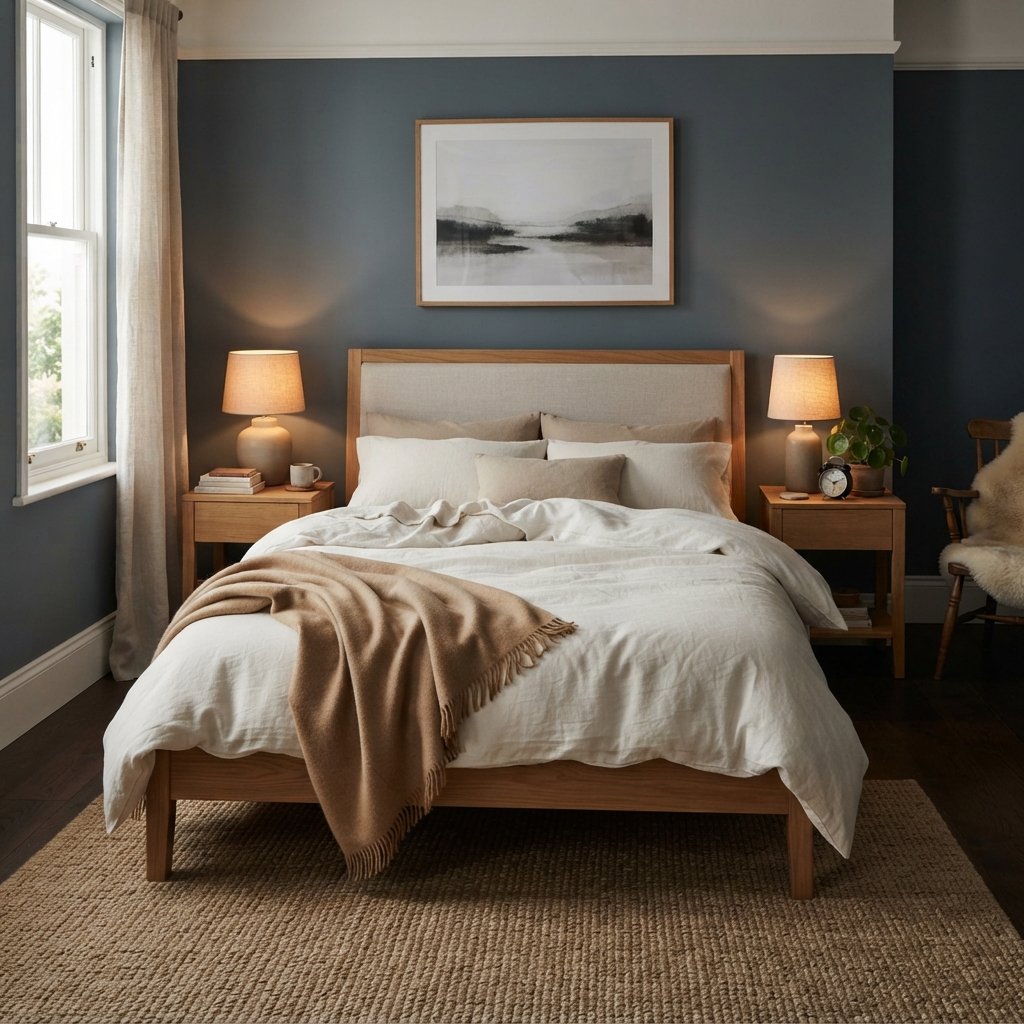
8. Dusty Blue
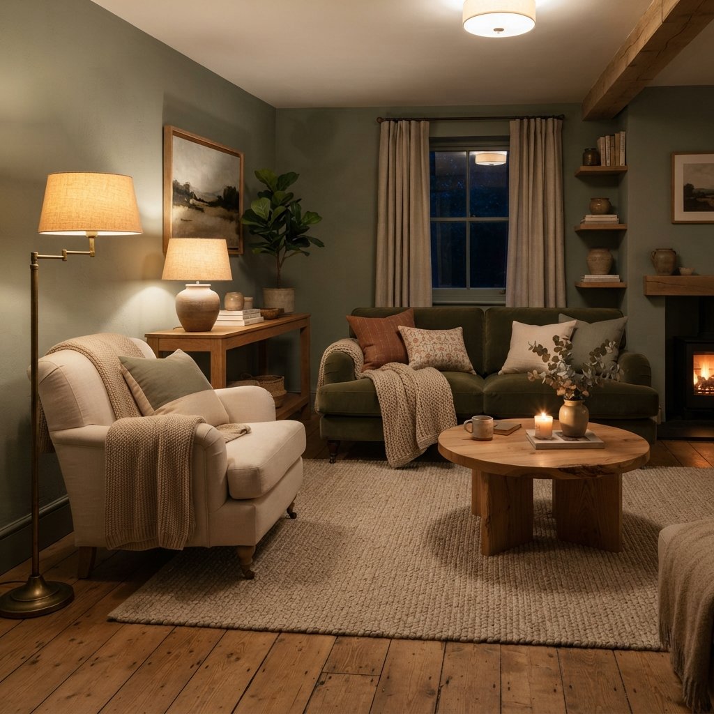
Blue does not have to make a dark room feel cold.
A muted, dusty blue can create a calm atmosphere, especially when balanced with warm furnishings.
Try it with:
- Cognac
- Warm wood
- Cream
- Camel
- Brass
Avoid pairing a very cool blue with nothing but gray, icy white, and chrome unless you intentionally want a crisp, cool room.
Warm accents can make blue much more inviting.
9. Blue-Gray
Blue-gray can work beautifully when you want a quiet, atmospheric room.
The key is understanding that it may look significantly grayer in low natural light.
Pair it with warm elements such as:
- Oak furniture
- Cream curtains
- Beige rug
- Brown leather
- Warm lighting
This can be especially effective in a bedroom or home office where a cozy mood is welcome.
10. Muted Blue-Green
A restrained blue-green can bring character to a room without feeling overly bright.
Think soft eucalyptus, smoky teal, or muted green-blue rather than highly saturated turquoise.
These colors can look beautiful with warm woods and creamy whites.
If the room already has green or blue fixed finishes, compare samples carefully so the undertones relate rather than compete.
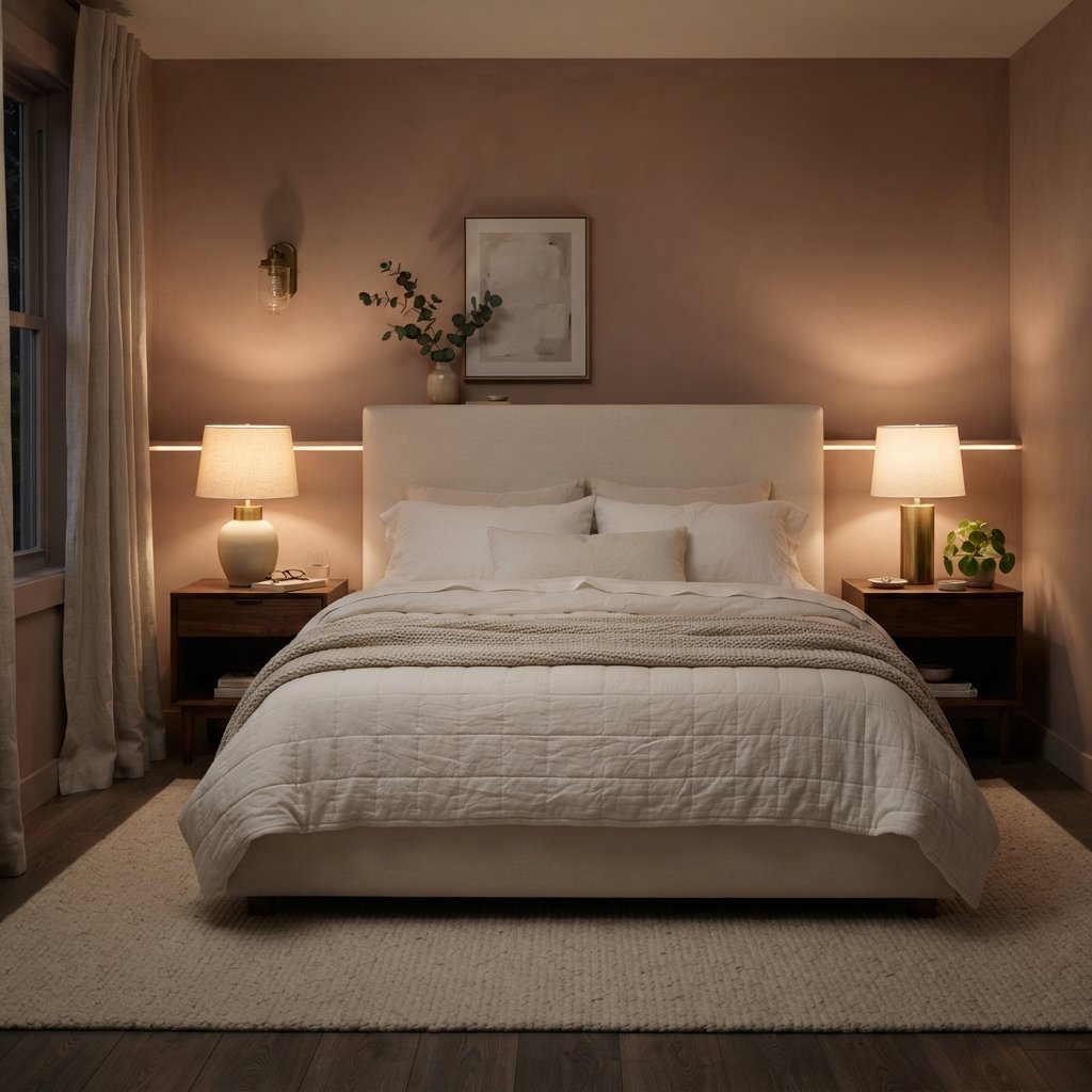
11. Warm Blush
Blush can function almost like a neutral when it is sufficiently muted.
Look for dusty, earthy pinks rather than sugary pink.
A warm blush can create a soft glow in:
- Bedroom
- Powder room
- Dressing room
- Home office
Pair it with cream, walnut, camel, brass, and soft gray.
12. Soft Terracotta
If you are willing to embrace warmth, terracotta can make a dark room feel intentional and enveloping.
Choose a muted clay tone rather than a highly saturated orange.
Terracotta works beautifully with:
- Cream
- Dark wood
- Olive
- Black
- Natural linen
This approach is less about making the room appear brighter and more about making low light feel warm and atmospheric.
13. Olive Green
Olive is another excellent choice when you want to lean into the darkness.
A medium or deep olive can create a sophisticated backdrop for:
- Wood furniture
- Cream upholstery
- Antique brass
- Brown leather
- Natural textiles
Use layered lighting so the room feels cozy rather than gloomy.
Olive can be particularly effective in libraries, dens, dining rooms, and bedrooms.
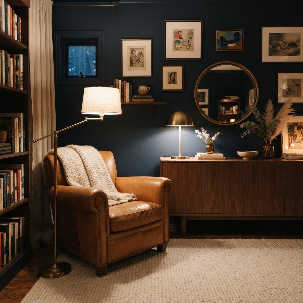
14. Deep Navy
Sometimes the best solution for a dark room is to stop fighting it.
Navy can create a rich, cocooning effect.
Instead of worrying that the walls will make the room darker, build an intentional palette around the depth.
Pair navy with:
- Warm white
- Camel
- Cognac
- Walnut
- Brass
- Cream
Use several sources of artificial light rather than relying on one ceiling fixture.
15. Charcoal
Charcoal can transform an awkwardly dark room into a dramatic one.
It works especially well when the room already has limited natural light and you want to create a cozy evening atmosphere.
Try charcoal with:
- Cream
- Natural oak
- Cognac
- Warm brass
- Soft white
- Muted green
Consider extending the color onto trim or other architectural details if that approach suits the room.
Dark colors can reduce harsh contrast between walls and shadows, creating a surprisingly restful effect.
Light Colors vs. Dark Colors in a Dark Room
There are two valid decorating strategies.
Strategy 1: Keep It Light
Choose:
- Warm off-white
- Cream
- Pale beige
- Light greige
- Soft taupe
This works when you want the room to feel airy and visually connected to brighter areas of the home.
Strategy 2: Embrace the Mood
Choose:
- Olive
- Navy
- Charcoal
- Terracotta
- Deep blue-green
This works when you want the room to feel intimate, cozy, and intentional.
What usually works less well is choosing a color solely because it looks “light” on a swatch without considering how it behaves in the actual room.
Best White Paint Colors for Dark Rooms
Instead of searching for one universal perfect white, identify what kind of white your room needs.
Warm White
Works well with warm wood, beige, cream, and many natural materials.
Soft Neutral White
Useful when you have a mixture of warm and cool finishes.
Cool White
Can work with cooler fixed finishes, but may become shadowy in some dark rooms.
A paint’s undertone matters more than its marketing name.
Place several large white samples beside your:
- Flooring
- Trim
- Cabinets
- Furniture
A white that looks neutral by itself can suddenly reveal yellow, pink, gray, green, or blue undertones when compared with another surface.
Best Paint Colors for a Dark Living Room
A living room usually needs to work during both daytime and evening.
For a lighter feeling, consider:
- Warm off-white
- Light beige
- Greige
- Mushroom
For a more colorful look:
- Muted sage
- Dusty blue
- Blue-green
For a dramatic room:
- Navy
- Olive
- Charcoal
Consider your largest furnishings before choosing.
A gray sectional, warm wood floors, and beige rug create very different color requirements from a cream sofa and cool gray flooring.
Best Paint Colors for a Dark Bedroom
Bedrooms are one of the easiest places to embrace lower light.
Instead of forcing the room to look bright, you can create a calm, cocooning effect.
Try:
- Soft taupe
- Dusty blue
- Sage
- Olive
- Navy
- Warm off-white
Layer bedding, curtains, rugs, and lighting to create softness.
Best Paint Colors for a Dark Hallway
Hallways often have little or no direct natural light.
Warm off-white, cream, light beige, and pale greige can help them connect visually to adjoining rooms.
Another option is to make the hallway deliberately moody with deeper paint and interesting lighting.
If several rooms open from the hallway, compare the hallway color with the colors visible through those doorways.
Transitions matter.
Best Paint Colors for a Dark Basement
Basements often have limited or unusual natural light, so artificial lighting becomes especially important.
Light options include:
- Warm white
- Cream
- Light greige
- Pale beige
If the basement is intended as a media room, bar, or cozy lounge, deeper colors may be appropriate.
Do not rely on paint to solve basement dampness or moisture problems. Address underlying building and moisture issues separately before decorating.
Best Paint Colors for a Dark Bathroom
A bathroom with little daylight can go in either direction.
Keep it airy with:
- Warm white
- Cream
- Light beige
- Pale greige
Or create a jewel-box effect with:
- Deep green
- Navy
- Charcoal
- Rich blue-green
Coordinate the paint with tile, countertops, vanity color, and lighting.
Bathroom finishes often have strong undertones that become obvious beside paint.
How to Choose Paint When a Room Has No Natural Light
If a room has no windows, the artificial lighting effectively becomes the room’s permanent light source.
Evaluate paint samples under the actual fixtures you plan to use.
Do not choose the color under store lighting.
Consider:
- Lamp placement
- Ceiling fixtures
- Wall sconces
- Bulb characteristics
- Light reflected from floors and furniture
A color can look dramatically different when you change the lighting.
Choose paint and lighting together rather than treating them as separate decisions.
Does LRV Matter in a Dark Room?
You may see paint colors described using Light Reflectance Value, or LRV.
LRV indicates how much visible light a surface reflects on a scale from darker to lighter.
It can be a useful comparison tool, but it does not tell you exactly how a paint color will look in your room.
A higher-LRV color cannot create light that is not there.
Undertones, exposure, artificial lighting, surrounding colors, and sheen all influence the final result.
Use LRV as one piece of information rather than choosing paint based on the number alone.
How Artificial Lighting Affects Paint Color
Artificial lighting is especially important in a dark room because you may use it throughout much of the day.
Different light sources can make colors appear warmer or cooler.
Rather than choosing a bulb solely to “fix” the paint, create lighting that works for the room’s function and then evaluate paint samples under that lighting.
Layer several light sources when practical.
A room can feel much more inviting with:
- Ceiling light
- Floor lamp
- Table lamp
- Sconce
- Task lighting
than with one harsh overhead fixture.
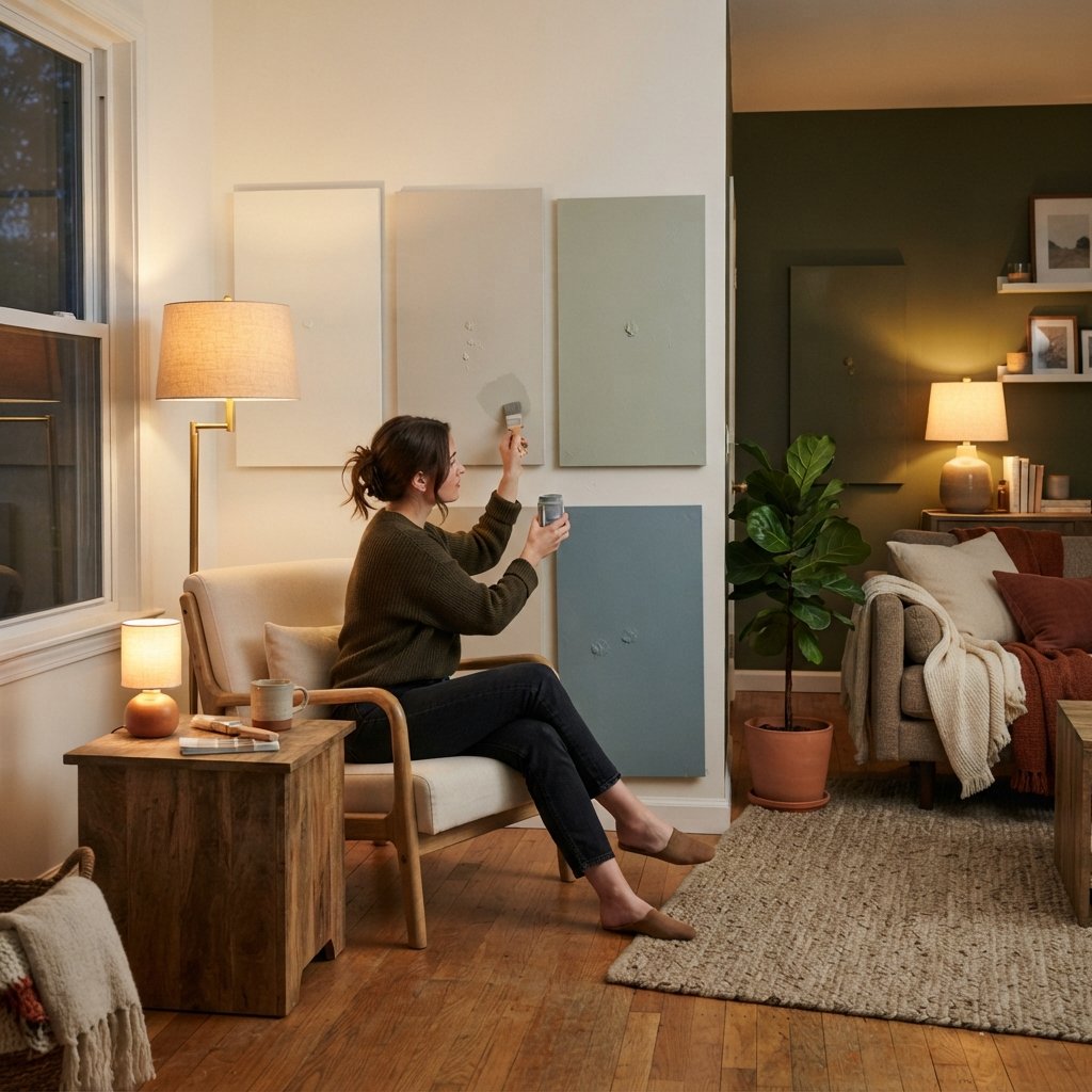
How to Sample Paint Colors in a Dark Room
Sampling is essential.
Step 1: Narrow Down Your Options
Choose a small group rather than testing dozens at once.
Step 2: Make Large Samples
Tiny chips make undertones difficult to evaluate.
Use a manufacturer sample method appropriate for the paint you are considering, or paint suitable sample boards.
Step 3: Move the Samples Around
Look at several walls.
One wall may receive noticeably different light from another.
Step 4: Check Them Throughout the Day
Morning, afternoon, and evening can look completely different.
Step 5: Turn On Your Lights
Evaluate the colors under the artificial lighting you actually use.
Step 6: Compare With Fixed Finishes
Place samples near flooring, trim, countertops, upholstery, or cabinetry.
How to Make a Dark Room Feel Brighter Beyond Paint
Paint is only part of the solution.
Add More Than One Light Source
Layered lighting reduces dark corners.
Use Mirrors Strategically
A mirror can reflect existing light when positioned effectively.
Choose Lighter Window Treatments
If privacy and function allow, avoid unnecessarily blocking available daylight.
Add Reflective Surfaces Carefully
Glass, mirrors, and some metal finishes can bounce light around the room.
Keep Large Furniture From Blocking Windows
Even part of a window can matter in a low-light space.
Use Lighter Textiles
Cream curtains, bedding, upholstery, and rugs can visually brighten the room.
Add Warm Natural Materials
Wood and woven texture can make a low-light room feel cozy rather than gloomy.
Common Paint Color Mistakes in Dark Rooms
Automatically Choosing Bright White
White is not guaranteed to make the room feel bright.
Choosing From a Tiny Paint Chip
Always sample.
Ignoring Undertones
Low light can make undertones more obvious.
Using Cool Gray Without Testing It
Some grays can become particularly flat or cold in limited natural light.
Trying to Fight the Room at All Costs
Sometimes a moody color is more successful than pretending the room is bright.
Ignoring Artificial Lighting
It may be the primary light source.
Forgetting the Fixed Finishes
Paint must work with the floor, furniture, stone, tile, and cabinetry.
Testing Only One Wall
Different walls can show the same color differently.
Choosing Paint From Online Photos Alone
Photography, editing, screens, exposure, and surrounding finishes can all change how a paint color appears.
FAQ About the Best Paint Colors for Dark Rooms
What paint color is best for a dark room?
There is no universal best color. Warm off-white, cream, light beige, greige, mushroom, sage, dusty blue, and deeper moody shades can all work depending on the room and desired atmosphere.
What color makes a dark room look brighter?
Light warm neutrals can create a brighter visual impression, especially when paired with good lighting and lighter furnishings. However, paint cannot replace natural or artificial light.
Should a dark room be painted white?
It can be, but white is not automatically the best option. Some whites may look gray or flat in limited light. Warm off-white or cream may be more inviting.
What colors should you avoid in a dark room?
There is no color family you must always avoid. The bigger issue is choosing a color without testing how its undertones respond to the room’s lighting and fixed finishes.
Is beige good for a dark room?
Yes. A light warm beige can make a dark room feel cozy and inviting, particularly with wood and other warm finishes.
Is gray good for a dark room?
It can be, but test carefully. Some cool grays become colder or flatter in low light. A warmer gray or greige may work better in some spaces.
Can you paint a dark room a dark color?
Absolutely. Navy, olive, charcoal, terracotta, and deep blue-green can turn limited light into an intentional cozy atmosphere.
Does higher LRV mean a room will look brighter?
A higher LRV means the paint reflects more available visible light, but it cannot create light. Room exposure, undertones, furnishings, and artificial lighting still matter.
Final Thoughts
Finding the best paint colors for dark rooms is not simply a matter of choosing the lightest paint chip you can find.
First, decide what you want the room to become.
If you want it to feel lighter, explore warm off-whites, cream, pale beige, greige, mushroom, and other soft neutrals.
If you want color without making the space feel overly heavy, consider muted sage, dusty blue, blush, or blue-green.
And if the room naturally feels cozy, you can embrace that character with olive, navy, charcoal, or muted terracotta.
Then look at the colors beside everything that is staying in the room.
Your flooring, furniture, countertops, tile, wood tones, and lighting all influence the way paint appears.
Most importantly, sample before committing.
Look at large samples on several walls during the day and at night with your lamps turned on.
A dark room does not have to become a bright white room to be beautiful.
Sometimes the goal is to maximize the light you have.
And sometimes the best solution is to turn the darkness into the room’s greatest strength.